
position: fixed를 이용하여 요소의 위치를 고정시킬 수 있다. 예를 들어<nav>로 상단에 고정되는 메뉴바를 만들 때 사용하는데fixed를 하면 요소가 갑자기 없어지고 어디 구석에 치우쳐 있다.
fixed의 경우 통상 중앙정렬 방법인margin:auto나flex box에서 justify-content:center/align-items:center이 적용되지 않아 문제가 된다.
가운데에 위치시키고 싶다면 어떻게 할까?
transform속성으로 가능하다!
예시
JavaScript
<!DOCTYPE html>
<html lang="ko">
    <meta charset="UTF-8">
    <meta http-equiv="X-UA-Compatible" content="IE=edge">
    <meta name="viewport" content="width=device-width, initial-scale=1.0">
    <script src="class.js"></script>
    <link rel="stylesheet" href="style.css">
    <title>Document</title>
</head>
<body>
    <div class="a">
        <div class="b"></div>
        <div class="c"></div>
    </div>
</body>
</html>
CSS
body {
  box-sizing: border-box;
  font-size: 80px;
  color: #fff;
}

.a {
  position: relative;
}
.b {
  width: 200px;
  height: 200px;
  margin: 0px auto;
  background-color: #000000;
  position: fixed;
}
.c {
  width: 600px;
  height: 600px;
  margin: 0px auto;
  background-color: #666666;
}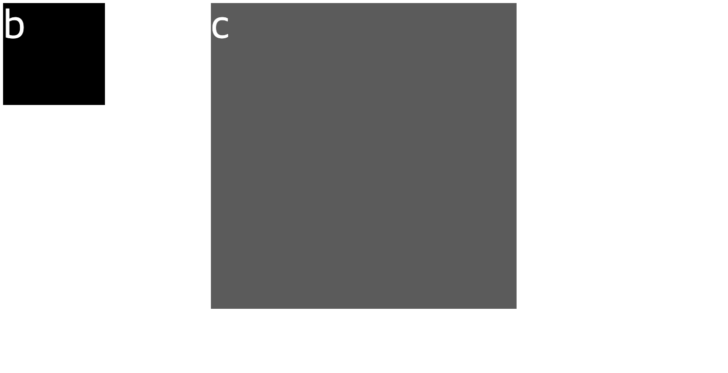
b라는 박스에 fixed를 적용하면 화면 왼쪽 끝으로 위치한다.
.b {
  width: 200px;
  height: 200px;
  margin: 0px auto;
  background-color: #000000;
  position: fixed;
  left: 50%;
  transform: translateX(-50%);
}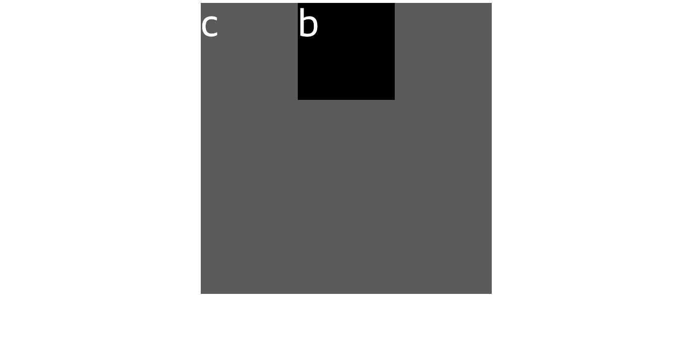
b박스에 left: 50%;를 추가하여 시작 위치를 정가운데로 만들고,
transform: translateX( -50% );를 추가하여 요소 크기의 50%만큼 왼쪽을 이동합니다. 끝!
인스타그램 클론 코딩을 하던 중
fixed로 input 검색바를 고정시키고 화면 중앙정렬을 시도하다 알게 된 내용이다.
매우 간단하지만 자주 쓰일 것같아 TIL로 작성! 💪
RN App Developer