
Matplot Library
Matplotlib은 Python에서 정적, 애니메이션 및 인터랙티브 시각화를 생성하기 위한 종합적인 라이브러리입니다.
Matplotlib은 쉬운 것은 더욱 쉽게, 어려운 것도 가능하게 합니다.
Matplotlib — Visualization with Python
Install
pip install matplotlibmatplotlib 한글 및 스타일 세팅
import matplotlib as mpl
import matplotlib.pyplot as plt

mpl.rcParams['font.family'] = 'AppleGothic' # 윈도우에서는 'Malgun Gothic'
mpl.rcParams['axes.unicode_minus'] = False
plt.style.use('_mpl-gallery')

# plt.style.available 에 사용할 수 있는 style 목록있음.
plt.style.use([style for style in plt.style.available if style.startswith('seaborn')][0])
Graph 종류
https://matplotlib.org/stable/plot_types/index
Plot
https://matplotlib.org/stable/plot_types/basic/plot.html#sphx-glr-plot-types-basic-plot-py
plt.hlines(y, xmin, xmax), plt.vlines(x, ymin, ymax)
- 수평선
- 수직선
plt.hlines(
    y: 'float | ArrayLike',
    xmin: 'float | ArrayLike',
    xmax: 'float | ArrayLike',
    colors: 'ColorType | Sequence[ColorType] | None' = None,
    linestyles: 'LineStyleType' = 'solid',
    label: 'str' = '',
    *,
    data=None,
    **kwargs,
) -> 'LineCollection'plt.hlines(-6, -10, 10, color='grey')
plt.hlines(-2, -10, 10, color='green')
plt.hlines(2, -10, 10, color='orange')
plt.hlines(6, -10, 10, color='red')
plt.vlines(-6, -10, 10, linestyles='solid')
plt.vlines(-2, -10, 10, linestyles='dashed')
plt.vlines(2, -10, 10, linestyles='dashdot')
plt.vlines(6, -10, 10, linestyles='dotted')
plt.show()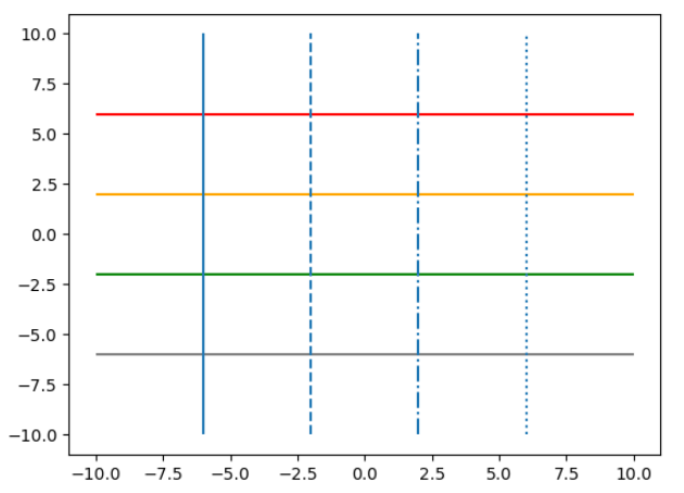
plt.plot(x, y, fmt, …), plt.plot(x, y, data)
- 펼쳐보기 (docs)
Signature: plt.plot( *args: 'float | ArrayLike | str', scalex: 'bool' = True, scaley: 'bool' = True, data=None, **kwargs, ) -> 'list[Line2D]' Docstring: Plot y versus x as lines and/or markers. x,y기준으로 그래프를 그린다.fmt옵션 목록- Markers
Character Description '.' 포인트 마커 ',' 픽셀 마커 'o' 원형 마커 'v' 아래쪽 삼각형 마커 '^' 위쪽 삼각형 마커 '<' 왼쪽 삼각형 마커 '>' 오른쪽 삼각형 마커 '1' 아래쪽 작은 삼각형 마커 '2' 위쪽 작은 삼각형 마커 '3' 왼쪽 작은 삼각형 마커 '4' 오른쪽 작은 삼각형 마커 '8' 팔각형 마커 's' 사각형 마커 'p' 오각형 마커 'P' 플러스 (채워진) 마커 '*' 별 마커 'h' 육각형1 마커 'H' 육각형2 마커 '+' 플러스 마커 'x' X 마커 'X' X (채워진) 마커 'D' 다이아몬드 마커 'd' 얇은 다이아몬드 마커 `' '` '_' 수평선 마커 - Line Styles
Character Description '-' 실선 스타일 '--' 대시선 스타일 '-.' 대시-점선 스타일 ':' 점선 스타일 - Colors
Character Color 'b' blue 'g' green 'r' red 'c' cyan 'm' magenta 'y' yellow 'k' black 'w' white
- Markers
- 코드 예시
# make data
x = np.linspace(-5, 5, 20)
y1 = x ** 3
y2 = 5 * x + 30
y3 = 4 * (x ** 2) - 20
y4 = -25 * x + 20

# plot

plt.xlim()
plt.plot(x, y1, '--g')
plt.plot(x, y2, ':b')
plt.plot(x, y3, '-.r')
plt.plot(x, y4)

# plt.xlim(-5, 5)
# plt.ylim(-10, 100)
# plt.xticks(np.arange(-5, 6))
# plt.yticks(np.arange(-100, 121, 20))
plt.grid(True) # plt.grid()
plt.show()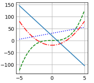
plt.xlim(left, right), plt.ylim(bottom, top)
- 그래프에서 x축, y축 값의 최대, 최소값 지정
- 인자를 넘겨주지 않으면, get 함수
- 인자를 넘겨주면, set 함수
left, right = xlim()  # return the current xlim
xlim((left, right))   # set the xlim to left, right
xlim(left, right)     # set the xlim to left, right

xlim(right=3)  # adjust the right leaving left unchanged
xlim(left=1)  # adjust the left leaving right unchanged
plt.xticks(ticks, labels=None), plt.yticks(ticks, labels=None)
- 그래프에서 x축, y축 그래프 tick 단위 선정
- 인자를 넘겨주지 않으면, get 함수
- 인자를 넘겨주면, set 함수
locs, labels = xticks()  # Get the current locations and labels.

xticks(np.arange(0, 1, step=0.2))  # Set label locations.
xticks(np.arange(3), ['Tom', 'Dick', 'Sue'])  # Set text labels.
xticks([]) # Disable xticks.plt.xticks(
ticks: 'ArrayLike | None' = None,
labels: 'Sequence[str] | None' = None,
*,
minor: 'bool' = False,
**kwargs,
) -> 'tuple[list[Tick] | np.ndarray, list[Text]]'
ticks : array-like, optional
The list of xtick locations. Passing an empty list removes all xticks.
labels : array-like, optional
The labels to place at the given *ticks* locations. This argument can
only be passed if *ticks* is passed as well.
minor : bool, default: False
If ``False``, get/set the major ticks/labels; if ``True``, the minor
ticks/labels.
**kwargs
`.Text` properties can be used to control the appearance of the labels.plt.grid()
- Configure the grid lines.
plt.xlabel(xlabel), plt.ylabel(ylabel)
- x축, y축에 이름을 지정해준다.
plt.xlabel(
    xlabel: 'str',
    fontdict: 'dict[str, Any] | None' = None,
    labelpad: 'float | None' = None,
    *,
    loc: "Literal['left', 'center', 'right'] | None" = None,
    **kwargs,
) -> 'Text'

xlabel : str
    The label text.

labelpad : float, default: :rc:`axes.labelpad`
    Spacing in points from the Axes bounding box including ticks
    and tick labels.  If None, the previous value is left as is.

loc : {'left', 'center', 'right'}, default: :rc:`xaxis.labellocation`
    The label position. This is a high-level alternative for passing
    parameters *x* and *horizontalalignment*.
plt.title(title)
- 그래프 제목을 지정해준다.
plt.title(
    label: 'str',
    fontdict: 'dict[str, Any] | None' = None,
    loc: "Literal['left', 'center', 'right'] | None" = None,
    pad: 'float | None' = None,
    *,
    y: 'float | None' = None,
    **kwargs,
) -> 'Text'

label : str
    Text to use for the title

fontdict : dict

    .. admonition:: Discouraged

       The use of *fontdict* is discouraged. Parameters should be passed as
       individual keyword arguments or using dictionary-unpacking
       ``set_title(..., **fontdict)``.

    A dictionary controlling the appearance of the title text,
    the default *fontdict* is::

       {'fontsize': rcParams['axes.titlesize'],
        'fontweight': rcParams['axes.titleweight'],
        'color': rcParams['axes.titlecolor'],
        'verticalalignment': 'baseline',
        'horizontalalignment': loc}

loc : {'center', 'left', 'right'}, default: :rc:`axes.titlelocation`
    Which title to set.

y : float, default: :rc:`axes.titley`
    Vertical Axes location for the title (1.0 is the top).  If
    None (the default) and :rc:`axes.titley` is also None, y is
    determined automatically to avoid decorators on the Axes.

pad : float, default: :rc:`axes.titlepad`
    The offset of the title from the top of the Axes, in points.
plt.legend(labels=None, loc=None)
- loc 옵션 목록
Location String Location Code 'best' (Axes only) 0 'upper right' 1 'upper left' 2 'lower left' 3 'lower right' 4 'right' 5 'center left' 6 'center right' 7 'lower center' 8 'upper center' 9 'center' 10
plt.figure(num = None, figsize=(2,2))
- 현재까지 plot한 그래프 창을 생성한다.
- 만약 이미 존재한다면, 해당 그래프(Figure)를 지정한다.
- 펼쳐보기 (docs)
Signature:
plt.figure(
    num: 'int | str | Figure | SubFigure | None' = None,
    figsize: 'tuple[float, float] | None' = None,
    dpi: 'float | None' = None,
    *,
    facecolor: 'ColorType | None' = None,
    edgecolor: 'ColorType | None' = None,
    frameon: 'bool' = True,
    FigureClass: 'type[Figure]' = <class 'matplotlib.figure.Figure'>,
    clear: 'bool' = False,
    **kwargs,
) -> 'Figure'
Docstring:
Create a new figure, or activate an existing figure.
plt.clf()
- 현재 선택된 Figure 삭제
- 코드 예시
# make data
x = np.linspace(-5, 5, 20)
y1 = x ** 3
y2 = 5 * x + 30
y3 = 4 * (x ** 2) - 20
y4 = -25 * x + 20

plt.figure("y=x^3")
plt.plot(x, y1, '--g')
plt.grid()

plt.figure("y=5x+30")
plt.plot(x, y2, ':b')
plt.grid()

plt.clf() # (x, y2) 그래프는 삭제됨

plt.figure("y=4x^2-20")
plt.plot(x, y3, '-.r')
plt.grid()

plt.figure("y=-25x+20")
plt.plot(x, y4)
plt.grid()

plt.clf() # (x, y4) 그래프는 삭제됨

plt.show()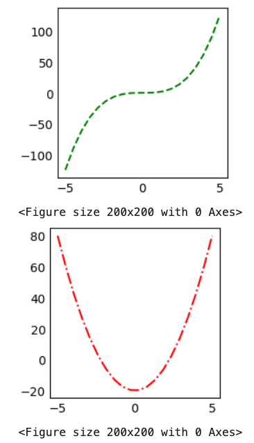
plt.gcf()
- Get the current figure.
plt.subplots(nrows=1, ncols=1, figsize=(2,2))
- 하나의 그래프 창을 하위 그래프 영역으로 나눈다.
- 코드 예시
```python # using the variable ax for single a Axes fig, ax = plt.subplots() # using the variable axs for multiple Axes fig, axs = plt.subplots(2, 2) axs[0, 0].plot(x, y1) axs[0][1].plot(x, y2 # using tuple unpacking for multiple Axes fig, (ax1, ax2) = plt.subplots(1, 2) fig, ((ax1, ax2), (ax3, ax4)) = plt.subplots(2, 2) # make data x = np.linspace(0, 10, 100) y1 = 4 + 1 * np.sin(2 * x) x2 = np.linspace(0, 10, 25) y2 = 4 + 1 * np.sin(2 * x2) y3 = 4 + 1 * np.cos(2 * x) y4 = 4 + 1 * np.cos(2 * x2) # plot fig, axs = plt.subplots(2,2) axs[0, 0].plot(x, y1, 'x', markeredgewidth=2) axs[0][1].plot(x2, y2, linewidth=2.0) axs[1, 0].plot(x, y3, 'o-', linewidth=2) axs[1][1].plot(x2, y4) for ax in axs: for x in ax: x.set(xlim=(0, 8), xticks=np.arange(1, 8), ylim=(0, 8), yticks=np.arange(1, 8)) plt.show() ```plt.subplots( nrows: 'int' = 1, ncols: 'int' = 1, *, sharex: "bool | Literal['none', 'all', 'row', 'col']" = False, sharey: "bool | Literal['none', 'all', 'row', 'col']" = False, squeeze: 'bool' = True, width_ratios: 'Sequence[float] | None' = None, height_ratios: 'Sequence[float] | None' = None, subplot_kw: 'dict[str, Any] | None' = None, gridspec_kw: 'dict[str, Any] | None' = None, **fig_kw, ) -> 'tuple[Figure, Any]'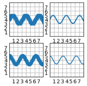
plt.subplot(nrows, ncols, index)
index: 1부터 시작하는 인덱스- subplot을 직접 추가
plt.subplots(nrows, ncols, index)한번에 모든 subplot을 만드는 반면- 이 함수는 한번에 하나씩 만들고 plot함
- 코드 예시
# make data
x = np.linspace(-5, 5, 20)
y1 = x ** 3
y2 = 5 * x + 30
y3 = 4 * (x ** 2) - 20
y4 = -25 * x + 20

# subplot
nrows, ncols = (2, 2)

plt.subplot(nrows, ncols, 1)
plt.plot(x, y1, '--g')
plt.subplot(nrows, ncols, 2)
plt.plot(x, y2, ':b')
plt.subplot(nrows, ncols, 3)
plt.plot(x, y3, '-.r')
plt.subplot(nrows, ncols, 4)
plt.plot(x, y4)

plt.show()
plt.text(x, y, text)
- Axes 에 텍스트를 추가한다.
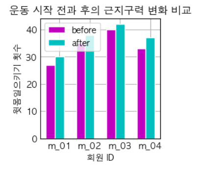
Bar Chart
plt.bar(x, y)
https://matplotlib.org/stable/plot_types/basic/bar.html#sphx-glr-plot-types-basic-bar-py
- 코드 예시
# make data:
ids = np.arange(4) + 1
member_ids = list(map(lambda x: f"m_{x:02d}", ids))

before_ex = [27, 35, 40, 33]
after_ex = [30, 38, 42, 37]

# plot
bar_width = 0.3
line_width = 1

plt.bar(ids, before_ex, label = 'before', width=bar_width, color = 'm', edgecolor="white", linewidth=line_width)
# plt.barh(ids, before_ex, label = 'before', height=bar_width, color = 'm', edgecolor="white", linewidth=line_width)
plt.bar(ids + bar_width, after_ex, label = 'after', width=bar_width, color = 'c', edgecolor="white", linewidth=line_width)
# plt.barh(ids + bar_width, after_ex, label = 'after', height=bar_width, color = 'c', edgecolor="white", linewidth=line_width)

plt.xticks(ids + bar_width, member_ids)
plt.xlabel('회원 ID')
plt.ylabel('윗몸일으키기 횟수')
plt.title('운동 시작 전과 후의 근지구력 변화 비교')
plt.legend()

plt.show()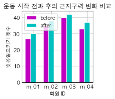
df.plot(kind='bar')
import pandas as pd
import matplotlib.pyplot as plt
from sklearn.datasets import load_wine

import numpy as np

wine_load = load_wine()
df = pd.DataFrame(wine_load.data, columns=wine_load.feature_names)
df['Target'] = wine_load.target
df['Target Name'] = df['Target'].map(lambda target: wine_load.target_names[target])

df['Target Name'].value_counts().to_frame().plot(kind='bar')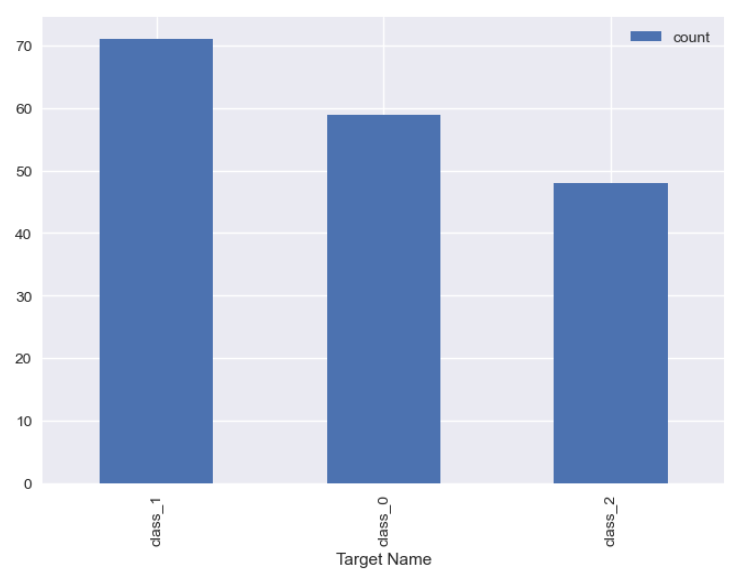
Pie Chart
plt.pie(x, explode=None, labels=None, colors=None)
https://matplotlib.org/stable/plot_types/stats/pie.html#sphx-glr-plot-types-stats-pie-py
- 코드 예시
fruit = ['사과', '바나나', '딸기', '오렌지', '포도']
result = [7, 6, 3, 2, 2]

# colors = plt.get_cmap('Blues')(np.linspace(0.2, 0.7, len(fruit)))

explode_value = (0.3, 0.1, 0.1, 0.1, 0.1) # the radius with which to offset each wedge.
plt.figure(figsize=(3,3))
plt.pie(result, labels=fruit, colors=['m', 'y', 'r', 'c', 'g'], autopct='%.0f%%', startangle=90, counterclock=False, explode=explode_value, shadow=True)

plt.title("과일 판매량 비율")
plt.legend(loc=4)
plt.show()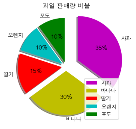
plt.get_cmap(colorName)
- 색깔을 매핑시켜주는 함수를 리턴
- [0, 1] 사이의 값을 주면, 색깔 RGB값을 리턴한다.
plt.get_cmap('Reds')plt.get_cmap('Greens')plt.get_cmap('Blues')
colors = plt.get_cmap('Blues')(np.linspace(0.2, 0.7, 5))df.plot(kind='pie', subplots=True)
import pandas as pd
import matplotlib.pyplot as plt
from sklearn.datasets import load_wine

import numpy as np

wine_load = load_wine()
df = pd.DataFrame(wine_load.data, columns=wine_load.feature_names)
df['Target'] = wine_load.target
df['Target Name'] = df['Target'].map(lambda target: wine_load.target_names[target])

df['Target Name'].value_counts().to_frame().plot(kind='pie', subplots=True)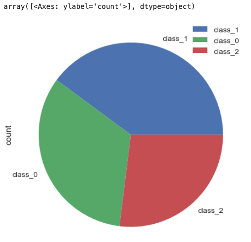
Histogram
plt.hist(x, bins:int=None)
https://matplotlib.org/stable/plot_types/stats/hist_plot.html#sphx-glr-plot-types-stats-hist-plot-py
- 코드 예시
def round_score(x):
    if x > 100:
        return 100
    elif x < 0:
        return 0
    else:
        return round(x)

math_scores = list(map(lambda x: round_score(x), 10 * np.random.randn(100) + 70))

fig, ax = plt.subplots()
plt.hist(math_scores, bins=8, linewidth=0.5, edgecolor="white")
plt.xlabel('수학 점수')
plt.ylabel('frequency')
plt.title('수학 점수 histogram')
fig.set_size_inches(3, 3)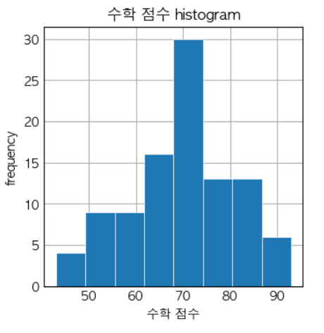
df.hist(column=None, by=None), df.plot(kind='hist', column=None, by=None)
df.hist(
    column: 'IndexLabel | None' = None,
    by=None,
    grid: 'bool' = True,
    xlabelsize: 'int | None' = None,
    xrot: 'float | None' = None,
    ylabelsize: 'int | None' = None,
    yrot: 'float | None' = None,
    ax=None,
    sharex: 'bool' = False,
    sharey: 'bool' = False,
    figsize: 'tuple[int, int] | None' = None,
    layout: 'tuple[int, int] | None' = None,
    bins: 'int | Sequence[int]' = 10,
    backend: 'str | None' = None,
    legend: 'bool' = False,
    **kwargs,
)
import pandas as pd
import matplotlib.pyplot as plt
from sklearn.datasets import load_wine
import numpy as np
wine_data = load_wine()
df = pd.DataFrame(wine_data.data, columns=wine_data.feature_names)
df['Target'] = wine_data.target
df['Target Name'] = df['Target'].map(lambda target: wine_data.target_names[target])
# df.hist(column='alcohol', bins=8, edgecolor='white')
df.plot(kind='hist', column='alcohol', edgecolor='white')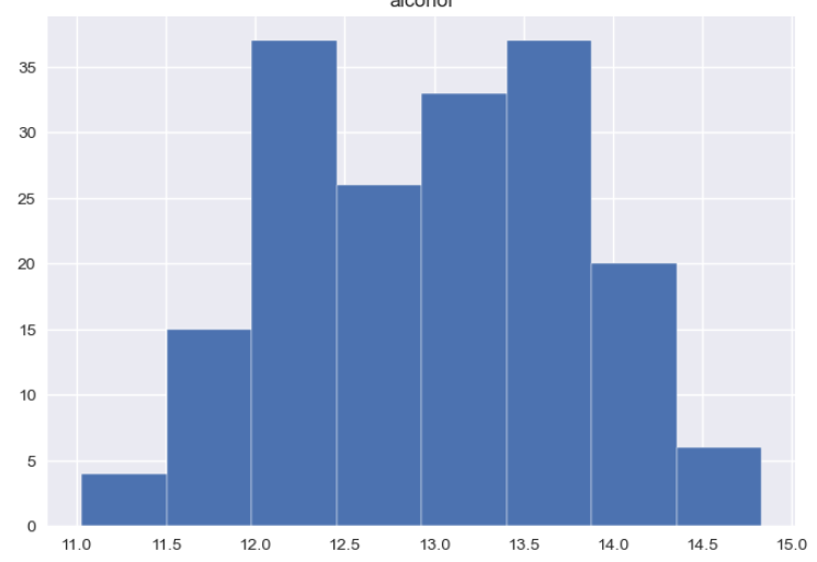
Box Plot
plt.boxplot(x, ...)
https://seaborn.pydata.org/generated/seaborn.boxplot.html
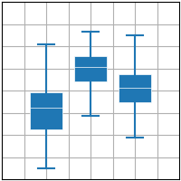
- plt.boxplot 코드 예시
import matplotlib.pyplot as plt
import numpy as np

plt.style.use('_mpl-gallery')

# make data:
np.random.seed(10)
D =np.random.normal((3, 5, 4), (1.25, 1.00, 1.25), (100, 3))

# plot
fig,ax =plt.subplots()
VP =ax.boxplot(D, positions=[2, 4, 6], widths=1.5, patch_artist=True,
                showmeans=False, showfliers=False,
                medianprops={"color": "white", "linewidth": 0.5},
                boxprops={"facecolor": "C0", "edgecolor": "white",
                          "linewidth": 0.5},
                whiskerprops={"color": "C0", "linewidth": 1.5},
                capprops={"color": "C0", "linewidth": 1.5})

ax.set(xlim=(0, 8), xticks=np.arange(1, 8),
       ylim=(0, 8), yticks=np.arange(1, 8))

plt.show()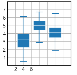
seaborn.boxplot(data, orient="h")
- sns.boxplot 코드 예시
import seaborn as sns

before_ex = np.random.randn(100) * 10 + 30
before_ex = list(map(lambda x: round(x), before_ex))

after_ex = list(map(lambda x: x + np.random.randint(0, 21), before_ex))

data = np.array([before_ex, after_ex]).transpose()

df = pd.DataFrame(data, columns=['before_ex', 'after_ex'])

sns.boxplot(df, orient="h", palette="Set2")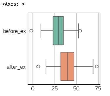
df.boxplot(), df.plot(kind='box')
import pandas as pd
from sklearn.datasets import load_iris
import matplotlib.pyplot as plt

iris = load_iris()
df = pd.DataFrame(iris.data, columns=iris.feature_names)
df['Class'] = pd.Series(iris.target).map(lambda target: iris.target_names[target])

df.select_dtypes([float, int]).boxplot()
# df.select_dtypes([float, int]).plot(kind='box') 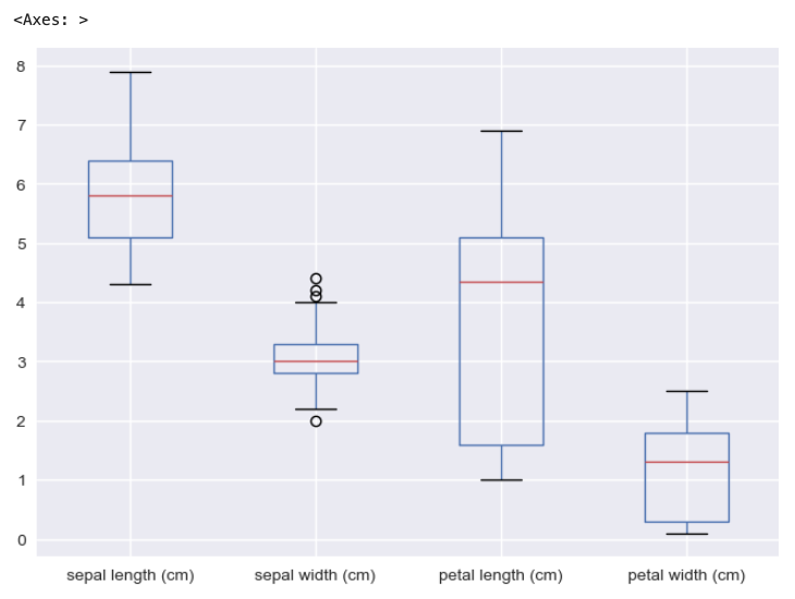
Scatter Plot (산점도)
plt.scatter(x, y, ...)
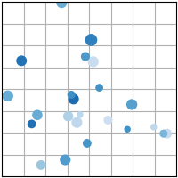
- 코드 예시
sample_size = 1000

base_normal_sample = np.random.randn(sample_size)

def transform_normal_sample(loc, scale):
    return list(map(lambda x: round(x), loc + scale * base_normal_sample))

height = list(map(lambda x: round(x), 170 + 10 * base_normal_sample))
weight = list(map(lambda x: round(x), 70 + 5 * base_normal_sample))

weight = list(map(lambda x: x + np.random.randint(0, 21), weight)) # 오차 적용

fig, ax = plt.subplots()
fig.set_size_inches(3,3)
plt.scatter(height, weight, s=2)
ax.set(xlabel="키", ylabel="체중", title="체중과 키 산점도")

plt.show()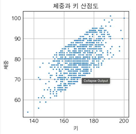
seaborn.scatterplot(data, x=None, y=None, hue=None, style=None)
sns.scatterplot(
    data=None,
    *,
    x=None,
    y=None,
    hue=None,
    size=None,
    style=None,
    palette=None,
    hue_order=None,
    hue_norm=None,
    sizes=None,
    size_order=None,
    size_norm=None,
    markers=True,
    style_order=None,
    legend='auto',
    ax=None,
    **kwargs,
)
import pandas as pd
import seaborn as sns
from sklearn.datasets import load_iris
iris = load_iris()
df = pd.DataFrame(iris.data, columns=iris.feature_names)
df['Class'] = pd.Series(iris.target).map(lambda target: iris.target_names[target])
sns.scatterplot(x='sepal length (cm)', y='sepal width (cm)', data=df, hue='Class', style='Class')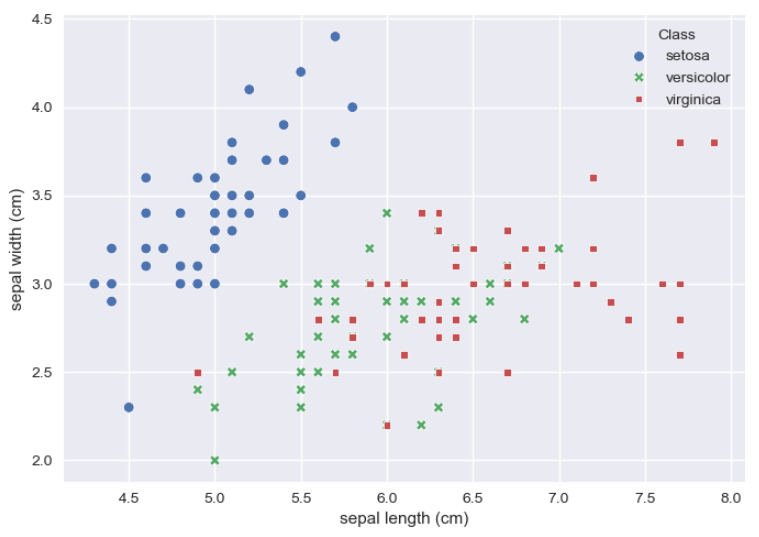
df.plot(king='scatter')
import pandas as pd
import matplotlib.pyplot as plt
from sklearn.datasets import load_iris
import seaborn as sns

iris = load_iris()
df = pd.DataFrame(iris.data, columns=iris.feature_names)
df['Class'] = pd.Series(iris.target).map(lambda target: iris.target_names[target])

fig, ax = plt.subplots()

colors = ['red', 'green', 'blue']
color_map = {clazz: colors[i] for i, clazz in enumerate(df['Class'].unique())}

for group_name, group_df in df.groupby('Class'):
    group_df.plot(
        x='sepal length (cm)',
        y='sepal width (cm)',
        kind='scatter',
        label=group_name,  # 범례용
        color=color_map[group_name],
        ax=ax,
    )
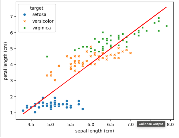
회귀선 그래프 그리기
sns.regplot(df, x=None, y=None)
- 산점도와 선형회귀선을 같이 그려줌.
# seaborn의 regplot을 이용해 산점도와 선형 회귀직선을 함께 시각화함
sns.regplot(df, x=feature, y=target_name, ax=axs[0])
np.polyfit(X, Y, deg)
- 2차 이상의 그래프를 그리는 경우,
- 반드시 X값에 대해서 정렬이 필요하다!
import numpy as np
from sklearn.datasets import load_iris
import pandas as pd
import seaborn as sns

iris = load_iris()

df = pd.DataFrame(iris.data, columns=iris.feature_names)
target_map = {target: target_name for target, target_name in enumerate(iris.target_names)}
df['target'] = pd.DataFrame(iris.target).map(lambda target: target_map[target])

df2 = df.sort_values(by='sepal length (cm)')
X, Y = df2['sepal length (cm)'], df2['petal length (cm)']
b2, b1, b0 = np.polyfit(X, Y, 2)

# plt.scatter(x = X, y = Y, alpha = 0.5)
sns.scatterplot(df, x='sepal length (cm)', y='petal length (cm)', hue='target', style='target')
plt.plot(X, b0 + b1*X + b2*X**2, color='red')
plt.show()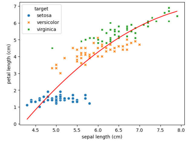
꺾은선 그래프
- 시간의 변화에 따라 값이 지속적을 변화할 때 유용한 그래프
plt.plot(x,y),plt.plot(x,y,data)- x축 값에 대한 정렬이 반드시 필요!
import numpy as np
from sklearn.datasets import load_iris
import pandas as pd
import seaborn as sns
import matplotlib.pyplot as plt

iris = load_iris()

df = pd.DataFrame(iris.data, columns=iris.feature_names)
target_map = {target: target_name for target, target_name in enumerate(iris.target_names)}
df['target'] = pd.DataFrame(iris.target).map(lambda target: target_map[target])

df2 = df.sort_values(by='sepal length (cm)')

# 특정 카테고리별로 그래프를 겹쳐 그릴 때 카테고리별로 plot을 그리고 범례를 제시함
for target_name in iris.target_names:
    plt.plot('sepal length (cm)', 'petal length (cm)', data=df2[df2['target'] == target_name])

plt.legend(iris.target_names)
plt.show()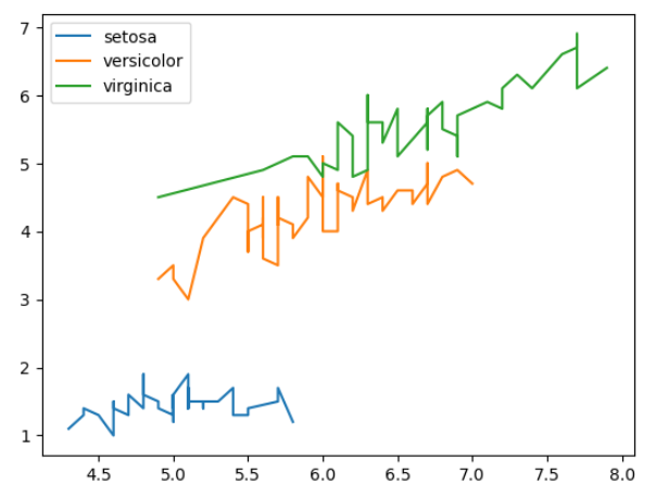
산점도 행렬 (Scatter Plot Matrix)
pd.plotting.scatter_matrix(data, alpha=0.5, figsize=None, diagonal='hist')
import pandas as pd
import matplotlib.pyplot as plt
from pandas.plotting import scatter_matrix
from sklearn.datasets import load_iris

iris = load_iris()

df = pd.DataFrame(iris.data, columns=iris.feature_names)
target_map = {target: target_name for target, target_name in enumerate(iris.target_names)}
df['target'] = pd.DataFrame(iris.target).map(lambda target: target_map[target])

pd.plotting.scatter_matrix(df, alpha = 0.5, figsize = (8, 8), diagonal = 'hist')
plt.show()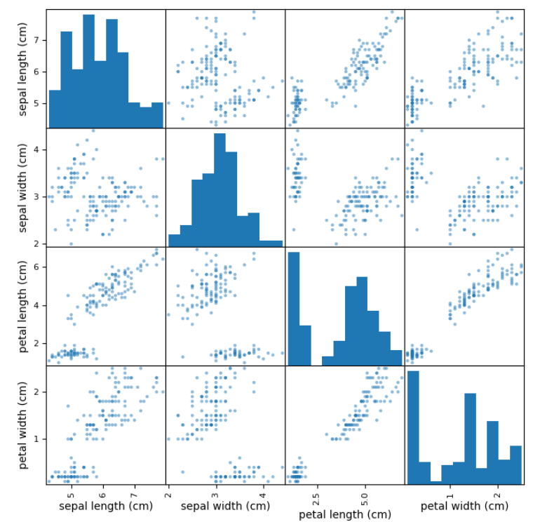
pd.plotting.scatter_matrix(
    frame: 'DataFrame',
    alpha: 'float' = 0.5,
    figsize: 'tuple[float, float] | None' = None,
    ax: 'Axes | None' = None,
    grid: 'bool' = False,
    diagonal: 'str' = 'hist',
    marker: 'str' = '.',
    density_kwds: 'Mapping[str, Any] | None' = None,
    hist_kwds: 'Mapping[str, Any] | None' = None,
    range_padding: 'float' = 0.05,
    **kwargs,
) -> 'np.ndarray'

frame : DataFrame
alpha : float, optional
    Amount of transparency applied.
figsize : (float,float), optional
    A tuple (width, height) in inches.
ax : Matplotlib axis object, optional
grid : bool, optional
    Setting this to True will show the grid.
diagonal : {'hist', 'kde'}
    Pick between 'kde' and 'hist' for either Kernel Density Estimation or
    Histogram plot in the diagonal.
marker : str, optional
    Matplotlib marker type, default '.'.
density_kwds : keywords
    Keyword arguments to be passed to kernel density estimate plot.
hist_kwds : keywords
    Keyword arguments to be passed to hist function.
range_padding : float, default 0.05
    Relative extension of axis range in x and y with respect to
    (x_max - x_min) or (y_max - y_min).
sns.pairplot(data, diag_kind='auto', hue=None)
import seaborn as sns
import pandas as pd
import matplotlib.pyplot as plt
from pandas.plotting import scatter_matrix
from sklearn.datasets import load_iris

iris = load_iris()

df = pd.DataFrame(iris.data, columns=iris.feature_names)
target_map = {target: target_name for target, target_name in enumerate(iris.target_names)}
df['target'] = pd.DataFrame(iris.target).map(lambda target: target_map[target])

sns.pairplot(df, diag_kind = 'auto', hue = 'target')
plt.show()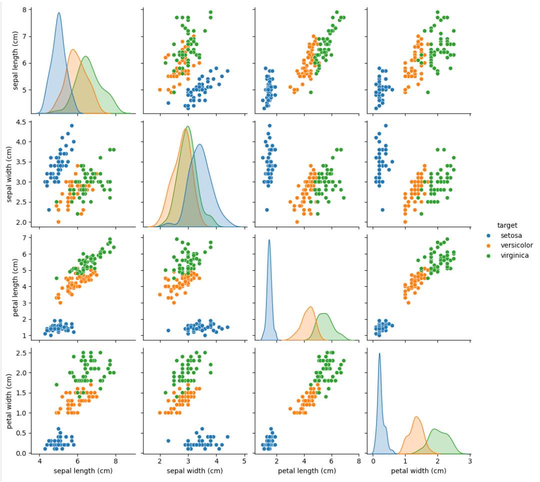
sns.pairplot(
    data,
    *,
    hue=None,
    hue_order=None,
    palette=None,
    vars=None,
    x_vars=None,
    y_vars=None,
    kind='scatter',
    diag_kind='auto',
    markers=None,
    height=2.5,
    aspect=1,
    corner=False,
    dropna=False,
    plot_kws=None,
    diag_kws=None,
    grid_kws=None,
    size=None,
)

data : `pandas.DataFrame`
    Tidy (long-form) dataframe where each column is a variable and
    each row is an observation.
hue : name of variable in ``data``
    Variable in ``data`` to map plot aspects to different colors.
hue_order : list of strings
    Order for the levels of the hue variable in the palette
palette : dict or seaborn color palette
    Set of colors for mapping the ``hue`` variable. If a dict, keys
    should be values  in the ``hue`` variable.
vars : list of variable names
    Variables within ``data`` to use, otherwise use every column with
    a numeric datatype.
{x, y}_vars : lists of variable names
    Variables within ``data`` to use separately for the rows and
    columns of the figure; i.e. to make a non-square plot.
kind : {'scatter', 'kde', 'hist', 'reg'}
    Kind of plot to make.
diag_kind : {'auto', 'hist', 'kde', None}
    Kind of plot for the diagonal subplots. If 'auto', choose based on
    whether or not ``hue`` is used.
markers : single matplotlib marker code or list
    Either the marker to use for all scatterplot points or a list of markers
    with a length the same as the number of levels in the hue variable so that
    differently colored points will also have different scatterplot
    markers.
height : scalar
    Height (in inches) of each facet.
aspect : scalar
    Aspect * height gives the width (in inches) of each facet.
corner : bool
    If True, don't add axes to the upper (off-diagonal) triangle of the
    grid, making this a "corner" plot.
dropna : boolean
    Drop missing values from the data before plotting.
{plot, diag, grid}_kws : dicts
    Dictionaries of keyword arguments. ``plot_kws`` are passed to the
    bivariate plotting function, ``diag_kws`` are passed to the univariate
    plotting function, and ``grid_kws`` are passed to the :class:`PairGrid`
    constructor.
상관계수 행렬
df.corr(method='pearson')
pearsonspearmankendall
import seaborn as sns
import pandas as pd
import matplotlib.pyplot as plt
from pandas.plotting import scatter_matrix
from sklearn.datasets import load_iris

iris = load_iris()

df = pd.DataFrame(iris.data, columns=iris.feature_names)
target_map = {target: target_name for target, target_name in enumerate(iris.target_names)}
df['target'] = pd.DataFrame(iris.target).map(lambda target: target_map[target])
df_corr = df.drop(columns='target').corr(method='pearson')

df_corr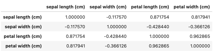
sns.heatmap(df, annot=True)
import seaborn as sns
import pandas as pd
import matplotlib.pyplot as plt
from pandas.plotting import scatter_matrix
from sklearn.datasets import load_iris

iris = load_iris()

df = pd.DataFrame(iris.data, columns=iris.feature_names)
target_map = {target: target_name for target, target_name in enumerate(iris.target_names)}
df['target'] = pd.DataFrame(iris.target).map(lambda target: target_map[target])
df_corr = df.drop(columns='target').corr(method='pearson')

sns.heatmap(df_corr, cmap = 'RdBu_r', annot = True)
plt.show()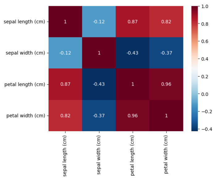
DataFrame에서 제공하는 plot 함수
line: line plot (default)bar: vertical bar plotbarh: horizontal bar plothist: histogrambox: boxplotkde: Kernel Density Estimation plotdensity: same as 'kde'area: area plotpie: pie plotscatter: scatter plot (DataFrame only)hexbin: hexbin plot (DataFrame only)
df.plot(*args, **kwargs)

Parameters
----------
data : Series or DataFrame
    The object for which the method is called.
x : label or position, default None
    Only used if data is a DataFrame.
y : label, position or list of label, positions, default None
    Allows plotting of one column versus another. Only used if data is a
    DataFrame.
kind : str
    The kind of plot to produce:

    - 'line' : line plot (default)
    - 'bar' : vertical bar plot
    - 'barh' : horizontal bar plot
    - 'hist' : histogram
    - 'box' : boxplot
    - 'kde' : Kernel Density Estimation plot
    - 'density' : same as 'kde'
    - 'area' : area plot
    - 'pie' : pie plot
    - 'scatter' : scatter plot (DataFrame only)
    - 'hexbin' : hexbin plot (DataFrame only)
ax : matplotlib axes object, default None
    An axes of the current figure.
subplots : bool or sequence of iterables, default False
    Whether to group columns into subplots:

    - ``False`` : No subplots will be used
    - ``True`` : Make separate subplots for each column.
    - sequence of iterables of column labels: Create a subplot for each
      group of columns. For example `[('a', 'c'), ('b', 'd')]` will
      create 2 subplots: one with columns 'a' and 'c', and one
      with columns 'b' and 'd'. Remaining columns that aren't specified
      will be plotted in additional subplots (one per column).

      .. versionadded:: 1.5.0

sharex : bool, default True if ax is None else False
    In case ``subplots=True``, share x axis and set some x axis labels
    to invisible; defaults to True if ax is None otherwise False if
    an ax is passed in; Be aware, that passing in both an ax and
    ``sharex=True`` will alter all x axis labels for all axis in a figure.
sharey : bool, default False
    In case ``subplots=True``, share y axis and set some y axis labels to invisible.
layout : tuple, optional
    (rows, columns) for the layout of subplots.
figsize : a tuple (width, height) in inches
    Size of a figure object.
use_index : bool, default True
    Use index as ticks for x axis.
title : str or list
    Title to use for the plot. If a string is passed, print the string
    at the top of the figure. If a list is passed and `subplots` is
    True, print each item in the list above the corresponding subplot.
grid : bool, default None (matlab style default)
    Axis grid lines.
legend : bool or {'reverse'}
    Place legend on axis subplots.
style : list or dict
    The matplotlib line style per column.
logx : bool or 'sym', default False
    Use log scaling or symlog scaling on x axis.

logy : bool or 'sym' default False
    Use log scaling or symlog scaling on y axis.

loglog : bool or 'sym', default False
    Use log scaling or symlog scaling on both x and y axes.

xticks : sequence
    Values to use for the xticks.
yticks : sequence
    Values to use for the yticks.
xlim : 2-tuple/list
    Set the x limits of the current axes.
ylim : 2-tuple/list
    Set the y limits of the current axes.
xlabel : label, optional
    Name to use for the xlabel on x-axis. Default uses index name as xlabel, or the
    x-column name for planar plots.

    .. versionchanged:: 2.0.0

        Now applicable to histograms.

ylabel : label, optional
    Name to use for the ylabel on y-axis. Default will show no ylabel, or the
    y-column name for planar plots.

    .. versionchanged:: 2.0.0

        Now applicable to histograms.

rot : float, default None
    Rotation for ticks (xticks for vertical, yticks for horizontal
    plots).
fontsize : float, default None
    Font size for xticks and yticks.
colormap : str or matplotlib colormap object, default None
    Colormap to select colors from. If string, load colormap with that
    name from matplotlib.
colorbar : bool, optional
    If True, plot colorbar (only relevant for 'scatter' and 'hexbin'
    plots).
position : float
    Specify relative alignments for bar plot layout.
    From 0 (left/bottom-end) to 1 (right/top-end). Default is 0.5
    (center).
table : bool, Series or DataFrame, default False
    If True, draw a table using the data in the DataFrame and the data
    will be transposed to meet matplotlib's default layout.
    If a Series or DataFrame is passed, use passed data to draw a
    table.
yerr : DataFrame, Series, array-like, dict and str
    See :ref:`Plotting with Error Bars <visualization.errorbars>` for
    detail.
xerr : DataFrame, Series, array-like, dict and str
    Equivalent to yerr.
stacked : bool, default False in line and bar plots, and True in area plot
    If True, create stacked plot.
secondary_y : bool or sequence, default False
    Whether to plot on the secondary y-axis if a list/tuple, which
    columns to plot on secondary y-axis.
mark_right : bool, default True
    When using a secondary_y axis, automatically mark the column
    labels with "(right)" in the legend.
include_bool : bool, default is False
    If True, boolean values can be plotted.
backend : str, default None
    Backend to use instead of the backend specified in the option
    ``plotting.backend``. For instance, 'matplotlib'. Alternatively, to
    specify the ``plotting.backend`` for the whole session, set
    ``pd.options.plotting.backend``.
**kwargs
    Options to pass to matplotlib plotting method.
ydata_profiling.ProfileReport(df)
- https://docs.profiling.ydata.ai/latest/
pip install ydata_profiling- DataFrame에 대한 EDA를 한 번에 수행할 수 있는 라이브러리
- Deprecated된 pandas_profiling을 대체
import pandas as pd
from sklearn.datasets import load_iris
from ydata_profiling import ProfileReport

iris = load_iris()

df = pd.DataFrame(iris.data, columns=iris.feature_names)
target_map = {target: target_name for target, target_name in enumerate(iris.target_names)}
df['target'] = pd.DataFrame(iris.target).map(lambda target: target_map[target])

report = ProfileReport(df, title="Iris Report", explorative=True)
# report.to_notebook_iframe()  # 노트북에서 보일 때
report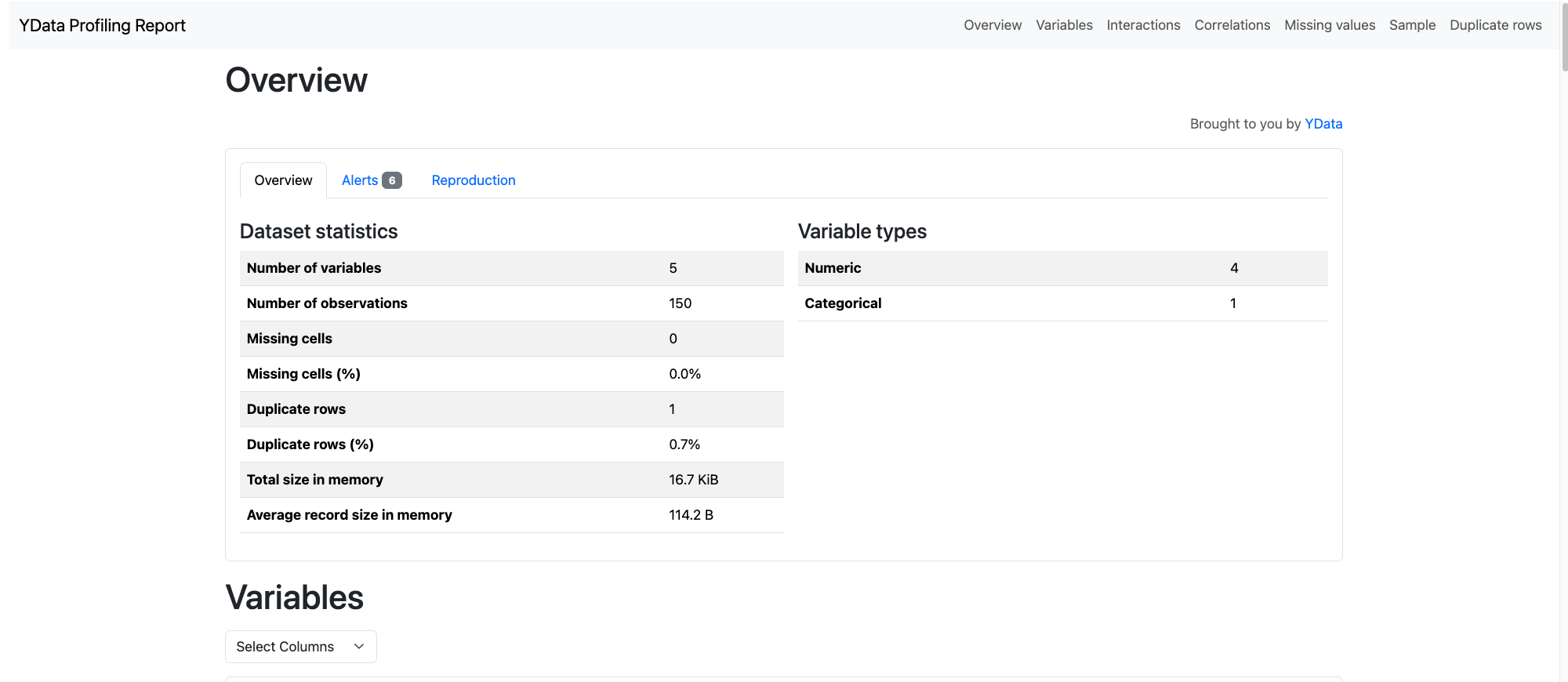
Measurement를 이용한 자료의 정리
Mean, Median, Mode
- Mean: 평균
- Median: 중앙값
- Mode: 최빈값

Mean
- np.mean(arr)
- np.average(arr)
- ser.mean()
- df.mean()
Median
- np.median(arr)
- ser.median()
- df.median()
Mode
- statistics.mode(arr)
- ser.mode()
- df.mode()
Variability (산포)
Variance
- np.var(arr, ddof=1)
Standard Deviation
- np.std(arr, ddof=1)
Range (max, min)
- np.max(arr)
- np.min(arr)
- ser.max()
- ser.min()
- df.max()[0]
- df.min()[0]
IQR (Quartile, Quantile, Percentile)
- np.quantile(arr, [0.25, 0.5, 0.75])
- np.percentile(arr, [25, 50, 75])
- ser.quantile([0.25, 0.5, 0.75]).to_numpy()
- df.quantile([0.25, 0.5, 0.75]).to_numpy()
Shape
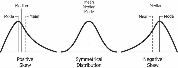
Skewness (왜도)
- scipy.stats.skew(arr)
- skewness 가 음수이면,
- mean < median < mode
- skewness 가 양수이면,
- mode < median < mean
Kurtosis (첨도)
- scipy.stats.kurtosis(arr)
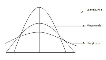
- Mesokurtic : 이 분포는 정규 분포와 유사한 첨도 통계량을 가지고 있다. 분포의 극단값이 정규 분포 특성과 유사하다는 뜻이다. 표준 정규 분포는 3의 첨도 갖는다.
- Leptokurtic (Kurtosis > 3) : 분포가 길고, 꼬리가 더 뚱뚱하다. 피크는 Mesokurtic보다 높고 날카롭기 때문에 데이터는 꼬리가 무겁거나 특이치(outlier)가 많다는 것을 의미한다.특이치(outlier)는 히스토그램 그래프의 수평 축을 확장하여 데이터의 대부분이 좁은 수직 범위로 나타나도록 하여 Leptokurtic 분포의 "skinniness"을 부여한다.
- Platykurtic (Kurtosis < 3) : 분포는 짧고 꼬리는 정규 분포보다 얇다. 피크는 Mesokurtic보다 낮고 넓으며, 이는 데이터가 가벼운 편이나 특이치(outlier)가 부족하다는 것을 의미한다.이유는 극단값(extream value)이 정규 분포의 극단값보다 작기 때문이

Hello velog!