[CSS]flexbox,display,flex-direction,flex-flow,flex-warp
CSSFlexboxcontaineritemsortcss아이탬정렬displayfleboxdisplayflex directionflex wrapflex-flowflexbox-displayflexbox:display정렬
Css
목록 보기
11/13
flexbox
- 컨테이너안에 item들이 있어야 하는 즉, 부모와 자식간의 관계를 가지고 있어야 성립
- 2차원의 평면이 아닌 1차원의 요소들을 정렬하기 위해 나온 개념
용어 정리
- felx container
- item의 부모
- felx item
- 부모의 자식간의 관계에서 자식의 해당
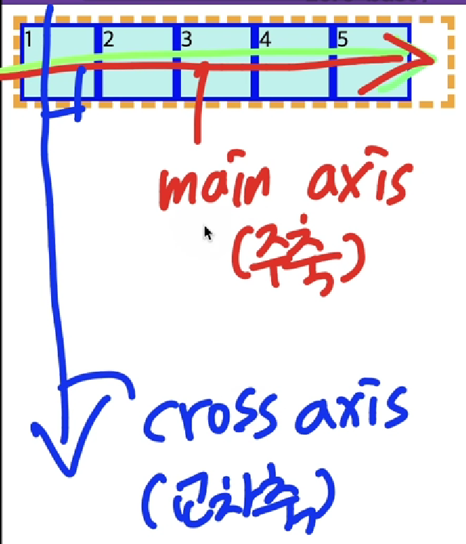
- main axis
- 행의 축, 주축, x축, 가로 축
- cross axis
- y축, 열의 축, 세로 축, 교차 축!
display
- container안에 있는 item들을 정렬
- display-outside
- 요소의 외부 디스플레이 유형을 설정하는 키워드
- display-inside
- 요소의 내부 디스플레이 유형을 설정하는 키워드
direction
- 플렉스 컨테이너 내의 아이탬을 배치할 때 사용할 주축 및 방향(정방향,역방향)을 지정
용어 정리
- row
- 기본값, 플렉스의 주축이 글의 작성 방향과 동일(정방향)
- row-reverse
- row와 동일하게 작동하지만 시작과 끝점이 반대에 위치(역방향)
- column
- flex의 주축이 가로방향이 아닌 세로방향으로 변경, 주축의 시작과 끝점이 글 작성 모드의 이전 지점 및 이후 지점과 동일
- column-reverse
- column과 동일하게 작동하지만 시작점과 끝점이 반대에 위치
<!DOCTYPE html>
<html lang="en">
<head>
    <meta charset="UTF-8">
    <meta http-equiv="X-UA-Compatible" content="IE=edge">
    <meta name="viewport" content="width=device-width, initial-scale=1.0">
    <link rel="stylesheet" href="styles/direction.css">
    <title>Document</title>
</head>
 <div class="container">
    <div class="item">1</div>
    <div class="item">2</div>
    <div class="item">3</div>
    <div class="item">4</div>
    <div class="item">5</div>

 </div>
<body>

</body>
</html>
.container{
height: 500px;
border:5px dashed orange;
display: flex;
/* row일 경우 item 1,2,3,4,5*/
/* row-reverse일 경우 왼쪽에서
오른쪽으로 바뀌고 item 5,4,3,2,1 */
/* flex-direction: row-reverse; */
/* column-reverse일 경우 아래에서 위로
item 5,4,3,2,1 */
/* column일 경우 아래에서 위에서 아래로
item 1,2,3,4,5 */
flex-direction: column;
}
.item{
width:50px;
height: 50px;
margin: 5px;
background-color: paleturquoise;
border:3px solid blue;
font-size: 30px;
}row는 기본값이면 방향은 왼쪽에서 오른쪽 으로 row-reverse일 경우 방향이 오른쪽에서 왼쪽으로 item의 위치가 왼쪽에서 오른쪽으로 바뀌고 column은 위에서 아래로 column-reverse일 경우 아래에서 위로 향하며 item의 위치가 위가 아닌 아래로 내려간다.
flex-wrap
- itme들을 강제로 한줄로 배치하게 할 것인지또는 가능한 영역 내에서 벗어나지 않고 여러행을 나누어 표현할 것인지 결정하는 속성
용어 정리
- nowarp
- 기본값, flex-item 요소들을 한줄에 배치
- wrap
- 여러행의 걸쳐서 배치 위에서 아래로 쌓는다
- warp-reverse
- 여러행의 걸쳐서 배치 하지만 시작점의 위치가 반대로 적용
.container{
    height: 500px;
    border:5px dashed orange;
    display: flex;
    flex-wrap: wrap;

}

.item{
    width:50px;
    height: 50px;
    margin: 5px;
    background-color: paleturquoise;
    border:3px solid blue;
    font-size: 30px;

}
flex-flow
- flex-direction,flex-warp의 단축 속성
.container{
    height: 500px;
    border:5px dashed orange;
    display: flex;

    /* flex-wrap: wrap;
    flex-direction: column; */

    flex-flow: column wrap;

}

.item{
    width:50px;
    height: 50px;
    margin: 5px;
    background-color: paleturquoise;
    border:3px solid blue;
    font-size: 30px;

}
풋살을 좋아하는 프론트엔드 개발자