
오늘은 전반적인 CSS의 속성에 대해 공부해보았다.
1️⃣ Font
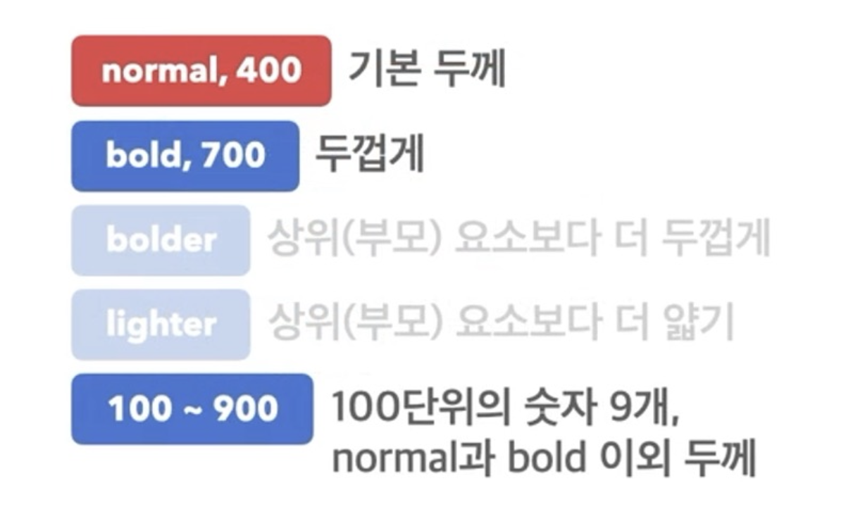
(1) font - weight : 글자의 두께 조정
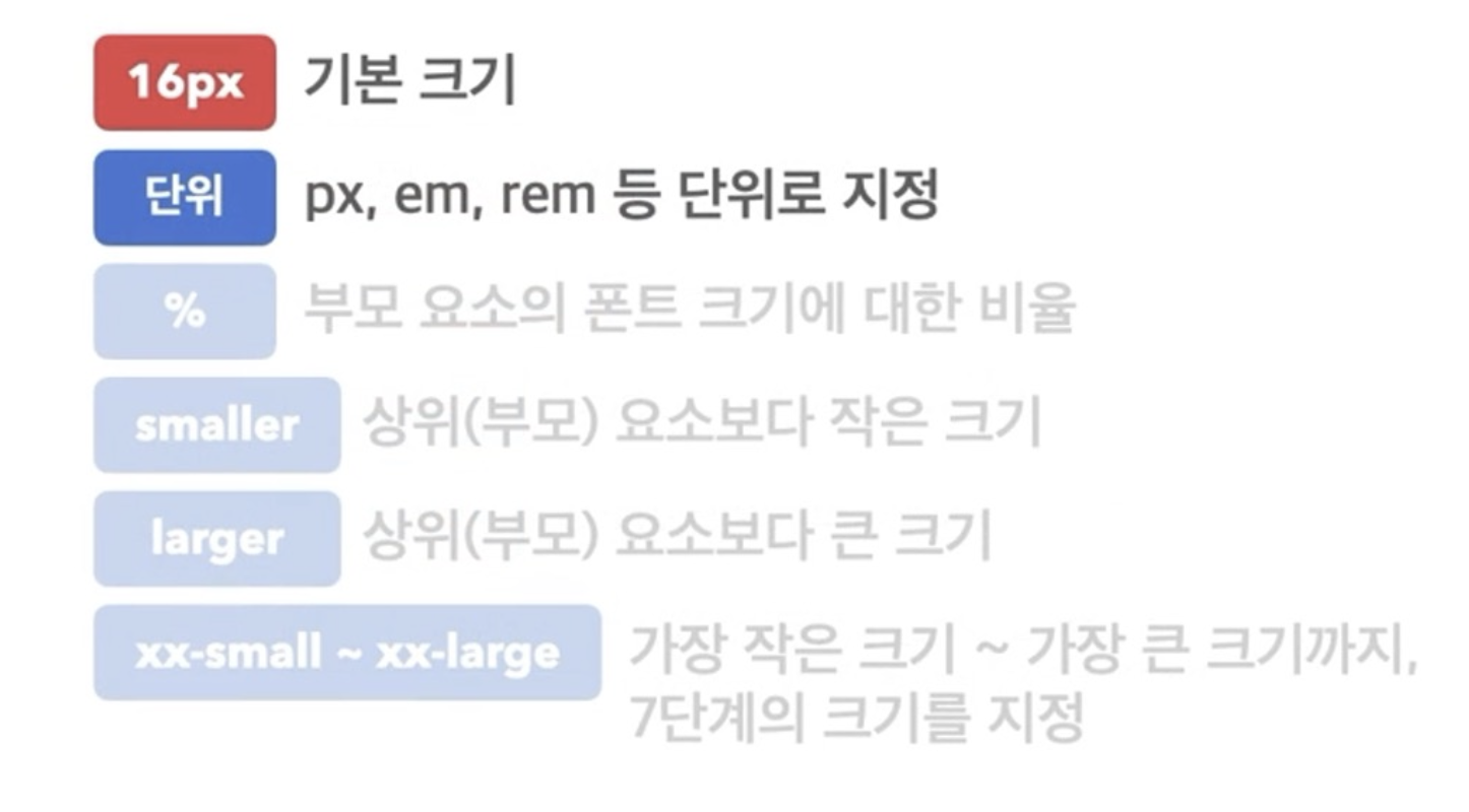
(2) font - size : 글자의 크기
(3) line - height : 한 줄의 높이, 행간과 유사
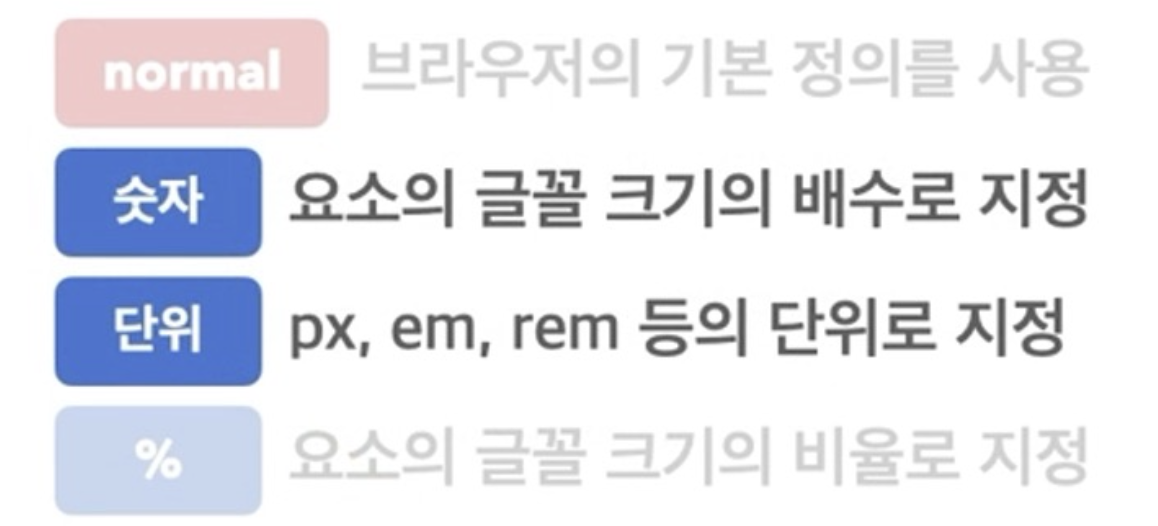
- 기본적으로 폰트 사이즈의
2배정도로 설정한다.
(4) font - family : 글꼴을 변경할 때 사용
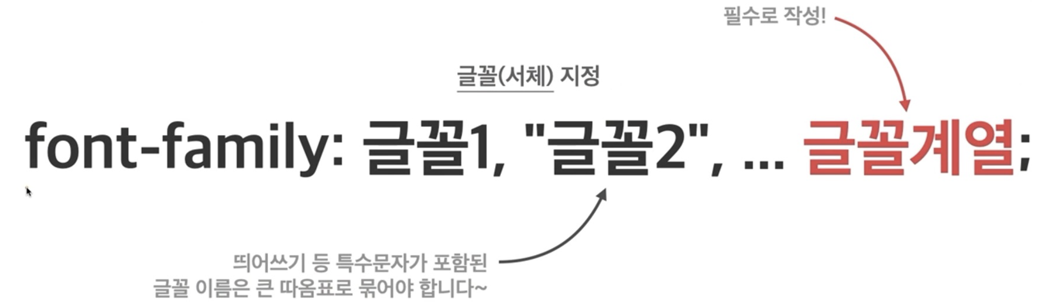
- 글꼴을 변경하고 싶으면 꼭! 적용해줘야 한다.
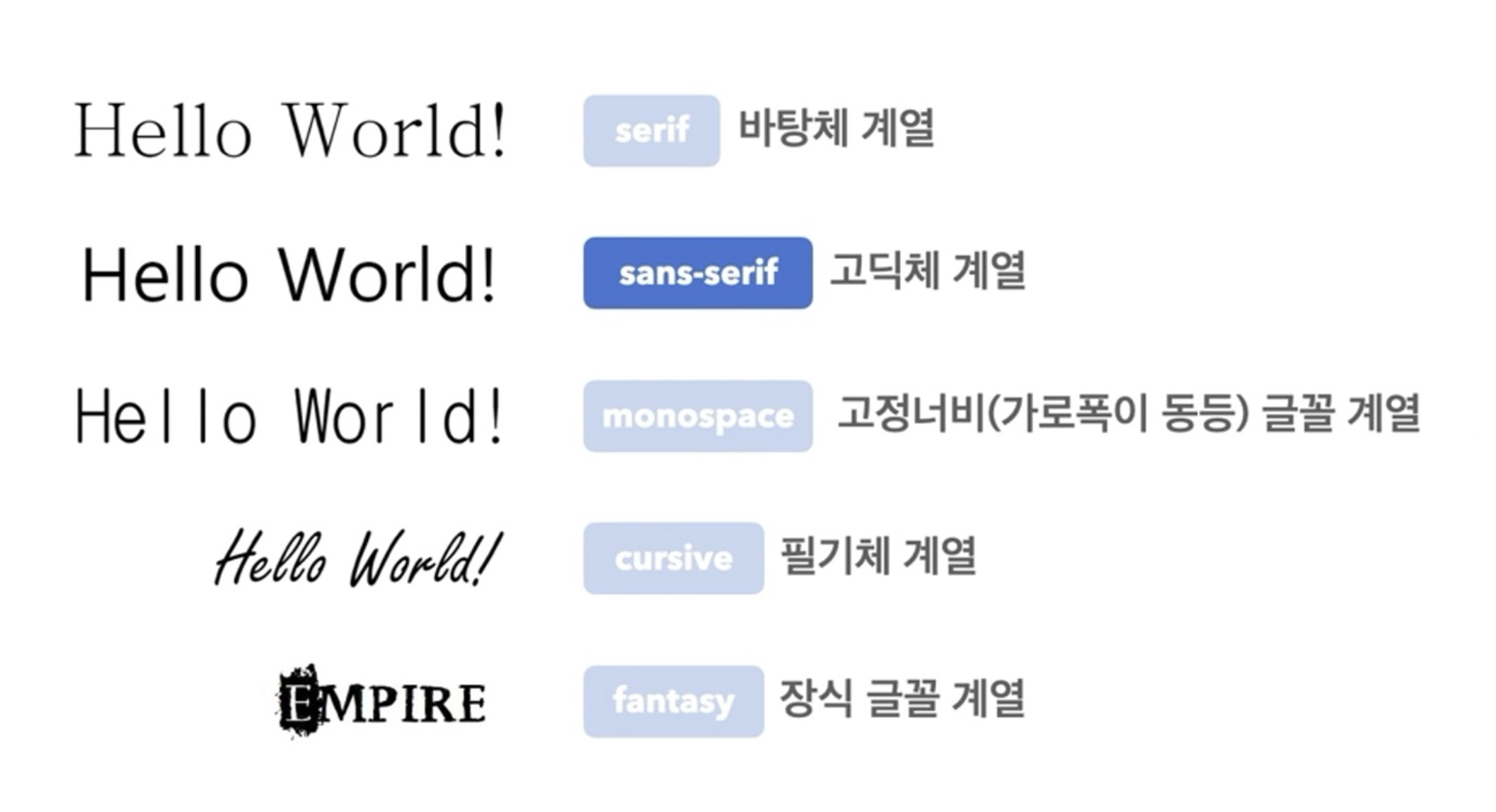
- 아래와 같이 폰트 이름 옆에 쓰이는 것처럼 폰트의 계열에 대한 정보이다.
.google{
  font-family: 'Satisfy', cursive;
}
✔️ 폰트 적용해보자!
일반적으로 폰트는 구글 폰트와 눈누 폰트를 많이 사용한다.
구글 폰트 : https://fonts.google.com/
눈누 폰트 : https://noonnu.cc/
- 구글 폰트는 링크 방식 +
font-family - 눈누 폰트는
font-face+font-family
📌 폰트 css에 가져오는 방법
구글폰트 적용하기
- 구글 폰트 사이트에 접속해서 원하는 폰트를 선택한다.
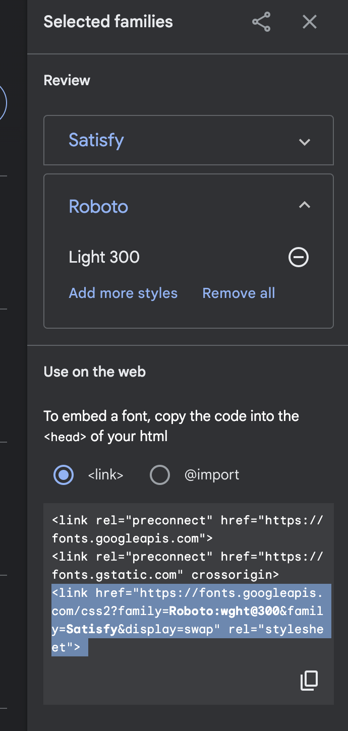
- 원하는 폰트 사이즈를 선택한다.
 -> select light 300에 옆에 +를 선택하면 장바구니에 추가된다.
 - 이런 창이 뜨면 밑에 드래그 되어있는 걸 복사해서
html파일에 링크방식으로 올린다.
<head>
  <meta charset="UTF-8">
  <meta name="viewport" content="width=device-width, initial-scale=1.0">
  <title>Document</title>
  <link rel="stylesheet" href="font_prac1.css">
  <link href="https://fonts.googleapis.com/css2?family=Satisfy&display=swap" rel="stylesheet">
➡️ 맨 밑에 link href 부분처럼 복사하면 된다.
4. 그 후 css에서 font-family 태그를 통해
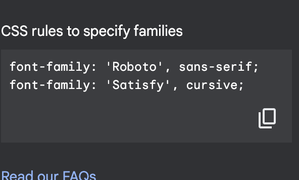
이 부분에서 복사해서 붙여넣기만 하면 적용된다!
눈누 폰트 적용하기
- 웹사이트에 접속해서 원하는 폰트를 선택한다.
- 웹폰트로 사용하기를 모두 복사한다.
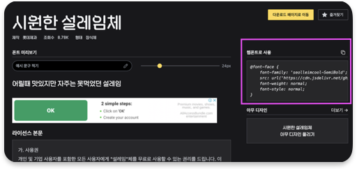
- css에 부분에 그대로 붙여넣기 하고
font-face에 있는 폰트 명을 아래의 예시코드와 같이font-family에 만들어주면 적용 완료다!
예시 코드
.google{
  font-family: 'Satisfy', cursive;
}
.nunnu{
  font-family: 'SOYOMapleBoldTTF';
}
/* 눈누 폰트 경우 웹폰트 가져오기 방식으로 이렇게 적용 */
@font-face {
  font-family: 'SOYOMapleBoldTTF';
  src: url('https://cdn.jsdelivr.net/gh/projectnoonnu/noonfonts_2310@1.0/SOYOMapleBoldTTF.woff2') format('woff2');
  font-weight: 700;
  font-style: normal;
}
<!-- 폰트 실습 -->
<!DOCTYPE html>
<html lang="en">
<head>
<meta charset="UTF-8">
<meta name="viewport" content="width=device-width, initial-scale=1.0">
<title>Document</title>
<link rel="stylesheet" href="font_prac1.css">
<!-- 구글폰트 가져오는 방식 -->
<link href="https://fonts.googleapis.com/css2?family=Satisfy&display=swap" rel="stylesheet">
</head>
<body>
<div class = "goole">Lorem Ipsum is simply dummy text of the printing and typesetting industry. Lorem Ipsum has been the industry's standard dummy text ever since the 1500s, when an unknown printer took a galley of type and scrambled it to make a type specimen book. It has survived not only five centuries, but also the leap into electronic typesetting, remaining essentially unchanged.</div>
<div class = "nunnu">Lorem Ipsum is simply dummy text of the printing and typesetting industry. Lorem Ipsum has been the industry's standard dummy text ever since the 1500s, when an unknown printer took a galley of type and scrambled it to make a type specimen book. It has survived not only five centuries, but also the leap into electronic typesetting, remaining essentially unchanged.</div>
</body>
</html>실행 결과
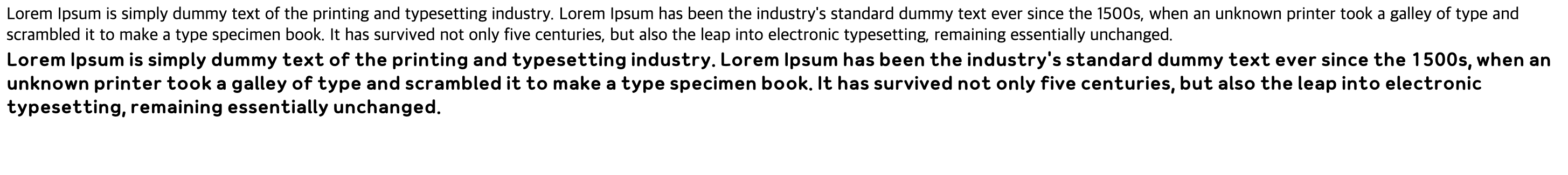 ➡️ 이렇게 각각 적용된 것을 확인할 수 있다.
2️⃣ 문자에 대한 속성
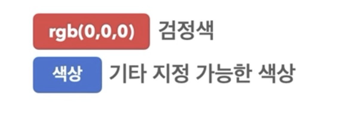
(1) color : 글자의 색상
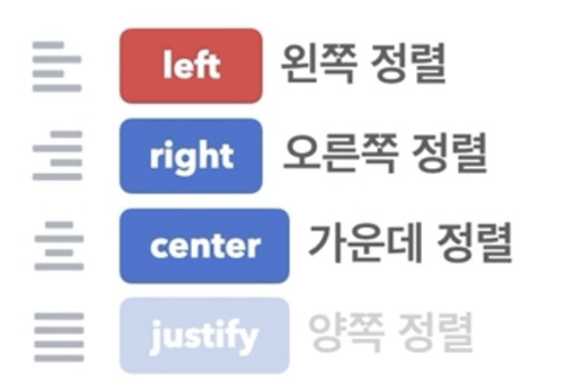
(2) text-align : 문자의 정렬방식
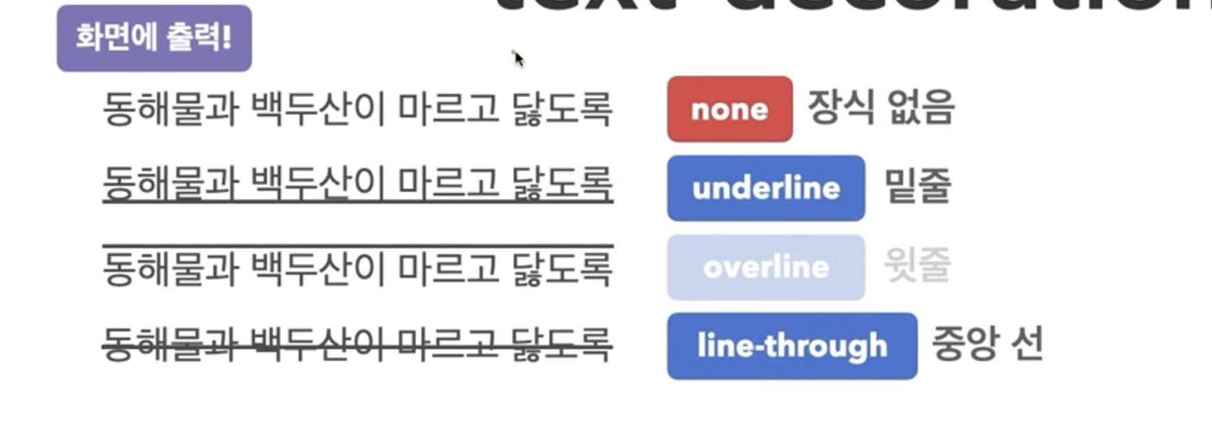
(3) text-decoration : 문자의 장식선
예시 코드
.google{
  /* text-align : 문자 정렬(왼쪽, 오른쪽, 가운데, 양쪽)
  justify 가 양쪽 정렬 */
  text-align: justify;
  width: 300px;
  /* text-decoration : 문자 선(위, 아래, 가운데  */
  text-decoration: underline;
}
<!-- 문자 속성 연습문제 -->
<!DOCTYPE html>
<html lang="en">
<head>
<meta charset="UTF-8">
<meta name="viewport" content="width=device-width, initial-scale=1.0">
<title>Document</title>
<link rel="stylesheet" href="css_text.css">
</head>
<body>
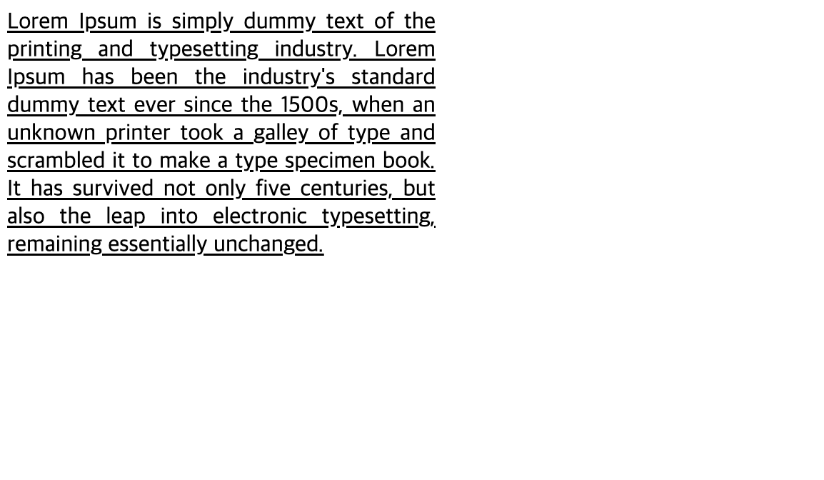
<div class = "google">Lorem Ipsum is simply dummy text of the printing and typesetting industry. Lorem Ipsum has been the industry's standard dummy text ever since the 1500s, when an unknown printer took a galley of type and scrambled it to make a type specimen book. It has survived not only five centuries, but also the leap into electronic typesetting, remaining essentially unchanged.</div>
</body>
</html>실행결과
3️⃣ 박스 모델
(1) inline 요소
- 이전 글에서 언급했던 inline요소는 본질적으로 아무것도 나타내지 않는
콘텐츠 영역을 설정하는 용도이다. - 요소가
수평으로 쌓인다. - inline 요소는
<style>에서 가로너비, 세로 너비 지정해도 반응이 없다.
단,<image>는 적용됨
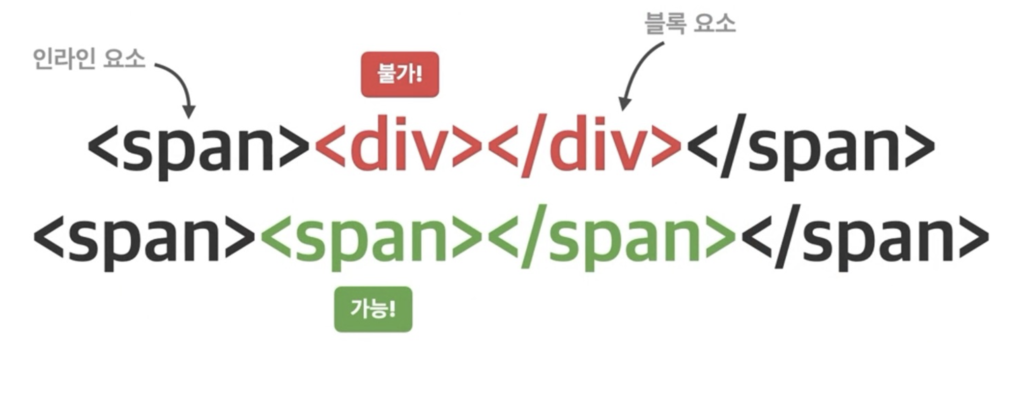 ➡️ 인라인 요소 안에 블록요소를 넣는 것은 불가하지만, 인라인 요소 안에 인라인 요소를 중첩적으로 넣는 것은 가능하다!
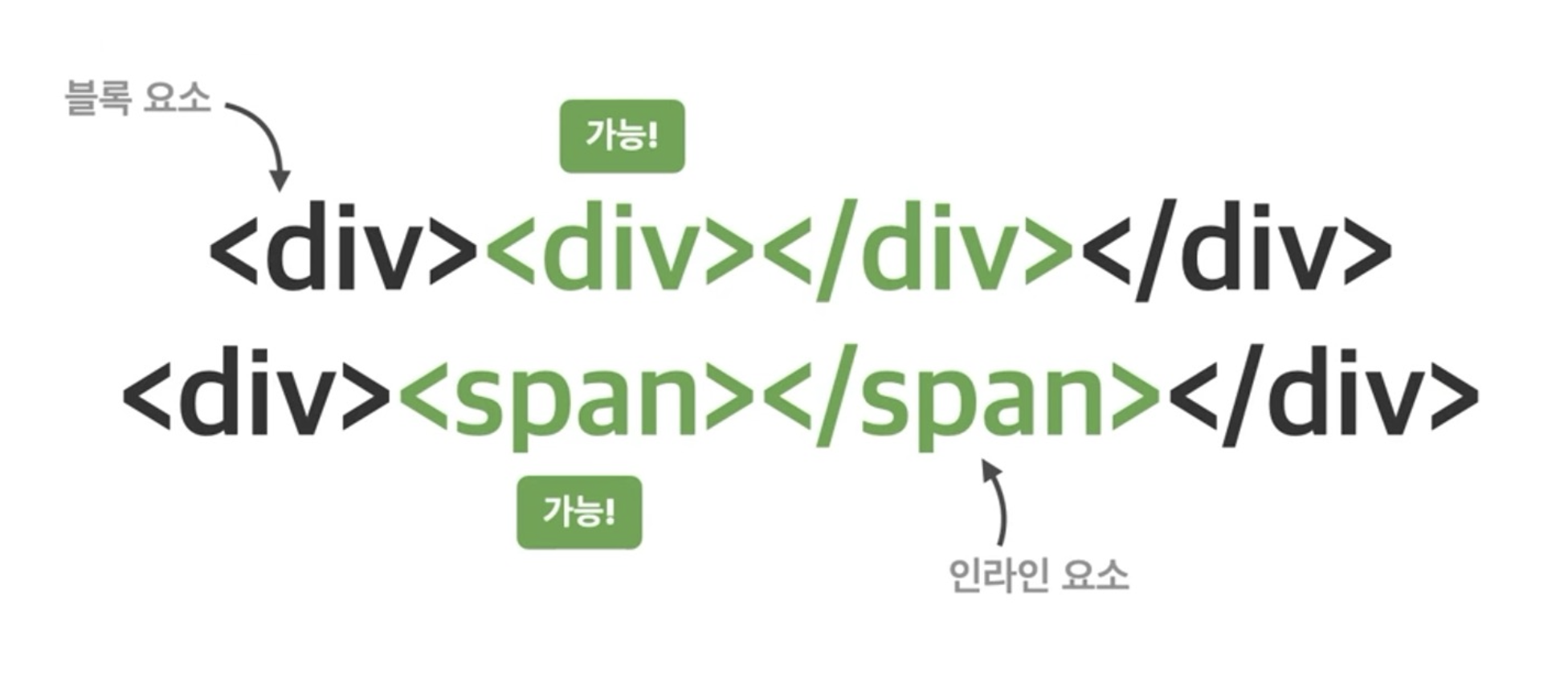
(2) Block 요소
-
block 요소 또한 본질적으로 아무것도 나타내지 않는
콘텐츠 영역을 설정하는 용도이다. -
inline 요소와의 뚜렷한 차이점은 요소가
수직으로 쌓인다는 것이다. -
block 요소는 하나하나의 블록을 차지하고 있기 때문에 너비지정하는
<style>이 모두 다 적용된다.
-
블록 요소는 인라인요소, 블록요소 모두 중첩해서 가능하다.
🔎 하지만 inline요소는 디자인 하기 불편하고, block요소는 수직으로만 쌓이니 또다른 문제점이 생겨서 이를 보완하기 위해 새로운 개념이 등장하게 된다.
(3) inline-block 요소
- 말그대로 inline요소와 block요소의 특징을 합쳐서 만든 요소이다.
이와 관련된 예시는 뒤에서 다뤄보겠다..!
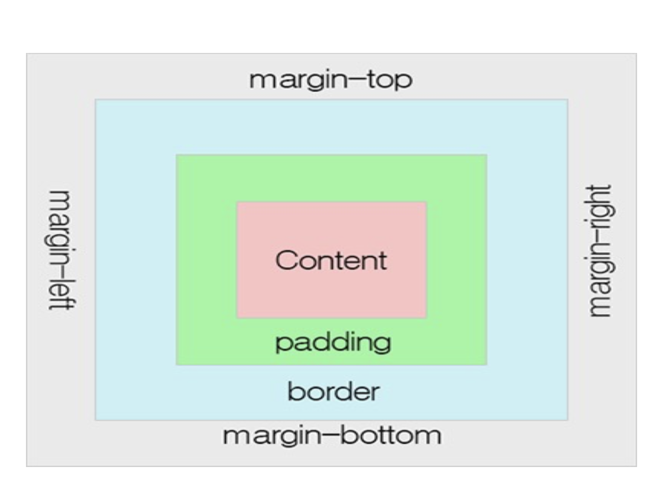
(4) margin & padding 요소
🖋️ 이 부분은 웹사이트의 검사에 들어가서 style 부분에서 확인하면 공부하기 더 좋다!
- margin : 다른 요소와의 거리, 바깥쪽 여백
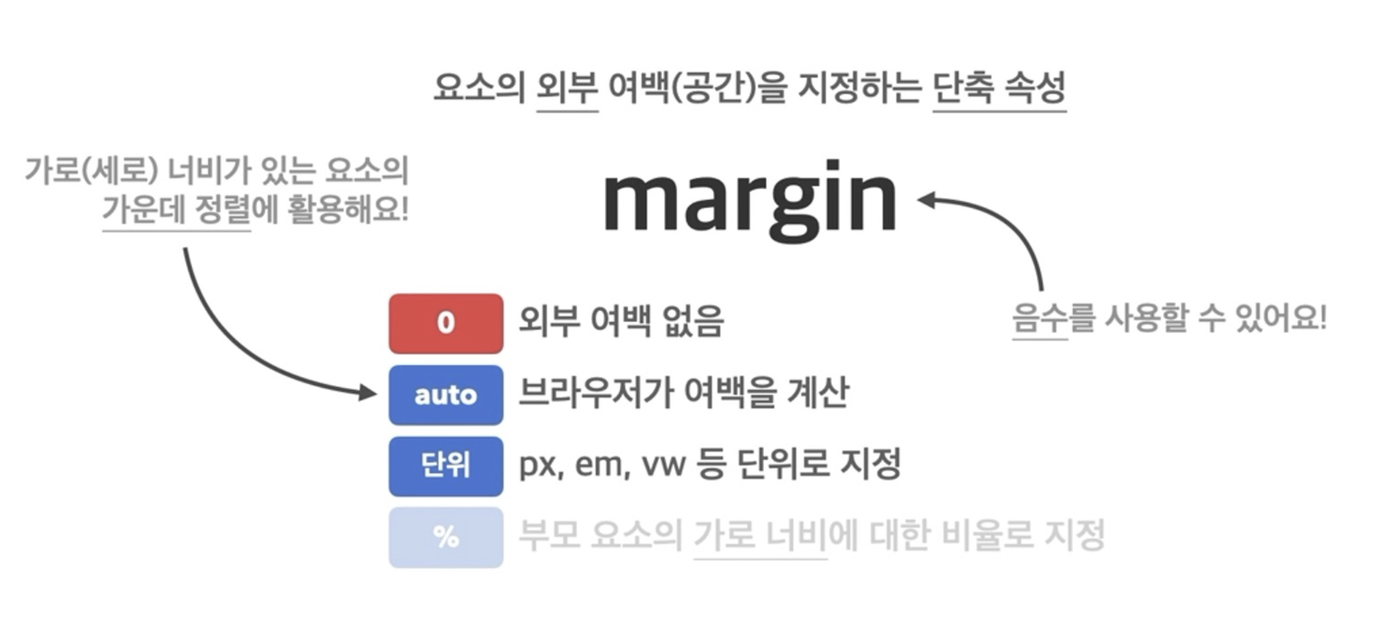
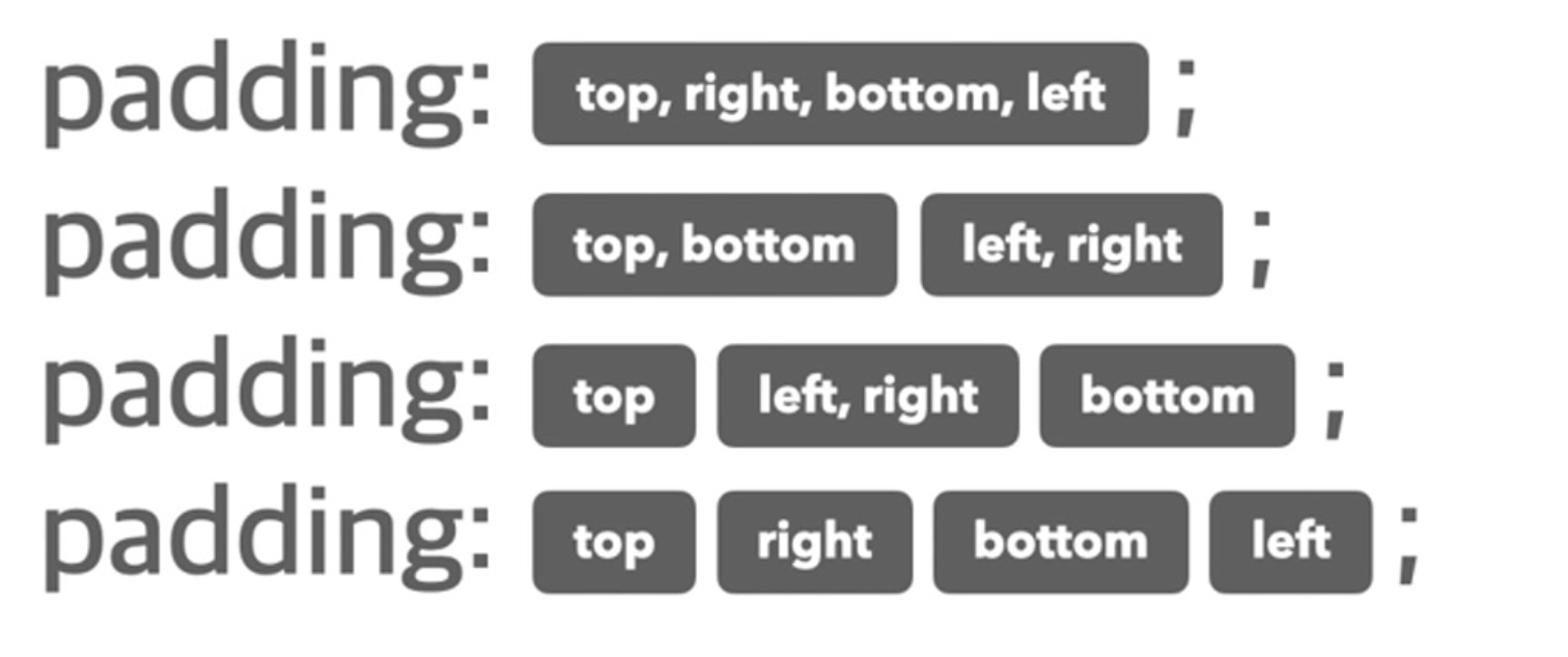
- margin의 단축속성
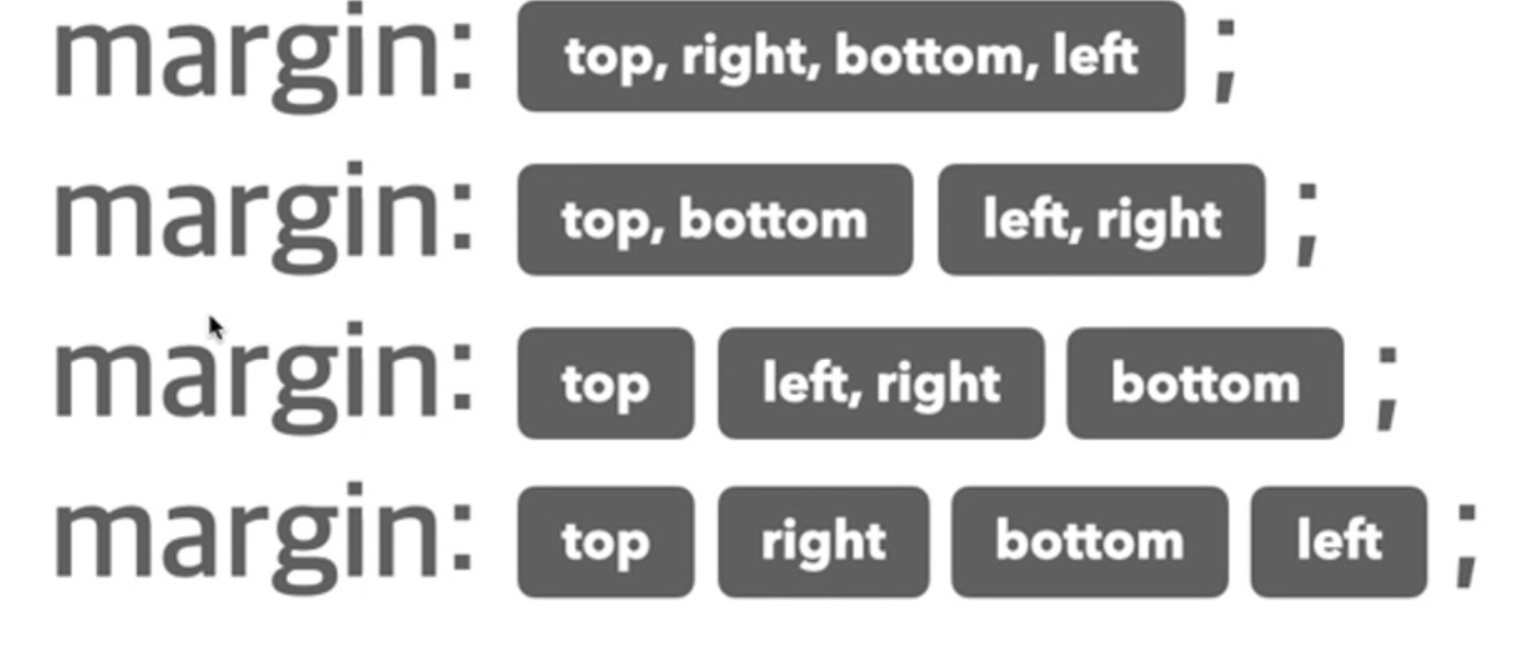 ➡️ 이때 순서가 중요하다. margin : 하고 저 순서대로 인식해서 적용되기 때문에 일일히 지정할거 아니라면 기억하는 것이 좋다!
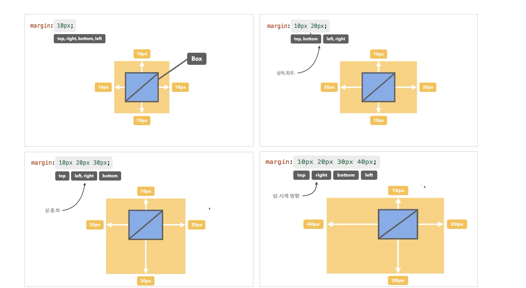 ➡️ 이런식으로 지정되는 것이다!
- margin 개별 속성
(1) margin-top
(2) margin-bottom
(3) margin-left
(4) margin-right
- padding : border와 content 간의 안쪽 여백
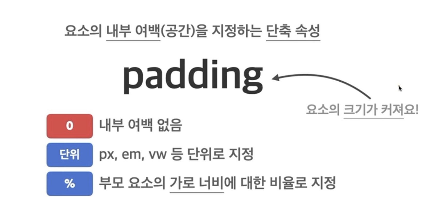
4. padding 단축속성
 ➡️ margin의 단축속성과 순서가 동일하다.
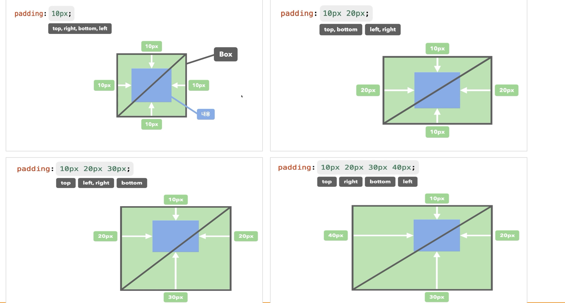 ➡️ 참고하자!
➡️ 개별속성도 margin과 동일하니 개별적으로 적용하고 싶을때 쓰면 된다.
➡️ 웹사이트의 검사에 들어가면 이 형태를 확인할 수 있으며 보면서 하면 도움이 된다.
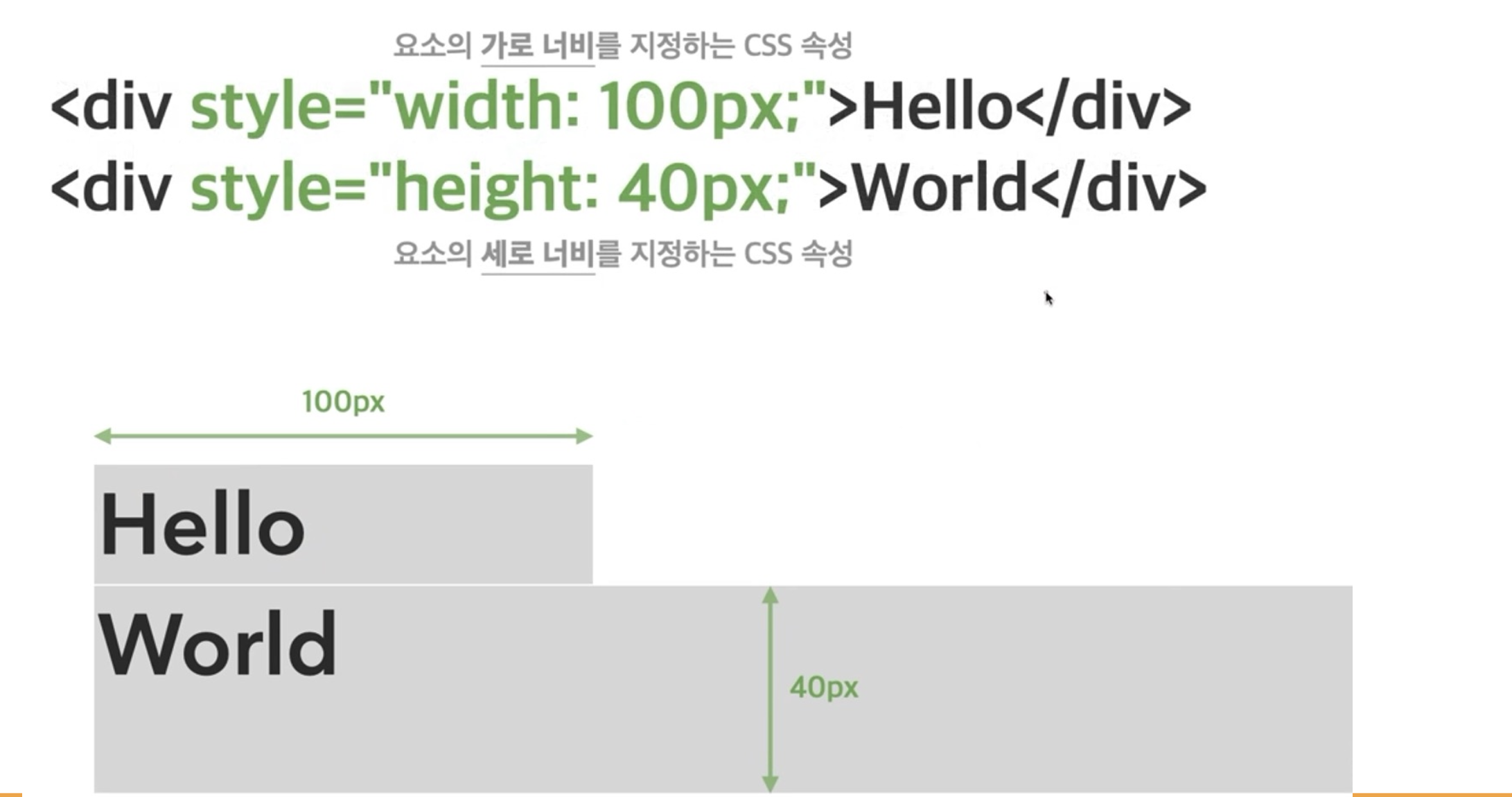
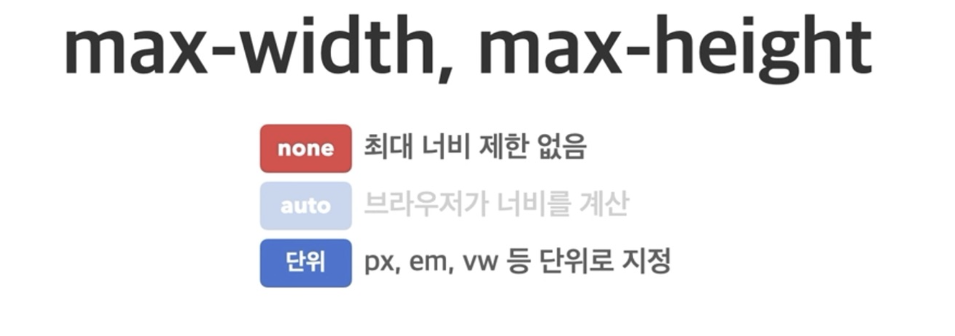
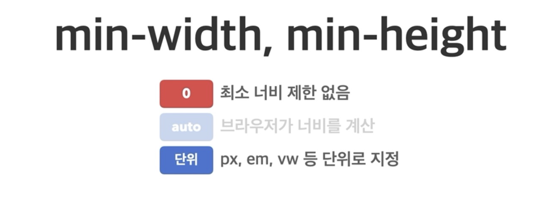
(5) width & height 요소
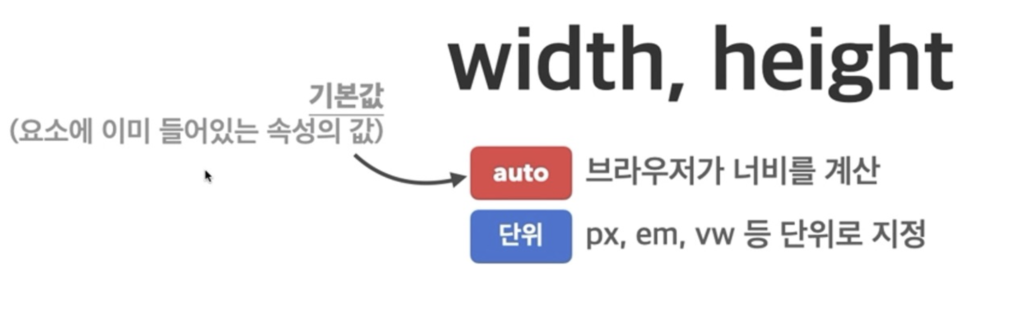
1. max-width, max-height : 요소가 커질 수 있는 최대 가로/세로 너비
2. min-width, min-height : 요소가 작아질 수 있는 최소 가로/세로 너비
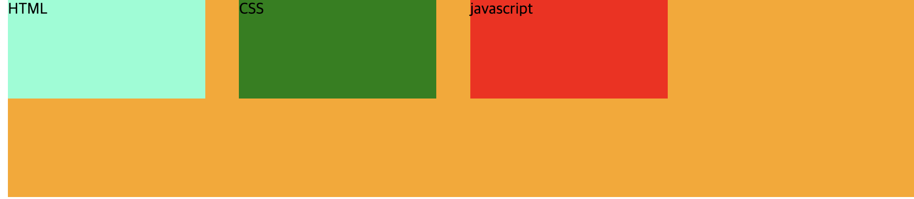
박스 모델에 대한 예시코드
/* layout : 레이아웃을 꾸밀 때 사용, 화면에 어떻게
  요소들을 보여줄지 나타내는 것
  inline만 해도 되고, block 만 해도 되고 원하는 형태 가능 */
.main > div{
  display: inline-block;
  width: 200px;
  height: 100px;
  margin-right: 30px;
}
.html{
  background-color: aquamarine;
}
.css{
  background-color: green;
}
.js{
  background-color: red;

}
.main{
  /* auto : 포함한 콘텐츠 크기만큼 자동으로 설정됨 */
  width: auto;
  height :200px;
  background-color: orange;

}
/* 알아두면 좋은 속성, 실행결과에 적용되지는 않음*/
/*  border : 테두리 선을 그리는 속성*/
  /*border: solid 2px rebeccapurple;*/
<!-- 박스모양 그림처럼 만들기 실습 -->
<!DOCTYPE html>
<html lang="en">
<head>
<meta charset="UTF-8">
<meta name="viewport" content="width=device-width, initial-scale=1.0">
<title>Document</title>
<link rel="stylesheet" href="text_prac1.css">
</head>
<body>
<div class="main">
<div class = "html">HTML</div>
<div class = "css">CSS</div>
<div class = "js">javascript</div>
</div>
</body>
</html>실행 결과
마무리
오늘은 css에서 웹사이트를 구성할 때 반드시 필요로 하고, 알아야 하는 속성들에 대해 배웠다. 내가 원하는대로 만들어낼 수 있는게 신기했고, 내가 배운게 웹사이트에 다 적용되고 있다는 것도 신기했댜...! 이제 고작 1주차가 지났지만, 복습 열심히 해서 내것으로 만드는데 열심히 노력할 예정이다:)