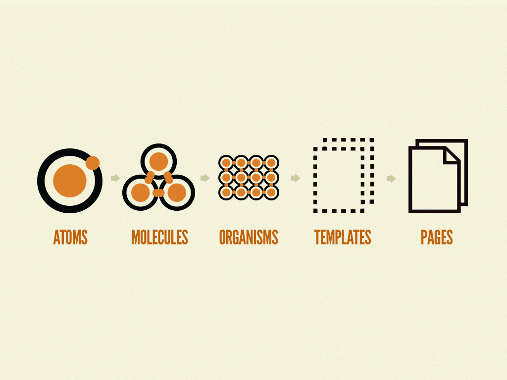
Atomic Design Methodology (1/2) 👈🏻
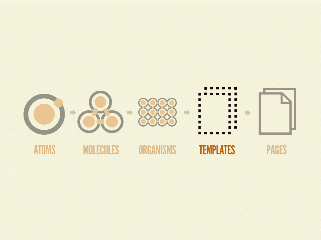
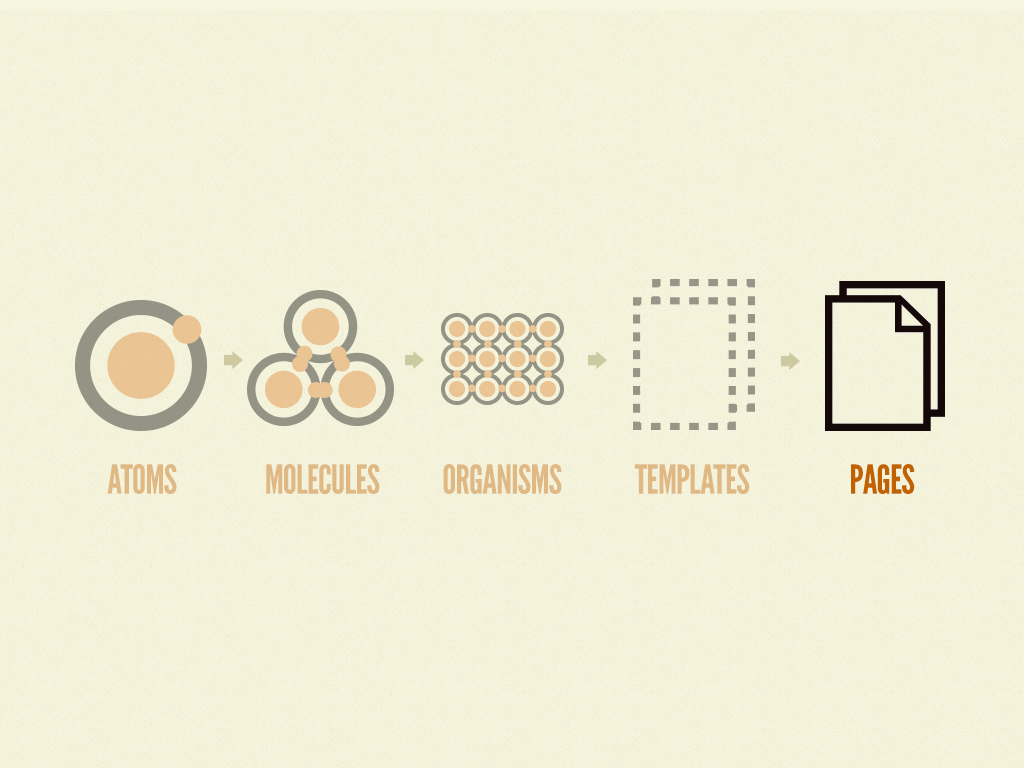
Templates
이제는 atoms, molecules, organisms 같은 화학적인 것들과는 멀어질 시간이다. 😅
Templates는 컴포넌트를 레이아웃에 배치하고 설계의 기본 내용 구조를 명확하게 하는 page-level 객체다. 이전의 예를 바탕으로, 우리는 헤더 organism을 홈페이지 템플릿에 넣을 수 있다.
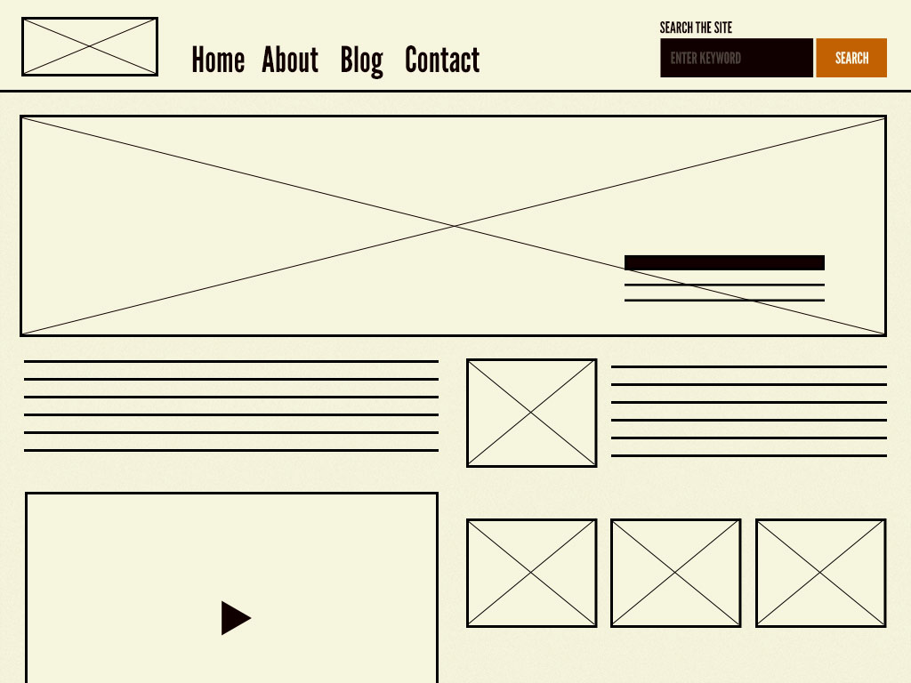
orgasism과 molecule로 이루어진 홈페이지 템플릿의 모습이다.
이 홈페이지 템플릿은 모든 필요한 페이지의 컴포넌트들을 보여준다. 이 컴포넌트들은 함께 기능하며, 상대적으로 추상적인 molecules와 organisms에 대한 이해를 돕는다. 컴포넌트들이 어떻게 보이고 함께 기능하는지를 보여주는 것이 중요하다.
Another important characteristic of templates is that they focus on the page’s underlying content structure rather than the page’s final content. Design systems must account for the dynamic nature of content, so it’s very helpful to articulate important properties of components like image sizes and character lengths for headings and text passages.
Mark Boulton discusses the importance of defining the underlying content structure of a page:
You can create good experiences without knowing the content. What you can’t do is create good experiences without knowing your content structure. What is your content made from, not what your content is.
Mark Boulton
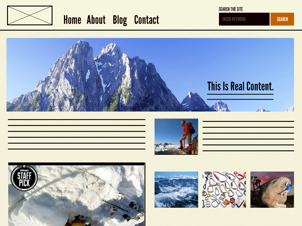
By defining a page’s skeleton we’re able to create a system that can account for a variety of dynamic content, all while providing needed guardrails for the types of content that populate certain design patterns. For example, the homepage template for Time Inc. shows a few key components in action while also demonstrating content structure regarding image sizes and character lengths:
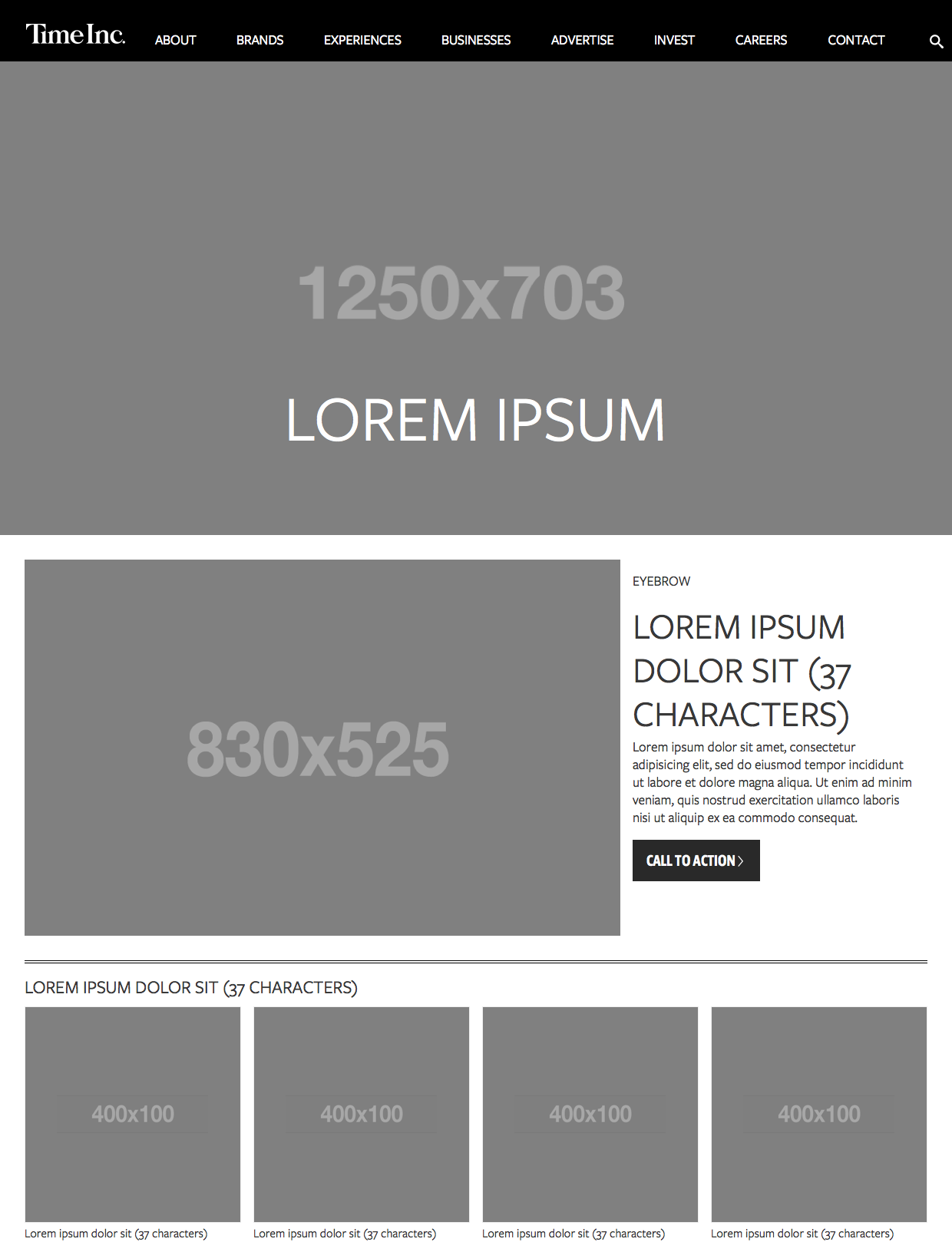
Time Inc.'s homepage template demonstrates the content's underlying structure.
Now that we’ve established our pages’ skeletal system, let’s put some meat on them bones!
Pages
Pages are specific instances of templates that show what a UI looks like with real representative content in place. Building on our previous example, we can take the homepage template and pour representative text, images, and media into the template to show real content in action.
The page stage replaces placeholder content with real representative content to bring the design system to life.
The page stage is the most concrete stage of atomic design, and it’s important for some rather obvious reasons. After all, this is what users will see and interact with when they visit your experience. This is what your stakeholders will sign off. And this is where you see all those components coming together to form a beautiful and functional user interface. Exciting!
In addition to demonstrating the final interface as your users will see it, pages are essential for testing the effectiveness of the underlying design system. It is at the page stage that we’re able to take a look at how all those patterns hold up when real content is applied to the design system. Does everything look great and function as it should? If the answer is no, then we can loop back and modify our molecules, organisms, and templates to better address our content’s needs.
When we pour real representative content into Time Inc.’s homepage template, we’re able to see how all those underlying design patterns hold up.
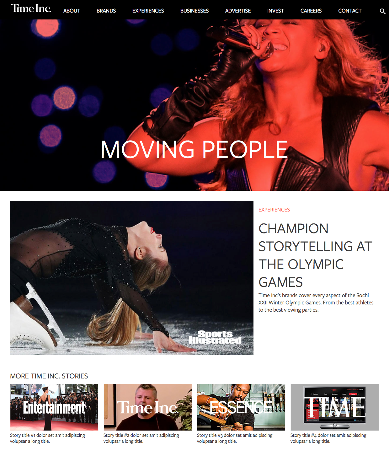
At the page stage, we're able to see what Time Inc.'s homepage looks like with real representative content in place. With actual content in place, we're able to see if the UI components making up the page properly serve the content being poured into them.
We must create systems that establish reusable design patterns and also accurately reflect the reality of the content we’re putting inside of those patterns.
Pages also provide a place to articulate variations in templates, which is crucial for establishing robust and reliant design systems. Here are just a few examples of template variations:
A user has one item in their shopping cart and another user has ten items in their cart.
A web app’s dashboard typically shows recent activity, but that section is suppressed for first-time users.
One article headline might be 40 characters long, while another article headline might be 340 characters long.
Users with administrative privileges might see additional buttons and options on their dashboard compared to users who aren’t admins.
In all of these examples, the underlying templates are the same, but the user interfaces change to reflect the dynamic nature of the content. These variations directly influence how the underlying molecules, organisms, and templates are constructed. Therefore, creating pages that account for these variations helps us create more resilient design systems.
So that’s atomic design! These five distinct stages concurrently work together to produce effective user interface design systems. To sum up atomic design in a nutshell:
Atoms are UI elements that can’t be broken down any further and serve as the elemental building blocks of an interface.
Molecules are collections of atoms that form relatively simple UI components.
Organisms are relatively complex components that form discrete sections of an interface.
Templates place components within a layout and demonstrate the design’s underlying content structure.
Pages apply real content to templates and articulate variations to demonstrate the final UI and test the resilience of the design system.
Advantages of atomic design
So why go through all this rigamarole? What’s atomic design good for? These are valid questions, considering we’ve been building user interfaces for a long time now without having an explicit five-stage methodology in place. But atomic design provides us with a few key insights that help us create more effective, deliberate UI design systems.
The part and the whole
One of the biggest advantages atomic design provides is the ability to quickly shift between abstract and concrete. We can simultaneously see our interfaces broken down to their atomic elements and also see how those elements combine together to form our final experiences.
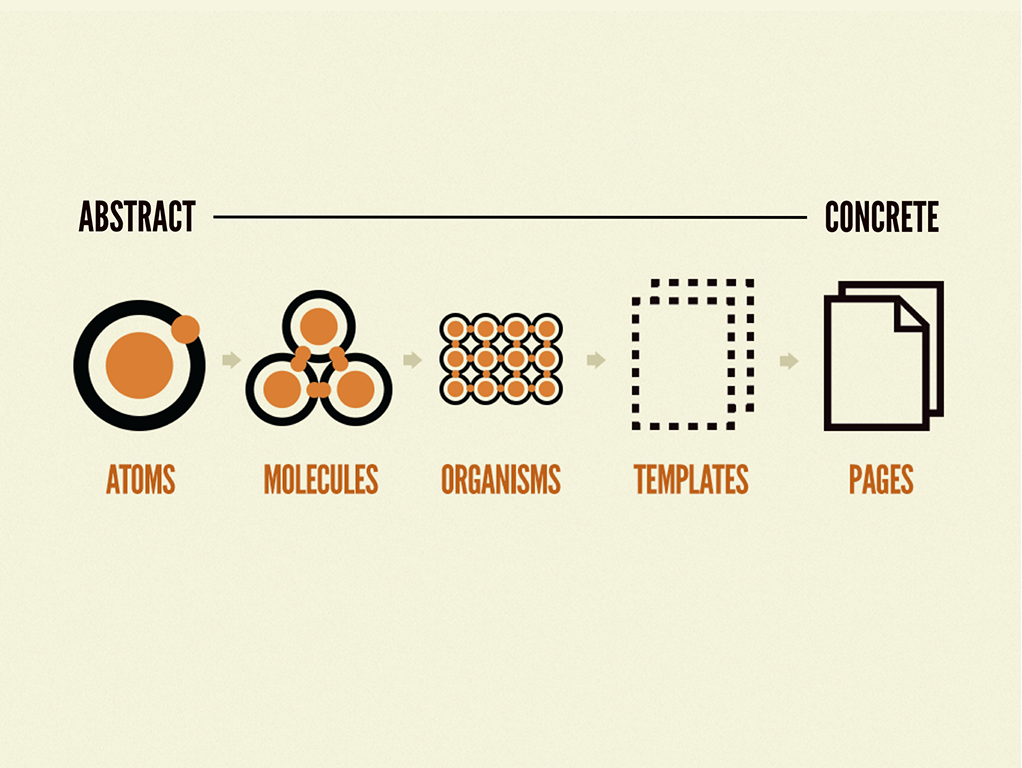
Atomic design allows designers to traverse between abstract and concrete.
In his book The Shape of Design, Frank Chimero beautifully articulates the power this traversal provides:
The painter, when at a distance from the easel, can assess and analyze the whole of the work from this vantage. He scrutinizes and listens, chooses the next stroke to make, then approaches the canvas to do it. Then, he steps back again to see what he’s done in relation to the whole. It is a dance of switching contexts, a pitter-patter pacing across the studio floor that produces a tight feedback loop between mark-making and mark-assessing.
Frank Chimero
Atomic design lets us dance between contexts like the painter Frank so eloquently describes. The atoms, molecules, and organisms that comprise our interfaces do not live in a vacuum. And our interfaces’ templates and pages are indeed composed of smaller parts. The parts of our designs influence the whole, and the whole influences the parts. The two are intertwined, and atomic design embraces this fact.
When designers and developers are crafting a particular component, we are like the painter at the canvas creating detailed strokes. When we are viewing those components in the context of a layout with real representative content in place, we are like the painter several feet back from the canvas assessing how their detailed strokes affect the whole composition. It’s necessary to zero in on one particular component to ensure it is functional, usable, and beautiful. But it’s also necessary to ensure that component is functional, usable, and beautiful in the context of the final UI.
Atomic design provides us a structure to navigate between the parts and the whole of our UIs, which is why it’s crucial to reiterate that atomic design is not a linear process. It would be foolish to design buttons and other elements in isolation, then cross our fingers and hope everything comes together to form a cohesive whole. So don’t interpret the five stages of atomic design as “Step 1: atoms; Step 2: molecules; Step 3: organisms; Step 4: templates; Step 5: pages.” Instead, think of the stages of atomic design as a mental model that allows us to concurrently create final UIs and their underlying design systems.
Clean separation between structure and content
Discussing design and content is a bit like discussing the chicken and the egg. Mark Boulton explains:
Content needs to be structured and structuring alters your content, designing alters content. It’s not ‘content then design’, or ‘content or design’. It’s ‘content and design’.
Mark Boulton
A well-crafted design system caters to the content that lives inside it, and well-crafted content is aware of how it’s presented in the context of a UI. The interface patterns we establish must accurately reflect the nature of the text, images, and other content that live inside them. Similarly, our content should be aware of the manner in which it will be presented. The close relationship between content and design requires us to consider both as we construct our UIs.
Atomic design gives us a language for discussing the structure of our UI patterns and also the content that goes inside those patterns. While there is a clean separation between the content structure skeleton (templates) and the final content (pages), atomic design recognizes the two very much influence each other. For instance, take the following example:
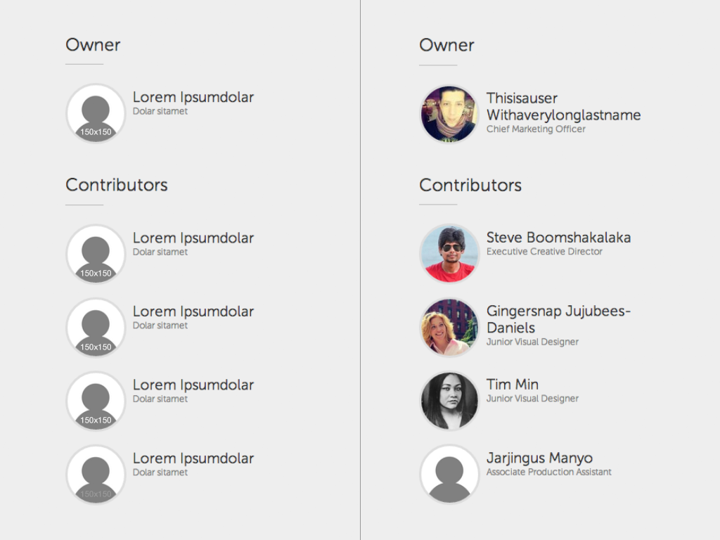
On the left we see the UI’s content skeleton, which consists of the same person block molecule repeated again and again. On the right we see what happens when we populate each instance of the person block molecule with representative content. Visualizing the content skeleton and the representative final content allows us to create patterns that accurately reflect the content that lives inside them. If a person’s name were to wrap onto five lines within the pattern, we would need to address that broken behavior at a more atomic level.
The content we pour into our UIs at the page stage will influence the characteristics and parameters of the underlying design patterns.
What's in a name?
Throughout this book I’ve mentioned that modular design and development is nothing new. So why are we introducing terms like atoms, molecules, and organisms when we can just stick with established terms like modules, components, elements, sections, and regions?
For as long as I’ve been talking about atomic design, I’ve had people proffer alternate names for the stages of the methodology. Person One would suggest, “Why not just name them elements, modules, and components?” while Person Two would suggest, “Why not just name them base, components, and modules?” The issue with terms like components and modules is that a sense of hierarchy can’t be deduced from the names alone. Atoms, molecules, and organisms imply a hierarchy that anyone with a basic knowledge of chemistry can hopefully wrap their head around.
That being said, naming things is hard and imperfect. The names I’ve chosen for the stages of atomic design have worked really well for me and the teams I’ve worked with as we create UI design systems. But maybe they don’t work for you and your organization. That’s more than OK. Here’s one perspective from the design team at GE:
As we showed our initial design system concepts that used the Atomic Design taxonomy to our colleagues, we were met with the some confused looks. […] The evidence was clear, for this to be successful within our organization we had to make the taxonomy more approachable.
Jeff Crossman, GE Design
The taxonomy the team landed on were “Principles”, “Basics”, “Components”, “Templates”, “Features”, and “Applications”. Do these labels make sense to you? It doesn’t matter. By establishing a taxonomy that made sense for their organization, everyone was able to get on board with atomic design principles and do effective work together.
“Atomic design” as a buzzword encapsulates the concepts of modular design and development, which becomes a useful shorthand for convincing stakeholders and talking with colleagues. But atomic design is not rigid dogma. Ultimately, whatever taxonomy you choose to work with should help you and your organization communicate more effectively in order to craft an amazing UI design system.
Atomic design is for user interfaces
Atomic design is a concept born of the web. After all, your lowly author is a web designer, which is mainly the reason this book primarily focuses on web-based interfaces. But it’s important to understand that atomic design applies to all user interfaces, not just web-based ones.
You can apply the atomic design methodology to the user interface of any software: Microsoft Word, Keynote, Photoshop, your bank’s ATM, whatever. To demonstrate, let’s apply atomic design to the native mobile app Instagram.
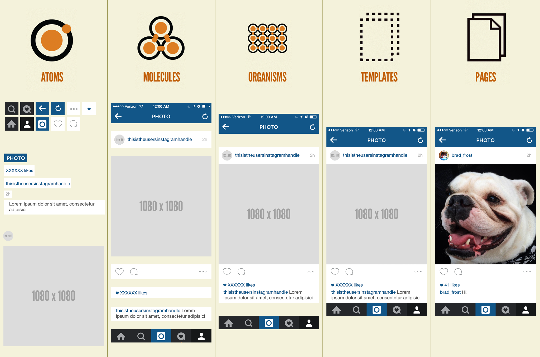
Atomic design applied to the native mobile app Instagram.
Let’s walk through this atomized Instagram interface:
Atoms: This screen of Instagram’s UI consists of a handful of icons, some text-level elements, and two image types: the primary image and the user’s avatar image.
Molecules: Several icons form simple utilitarian components like the bottom navigation bar and the photo actions bar where users can like or comment on a photo. Also, simple combinations of text and/or images form relatively simple components.
Organisms: Here we can see the photo organism take shape, which consists of the user’s information, time stamp, the photo itself, actions around that photo, and information about the photo including like count and caption. This organism becomes the cornerstone of the entire Instagram experience as it is stacked repeatedly in a never-ending stream of user-generated photos.
Templates: We get to see our components come together in the context of a layout. Also, it’s here where we see the exposed content skeleton of the Instagram experience, highlighting dynamic content such as the user’s handle, avatar, photo, like count, and caption.
Pages: And finally we see the final product, complete with real content poured into it, which helps ensure the underlying design system comes together to form a beautiful and functional UI.
I show this non-web example because atomic design tends to get misinterpreted as an approach to web-specific technologies like CSS and JavaScript. Let me be clear about this: atomic design has nothing to do with web-specific subjects like CSS or JavaScript architecture. In chapter 1 we discussed the trend toward modularity in all aspects of design and development, which includes CSS and JavaScript. These are fantastic trends in CSS and JavaScript, but atomic design deals with crafting user interface design systems irrespective of the technology used to create them.
Atomic design in theory and in practice
This chapter introduced the atomic design methodology and demonstrated how atoms, molecules, organisms, templates, and pages all work together to craft thoughtful, deliberate interface design systems. Atomic design allows us to see our UIs broken down to their atomic elements, and also allows us to simultaneously step through how those elements join together to form our final UIs. We learned about the tight bond between content and design, and how atomic design allows us to craft design systems that are tailored to the content that lives inside them. And finally we learned how the language of atomic design gives us a helpful shorthand for discussing modularity with our colleagues, and provides a much needed sense of hierarchy in our design systems.
Atomic design is a helpful design and development methodology, but essentially it’s merely a mental model for constructing a UI. By now you may be wondering how you make atomic design happen. Well, fear not, dear reader, because the rest of the book focuses on tools and processes to make your atomic design dreams come true.