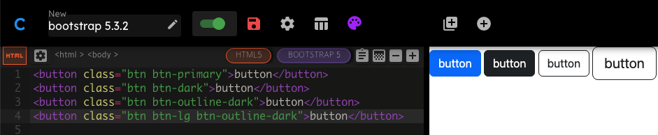
❖ Bootstrap
- https://getbootstrap.com (강의와 달리 현재 최신 버전은 부트스트랩 5)
- 가장 인기 있는 프론트엔드 라이브러리
- 무료 오픈소스로, Github 저장소에서 모든 소스 코드 확인 가능
- 특징
- 반응적(responsive) : 어느 기기에서 웹사이트를 보든 각 화면에 적응 가능한 레이아웃
- 미리 스타일이 지정된 요소 전체에 엑세스 가능
- HTML 요소에 대한 스타일이 이미 정의되어 있기 때문에 CSS 코드 없이도 스타일링 가능
https://www.codeply.com/ : 부트스트랩을 사용할 수 있는 온라인 에디터
❖ 설치
◇ 부트스트랩 CDN을 복사하여 붙여넣는 방법
https://getbootstrap.com/docs/5.3/getting-started/introduction/
CDN(Content Delivery Network)
- 케이블을 통해 인터넷 서버에 접속하는 방법
- 전 세계에 수많은 라우팅 포인트가 있어서 파일이 없을 경우 다운 가능한 최단 경로를 찾음
- 웹사이트에서 많이 사용되는 프레임워크이기 때문에 파일이 이미 사용자 브라우저에 캐시로 있을 가능성 높음
(대기 시간을 줄일 수 있음)
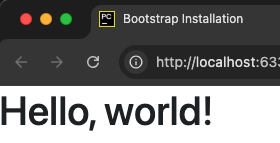
순서
- 프로젝트 루트에
index.html파일 생성 - 모바일 화면에 맞는 뷰포트를 위해
<meta name="viewport">태그 추가 <head>에<link>태그로 CSS 추가</body>로 닫기 전 위치에<script>태그로 JS 추가
a. popper(떠다니는 UI)가 포함된 번들을 한꺼번에 설치하거나,
b. popper와 JS를 따로 분리하여 설치 가능(기능이 필요 없을 경우 제외하여 가볍게 만들기)- 브라우저를 열어 부트스트랩이 적용된 페이지 확인 가능
🏗️ index.html
<!DOCTYPE html>
<html lang="en">
<head>
    <meta charset="UTF-8">
    <!-- 뷰포트 추가 -->
    <meta name="viewport" content="width=device-width, initial-scale=1">
    <title>Bootstrap Installation</title>
    <!-- CSS 추가 -->
    <link href="https://cdn.jsdelivr.net/npm/bootstrap@5.3.3/dist/css/bootstrap.min.css" rel="stylesheet" integrity="sha384-QWTKZyjpPEjISv5WaRU9OFeRpok6YctnYmDr5pNlyT2bRjXh0JMhjY6hW+ALEwIH" crossorigin="anonymous">
</head>
<body>
    <h1>Hello, world!</h1>
    <!-- JS 번들 추가(popper 포함) -->
    <script src="https://cdn.jsdelivr.net/npm/bootstrap@5.3.3/dist/js/bootstrap.bundle.min.js" integrity="sha384-YvpcrYf0tY3lHB60NNkmXc5s9fDVZLESaAA55NDzOxhy9GkcIdslK1eN7N6jIeHz" crossorigin="anonymous"></script>
</body>
</html>
◇ 다른 방법들
- 스타터 템플릿을 복사하여 사용하는 방법
https://getbootstrap.com/docs/5.3/getting-started/rtl/#starter-template - CSS, JS 소스 코드를 다운로드해서 웹사이트에 포함하는 방법
a. 다운받은 파일은 브라우저가 인식하지 못하기 때문에 웹사이트 로드 시 모든 파일을 다운받아야 한다
b. 대기시간이 늘어나기 때문에 CDN을 통해 가져오는 것을 더 추천
❖ 웹 디자인 101
- 다른 사람들의 작품 참고하여 아이디어 얻기
https://ui-patterns.com/patterns
https://dribbble.com/search/website (원하는 색을 지정하여 작품을 찾을 수 있음) 와이어 프레이밍(Wire Framing)제작
a. 간단하고 빠르게 스케치하는 것
b. 연필과 종이를 사용하거나 https://sneakpeekit.com 에서 양식 다운
(https://balsamiq.cloud 는 유료 서비스, 30일 무료 체험판)목업(mock-up)제작
a. 응용프로그램이나 웹사이트의 디자인을 정교하게 구현하는 것
b. 나중에 얻게 될 결과물과 동일한 모양을 보게 됨프로토타입제작
a. 웹사이트의 애니메이션 버전이 실제로 어떻게 생겼는지 볼 수 있음
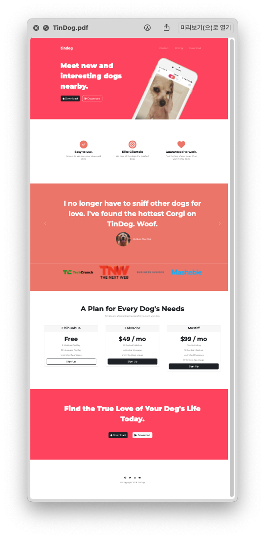
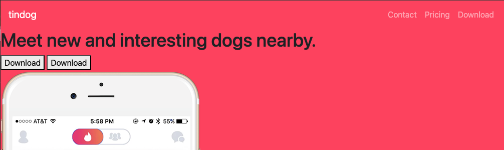
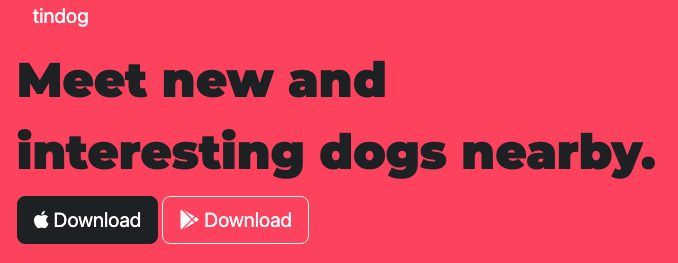
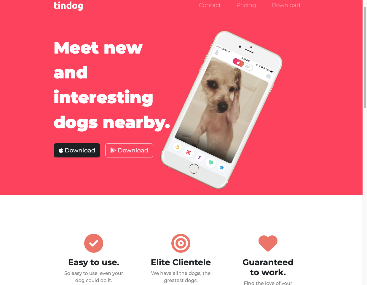
🗂️ Day58 프로젝트: 틴독 웹페이지
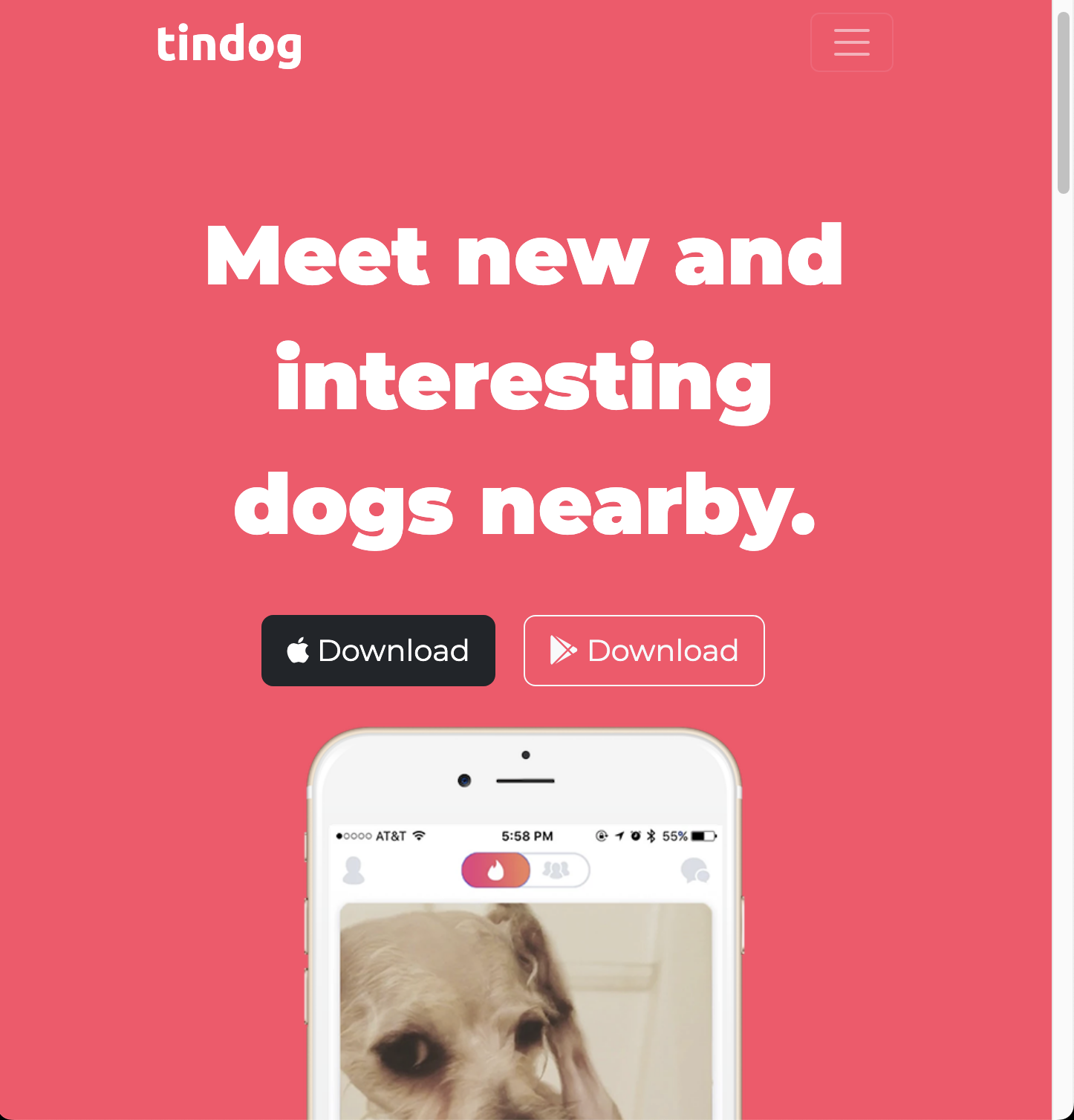
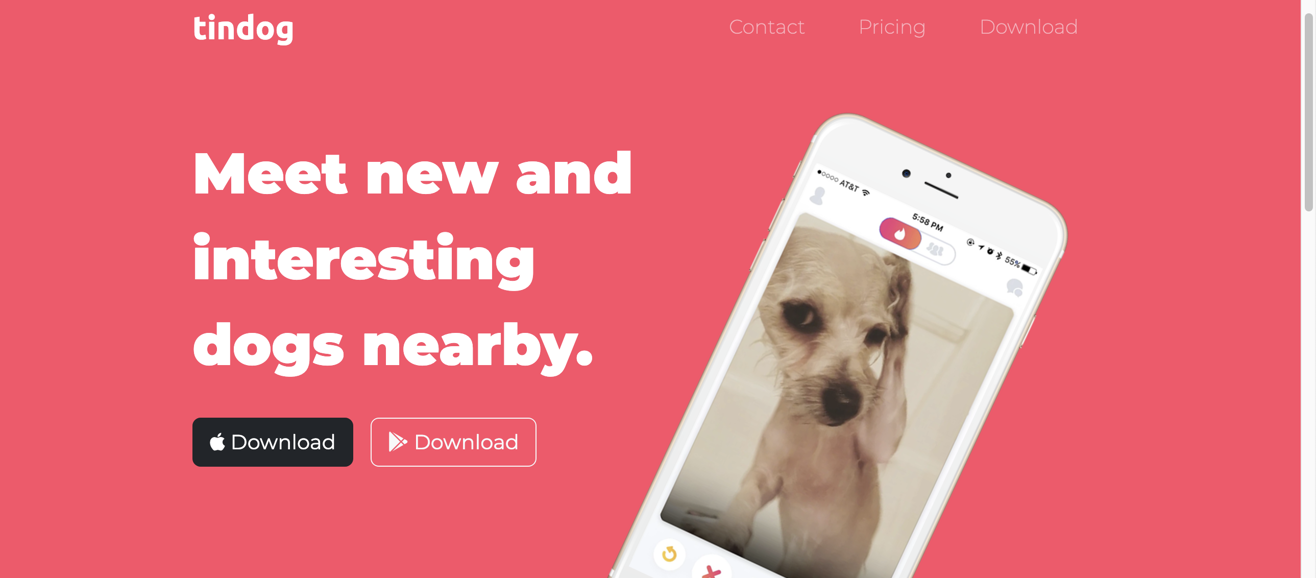
부트스트랩으로 구축한 가상의 서비스 Tindog(Tinder의 강아지 버전)의 웹사이트
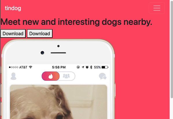
1. 네비게이션 바 추가
🔍 유의 사항
- HTML에 CSS 및 JS 파일을 포함시켜야 정상적으로 작동
(자바스크립트가 없으면 햄버거 메뉴를 눌러도 드롭다운이 토글되지 않음)
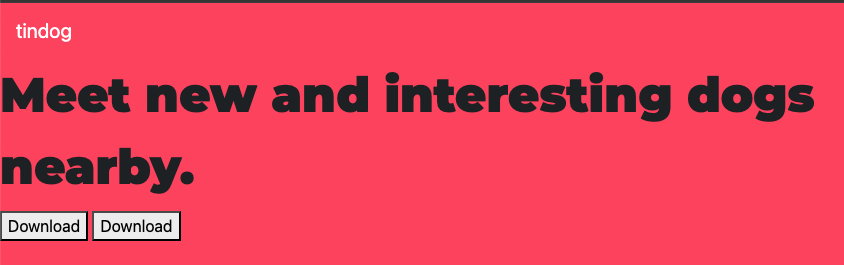
2. 폰트 적용
🔍 유의 사항
- 폰트 다운
- 본문 : Montserrat
- 로고 : Ubuntu
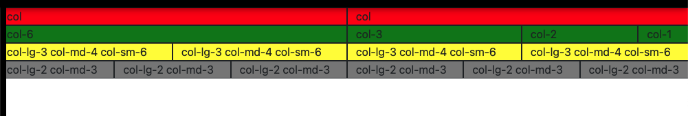
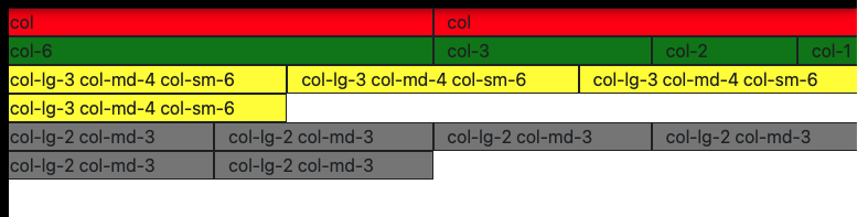
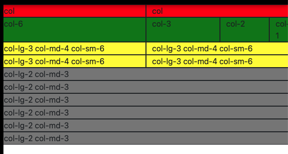
3. 그리드 레이아웃 추가
🔍 유의 사항
- 그리드 시스템은 한 행을 12개의 열로 나눔
- 한 행의 최소 너비
xs(초소형) : pxsm(작은 화면) : pxmd(중간 화면) : pxlg(큰 화면) : pxxl(초대형 화면) : pxxxl(매우 큰 화면) : px- 클래스에 반응형 열 집합 옵션 넣기(화면 크기에 따라 열 개수가 달라짐)
데스크탑 사이즈
태블릿 사이즈
모바일 사이즈
4. 컨테이너 적용
🔍 유의 사항
- 컨테이너: 부트스트랩의 구성 요소들에 대한 기본 빌딩 블록
container: 컨테이너 내부에 포함된 모든 것이 뷰포트의 크기에 대해 반응형이 됨container-fluid: 항상 화면 너비의 100%를 차지- 플루이드 컨테이너로 컨텐츠에 패딩과 센터링 추가하기
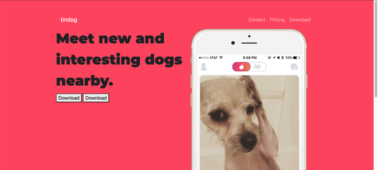
5. 버튼 스타일
🔍 유의 사항
- 다운로드 버튼에 애플과 구글 플레이 모양 폰트 추가
- https://fontawesome.com/ 에서 이메일로 회원가입
- 한 달에 10,000번의 페이지뷰까지 무료사용 가능
- 키트를 생성 후 받은 CDN을 HTML에 붙여넣어야 사용 가능
(사용하려는 모든 아이콘을 다운로드)
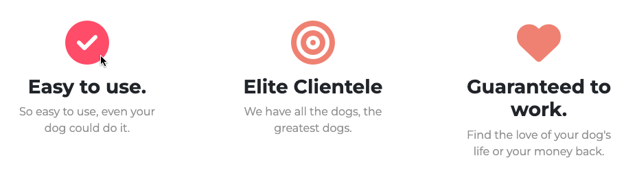
6. 타이틀, 기능 소개 스타일
🔍 유의 사항
- 텍스트의 폰트, 크기, 색상 변경
- 네비게이션 바와 버튼에 패딩을 추가
- 스마트폰 이미지 크기를 변경하고 회전시키기
- 기능 소개 부분 변경
- 폰트 어썸 아이콘 추가
- 반응형으로 설정 : 태블릿, 모바일 화면에서 100%, 데스크탑 화면에서 화면 폭의 1/3
- 폰트 사이즈를 자체 변경 가능
- 폰트 색상도 자체 변경 가능하지만 커스텀 클래스를 지정하는 것을 더 추천
- 아이콘에 마우스 포인트를 올리면 아이콘 색이 바뀌도록 변경
7. 캐러셀로 후기 슬라이드 쇼 제작
🔍 유의 사항
- 자동 재생되지 않으면서 화살표를 눌러 넘기는 슬라이드로 만들기
- 버전 5에서 바뀐 것들 주의하기
8. 카드로 가격표 제작
🔍 유의 사항
- 카드
- 카드 모양의 컨테이너를 제공하는 요소
- HTML와 비슷하게 헤더, 바디, 바닥글 등이 있음
- 부트스트랩 홈페이지의 사용자 지정 컴포넌트 참고하기 : Pricing
- 한 행에 여러 개의 카드를 넣으려면 그리드를 사용해야 한다
- 버튼 너비를 카드 크기만큼 늘리기 위해 강의의
btn-block대신w-100을 사용
(해당 요소의 너비를 부모의 100%로 설정)
❖ 고급 CSS
부트스트랩 등의 프레임워크와 관련 없는 CSS
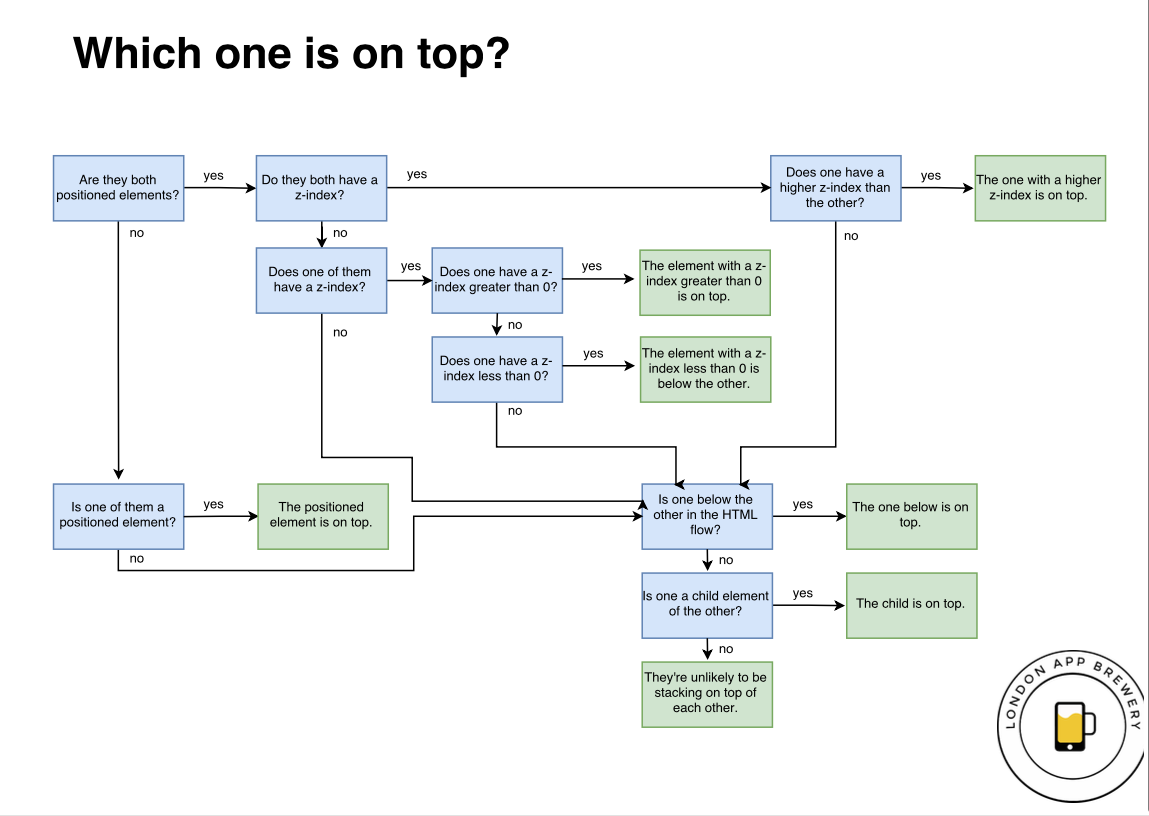
◇ Z-index와 Stacking Order
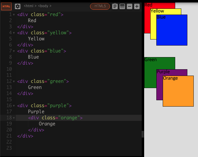
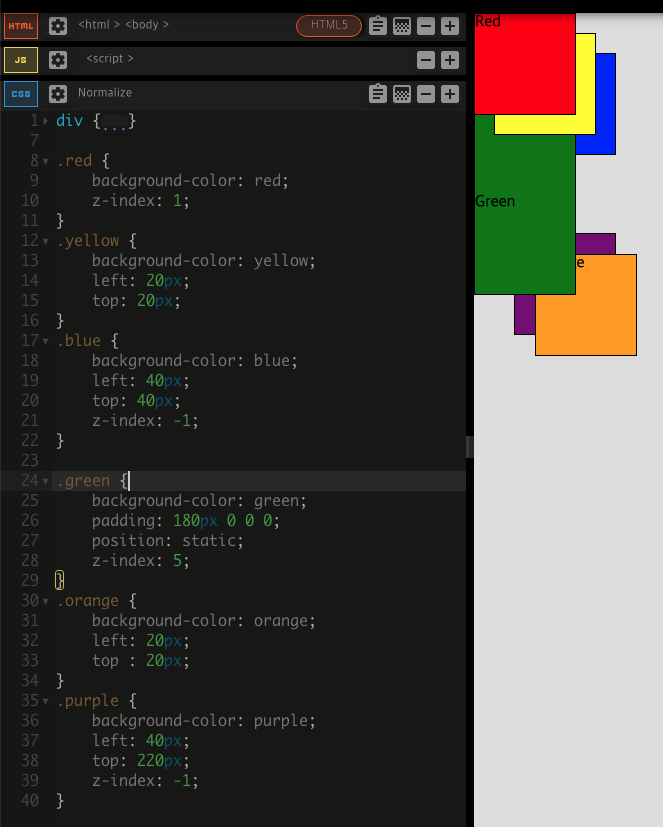
요소들이 쌓이는 순서를 변경하는 방법
- HTML 코드에서
Stacking Order
a. 모든 요소들이 동일한 계층에 배치된 경우 코드 아래로 내려갈수록 위로 쌓임
b. 부모 요소 안의 자식은 부모 위에 쌓이게 됨 - CSS 코드에서
z-index
a. 모든 요소의 기본 z-index 값은 0이고, 숫자가 커질수록 위로 쌓임
b. 포지셔닝된 요소에만 사용 가능
(포지셔닝 값이 static이면 z-index가 무시되고, 다른 값들보다 쌓임 순서에서 밀리게 됨)
◇ 미디어 쿼리 중단점
모바일에서 읽기 적합한 환경을 만드는 방법
- 모바일에서 접속하는 경우를 위해 별도의 모바일용 사이트를 만드는 것
- 예)
facebook.com이 아닌m.facebook.com으로 리디렉션 - 두 개의 웹사이트를 디자인하기 때문에 작업량이 많아짐
- 예)
- 웹사이트를 반응형으로 제작하는 방법
- 어느 사이즈에서 접속해도 적절하도록 설정하는 것
- CSS의 Media Query Breakpoints으로 구현 가능
- 미디어 쿼리:
@media키워드 이후에 나오는<type>과<feature> - 미디어의 유형 : 주어진 장치의 일반적인 분류를 설명(보통 스크린 관련)
- 기능 : 어떤 것이 참인지 거짓인지 확인(화면 크기에 따라 다른 항목 적용 가능)
- 미디어 쿼리:
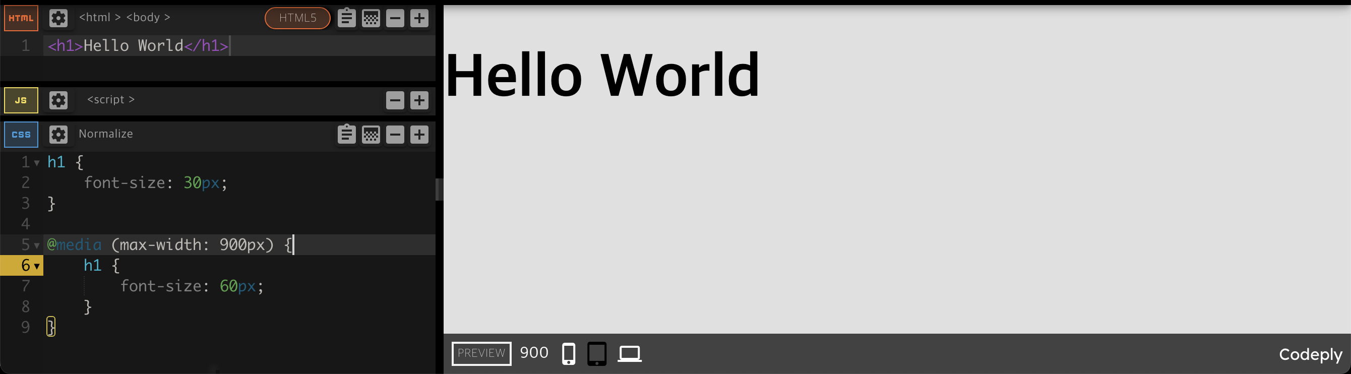
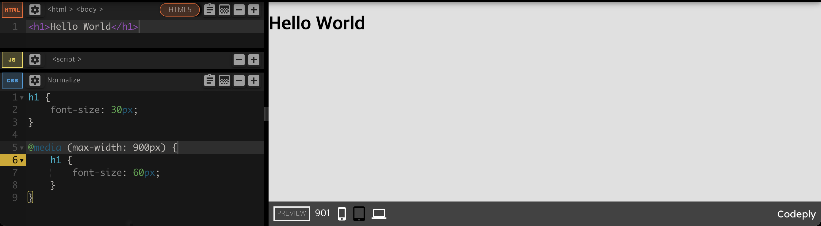
900px에서 미디어 쿼리 중단점을 생성
💡 크기에 대한 용어 정리
- 장치의 크기 : 바꿀 수 없는 고정된 크기
- 브라우저의 크기 : 변경 가능
- 뷰포트의 크기 : 웹사이트가 표시되는 '화면'의 크기를 의미
◇ 선택자 선택 및 결합
다중(multiple) 선택자
- 쉼표로 선택자끼리 구분
- 코드를 단축하고 유사한 것들을 함께 그룹화
selector1, selector2 {
  …
}
계층적(hierarchical) 선택자
- 공백으로 선택자끼리 구별
- 첫 번째 선택자는 부모로부터, 두 번째 선택자는 자식으로부터 온다
selector1 selector2 {
  …
}
선택자 결합(combined)
- 선택자들을 공백 없이 붙임
- 모두 같은 요소에서 발생한 선택자이어야 한다
selector1.selector2{
  …
}

selector1#selector2{
  …
}
◇ 선택자 우선순위
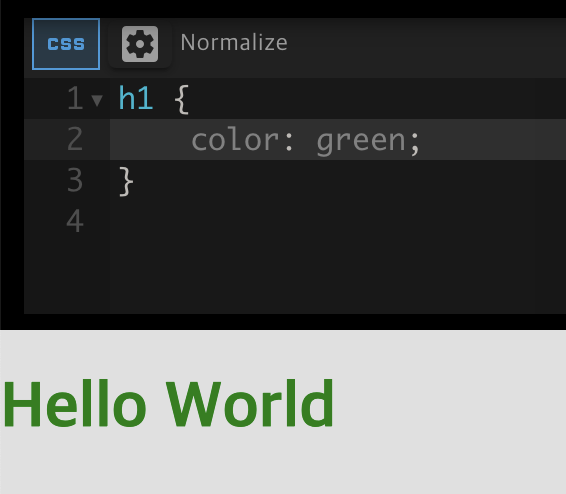
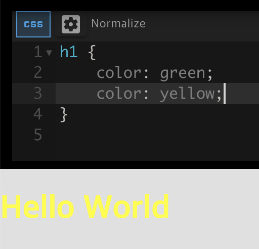
HTML 요소끼리는 가장 마지막 규칙이 우선 적용됨
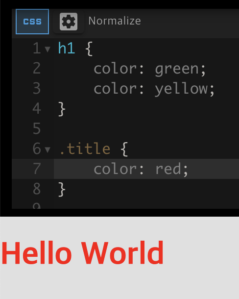
class는 HTML 요소보다 더 높은 우선순위
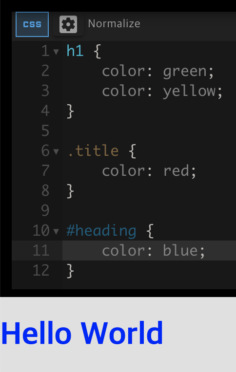
id는 class보다 더 높은 우선순위
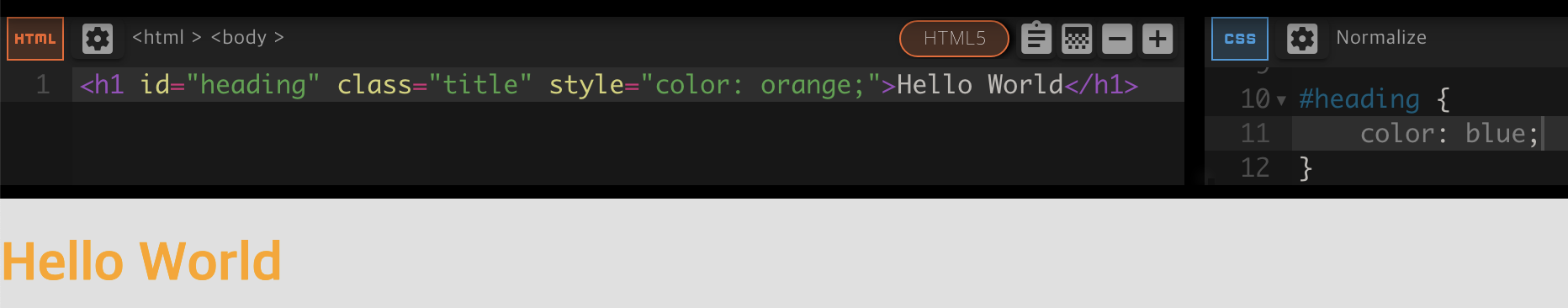
인라인 style은 id보다 더 높은 우선순위
💡 규칙들끼리 충돌을 방지하는 방법
- id를 매우 드물게 사용하기
- id가 확실히 필요한 코드 섹션과 부분에만
- 클래스 사용을 먼저 고려하기
- 되도록 한 요소에 하나의 사용자 정의 클래스만 적용하기
- 인라인 스타일 피하기
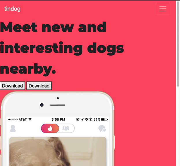
9. Z-index와 Media Query Breakpoints 사용
🔍 유의 사항
- 아이폰 이미지를 기능 소개 섹션 뒤로 숨기기
- 따로 배경을 설정하지 않은 상태에서 흰 바탕은 투명한 상태
- 투명 상태에서는 요소를 뒤로 보내도 보이기 때문에 배경색을 흰색으로 설정해야 한다
- 요소가 HTML 흐름을 따르게 하려면 포지션 값을
relative로 설정해야 한다- 태블릿 크기 이하로 화면을 줄일 때 아이폰 이미지와 제목에 변화 주기
- 이미지의 포지션 값을 정적으로 변경하고 기울임을 없애기
- 제목을 가운데 정렬
- 개발자 모드에서 디자인이 바뀌는 지점의 화면 사이즈를 확인해야 한다
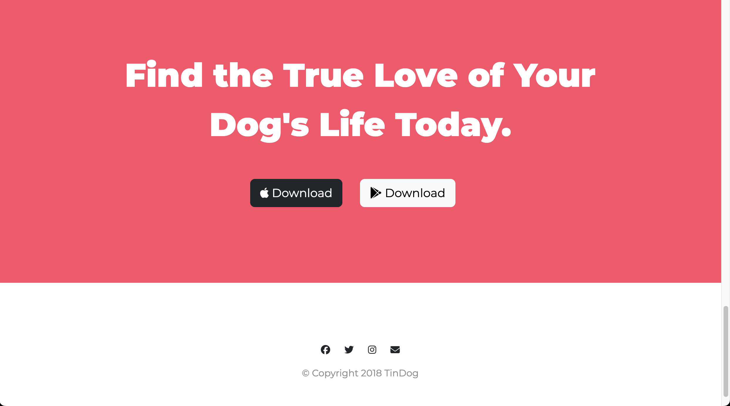
10. 콜 투 액션, 바닥글 스타일
🔍 유의 사항
CTA(Call To Action): 다운로드를 유도하는 문구 부분- 바닥글에 페이스북, 트위터, 인스타그램, 메일 아이콘 넣기
- 네비게이션 바의 연락처, 가격, 다운로드를 누르면 해당 부분으로 이동해야 한다
- 각 글자의 링크에
#id이름첨부
❖ 코드 리팩토링
- 코드의 성능을 유지하고 읽기 쉽도록 하기 위해 정기적인 리팩토링 필요
- 코드 리팩토링 기본 원칙(중요도 순)
- 가독성
- 모듈성
- 코드의 일부를 쉽게 재사용 가능해야 한다
- 문제가 생겼을 때, 어느 부분인지 정확한 범위를 좁힐 수 있어야 한다
- 효율성
- 효율적이고 빠른 코드
- 길이
- 가독성 향상을 위해 길이를 줄이는 것은 중요
- 단순히 길이만 줄이는 것은 좋은 방법이 아님
- 코드 골프 : 가능한 한 최소한의 코드로 목적을 달성하는 게임
11. 웹사이트 리팩토링
🔍 유의 사항
- h1, h2, h3 태그로 스타일을 지정하는 대신
정확한 위치에 클래스를 추가하여 따로 스타일링하기- 특정 코드가 어떤 패턴으로 반복되는지 체크하고 하나로 묶기
- 단순히 하나의 클래스로 묶기에 관련성이 없는 것들은 그대로 두기
🏗️ index.html
<!DOCTYPE html>
<html>
<head>
<meta charset="utf-8">
<meta name="viewport" content="width=device-width, initial-scale=1">
<title>TinDog</title>
<!-- 구글 폰트 -->
<link rel="preconnect" href="https://fonts.googleapis.com">
<link rel="preconnect" href="https://fonts.gstatic.com" crossorigin>
<!-- 폰트 어썸 -->
<script src="https://kit.fontawesome.com/cfaaaf681d.js" crossorigin="anonymous"></script>
<!-- 부트스트랩 CSS, JS 불러오기 -->
<link href="https://fonts.googleapis.com/css2?family=Montserrat:ital,wght@0,100..900;1,100..900&family=Ubuntu:ital,wght@0,300;0,400;0,500;0,700;1,300;1,400;1,500;1,700&display=swap" rel="stylesheet">
<link href="https://cdn.jsdelivr.net/npm/bootstrap@5.3.3/dist/css/bootstrap.min.css" rel="stylesheet" integrity="sha384-QWTKZyjpPEjISv5WaRU9OFeRpok6YctnYmDr5pNlyT2bRjXh0JMhjY6hW+ALEwIH" crossorigin="anonymous">
<!-- 사용자 지정 스타일(부트스트랩 CDN 다음에 작성해야 부트스트랩 스타일을 덮어쓸 수 있음) -->
<link rel="stylesheet" href="css/styles.css">
</head>
<body>
<section class="colored-section" id="title">
<!-- 내비게이션 바와 제목을 컨테이너로 묶기 -->
<div class="container-fluid">
<!-- Nav Bar -->
<nav class="navbar navbar-expand-lg navbar-dark">
<a class="navbar-brand" href="">tindog</a>
<button class="navbar-toggler" type="button" data-bs-toggle="collapse" data-bs-target="#navbarSupportedContent" aria-controls="navbarSupportedContent" aria-expanded="false" aria-label="Toggle navigation">
<span class="navbar-toggler-icon"></span>
</button>
<div class="collapse navbar-collapse" id="navbarSupportedContent">
<ul class="navbar-nav ms-auto">
<li class="nav-item">
<a class="nav-link" href="#footer">Contact</a>
</li>
<li class="nav-item">
<a class="nav-link" href="#pricing">Pricing</a>
</li>
<li class="nav-item">
<a class="nav-link" href="#footer">Download</a>
</li>
</ul>
</div>
</nav>
<!-- Title -->
<div class="row">
<div class="col-lg-6">
<h1 class="big-heading">Meet new and interesting dogs nearby.</h1>
<button type="button" class="btn btn-dark btn-lg download-button"><i class="fa-brands fa-apple"></i> Download</button>
<button type="button" class="btn btn-outline-light btn-lg download-button"><i class="fa-brands fa-google-play"></i> Download</button>
</div>
<div class="col-lg-6">
<img class="title-image" src="images/iphone6.png" alt="iphone-mockup">
</div>
</div>
</div>
</section>
<!-- Features -->
<section class="white-section" id="features">
<div class="container-fluid">
<div class="row">
<div class="feature-box col-lg-4">
<i class="icon fa-solid fa-circle-check fa-4x"></i>
<h3 class="feature-title">Easy to use.</h3>
<p>So easy to use, even your dog could do it.</p>
</div>
<div class="feature-box col-lg-4">
<i class="icon fa-solid fa-bullseye fa-4x"></i>
<h3 class="feature-title">Elite Clientele</h3>
<p>We have all the dogs, the greatest dogs.</p>
</div>
<div class="feature-box col-lg-4">
<i class="icon fa-solid fa-heart fa-4x"></i>
<h3 class="feature-title">Guaranteed to work.</h3>
<p>Find the love of your dog's life or your money back.</p>
</div>
</div>
</div>
</section>
<!-- Testimonials -->
<section class="colored-section" id="testimonials">
<div id="testimonial-carousel" class="carousel slide">
<div class="carousel-inner">
<div class="carousel-item active container-fluid">
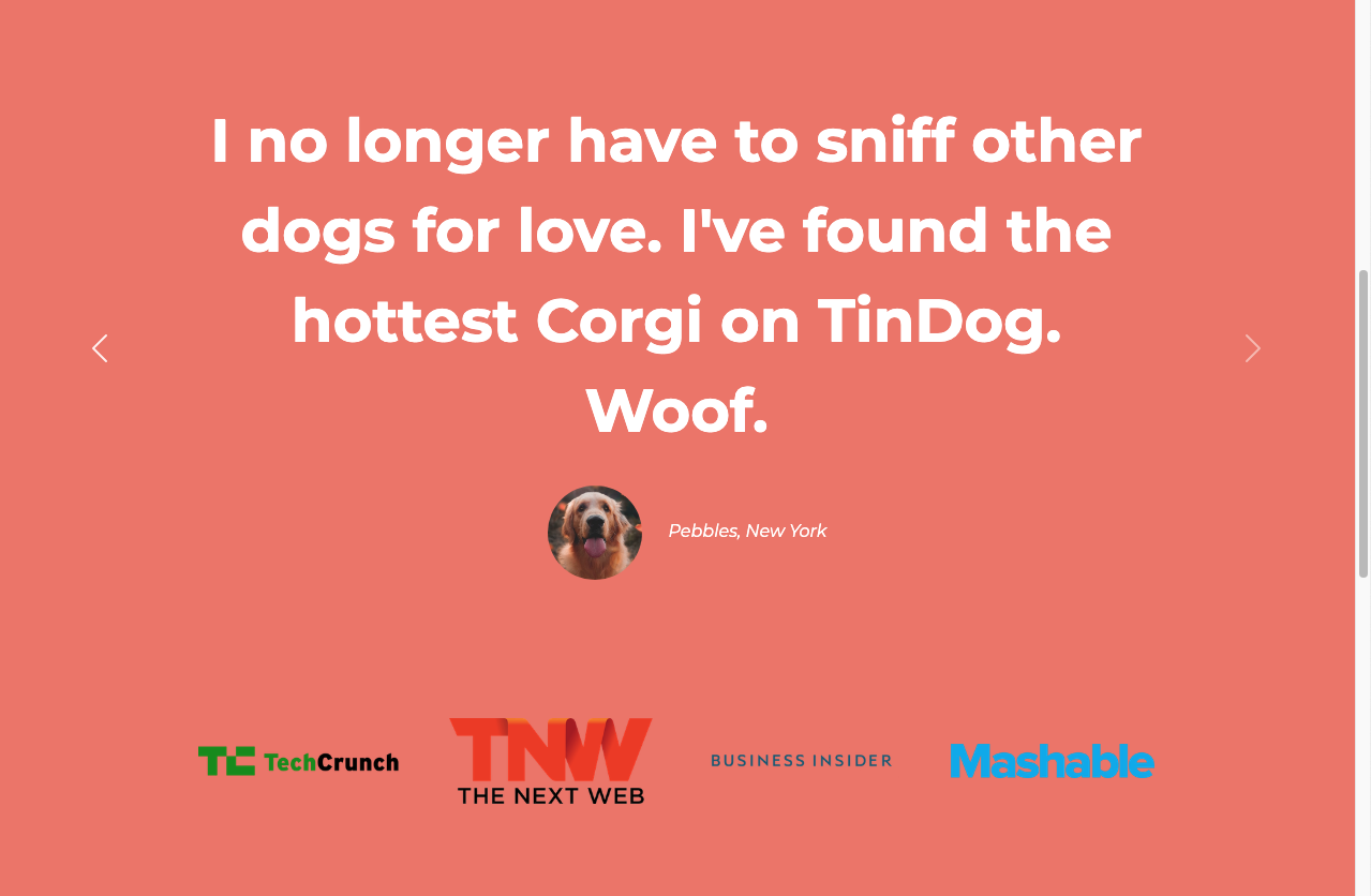
<h2 class="testimonial-text">I no longer have to sniff other dogs for love. I've found the hottest Corgi on TinDog. Woof.</h2>
<img class="testimonial-image" src="images/dog-img.jpg" alt="dog-profile">
<em>Pebbles, New York</em>
</div>
<div class="carousel-item container-fluid">
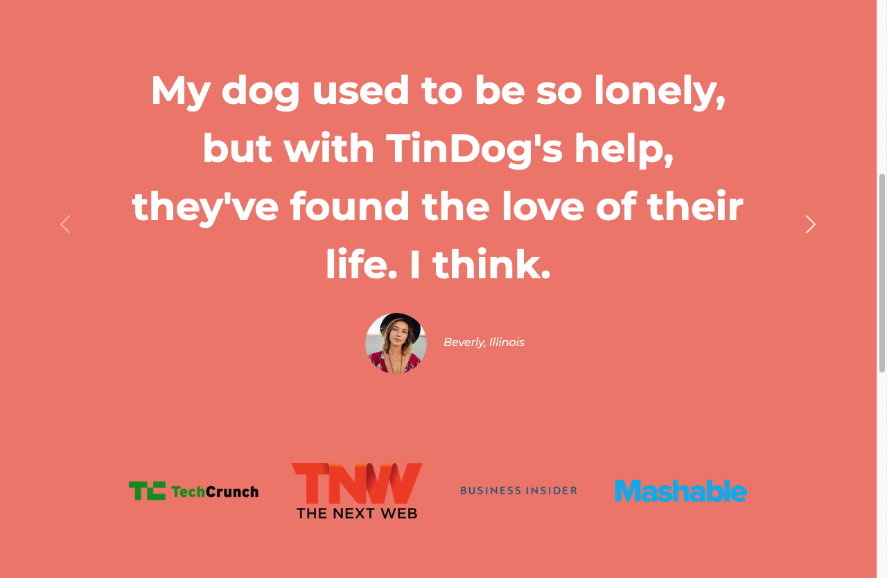
<h2 class="testimonial-text">My dog used to be so lonely, but with TinDog's help, they've found the love of their life. I think.</h2>
<img class="testimonial-image" src="images/lady-img.jpg" alt="lady-profile">
<em>Beverly, Illinois</em>
</div>
</div>
<button class="carousel-control-prev" type="button" data-bs-target="#testimonial-carousel" data-bs-slide="prev">
<span class="carousel-control-prev-icon" aria-hidden="true"></span>
<span class="visually-hidden">Previous</span>
</button>
<button class="carousel-control-next" type="button" data-bs-target="#testimonial-carousel" data-bs-slide="next">
<span class="carousel-control-next-icon" aria-hidden="true"></span>
<span class="visually-hidden">Next</span>
</button>
</div>
</div>
</section>
<!-- Press -->
<section class="colored-section" id="press">
<img class="press-logo" src="images/techcrunch.png" alt="tc-logo">
<img class="press-logo" src="images/tnw.png" alt="tnw-logo">
<img class="press-logo" src="images/bizinsider.png" alt="biz-insider-logo">
<img class="press-logo" src="images/mashable.png" alt="mashable-logo">
</section>
<!-- Pricing -->
<section class="white-section" id="pricing">
<h2 class="section-heading">A Plan for Every Dog's Needs</h2>
<p>Simple and affordable price plans for your and your dog.</p>
<div class="row">
<div class="pricing-column col-lg-4 col-md-6">
<div class="card">
<div class="card-header">
<h3>Chihuahua</h3>
</div>
<div class="card-body">
<h2 class="price-text">Free</h2>
<p>5 Matches Per Day</p>
<p>10 Messages Per Day</p>
<p>Unlimited App Usage</p>
<button type="button" class="btn btn-lg btn-outline-dark w-100">Sign Up</button>
</div>
</div>
</div>
<div class="pricing-column col-lg-4 col-md-6">
<div class="card">
<div class="card-header">
<h3>Labrador</h3>
</div>
<div class="card-body">
<h2 class="price-text">$49 / mo</h2>
<p>Unlimited Matches</p>
<p>Unlimited Messages</p>
<p>Unlimited App Usage</p>
<button type="button" class="btn btn-lg btn-dark w-100">Sign Up</button>
</div>
</div>
</div>
<div class="pricing-column col-lg-4">
<div class="card">
<div class="card-header">
<h3>Mastiff</h3>
</div>
<div class="card-body">
<h2 class="price-text">$99 / mo</h2>
<p>Pirority Listing</p>
<p>Unlimited Matches</p>
<p>Unlimited Messages</p>
<p>Unlimited App Usage</p>
<button type="button" class="btn btn-lg btn-dark w-100">Sign Up</button>
</div>
</div>
</div>
</div>
</section>
<!-- Call to Action -->
<section class="colored-section" id="cta">
<div class="container-fluid">
<h3 class="big-heading">Find the True Love of Your Dog's Life Today.</h3>
<button class="download-button btn btn-lg btn-dark" type="button"><i class="fa-brands fa-apple"></i> Download</button>
<button class="download-button btn btn-lg btn-light" type="button"><i class="fa-brands fa-google-play"></i> Download</button>
</div>
</section>
<!-- Footer -->
<footer class="white-section" id="footer">
<div class="container-fluid">
<i class="social-icon fa-brands fa-facebook"></i>
<i class="social-icon fa-brands fa-twitter"></i>
<i class="social-icon fa-brands fa-instagram"></i>
<i class="social-icon fa-solid fa-envelope"></i>
<p>© Copyright 2018 TinDog</p>
</div>
</footer>
<script src="https://cdn.jsdelivr.net/npm/bootstrap@5.3.3/dist/js/bootstrap.bundle.min.js" integrity="sha384-YvpcrYf0tY3lHB60NNkmXc5s9fDVZLESaAA55NDzOxhy9GkcIdslK1eN7N6jIeHz" crossorigin="anonymous"></script>
</body>
</html>🎨style.css
body {
  font-family: "Montserrat", serif;
  text-align: center;
}

h1, h2, h3, h4, h5, h6{
  font-family: "Montserrat", serif;
}

p {
  color: #8f8f8f;
}

/* 헤딩 */
.big-heading {
  font-size: 3.5rem;
  line-height: 1.5;
  font-weight: 900;
}

.section-heading {
  font-size: 3.5rem;
  line-height: 1.5;
  font-weight: 700;
}

/* 컨테이너 */
.container-fluid {
  padding: 7% 15%;
}

/* 배경색 */
.colored-section {
  background-color: #ff4c68;
  color: #fff;
}

.white-section {
  background-color: #fff;
}

/* 네비게이션 바 */
.navbar {
  padding-bottom: 4.5rem;
}

.navbar-brand {
  font-family: "Ubuntu", sans-serif;
  font-size: 2rem;
  font-weight: 700;
  font-style: normal;
}

.nav-item {
  padding: 0 18px;
}

.nav-link {
  font-size: 1.2rem;
  font-weight: 200;
}

/* 다운로드 버튼 */
.download-button {
  margin: 5% 3% 5% 0;
}

/* 타이틀 */
#title .container-fluid {  /* id가 title인 곳의 컨테이너 플루이드에만 적용*/
  padding: 3% 15% 7%;
  text-align: left;
}

/* 스마트폰 이미지 */
.col-lg-6 {
  position: relative;
}

.title-image {
  width: 60%;
  transform: rotate(25deg);
  position: absolute;
  right: 30%;
}

/* 기능*/
#features {
  position: relative;
}

.feature-title {
  font-size: 1.5rem;
  font-weight: 700;
}

.feature-box {
  padding: 4.5%;
}

.icon {
  color: #ef8172;
  margin-bottom: 1rem;
}

.icon:hover {
  color: #ff4c68;
}

/* 후기 */
#testimonials {
  background-color: #ef8172;
}

.testimonial-text {
  font-size: 3.5rem;
  line-height: 1.5;
  font-weight: 700;
}

.testimonial-image {
    width: 10%;
    border-radius: 100%;
    margin: 20px;
}

/* 언론 */
#press {
  background-color: #ef8172;
  padding-bottom: 3%;
}

.press-logo {
  width: 15%;
  margin: 20px 20px 50px;
}

/* 가격 */
#pricing {
  padding: 100px;
}

.price-text {
  font-size: 3rem;
  line-height: 1.5;
  font-weight: 700;
}

.pricing-column {
  padding: 3% 2%;
}

/* CTA */

/* 바닥글 */
.social-icon {
  margin: 20px 10px;
}

@media (max-width: 1028px) {
  #title {
      text-align: center;
  }
  .title-image {
      position: static;
      transform: rotate(0);
  }
}