
✔️ 서울시 범죄 현황 데이터 분석 1~4
1. 프로젝트 개요
→ 목표
- 아래 기사 스크랩처럼 실제 강남 3구가 범죄로부터 안전하다고 할 수 있는지 확인하기 위해 데이터를 가공하고 시각화 해보기

- 데이터 : 2016년 서울특별시 관서별 5대 범죄 현황
출처 : https://www.data.go.kr/data/15054738/fileData.do
2. 데이터 개요
- 데이터 읽기
import numpy as np
import pandas as pd

# thousands : 값에 (,)가 포함되었을 경우 문자열로 인식할 수 있어 숫자로 인식할 수 있도록 별도 설정
crime_raw_data = pd.read_csv("../data/02. crime_in_Seoul.csv", thousands=',', encoding='euc-kr')
crime_raw_data.head()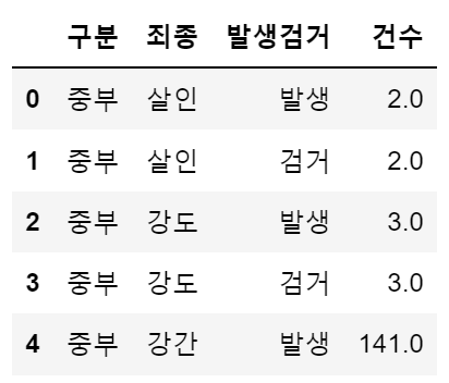
- info() : 데이터 개요 확인하기
crime_raw_data.info()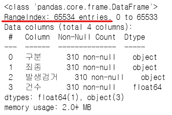 → RangeIndex가 65534인데, 실제 들어있는 값들은 310임을 확인
- unique() : 특정 컬럼에서 고윳값 조사
crime_raw_data['죄종'].unique()
# array(['살인', '강도', '강간', '절도', '폭력', nan], dtype=object)
→ NaN 값이 포함되어 있음
- NaN 값 삭제
crime_raw_data = crime_raw_data[crime_raw_data['죄종'].notnull()]
crime_raw_data.info()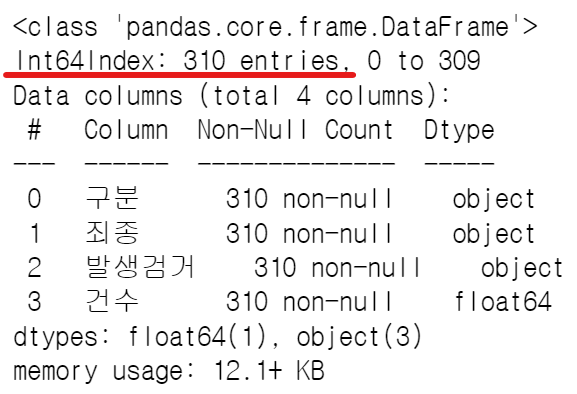
⭐ Pandas pivot table
예제로 알아보는 pivot table
- 구성요소 : index, columns, values, aggfunc
df = pd.read_excel('../data/02. sales-funnel.xlsx')
df.head()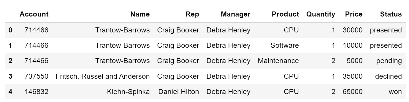
인덱스 설정
- 'Name' 컬럼을 인덱스로 설정
# 2가지 방법 모두 가능

# pd.pivot_table(df, index='Name')
df.pivot_table(index='Name')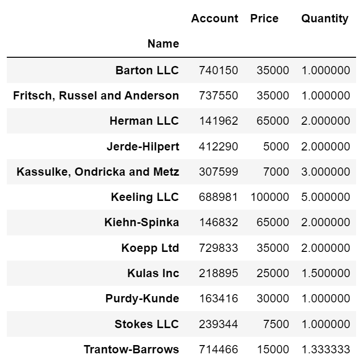
- 멀티 인덱스('Name', 'Rep', 'Manager') 설정
df.pivot_table(index=['Name', 'Rep', 'Manager'])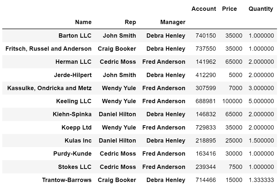
df.pivot_table(index=['Manager', 'Rep'])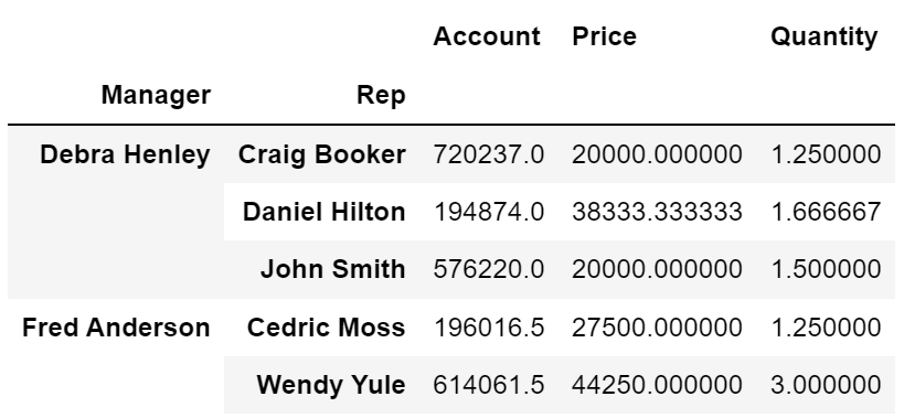
values 설정
- 'Price' 컬럼 sum 연산 적용
# aggfunc 연산 적용 하지 않으면 기본 mean 연산 적용
df.pivot_table(index=['Manager', 'Rep'], values='Price', aggfunc=np.sum)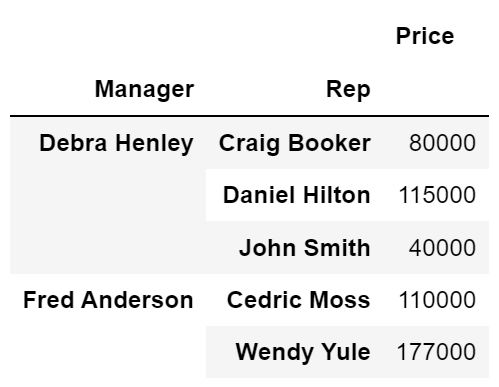
- 'Price' 컬럼 sum, len 연산 적용
df.pivot_table(index=['Manager', 'Rep'], values='Price', aggfunc=[np.sum, len])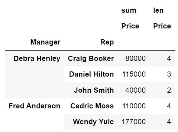
columns 설정
- 'Product'를 컬럼으로 지정
df.pivot_table(index=['Manager', 'Rep'], values='Price', columns='Product', aggfunc=np.sum)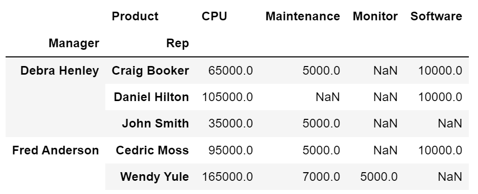
- fill_value : NaN 값을 0으로 설정
df.pivot_table(index=['Manager', 'Rep'], values='Price', columns='Product', aggfunc=np.sum, fill_value=0)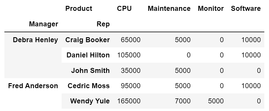
- 2개 이상 index, values 와 2개 이상 aggfunc 지정
df.pivot_table(index=['Manager', 'Rep', 'Product'],
               values=['Price', 'Quantity'],
               aggfunc=[np.sum, np.mean],
               fill_value=0,
               margins=True # 총계(All) 추가
              )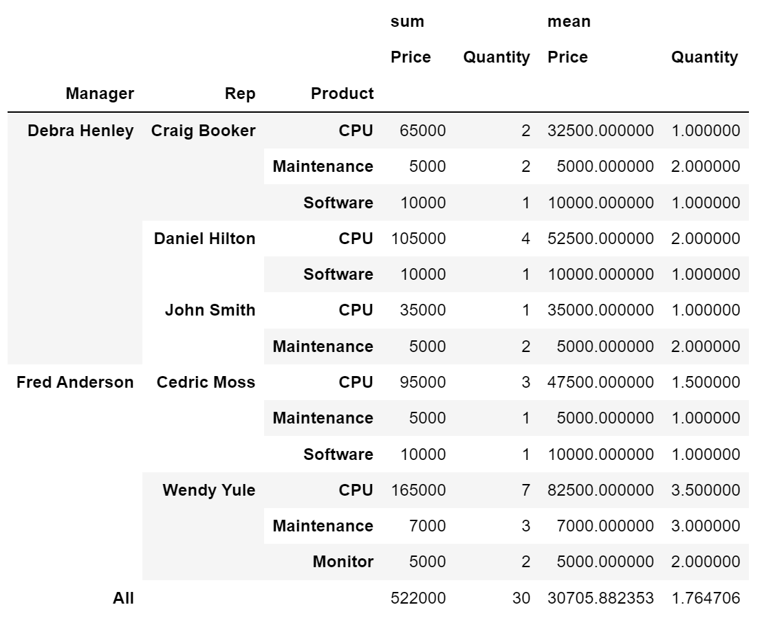
3. 서울시 범죄 현황 데이터 정리
crime_station = crime_raw_data.pivot_table(
    crime_raw_data,
    index='구분',
    columns=['죄종', '발생검거'],
    aggfunc=[np.sum]
)
crime_station.head()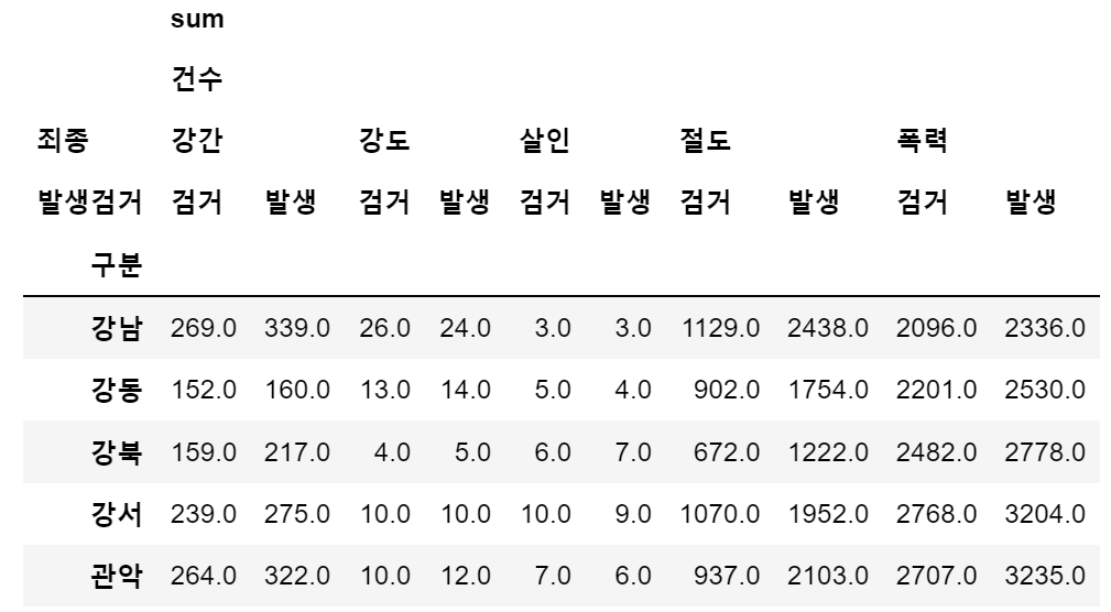
- index에 접근하는 방법
crime_station['sum', '건수', '강간', '검거'][:3]

# 출력
# 구분
# 강남    269.0
# 강동    152.0
# 강북 159.0- 다중컬럼에서 특정 컬럼('sum', '건수') 제거
crime_station.columns = crime_station.columns.droplevel([0,1])
crime_station.head()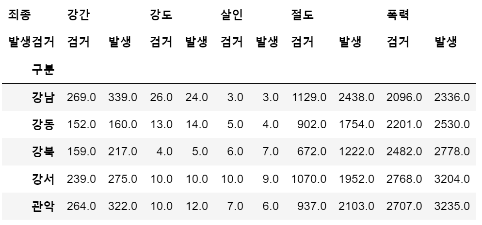
crime_station.index

# 출력
# Index(['강남', '강동', '강북', '강서', '관악', '광진', '구로', '금천', '남대문', '노원', '도봉',
#       '동대문', '동작', '마포', '방배', '서대문', '서부', '서초', '성동', '성북', '송파', '수서',
#       '양천', '영등포', '용산', '은평', '종로', '종암', '중랑', '중부', '혜화'],
#      dtype='object', name='구분')
→ 현재 인덱스는 경찰서 이름으로 되어있고, 경찰서 이름으로 구 이름을 알아내야 한다.
4. Python 모듈 설치
- pip 명령
- python의 공식 모듈 관리자
- pip install module_name
- pip uninstall module_name
- conda 명령
- conda list
- conda install module_name
- conda uninstall module_name
- 지정된 배포 채널에서 모듈 설치
- Windows, mac(intel)
5. Google Maps API 설치
- Windows, mac(intel)
- conda install -c conda-forge googlemaps
< 참고 >
- list comprehension : 여러줄의 코드를 한줄로 표현
# 1.
for n in range(0, 10):
    print(n ** 2)

# 2.
[n ** 2 for n in range(0, 10)]
- pandas에 잘 맞춰진 반복문용 명령 iterrows()
- Pandas 데이터 프레임은 대부분 2차원
- 이럴때 for문을 사용하면, n 번째라는 지정을 반복해서 가독률이 떨어짐
- Pandas 데이터 프레임으로 반복문을 만들때 iterrows() 옵션을 사용하면 편함
- 받을 때, 인덱스와 내용으로 나누어 받는 것만 주의
6. Google Maps를 이용한 데이터 정리
- '강남' 예로 데이터 확인
import googlemaps

gmaps_key = "IP 값"
gmaps = googlemaps.Client(key=gmaps_key)

gmaps.geocode('서울영등포경찰서', language='ko')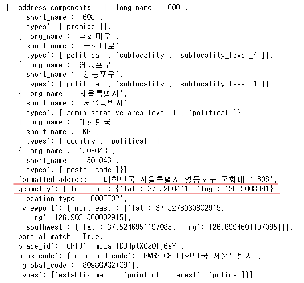
tmp = gmaps.geocode('서울영등포경찰서', language='ko')

print(tmp[0].get('geometry')['location'])	# {'lat': 37.5260441, 'lng': 126.9008091}
print(tmp[0].get('geometry')['location']['lat']) 	# 37.5260441 → 위도(Latitude)
print(tmp[0].get('geometry')['location']['lng']) 	# 126.9008091 → 경도(Longitude)

print(tmp[0].get('formatted_address'))		# '대한민국 서울특별시 영등포구 국회대로 608'

# 띄어쓰기로 저장되어있는 주소를 각각 리스트에 담은 후 찾고자 하는 값 위치의 인덱스로 확인
print(tmp[0].get('formatted_address').split()[2]) # '영등포구'- '구별', 'lat', 'lng' 컬럼 추가 (일단 NaN 값으로 할당)
crime_station['구별'] = np.nan
crime_station['lat'] = np.nan
crime_station['lng'] = np.nan- 경찰서 이름에서 소속된 구 이름 얻기
- 구이름과 위도 경도 정보를 저장할 준비
- 반복문을 이용해서 NaN을 구 이름으로 할당
- iterrows() 메서드의 데이터 형태 : (index, row_series) → DataFrame 형태로 출력
for idx, rows in crime_station.iterrows():
    station_name = '서울' + str(idx) + '경찰서'
    # print(station_name)
    tmp = gmaps.geocode(station_name,language='ko')

    # tmp[0].get('formated_address')
    tmp_gu = tmp[0].get('formatted_address')

    lat = tmp[0].get('geometry')['location']['lat']
    lng = tmp[0].get('geometry')['location']['lng']

    crime_station.loc[idx, 'lat'] = lat
    crime_station.loc[idx, 'lng'] = lng
crime_station.loc[idx, '구별'] = tmp_gu.split()[2] # 영등포구 와 같은 값만 저장print(crime_station.columns.get_level_values(0))
# Index(['강간', '강간', '강도', '강도', '살인', '살인', '절도', '절도', '폭력', '폭력', '구별', 'lat', 'lng'],
# dtype='object', name='죄종')
print(crime_station.columns.get_level_values(1))
# Index(['검거', '발생', '검거', '발생', '검거', '발생', '검거', '발생', '검거', '발생', '', '', ''],
# dtype='object', name='발생검거')
print(crime_station.columns.get_level_values(0)[2]) # '강도'- 중복되는 컬럼들 합치기
tmp = [
    crime_station.columns.get_level_values(0)[n] + crime_station.columns.get_level_values(1)[n]
    for n in range(0, len(crime_station.columns.get_level_values(0)))
]
print(tmp)
# ['강간검거', '강간발생', '강도검거', '강도발생', '살인검거', '살인발생', '절도검거', '절도발생', '폭력검거', '폭력발생', '구별', 'lat', 'lng']

crime_station.columns = tmp
crime_station.head()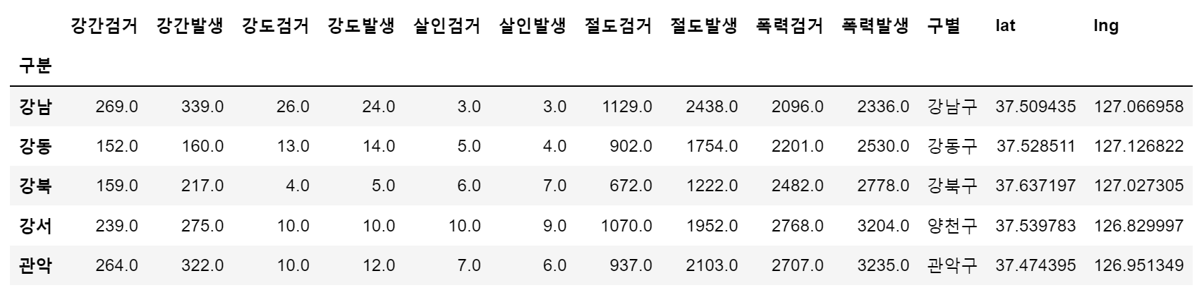
- 데이터 저장('02. crime_in_Seoul_raw.csv')
crime_station.to_csv('../data/02. crime_in_Seoul_raw.csv', sep=',', encoding='utf-8')7. 구별 데이터로 정리
- pivot_table() 사용하여 테이블 생성(crime_anal_gu)
crime_anal_station = pd.read_csv('../data/02. crime_in_Seoul_raw.csv',
								index_col=0, encoding='utf-8')
							  # index_col : 0 컬럼('구분')을 인덱스로 지정

# '구별'로 테이블 재조정
crime_anal_gu = pd.pivot_table(crime_anal_station, index='구별', aggfunc=np.sum)

# 좌표값('lat', 'lan')은 필요없는 데이터이므로 삭제
del crime_anal_gu['lat']							# 컬럼 삭제 방법 1
crime_anal_gu.drop('lng', axis=1, inplace=True)		# 컬럼 삭제 방법 2

crime_anal_gu.head()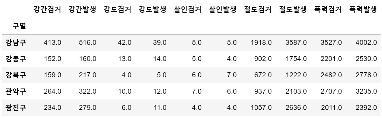
- '검거율' 컬럼 추가

# 다수의 컬럼을 다수의 컬럼으로 각각 나누기
target = ['강간검거율', '강도검거율', '살인검거율', '절도검거율', '폭력검거율']
num = ['강간검거','강도검거','살인검거','절도검거','폭력검거']
den = ['강간발생','강도발생','살인발생','절도발생','폭력발생']

crime_anal_gu[target] = crime_anal_gu[num].div(crime_anal_gu[den].values, axis=0) * 100
crime_anal_gu.head()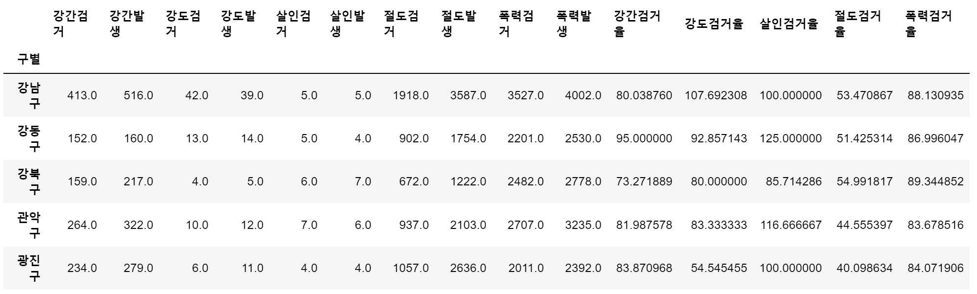
# 필요 없는 컬럼 제거
del crime_anal_gu['강간검거']
del crime_anal_gu['강도검거']
crime_anal_gu.drop(['살인검거', '절도검거', '폭력검거'], axis=1, inplace=True)

# 검거율 중에서 100보다 큰 값 찾아서 바꾸기
crime_anal_gu[crime_anal_gu[target]>100] = 100
crime_anal_gu.head()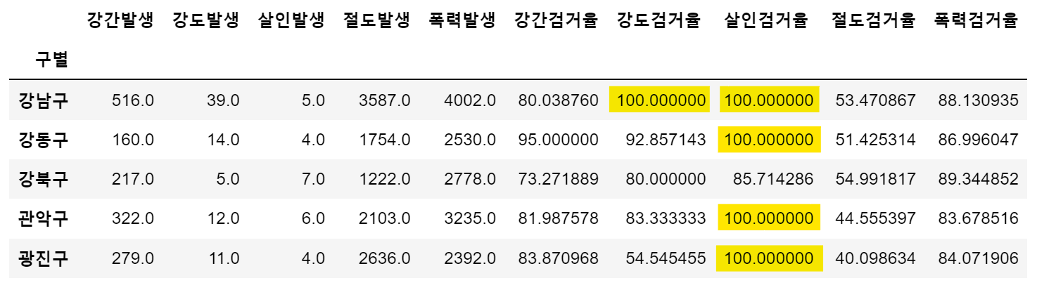
- 컬럼 이름 변경
crime_anal_gu.rename(columns={'강간발생':'강간', '강도발생':'강도', '살인발생':'살인',
                      '절도발생':'절도', '폭력발생':'폭력'}, inplace=True)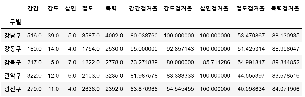
8. 범죄 데이터 정렬을 위한 데이터 정리
# 정규화 수행 (최고값은 1, 최소값은 0)
col = ['강간', '강도', '살인', '절도', '폭력']
crime_anal_norm = crime_anal_gu[col] / crime_anal_gu[col].max()

# 검거율 추가
col2 = ['강간검거율','강도검거율','살인검거율','절도검거율','폭력검거율']
crime_anal_norm[col2] = crime_anal_gu[col2]

crime_anal_norm.head()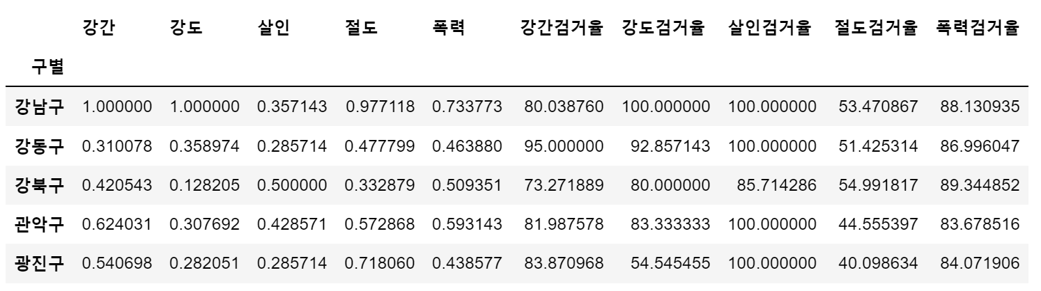
- 구별 CCTV 자료에서 인구수와 CCTV 수 추가
result_CCTV = pd.read_csv("../data/01. CCTV_result.csv", index_col='구별', encoding='utf-8')

crime_anal_norm[['인구수', 'CCTV']] = result_CCTV[['인구수', '소계']]
crime_anal_norm.head()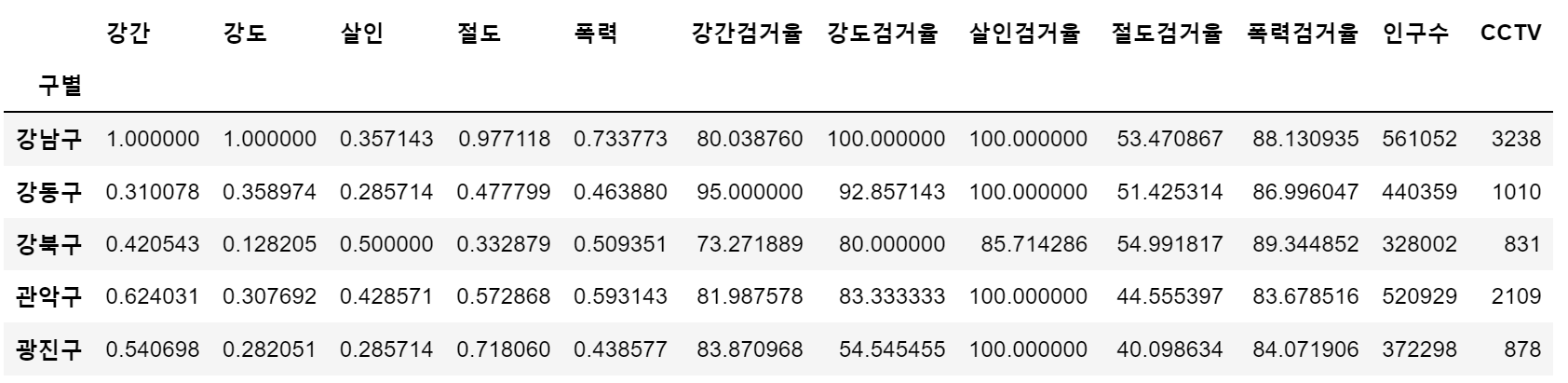
- 정규화된 5대 범죄발생 건수 전체의 평균을 구해서 '범죄' 컬럼 대표값으로 사용
col = ['강간', '강도', '살인', '절도', '폭력']
crime_anal_norm['범죄'] = np.mean(crime_anal_norm[col], axis=1)
# axis = 1 행 기준 계산, axis = 0 열 기준 계산 (pandas 와 반대)- 5대 범죄 검거율의 평균을 구해서 '검거' 컬럼의 대표값으로 사용
col = ['강간검거율', '강도검거율', '살인검거율', '절도검거율', '폭력검거율']
crime_anal_norm['검거'] = np.mean(crime_anal_norm[col], axis=1)
						# axis=1 행 기준 계산
crime_anal_norm.head()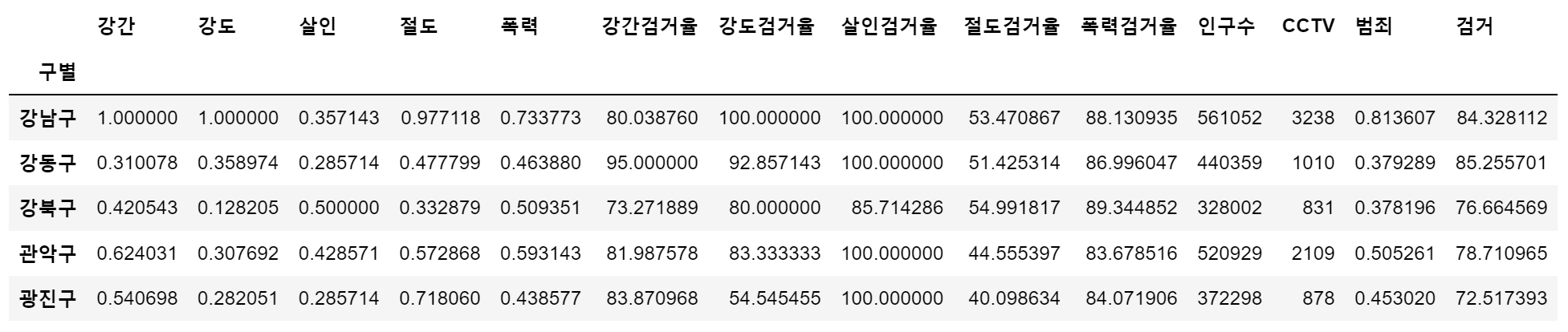
np.mean()
np.array([0.310078, 0.358974, 0.285714, 0.477799, 0.463880])
# array([0.310078, 0.358974, 0.285714, 0.477799, 0.46388 ])

np.mean(np.array([0.310078, 0.358974, 0.285714, 0.477799, 0.463880]))
# 0.379289

np.array( [[1.000000, 1.000000, 0.357143, 0.977118, 0.733773],
     [0.310078, 0.358974, 0.285714, 0.477799, 0.463880]] )
# array([0.8136068, 0.379289 ])

np.mean(np.array(
    [[1.000000, 1.000000, 0.357143, 0.977118, 0.733773],
     [0.310078, 0.358974, 0.285714, 0.477799, 0.463880]]
), axis=0) # axis = 1 행기준 계산, axis = 0 열 기준 계산 (pandas 와 반대)
# array([0.655039 , 0.679487 , 0.3214285, 0.7274585, 0.5988265])
⭐ Seaborn
- 모듈 설치 : !conda install -y seaborn
- 모듈 사용
import numpy as np
import pandas as pd
import matplotlib.pyplot as plt
import seaborn as sns
from matplotlib import rc

plt.rcParams['axes.unicode_minus'] = False
rc('font', family='Malgun Gothic')
%matplotlib inline
#get_ipython().run_line_magic('matplotlib', 'inline')
예제 1 : seaborn 기초
x = np.linspace(0, 14, 100)
y1 = np.sin(x)
y2 = np.sin(x + 0.5)
y3 = 2 * np.sin(x + 1.0)
y4 = 3 * np.sin(x + 1.5)

# sns.set_style() : white, dark, whitegrid, darkgrid
sns.set_style('white')
plt.figure(figsize=(10, 6))
plt.plot(x, y1, x, y2, x, y3, x, y4)
plt.show()

sns.set_style('darkgrid')
plt.figure(figsize=(10, 6))
plt.plot(x, y1, x, y2, x, y3, x, y4)
plt.show()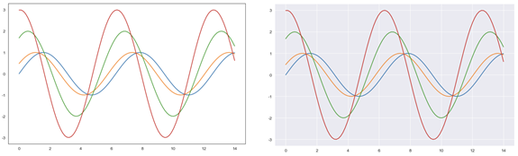
예제 2 : seaborn tips data
- boxplot
- swarmplot
- lmplot
tips = sns.load_dataset('tips')
print(tips.info())
tips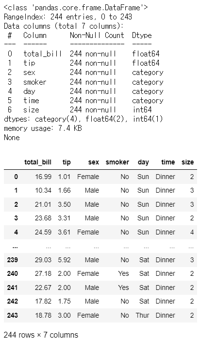
boxplot
plt.figure(figsize=(8,6))
sns.boxplot(x=tips['total_bill'])
plt.show()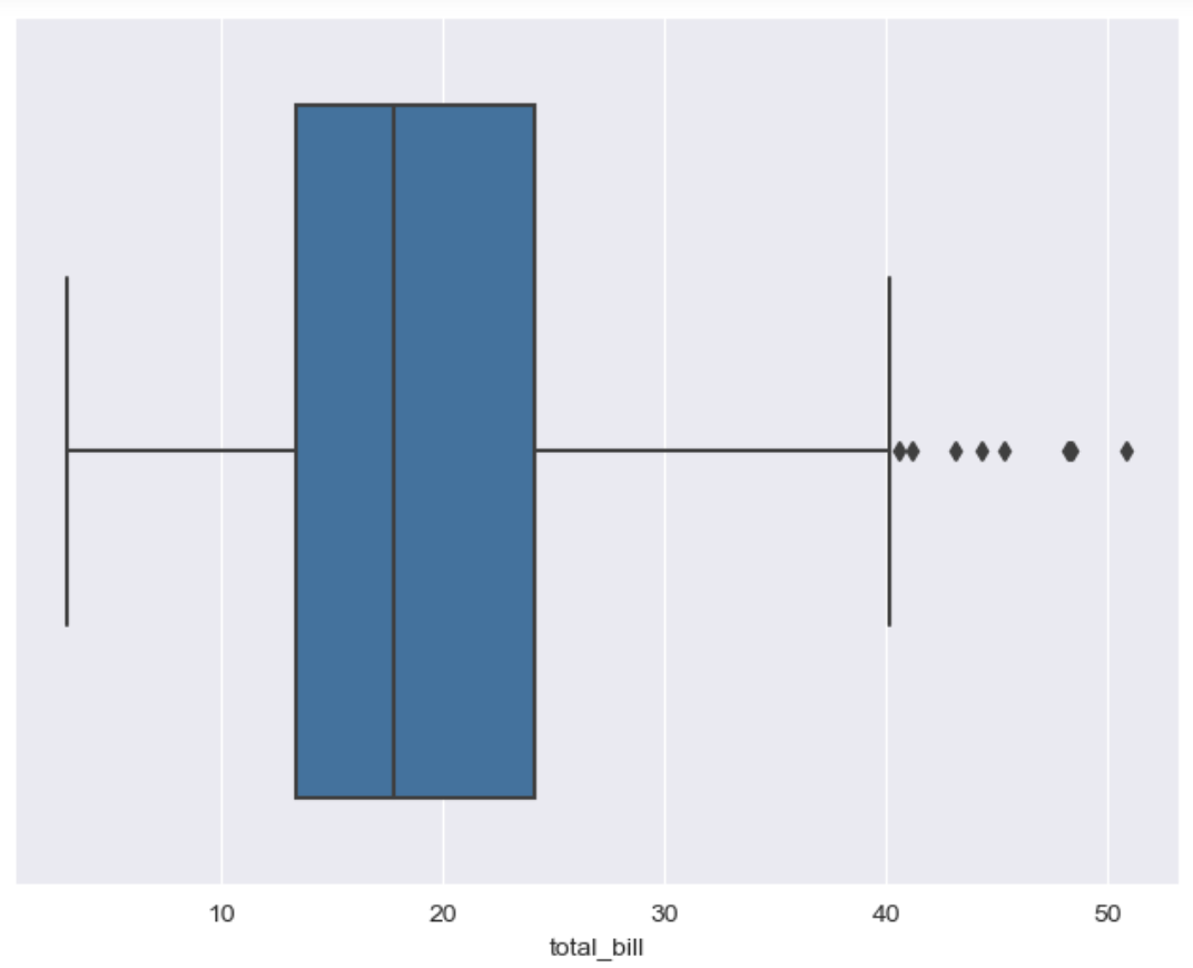
tips['day'].unique() # ['Sun', 'Sat', 'Thur', 'Fri'] # Categories (4, object): ['Thur', 'Fri', 'Sat', 'Sun']plt.figure(figsize=(8,6)) sns.boxplot(x='day', y = 'total_bill', data=tips) plt.show()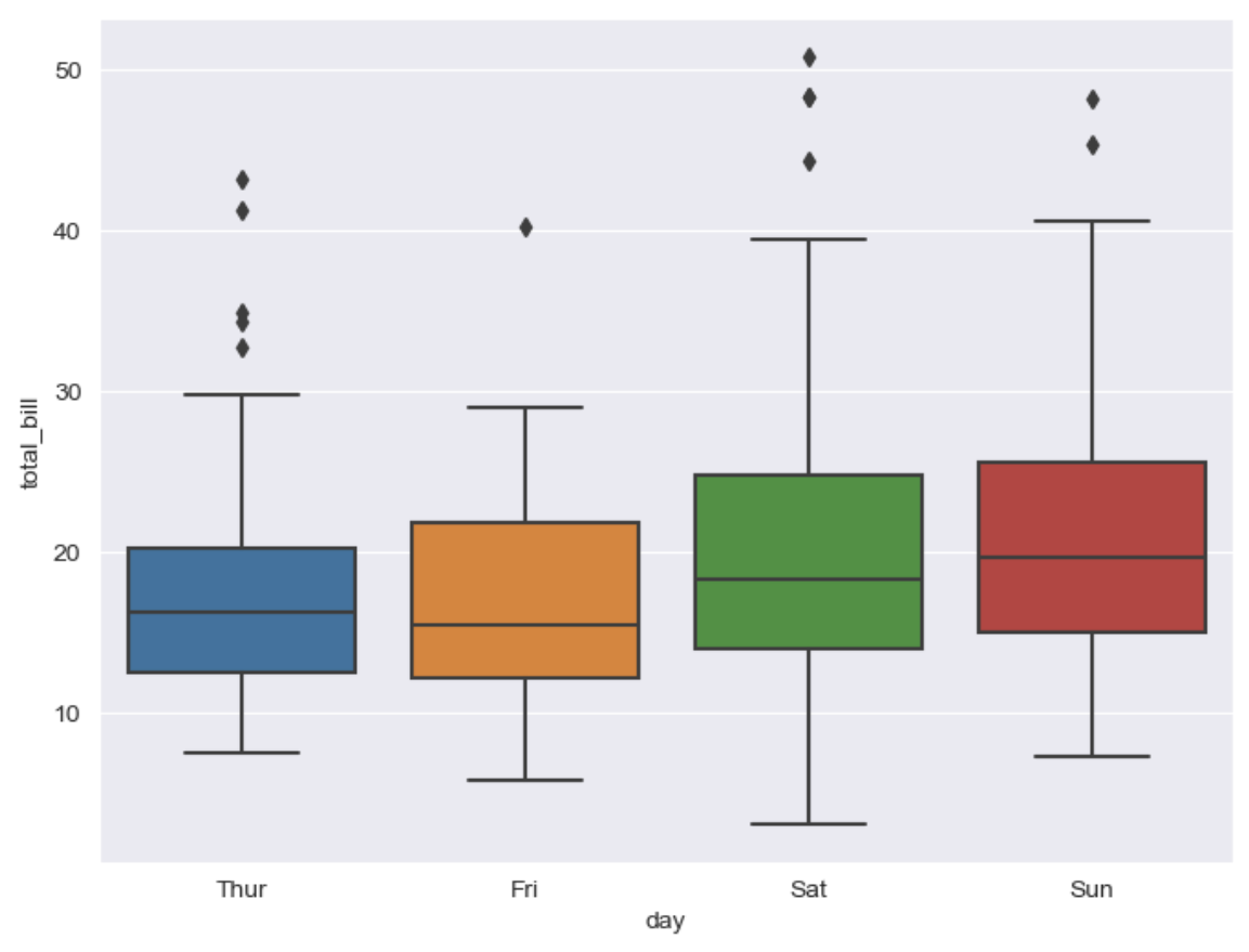
plt.figure(figsize=(8, 6))
sns.boxplot(x='day', y='total_bill', data=tips, hue='smoker', palette='Set1')
					# hue(카테고리를 나눠서 볼 수 있는 옵션), palette(set 1~3 색상) option 설정
plt.show()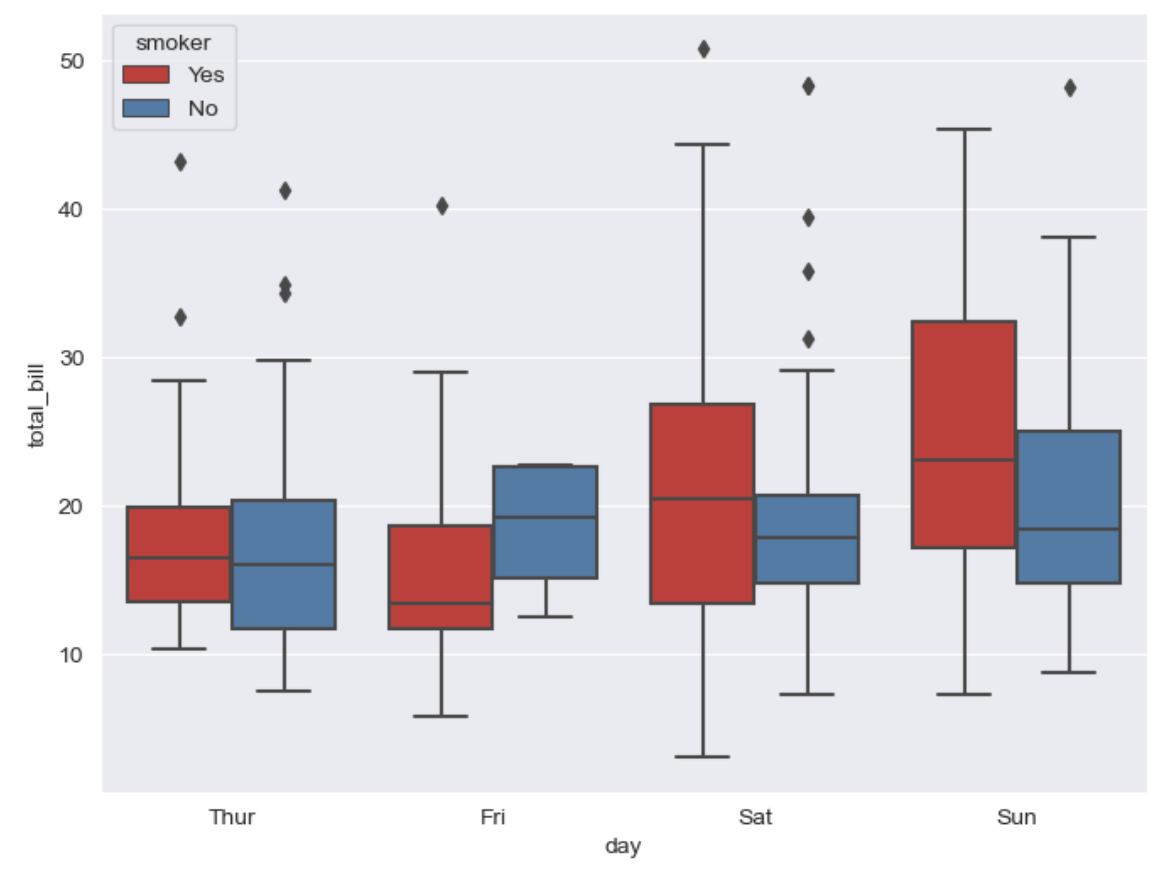
swarmplot
plt.figure(figsize=(8, 6))
sns.swarmplot(x='day', y='total_bill', data=tips, color='0.5')
											  # color : 0(검은색)~1(흰색) 사이값을 조절
plt.show()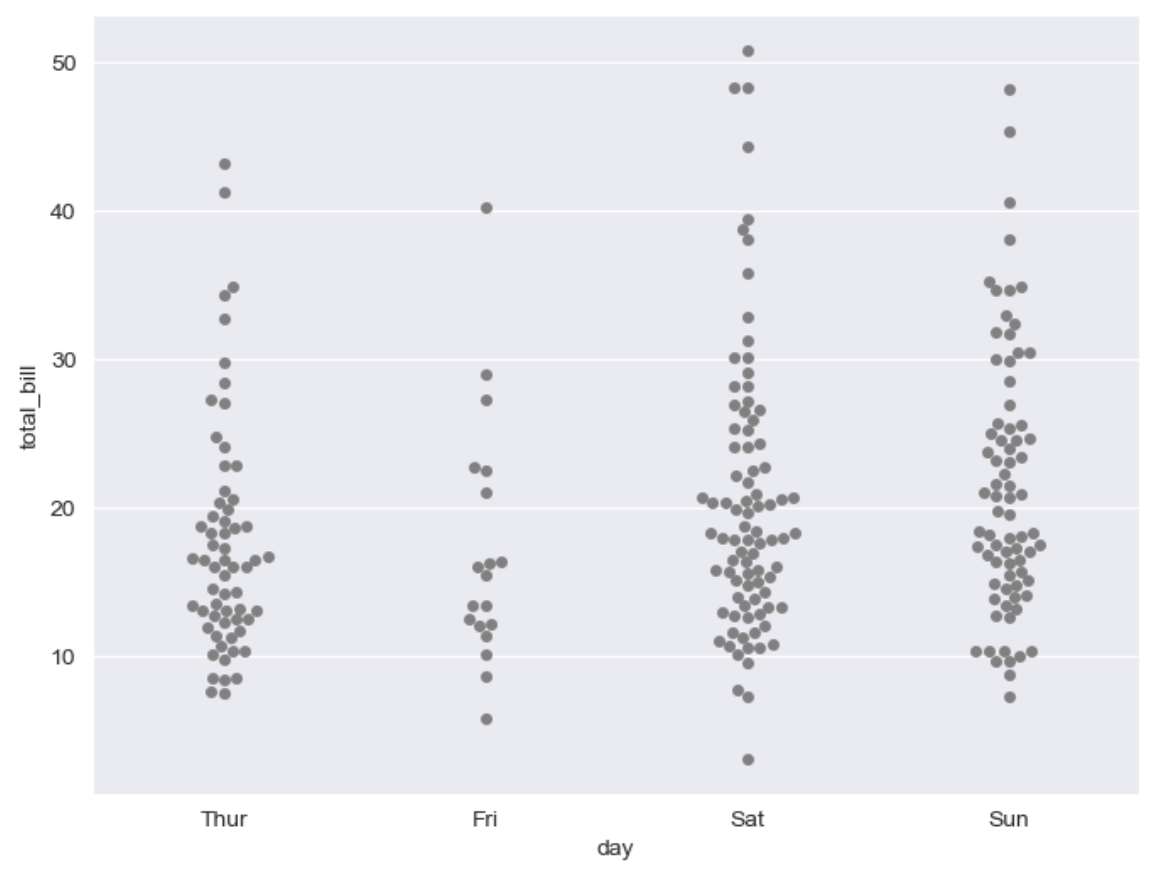
boxplot with swarmplot
plt.figure(figsize=(8,6)) sns.boxplot(x='day', y='total_bill', data=tips) sns.swarmplot(x='day', y='total_bill', data=tips, color='0.25') plt.show()![]()
lmplot
- column 간 선형관계를 확인하기에 용이한 차트
- total_bill과 tip 사이의 관계를 파악할때 사용sns.set_style('darkgrid') sns.lmplot(x='total_bill', y='tip', data=tips, height=5) # size 옵션 → height 옵션명 변경됨 plt.show()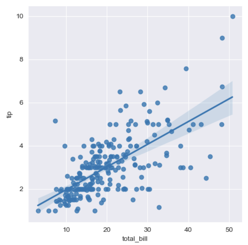
sns.set_style('darkgrid')
sns.lmplot(x='total_bill', y='tip', data=tips, height=7, hue='smoker')
													# hue 옵션 - category 분류
plt.show()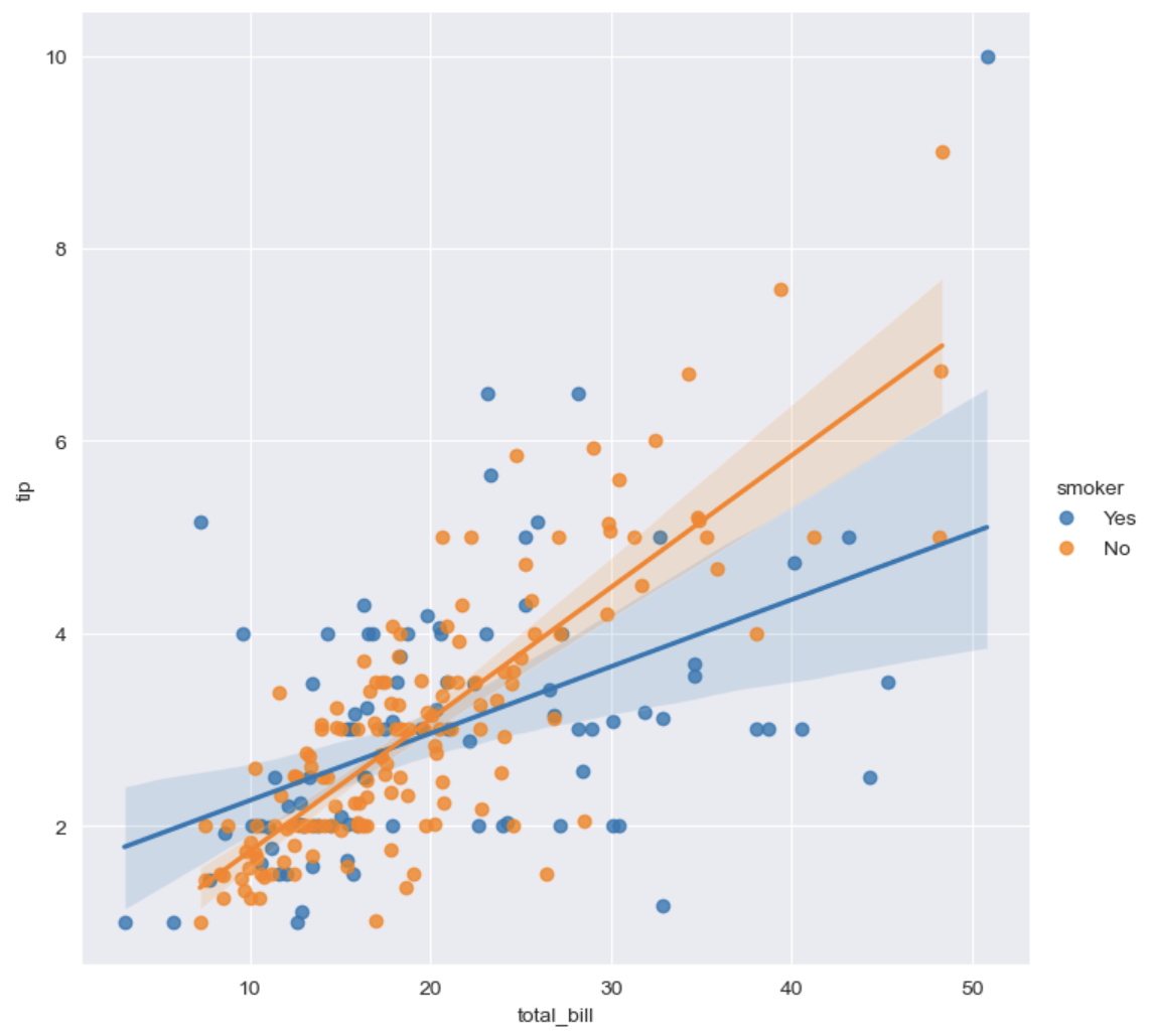
예제 3 : flights data
flights = sns.load_dataset('flights')
print(flights.info())
flights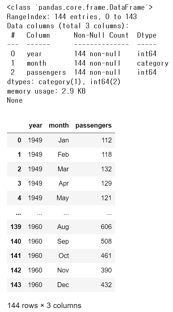
# pivot 요소 : index, columns, values
flights = flights.pivot(index='month', columns='year', values='passengers')
flights.head()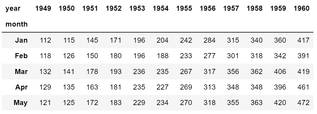
heatmap
# annot=True 는 데이터 값을 표시할건지 False 말건지
# fmt='d' 정수형으로 표시, 'f' 실수형으로 표시
# colormap → cmap 색상 지정(sns 색상 링크 참조: https://matplotlib.org/stable/tutorials/colors/colormaps.html)

plt.figure(figsize=(8, 6))
sns.heatmap(flights, annot=True, fmt='d', cmap='YlGnBu')
plt.show()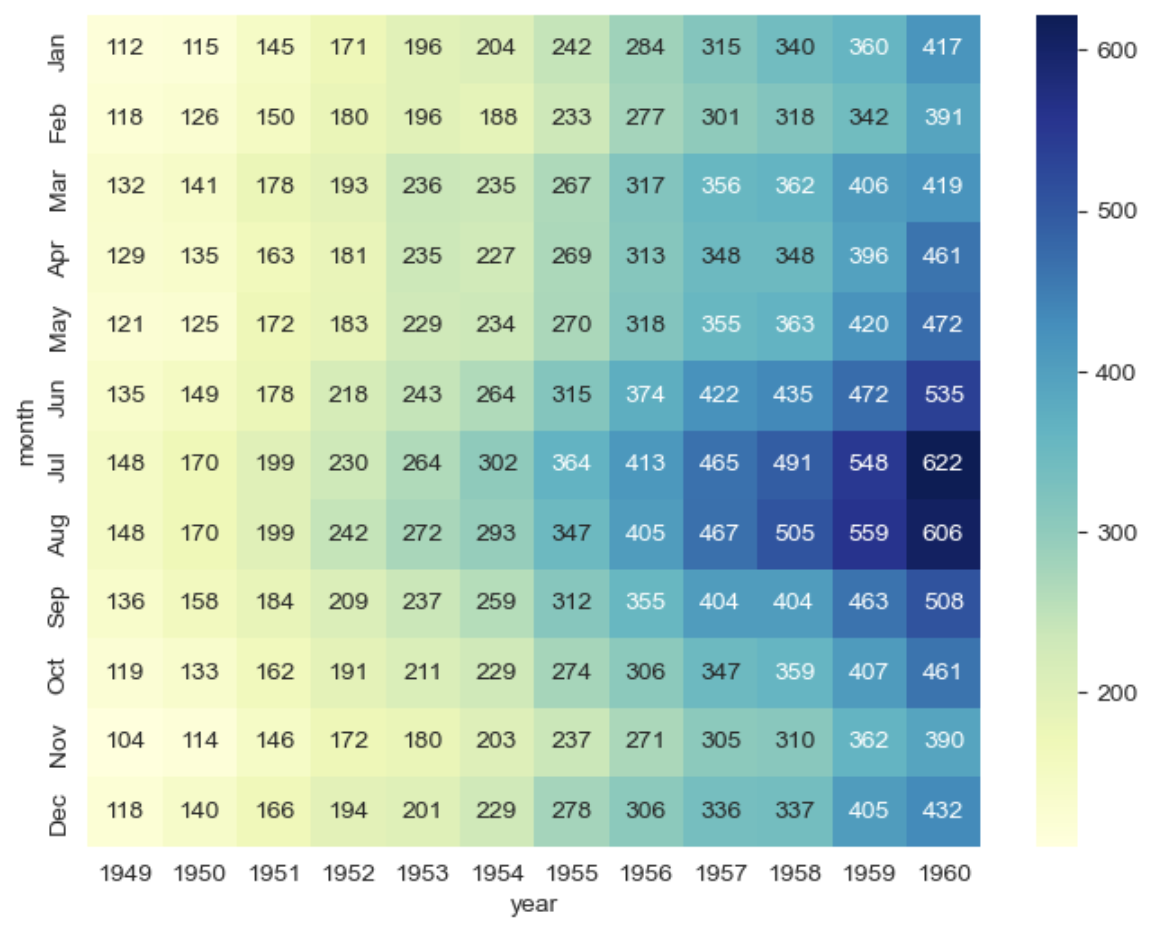
예제 4 : Iris data
iris = sns.load_dataset('iris')
print(iris.info())
# iris.tail()
iris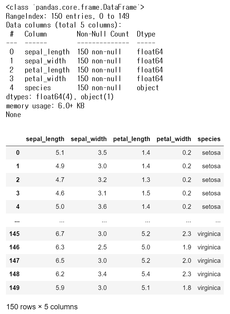
pairplot
sns.set_style('ticks')
sns.pairplot(iris)
plt.show()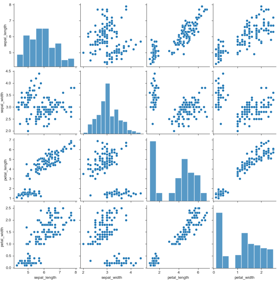
iris['species'].unique() # array(['setosa', 'versicolor', 'virginica'], dtype=object)sns.pairplot(iris, hue='species') # hue : 카테고리로 분류 plt.show()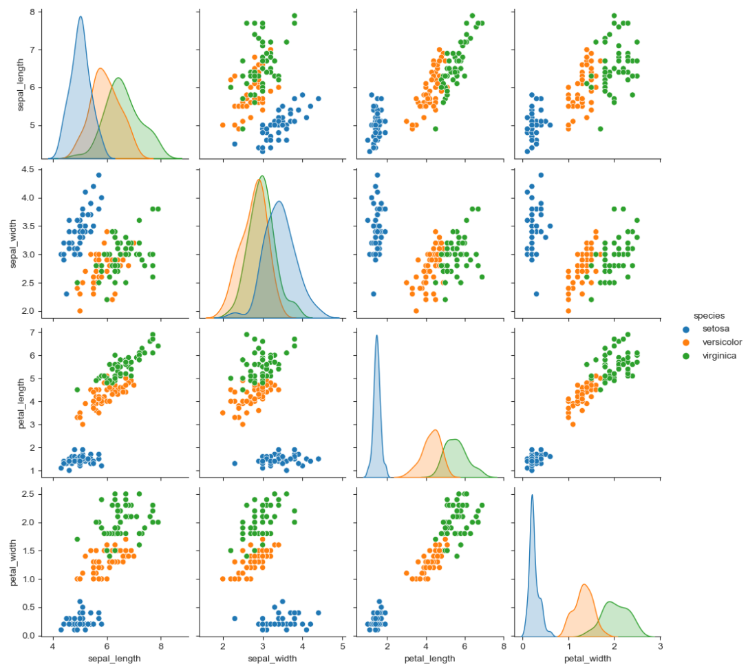
- 원하는 컬럼만 pairplot
sns.pairplot(iris,
             x_vars=['sepal_width', 'sepal_length'],
             y_vars=['petal_width', 'petal_length'])
plt.show()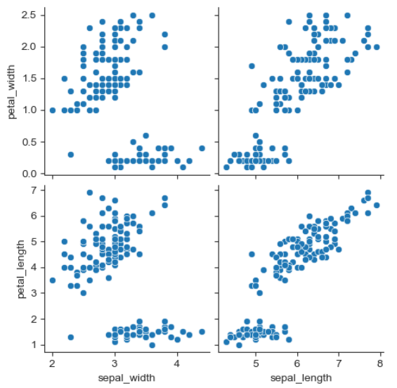
예제 5 : anscombe data
anscombe = sns.load_dataset('anscombe')
print(anscombe.info())
anscombe.head()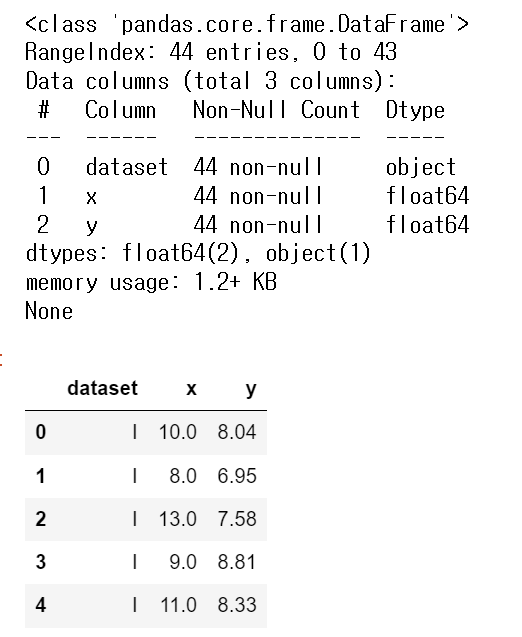
anscombe['dataset'].unique() # array(['I', 'II', 'III', 'IV'], dtype=object)
- lmplot
- column 간의 선형관계를 확인하기에 용이한 차트
- outlier 파악 가능# 선형회귀 그래프 sns.set_style('darkgrid') sns.lmplot(x='x', y='y', data=anscombe.query('dataset == "I"'), ci=None, height=5, scatter_kws={'s':50}) # ci:신뢰구간 선택 옵션 # scatter_kws: 점 크기 설정 plt.show()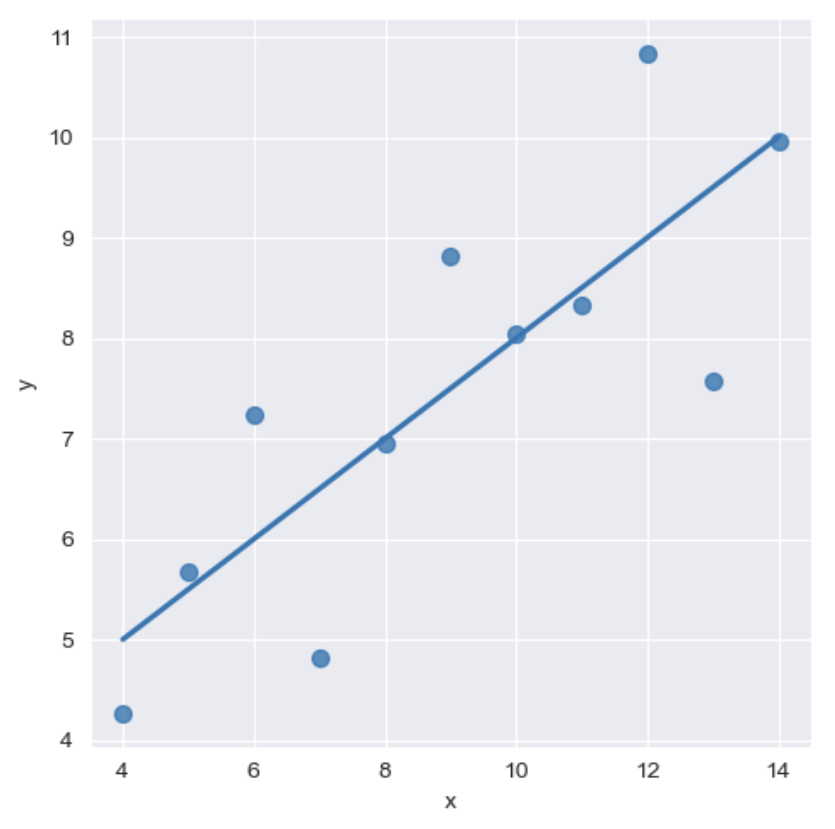
sns.set_style('darkgrid')
sns.lmplot(x='x',
           y='y',
           data=anscombe.query('dataset == "II"'),
           order = 2,  # order: 다항식 회귀선을 설정 (1: 일차원, 2: 이차원)
           ci=None,
           height=5,
           scatter_kws={'s':50}
          )
plt.show()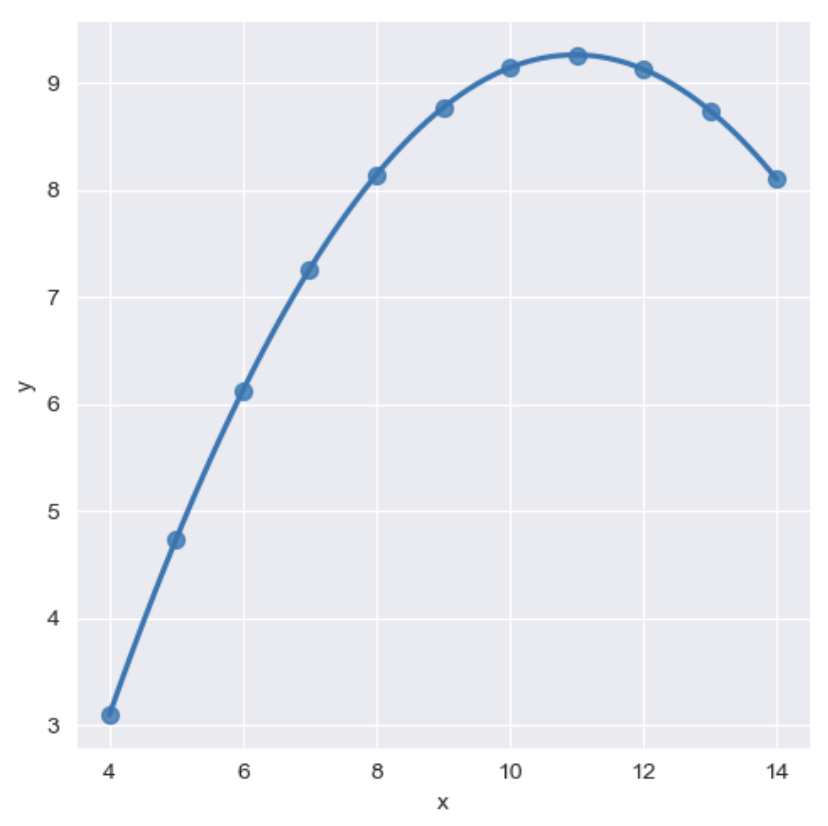
- outlier(이상치) 조정
sns.set_style('darkgrid')
sns.lmplot(x='x',
           y='y',
           data=anscombe.query('dataset == "III"'),
           robust=True,   # outlier(이상치)의 가중치를 줄여주는 옵션
           ci=None,
           height=5,
           scatter_kws={'s':50}
          )
plt.show()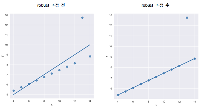
9. 서울시 범죄현황 데이터 시각화
import matplotlib.pyplot as plt
import seaborn as sns
from matplotlib import rc

plt.rcParams['axes.unicode_minus'] = False
%matplotlib inline
rc('font', family='Malgun Gothic')

crime_anal_norm.head()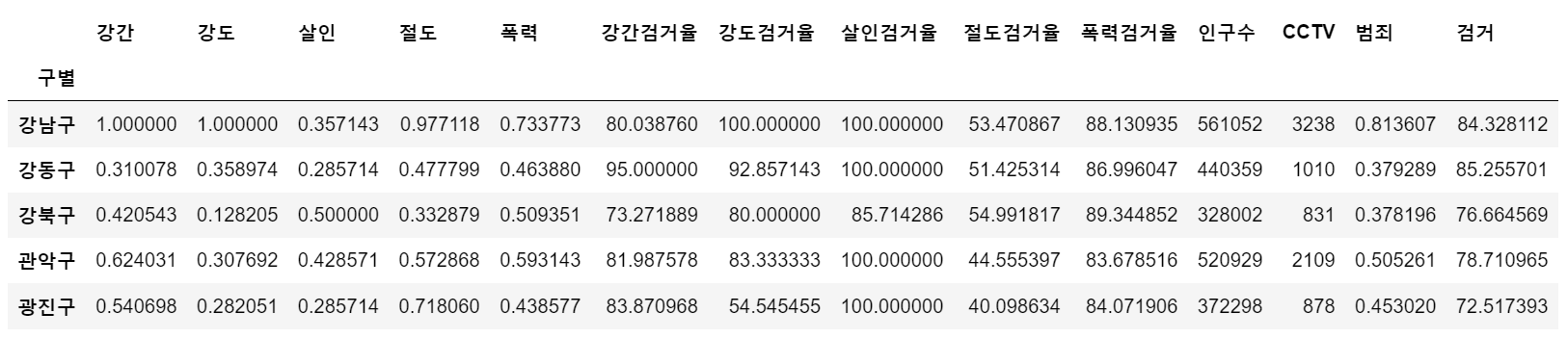
- pairplot으로 '강도', '살인', '폭력'에 대한 상관관계 확인
# kind 옵션 : {'scatter', 'kde'-커널밀도히스토그램(등고선), 'hist', 'reg'-회귀분석}
sns.pairplot(data=crime_anal_norm, vars=['강도', '살인', '폭력'], kind='reg', height=3)
plt.show()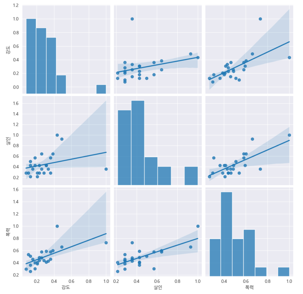
- '인구수', 'CCTV'와 '살인', '강도'의 상관관계를 확인
def drawGraph():
    sns.pairplot(data=crime_anal_norm,
                 x_vars=['인구수', 'CCTV'],
                 y_vars=['살인', '강도'],
                 kind='reg',
                 height=4
                )
    plt.show()

drawGraph()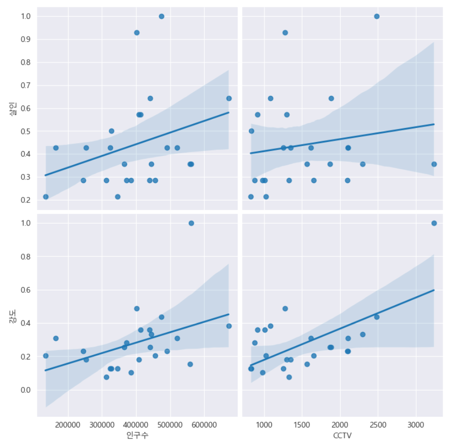
- '인구수', 'CCTV'와 '살인검거율', '폭력검거율'의 상관관계 확인
def drawGraph():
    sns.pairplot(data=crime_anal_norm,
                 x_vars=['인구수', 'CCTV'],
                 y_vars=['살인검거율', '폭력검거율'],
                 kind='reg',
                 height=4
                )
    plt.show()

drawGraph()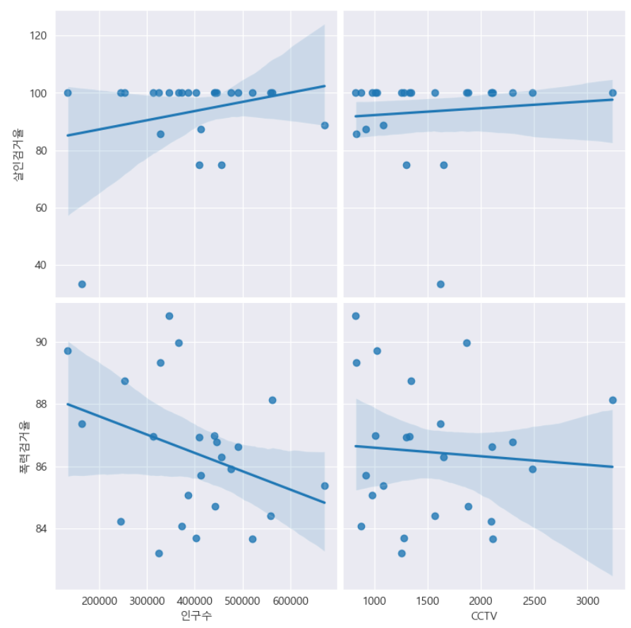
- '인구수', 'CCTV'와 '절도검거율', '강도검거율'의 상관관계 확인
def drawGraph():
    sns.pairplot(data=crime_anal_norm,
                 x_vars=['인구수', 'CCTV'],
                 y_vars=['절도검거율', '강도검거율'],
                 kind='reg',
                 height=4
                )
    plt.show()

drawGraph()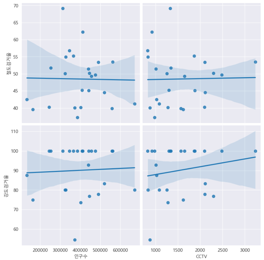
- '검거' 컬럼을 기준으로 정렬한 후 '검거율'로 heatmap 그리기
def drawGraph():

    # 데이터 프레임 생성
    target_col = ['강간검거율', '강도검거율', '살인검거율', '절도검거율', '폭력검거율', '검거']
    crime_anal_norm_sort = crime_anal_norm.sort_values(by='검거', ascending=False) # 내림차순 정렬

    # 그래프 설정
    plt.figure(figsize=(10, 8))
    sns.heatmap(
        data = crime_anal_norm_sort[target_col],
        annot=True,
        fmt='f', # 실수로 표현
        linewidth=0.7, # 박스 간 간격 설정
        cmap='RdPu'
    )
    plt.title('범죄 검거 비율(정규화된 검거의 합으로 정렬)')
    plt.show()

drawGraph()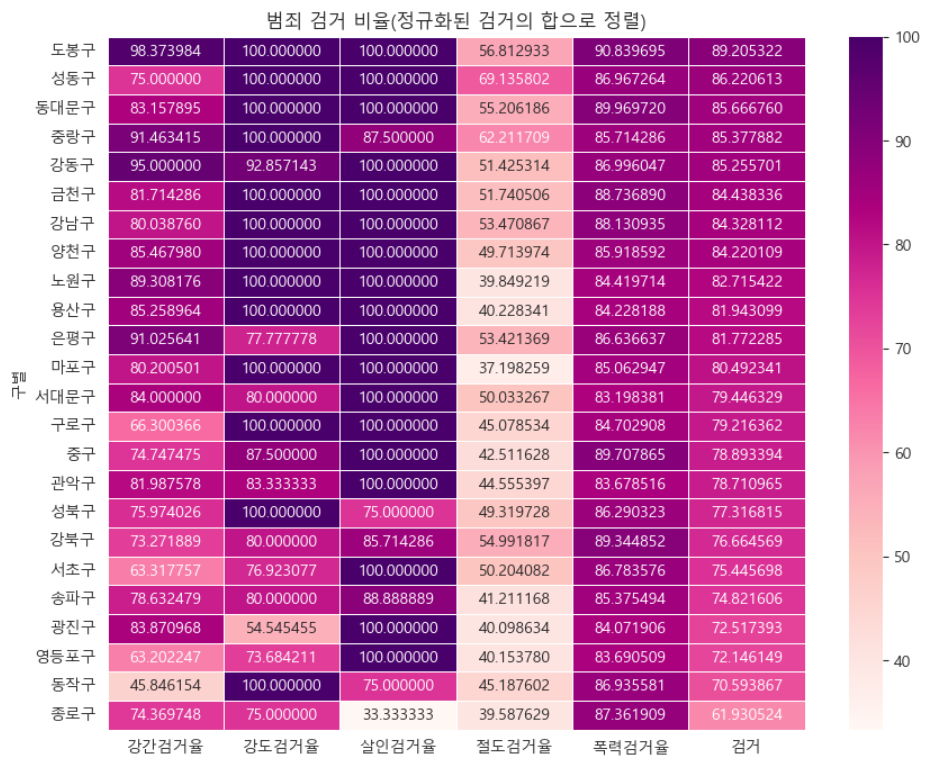
- '범죄' 컬럼을 기준으로 정렬한 후 범죄발생 건수로 heatmap 그리기
def drawGraph():

    # 데이터 프레임 생성
    target_col = ['강간', '강도', '살인', '절도', '폭력', '범죄']
    crime_anal_norm_sort = crime_anal_norm.sort_values(['범죄'], ascending=False)

    # 그래프 설정
    plt.figure(figsize=(10, 8))
    sns.heatmap(
        data=crime_anal_norm_sort[target_col],
        annot=True, # 데이터값 표현
        fmt='f', # 실수값으로 표현
        linewidth=0.7, # 박스 간격 설정
        cmap='RdPu'
    )
    plt.title('범죄 비율(정규화된 발생 건수로 정렬)')
    plt.show()

drawGraph()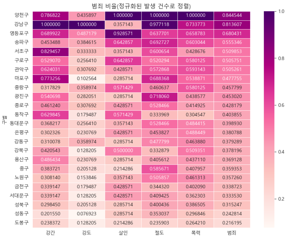
→ 소량의 데이터로 분석했기 때문에 정확도는 떨어지지만 '강남구'의 검거율이 서울시에서 가장 높지 않다는 결과로 보인다.
데이터 저장('02. crime_in_Seoul_final.csv')
crime_anal_norm.to_csv('../data/02. crime_in_Seoul_final.csv', sep=',', encoding='utf-8')"이 글은 제로베이스 데이터 취업 스쿨의 강의 자료 일부를 발췌하여 작성되었습니다."
