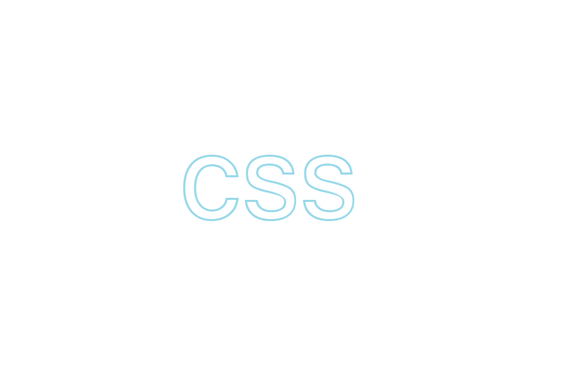
box

커서를 위로 올리면 사이즈 커짐

클릭하면 빨간색으로 변함

<head>
<style>
.box {
width: 100px;
height: 100px;
background-color: orange;
-ms-transition-duration: 2s;
-moz-transition-duration: 2s;
-webkit-transition-duration: 2s;
transition-duration: 2s;
}
.box:hover {
width: 200px;
height: 300px;
}
.box:active {
background-color: red;
}
</style>
</head>
<body>
<div class="box"></div>
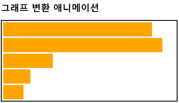
</body>graph

커서를 위로 올리면 시간 순서대로 그래프 채워짐
<head>
    <style>
        #graph {
            width: 610px;
            border: 3px solid black;
        }
        .bar {
            width: 10px;
            height: 50px;
            background-color: orange;
            margin: 5px;
            transition-duration: 5s;
        }
        #graph:hover > .bar {
            width: 600px;
        }
        .bar:nth-child(1) {
            transition-delay: 0s;
            transition-timing-function: linear;
      		/* 변화 속도가 동일 */
        }
        .bar:nth-child(2) {
            transition-delay: 1s;
            transition-timing-function: ease;
      		/* 처음은 천천히 시작하면서 빨라지다가 마지막에 다시 느려짐 */
        }
        .bar:nth-child(3) {
            transition-delay: 2s;
            transition-timing-function: ease-in;
      		/* 처음은 천천히 마지막에 빠름 */
        }
        .bar:nth-child(4) {
            transition-delay: 3s;
            transition-timing-function: ease-in-out;
      		/* 천천히 시작하다가 정상 속도로 이동하다가 마지막에 느려짐 */
        }
        .bar:nth-child(5) {
            transition-delay: 4s;
            transition-timing-function: ease-out;
      		/* 처음에 빠르다가 마지막에 느림 */
        }
    </style>
</head>
<body>
    <h1>그래프 변환 애니메이션</h1>
    <div id="graph">
        <div class="bar"></div>
        <div class="bar"></div>
        <div class="bar"></div>
        <div class="bar"></div>
        <div class="bar"></div>
    </div>
</body>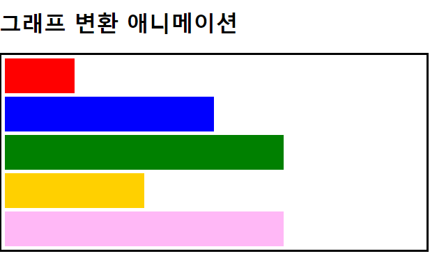
<head>
  <style>
		#graph:hover > .bar:nth-child(1) {
            background-color: red;
            width: 100px;
        }
        #graph:hover > .bar:nth-child(2) {
            background-color: blue;
            width: 300px;
        }
        #graph:hover > .bar:nth-child(3) {
            background-color: green;
            width: 400px;
        }
        #graph:hover > .bar:nth-child(4) {
            background-color: rgb(255, 208, 0);
            width: 200px;
        }
        #graph:hover > .bar:nth-child(5) {
            background-color: rgb(255, 184, 246);
            width: 400px;
        }
    </style>
 </head>
나야