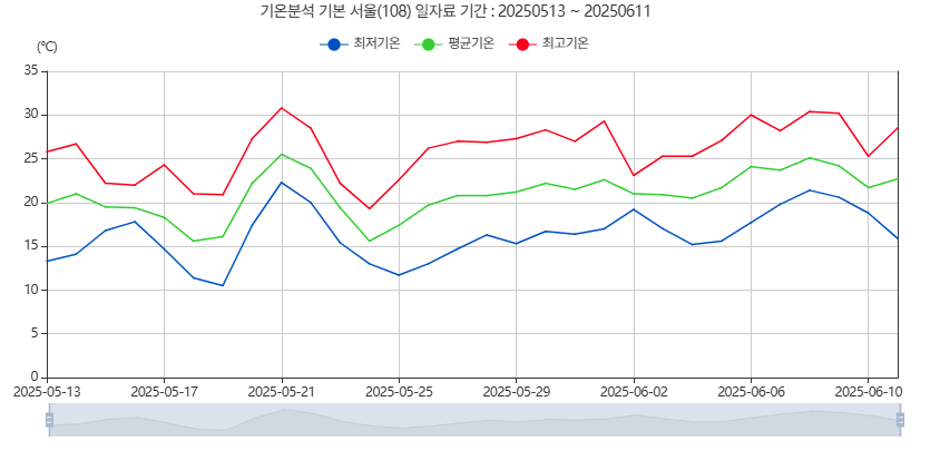
기상청 그래프 원본 사진
내가 만든 기상청 그래프 사진
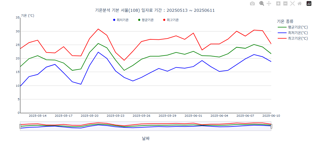
코드
# 컬럼 공백 제거 df.columns = df.columns.str.strip() # 날짜 변환 df['날짜'] = pd.to_datetime(df['날짜']) # 결측치 제거 df = df.dropna(subset=['날짜', '평균기온(℃)', '최저기온(℃)', '최고기온(℃)']) # 날짜 범위 설정 date_range = pd.date_range(start='2025-05-12', end='2025-06-10', freq='D') df = df.set_index('날짜').reindex(date_range).reset_index() df.rename(columns={'index': '날짜'}, inplace=True) # Long format 변환 df_long = pd.melt( df, id_vars=['날짜'], value_vars=['평균기온(℃)', '최저기온(℃)', '최고기온(℃)'], var_name='기온 종류', value_name='기온' ) # 색상 맵핑 color_map = { '평균기온(℃)': 'green', '최저기온(℃)': 'blue', '최고기온(℃)': 'red' } # 그래프 생성 fig = px.line( df_long, x='날짜', y='기온', color='기온 종류', template='plotly_white', color_discrete_map=color_map ) # 레이아웃 조정 fig.update_layout( hovermode='x unified', hoverlabel=dict( bgcolor='black', bordercolor='white', font=dict( color='white', size=10, family='Arial, sans-serif' ), namelength=-1, align='left' ), xaxis=dict( tickangle=0, tickformat='%Y-%m-%d', rangeslider=dict( visible=True, thickness=0.08, bgcolor="rgba(200, 200, 255, 0.2)", bordercolor="rgba(150, 150, 150, 0.5)", borderwidth=1 ), showline=True, linecolor='black', linewidth=1, showgrid=False, tickfont=dict(size=10) ), yaxis=dict( range=[0, 35], tickmode='array', tickvals=list(range(0, 36, 5)), title_text='', showgrid=True, gridcolor='lightgray', gridwidth=1, zeroline=True, zerolinecolor='black', zerolinewidth=1.5, showline=True, linecolor='black', linewidth=1, tickfont=dict(size=10) ), plot_bgcolor='white', annotations=[ dict( xref='paper', yref='paper', x=0, y=1.05, showarrow=False, text='기온 (℃)', font=dict(size=11) ) ], title=dict( text="기온분석 기본 서울(108) 일자료 기간 : 20250513 ~ 20250611", x=0.5, xanchor='center', yanchor='top', font=dict(size=14) ) ) # 🔵 아이콘 크기 키움 (font-size: 16px 적용) fig.add_annotation( xref='paper', yref='paper', x=0.5, y=1.02, showarrow=False, text=""" <span style='color:blue; font-size:16px;'>●</span> 최저기온 <span style='color:green; font-size:16px;'>●</span> 평균기온 <span style='color:red; font-size:16px;'>●</span> 최고기온 """, font=dict(size=11), align='center' ) fig.show()

개발자를 꿈꾸는 학생