본문 > https://velog.io/@si9138/position
태그에 이미지를 넣는 background 속성
<!DOCTYPE html>
<html lang="ko">
<head>
<meta charset="UTF-8">
<meta http-equiv="X-UA-Compatible" content="IE=edge">
<meta name="viewport" content="width=device-width, initial-scale=1.0">
<title>01_태그에 이미지를 넣는 background 속성</title>
<style>
html,body{
}
/*초기화*/
*{margin:0; padding:0;}
ul li,ol li{list-style:none;}
/**/
img{
/* width: 400px; */
height: 200px;
}
div{
width: 80%;height: 500px;
border: 1px solid red;
}
/*div 부모의 2번째 자식*/
div:nth-child(2){
background-image: url(img/01.jpg);
background-repeat:no-repeat;
background-size: 100%;
}
div:nth-child(3){
width: 100%; height: 700px;
background: url(img/background.jpg) center/contain no-repeat orange fixed;
/**/
}
h1{
text-align: center;
line-height: 500px;
color: white;
}
</style>
</head>
<body>
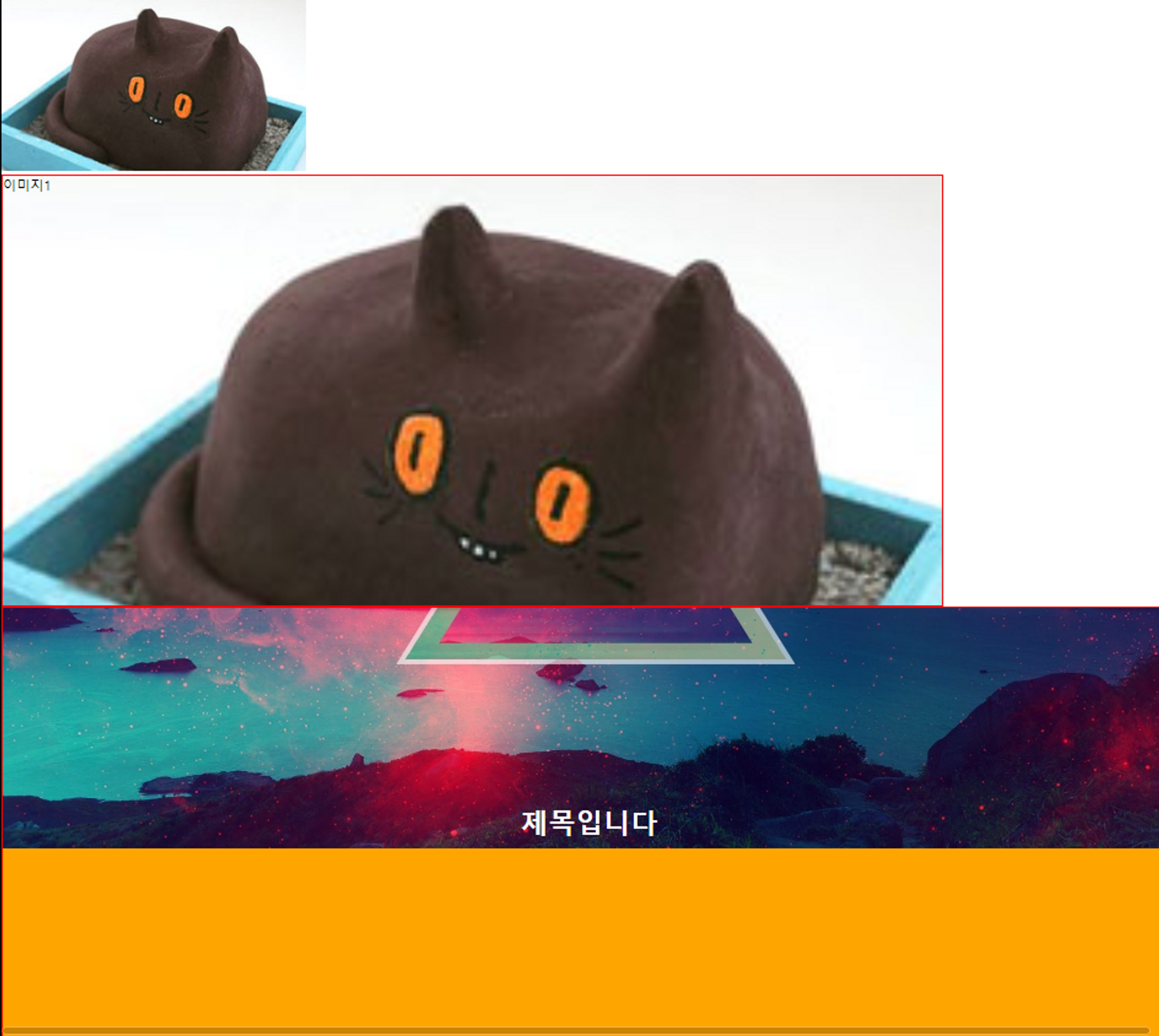
<img src="img/01.jpg" alt="">
<div>이미지1</div>
<div><h1>제목입니다</h1></div>
</body>
</html>mikimottes site bg
<!DOCTYPE html>
<html lang="en">
<head>
<meta charset="UTF-8">
<meta name="viewport" content="width=device-width, initial-scale=1.0">
<title>02_mikimottes site bg</title>
<style type="text/css">
*{margin: 0;
padding: 0;}
#wrapper{
width: 100%;
height: 3117px;
/*border:3px solid red;*/
background: url(img/miki_bg.png) center bottom no-repeat #F6B424;
position: absolute;
left:0;
top: 0;
}
#wrapper>*{
border:5px solid red;
box-sizing: border-box;
position: relative;
top:0;
left:0;
}
#wrapper>header{
width: 100%;
height: 400px;
}
#wrapper>nav{
width: 100%;
height: 165px;
}
#wrapper>nav>ul{
position: absolute;
border:3px solid white;
width: 500px;
height: 150px;
top:0;
left:50%;
margin-left: -250px;
}
#wrapper>section:nth-of-type(1){
width: 100%;
height: 1400px;
}
#wrapper>section:nth-of-type(2){
width: 100%;
height: 400px;
}
#wrapper>section:nth-of-type(3){
width: 100%;
height: 400px;
}
#wrapper>footer{
width: 100%;
height: 352px;
}
</style>
</head>
<body>
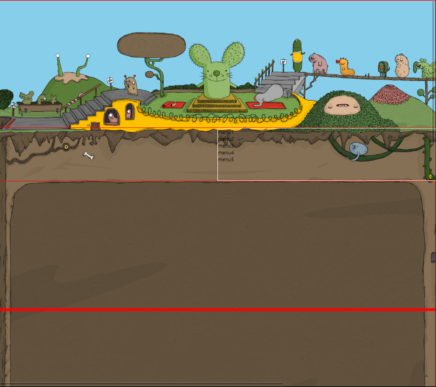
<div id="wrapper">
<!-- header+nav+section*3+footer -->
<header></header>
<nav>
<ul>
<li>menu1</li>
<li>menu2</li>
<li>menu3</li>
<li>menu4</li>
<li>menu5</li>
</ul>
</nav>
<section></section>
<section></section>
<section></section>
<footer></footer>
</div>
</body>
</html>불닭볶음면 (세로형)
=<!DOCTYPE html>
<html lang="ko">
<head>
<meta charset="UTF-8">
<meta http-equiv="X-UA-Compatible" content="IE=edge">
<meta name="viewport" content="width=device-width, initial-scale=1.0">
<title>불닭볶음면</title>
<style>
/*초기화*/
*{margin:0; padding:0;}
ul li,ol li{list-style:none;}
/**/
#wrapper{
width: 100%; height: 6480px;
}
#wrapper>section{
width: 100%;
height: 1080px;
border: 1px solid red;
position: relative;
}
#wrapper>section:nth-child(1){
background: url(img/ramen_bg_01.jpg) center;
}
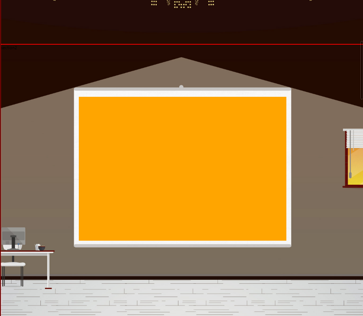
#wrapper>section:nth-child(2){
background: url(img/ramen_bg_02.jpg) center;
}
#wrapper>section:nth-child(2)>.presentation{
width: 780px; height: 540px;
background:orange;
position: absolute;
left: 50%;top: 195px;
margin-left: -390px;
}
#wrapper>section:nth-child(3){
background: url(img/ramen_bg_03.jpg) center;
}
#wrapper>section:nth-child(4){
background: url(img/ramen_bg_04.jpg) center;
}
#wrapper>section:nth-child(5){
background: url(img/ramen_bg_05.jpg) center;
}
#wrapper>section:nth-child(6){
background: url(img/ramen_bg_06.jpg) center;
}
</style>
</head>
<body>
<div id="wrapper">
<section>section1</section>
<section>section2
<div class="presentation"></div>
</section>
<section>section3</section>
<section>section4</section>
<section>section5</section>
<section>section6</section>
</div>
</body>
</html>04 크리스피 bg (가로형)
<!DOCTYPE html>
<html lang="ko">
<head>
<meta charset="UTF-8">
<meta http-equiv="X-UA-Compatible" content="IE=edge">
<meta name="viewport" content="width=device-width, initial-scale=1.0">
<title>04_크리스피bg(가로형)</title>
<style>
/*초기화*/
*{margin:0; padding:0;}
ul li,ol li{list-style:none;}
/**/
html,body{
border: 3px solid orange;
box-sizing: border-box;
width: 100%;height: 100%;/*1-3.여기에 높이값을 설정함*/
/*배경이미지가 디바이스 장치 사이즈에 관련 없이 같은사이즈의 배경으로 처리하고싶을때는 px고정값으로 처리한다.*/
}
#wrapper{
border: 3px solid red;
box-sizing: border-box;
width: 500%;
height: 100%;/*1-2.부모(body)가 높이값이 없음*/
overflow: hidden;
background: url(img/crispy_bg.png) left bottom/100% no-repeat #a2ddee;
}
#wrapper>section{
border: 3px solid blue;
box-sizing: border-box;
width: 20%; /*부모(#wrapper)너비의 1/5 */
height: 100%;/*1-1.부모(#wrapper)가 높이값이 없음*/
float: left;
position: relative;
}
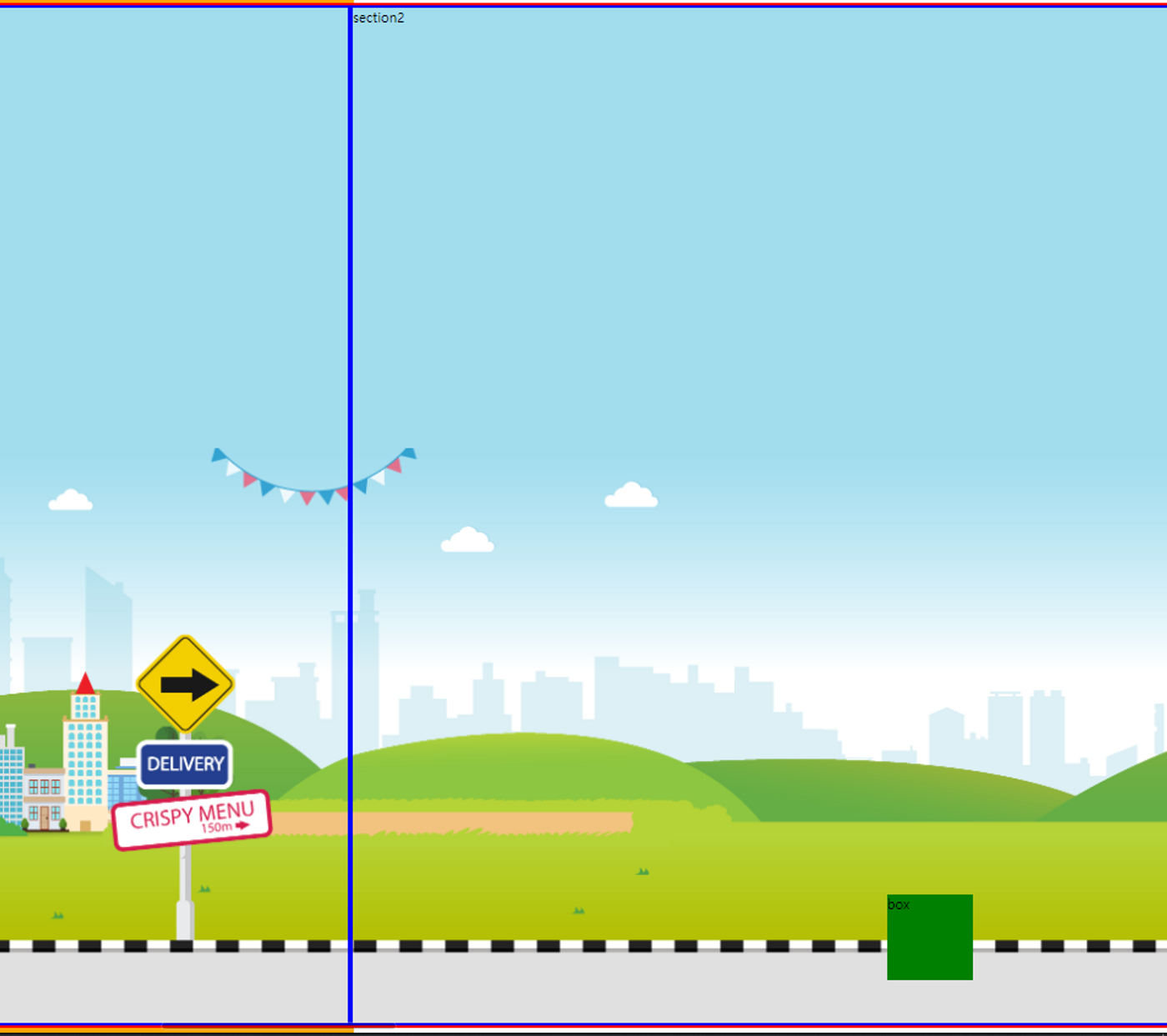
#wrapper>section:nth-child(2) .box{
width: 100px;height: 100px;
background-color: green;
position: absolute;
left: 50%;
margin-left: -50px;
bottom: 50px;
}
</style>
</head>
<body>
<div id="wrapper">
<section>section1</section>
<section>section2
<div class="box">box</div>
</section>
<section>section3</section>
<section>section4</section>
<section>section5</section>
</div>
</body>
</html>러쉬 웹 bg (가로형)
<!DOCTYPE html>
<html lang="ko">
<head>
    <meta charset="UTF-8">
    <meta http-equiv="X-UA-Compatible" content="IE=edge">
    <meta name="viewport" content="width=device-width, initial-scale=1.0">
    <title>05_러쉬 웹 bg(가로형)</title>
    <style type="text/css">
        /*초기화*/
        *{margin:0; padding:0;}
        ul li,ol li{list-style:none;}
        /**/
        html,body{
            width: 100%; height: 100%; /*창 크기에 반응하도록 설정*/
        }
        #wrapper{
            width: 500%;height: 100%;/*5장 가로형페이지*/
        }
        #wrapper>section{
            width: 20%;height: 100%;
            float: left; /*가로로 정렬될수 있도록 float 처리*/
        }
        #wrapper>section:nth-child(1){
            background: url(img/n_bg_1.jpg) left top/100% no-repeat #76bf87;
            /*화면상단이 그라데이션되어서 하단을 남기고 배경색을 단색으로 채움
            남는부분이 반복되지않도록 no-repeat처리함*/
        }
        #wrapper>section:nth-child(2){
            background: url(img/n_bg_2.jpg) left top/100% no-repeat #76bf87;
        }
        #wrapper>section:nth-child(3){
            background: url(img/n_bg_3.jpg) left top/100% no-repeat #76bf87;
        }
        #wrapper>section:nth-child(4){
            background: url(img/n_bg_4.jpg) left top/100% no-repeat #76bf87;
        }
        #wrapper>section:nth-child(5){
            background: url(img/n_bg_5.jpg) left top/100% no-repeat #76bf87;
        }
     </style>
</head>
<body>
    <div id="wrapper">
        <section>section1</section>
        <section>section2</section>
        <section>section3</section>
        <section>section4</section>
        <section>section5</section>
    </div>
</body>
</html>
치토스 웹 bg (세로형)
<!DOCTYPE html>
<html lang="ko">
<head>
    <meta charset="UTF-8">
    <meta http-equiv="X-UA-Compatible" content="IE=edge">
    <meta name="viewport" content="width=device-width, initial-scale=1.0">
    <title>01_치토스 웹 bg(세로형)</title>
    <style type="text/css">
        /*초기화*/
        *{margin:0; padding:0;}
        ul li,ol li{list-style:none;}
        /*1333+1641+1296+1018*/
        body,html{
            width: 100%; height: 100%;
        }
        #wrapper{
            width: 100%;
        }
        #wrapper>section{
        }
        #wrapper>section:nth-child(1){
            background: url(img/bg_01.jpg) center;
            height: 1333px;
        }
        #wrapper>section:nth-child(2){
            background: url(img/bg_02.jpg) center;
            height: 1641px;
        }
        #wrapper>section:nth-child(3){
            background: url(img/bg_03.jpg) center;
            height: 1296px;
        }
        #wrapper>section:nth-child(4){
            background: url(img/bg_04.jpg) center;
            height: 1018px;
        }
     </style>
</head>
<body>
        <div id="wrapper">
            <section>section1</section>
            <section>section2</section>
            <section>section3</section>
            <section>section4</section>
        </div>
</body>
</html>
허브농원bg (가로형)
<!DOCTYPE html>
<html lang="ko">
<head>
    <meta charset="UTF-8">
    <meta http-equiv="X-UA-Compatible" content="IE=edge">
    <meta name="viewport" content="width=device-width, initial-scale=1.0">
    <title>02_허브농원bg</title>
    <style type="text/css">
        /*초기화*/
        *{margin:0; padding:0;}
        ul li,ol li{list-style:none;}
        /**/
        html,body{
            width: 100%; height: 100%;
            /* border: 1px solid blueviolet; box-sizing: border-box; 가이드라인 */
        }
        #wrapper{
            background: url(img/herb_bg_color.png) left top/100%;
            width: 600%; height: 100%;
        }
        .box{
            /* border: 1px solid red; box-sizing: border-box; 가이드라인 */
            width: 16.666%; height: 100%;
            float: left;
        }
        .box:nth-child(1){
            background:url(img/herb_bg_1.png) left bottom/100% no-repeat;
        }
        .box:nth-child(2){
            background:url(img/herb_bg_2.png) left bottom/100% no-repeat;
        }
        .box:nth-child(3){
            background:url(img/herb_bg_3.png) left bottom/100% no-repeat;
        }
        .box:nth-child(4){
            background:url(img/herb_bg_4.png) left bottom/100% no-repeat;
        }
        .box:nth-child(5){
            background:url(img/herb_bg_5.png) left bottom/100% no-repeat;
        }
        .box:nth-child(6){
            background:url(img/herb_bg_6.png) left bottom/100% no-repeat;
        }
     </style>
</head>
<body>
    <div id="wrapper">
        <div class="box">section1</div>
        <div class="box">section2</div>
        <div class="box">section3</div>
        <div class="box">section4</div>
        <div class="box">section5</div>
        <div class="box">section6</div>
    </div>
</body>
</html>
parallex web
<!DOCTYPE html>
<html lang="ko">
<head>
<meta charset="UTF-8">
<meta http-equiv="X-UA-Compatible" content="IE=edge">
<meta name="viewport" content="width=device-width, initial-scale=1.0">
<title>01_parallax web</title>
<!--parallax란 시차를 뜻한다. 배경이 컨텐츠들과 다르게 움직여, 컨텐츠마다 시간차를 느끼도록 만드는 기법이다. -->
<style type="text/css">
/*초기화*/
*{margin:0; padding:0;}
ul li,ol li{list-style:none;}
/**/
html,body{
width: 100%; height: 100%; /*화면크기에 맞춤*/
border: 1px solid red; box-sizing: border-box; /*가이드라인*/
}
#wrapper{
width: 100%; height: 400%;
/*사진4장이 세로로 빈칸없이 정렬되게 하기위해서 400%를 줌*/
position: absolute;
/*현재 배경만 만든 상태에선 포지션이 있든 없든 상관이 없음.*/
/*하지만 나중에 컨텐츠를 추가하다보면 부모의 position 유뮤에 영향을 받는 효과들이 많아서 미리 추가함.*/
border: 1px solid blue; box-sizing: border-box; /*가이드라인*/
}
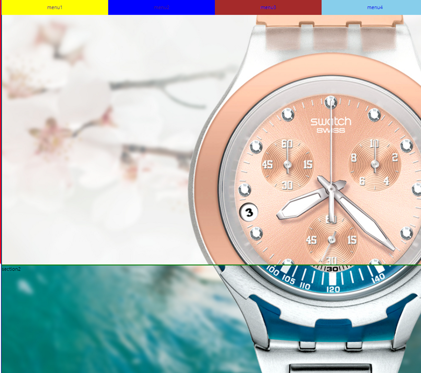
/*nav style*/
#wrapper>nav#gnb{
width: 100%;height: 50px; /*gnb가 앙옆으로 꽉차는 모양을 갖기위해 100%을 줌*/
background: #000; /*가이드라인*/
position: fixed; top: 0; /*스크롤을내려도 메뉴가 고정됨 */
}
#wrapper>nav#gnb li{
width: 25%;height: 100%; /*메뉴4개가 화면에 꽉차도록 25%줌*/
float: left; /*블럭요소인 li가 가로정렬되도록*/
line-height: 50px; /*글자가 메뉴칸 세로 중앙에 오도록 높이를 동일하게 줌*/
}
#wrapper>nav#gnb li a{
text-align: center; /*a태그 글자 중앙에 오도록*/
display: block; /*a태그를 li에 꽉차게 설정*/
text-decoration: none; /*a태그 밑줄 없앰*/
}
#wrapper>nav#gnb li:nth-child(1){
background: yellow;
}
#wrapper>nav#gnb li:nth-child(2){
background: blue;
}
#wrapper>nav#gnb li:nth-child(3){
background: brown;
}
#wrapper>nav#gnb li:nth-child(4){
background: skyblue;
}
/*section style*/
#wrapper>section{
width: 100%; height: 25%;
/*사진4장이 #wrapper(부모) 400%의 25%에 맞게 들어가게끔 하여
사진한장이 한 화면에 꽉차도록 만듬*/
border: 1px solid green; box-sizing: border-box; /*가이드라인*/
}
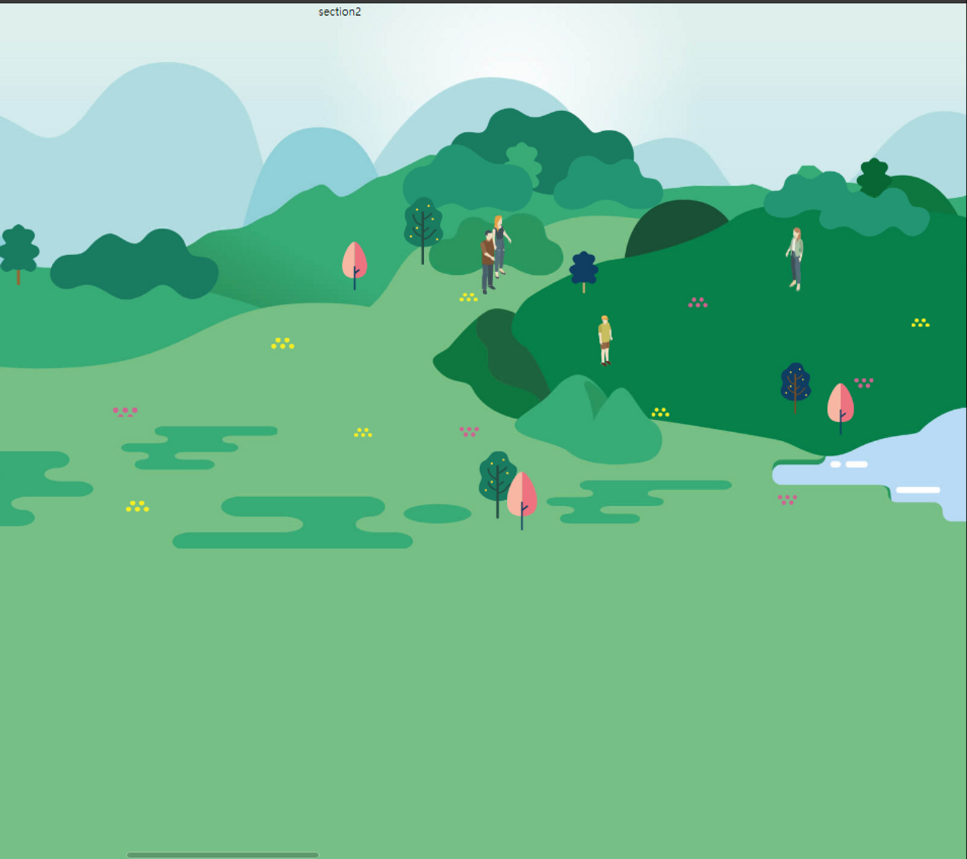
#wrapper>section:nth-of-type(1){
background: url(img/pic1.jpg) no-repeat center/cover fixed;
}
#wrapper>section:nth-of-type(2){
background: url(img/pic2.jpg) no-repeat center/cover fixed;
}
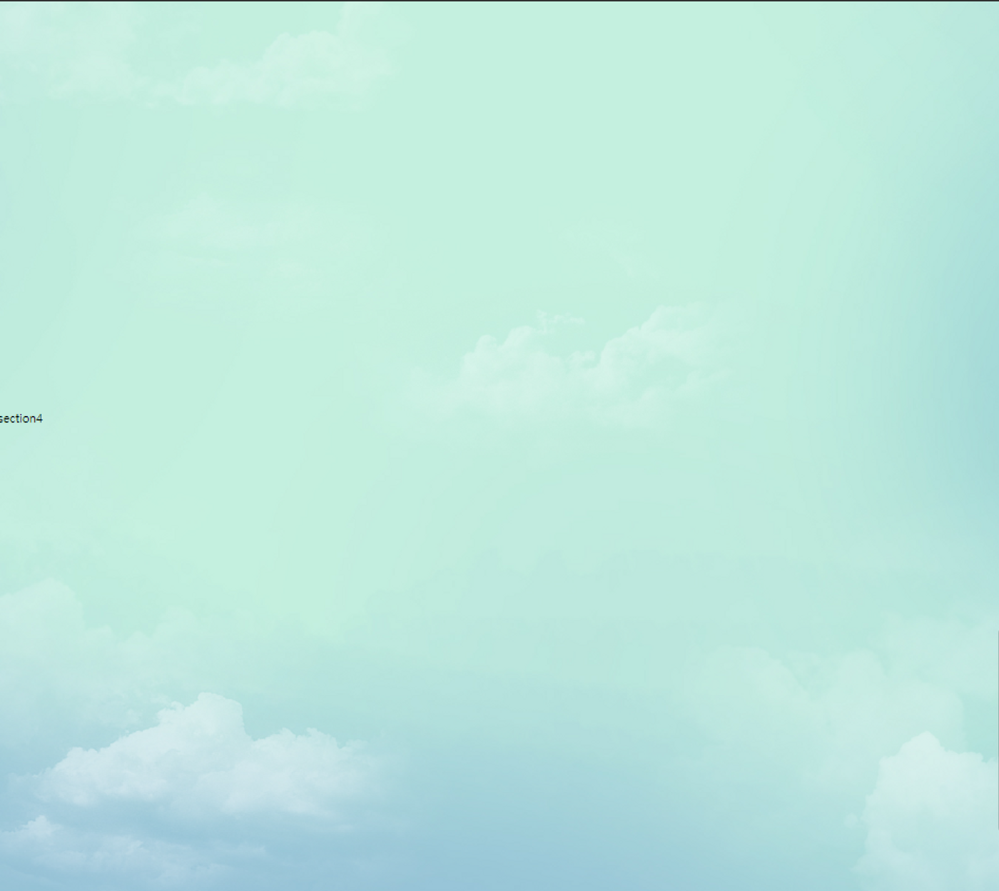
#wrapper>section:nth-of-type(3){
background: url(img/pic3.jpg) no-repeat center/cover fixed;
}
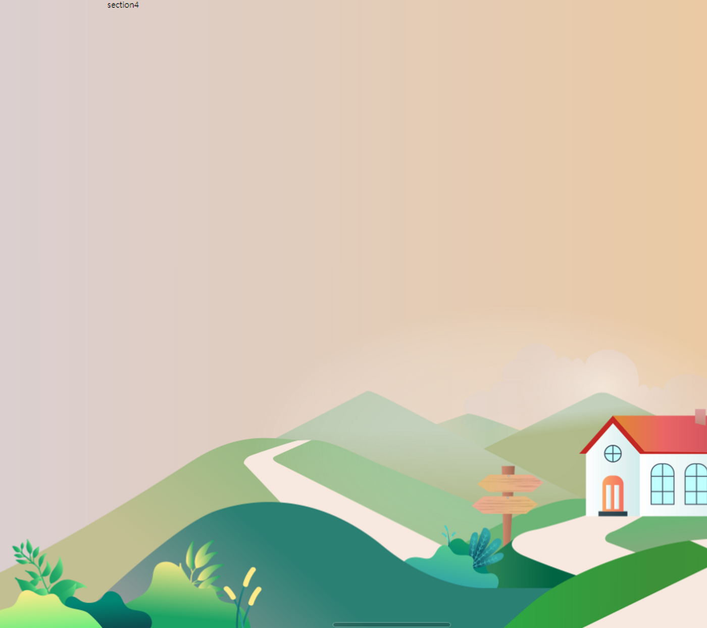
#wrapper>section:nth-of-type(4){
background: url(img/pic4.jpg) no-repeat center/cover fixed;
}
/*fixed. 이미지가 스크롤을 내려도 화면에 고정되도록 설정하여
스크롤을 내릴때 화면이 전환되는것같은 효과를 줌*/
</style>
</head>
<body>
<div id="wrapper">
<nav id="gnb">
<ul>
<li><a href="#spring">menu1</a></li>
<li><a href="#summer">menu2</a></li>
<li><a href="#fall">menu3</a></li>
<li><a href="#winter">menu4</a></li>
</ul>
</nav>
<section id="spring">section1</section>
<section id="summer">section2</section>
<section id="fall">section3</section>
<section id="winter">section4</section>
</div>
</body>
</html>
풀스택 국비수강중