01_ 다양한 position 속성값
<!DOCTYPE html>
<html lang="ko">
<head>
<meta charset="UTF-8">
<meta http-equiv="X-UA-Compatible" content="IE=edge">
<meta name="viewport" content="width=device-width, initial-scale=1.0">
<title>01_다양한 positiont속성값</title>
<style>
/*리셋*/
*{margin:0; padding:0;}
ul li,ol li{list-style:none;}
/*가이드라인과 초기설정*/
body{
height: 3000px;
}
div{
border: 1px solid gray;
width: 100px;
height: 100px;
text-align: center;
line-height: 100px;
}
#warpper{
border: 1px solid red;
width: 700px;
height: 700px;
position: absolute;
bottom: 0;left: 100px;
}
#wrap{
border-color: blue;
width: 500px; height: 300px;
position: absolute;
top: 200px; right:200px;
}
/*position style*/
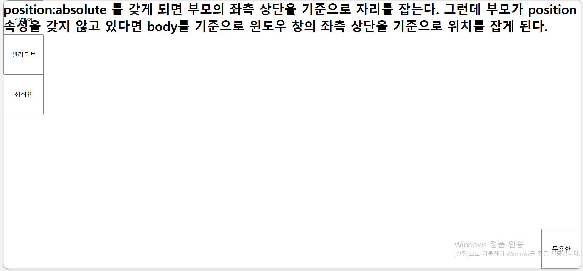
/* absolute를 갖게되면 자신의 자리는 없어지고 부모의 왼쪽상단 기준으로 자리를 잡는다. 만약 아무리 거슬러올라가도 부모가 absolute속성을 가지고 있지 않다면 body를 따르게된다. */
.first{
position: absolute;
left: 0;
top: 0;
}
.second{
position: absolute;
right: 0;
top: 0;
}
/*relative를 갖게되면 현재 갖고있는 자리는 유지하되 현재자리 기준으로 이동하게된다.*/
.third{
position: relative;
left: 300px;
top: 100px;
}
/*static은 position의 디폴트값이다.
forth에 들어간 position관련 효과는 적용되지 않는다.
static은 원래 있어야할 곳에 고정되는 속성이다 html구조에 의해서 자리를 잡게된다.*/
.forth{
position: static;
left: 500px;
}
.content{
position: absolute;
left: 0;
top: 0;
}
.fifth{
background: orange;
position: fixed;
}
</style>
</head>
<body>
<div id="warpper">
<div class="first">absolute</div>
<div class="second">absolute</div>
<div class="third">relative</div>
<div class="forth">static</div>
<div id="wrap">
<div class="content">content</div>
</div>
</div>
<div class="fifth">fixed</div>
</body>
</html>02_Z_index
<!DOCTYPE html>
<html lang="ko">
<head>
    <meta charset="UTF-8">
    <meta http-equiv="X-UA-Compatible" content="IE=edge">
    <meta name="viewport" content="width=device-width, initial-scale=1.0">
    <title>02_z-index</title>
    <style>
        /*초기화*/
        *{margin:0; padding:0;}
ul li,ol li{list-style:none;}
        /**/
        #wrapper{
            border: 1px solid red;
            position: relative;
            top: 300px;
            left: 300px;
            width: 500px;
            height: 500px;
        }
        #wrapper>div{
            border: 1px solid gray;
            width: 100px;
            height: 100px;
            position: absolute;
        }
        #wrapper>div:nth-child(1){
            background: pink;
            z-index: 3;
        }
        #wrapper>div:nth-child(2){
            background: beige;
            top: 50px; left: 50px;
            z-index: 2;
        }
        #wrapper>div:nth-child(3){
            background: lightblue;
            top: 100px;
            left: 100px;
            z-index: 3;
        }
        #wrapper>div:nth-child(4){
            background: yellow;
            top: 150px;left: 150px;
            z-index: 4;
        }
    </style>
</head>
<body>
    <div id="wrapper">
        <div class="box">box1</div>
        <div class="box">box2</div>
        <div class="box">box3</div>
        <div class="box">box4</div>
    </div>
</body>
</html>
03_position_fixed
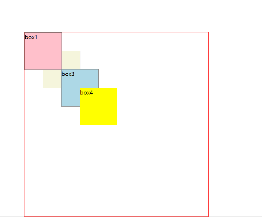
<!DOCTYPE html>
<html lang="ko">
<head>
<meta charset="UTF-8">
<title>01_레이아웃실습_self과제</title>
<style>
*{margin: 0;
padding: 0;}
body{
height: 3000px;
}
#wrapper{
position: absolute;
top:45px;
text-align: center;
text-transform: uppercase;
}
#wrapper,header,#top,#carousel,section, article, h1,h2{
border:1px solid gray;
}
ul li, ol li{
list-style: none;
border:1px solid orange;
}
header{
padding:1%;
overflow: hidden;
position: fixed;
width: 100%;
background-color: white;
z-index: 9999;
}
nav#gnb{
border:1px solid red;
width: 50%;
float: left;
}
nav#gnb ul{
overflow: hidden;
}
nav#gnb li{
width: 25%;
float: left;
box-sizing: border-box;
}
input{
float: right;
}
input[type="search"]{
width: 15%;
margin-right: 1%;
height: 25px;
}
input[type="submit"]{
width: 9%;
height: 25px;
}
div#top{
padding:20px;
}
#top h1{
width: 100px;
height: 100px;
margin:0 auto;
border-radius: 50%;
line-height: 100px;
}
#top nav#lnb{
border:1px solid red;
width: 70%;
margin:0 auto;
overflow: hidden;
margin-top: 20px;
}
nav#lnb li{
width: 23%;
float: left;
box-sizing: border-box;
margin: 0 1%;
}
div#carousel{
padding: 50px;
}
div#carousel h2{
width: 55%;
margin:0 auto 25px;
}
section{
padding:0 100px;
overflow: hidden;
}
section article{
width: 30%;
float: left;
overflow: hidden;
}
</style>
</head>
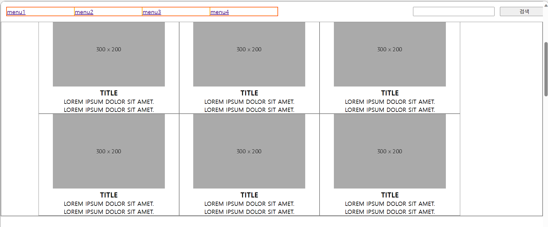
<body>
<!-- div#wrapper>header+div#top+div#carousel+section -->
<header>
<!-- (nav>ul>li*4>a>{menu$})+input*2 -->
<nav id="gnb">
<ul>
<li><a href="">menu1</a></li>
<li><a href="">menu2</a></li>
<li><a href="">menu3</a></li>
<li><a href="">menu4</a></li>
</ul>
</nav>
<input type="submit" value="검색">
<input type="search">
</header>
<div id="wrapper">
<div id="top">
<!-- h1{logo}+nav#lnb>ul>li*4>a>{mdenu$} -->
<h1>logo</h1>
<nav id="lnb">
<ul>
<li><a href="">menu1</a></li>
<li><a href="">menu2</a></li>
<li><a href="">menu3</a></li>
<li><a href="">menu4</a></li>
</ul>
</nav>
</div>
<div id="carousel">
<!-- h2{image scroller}+p*2 -->
<h2>image scroller</h2>
<p>Lorem ipsum dolor sit amet, consectetur adipisicing elit. Illum, qui.</p>
<p>Lorem ipsum dolor sit amet, consectetur adipisicing elit. Culpa, fugit!</p>
</div>
<section>
<!-- article>img+h3{title}+p*2 -->
<article>
<img src="http://place-hold.it/300x200" alt="">
<h3>title</h3>
<p>Lorem ipsum dolor sit amet.</p>
<p>Lorem ipsum dolor sit amet.</p>
</article>
<article>
<img src="http://place-hold.it/300x200" alt="">
<h3>title</h3>
<p>Lorem ipsum dolor sit amet.</p>
<p>Lorem ipsum dolor sit amet.</p>
</article>
<article>
<img src="http://place-hold.it/300x200" alt="">
<h3>title</h3>
<p>Lorem ipsum dolor sit amet.</p>
<p>Lorem ipsum dolor sit amet.</p>
</article>
<article>
<img src="http://place-hold.it/300x200" alt="">
<h3>title</h3>
<p>Lorem ipsum dolor sit amet.</p>
<p>Lorem ipsum dolor sit amet.</p>
</article>
<article>
<img src="http://place-hold.it/300x200" alt="">
<h3>title</h3>
<p>Lorem ipsum dolor sit amet.</p>
<p>Lorem ipsum dolor sit amet.</p>
</article>
<article>
<img src="http://place-hold.it/300x200" alt="">
<h3>title</h3>
<p>Lorem ipsum dolor sit amet.</p>
<p>Lorem ipsum dolor sit amet.</p>
</article>
</section>
</div>
</body>
</html>04_sticky
<!DOCTYPE html>
<html lang="en">
<head>
<meta charset="UTF-8">
<meta name="viewport" content="width=device-width, initial-scale=1.0">
<title>04_sticky</title>
<style>
*{margin: 0;
padding: 0;}
#wrapper{
width: 100%;
/* overflow: hidden; */
height: 5000px;
}
h1{
padding: 5px;
text-align: center;
text-transform: uppercase;
}
nav{
width: 100%;
overflow: hidden;
/* position:-webkit-sticky; */
position: sticky ;
top: 0px;
}
nav li{
width: 20%;
background-color: orange;
height: 50px;
text-align: center;
float: left;
list-style: none;
line-height: 50px;
}
nav li:hover{
background-color: navy;
color:white;
}
section{
width: 50%;
height: 300px;
border:1px solid gray;
box-sizing: border-box;
float: left;
text-align: center;
line-height: 300px;
}
footer{
text-align: center;
line-height: 300px;
}
</style>
</head>
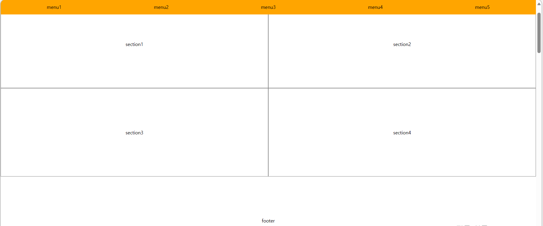
<body>
<div id="wrapper">
<h1>shopping mall</h1>
<nav>
<ul>
<li>menu1</li>
<li>menu2</li>
<li>menu3</li>
<li>menu4</li>
<li>menu5</li>
</ul>
</nav>
<section>section1</section>
<section>section2</section>
<section>section3</section>
<section>section4</section>
<footer>footer</footer>
</div>
</body>
</html>
풀스택 국비수강중