▶ 웹사이트 레이아웃 설계하기
- 해설 : Coding Works
▼첫 번째
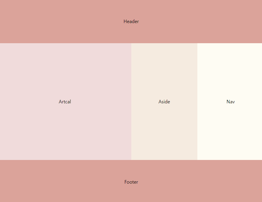
▷ HTML
<!DOCTYPE html>
<html lang="ko">
<head>
<meta charset="UTF-8">
<meta http-equiv="X-UA-Compatible" content="IE=edge">
<meta name="viewport" content="width=device-width, initial-scale=1.0">
<link rel = "stylesheet" href="style.css">
<title>flex</title>
</head>
<body class="container">
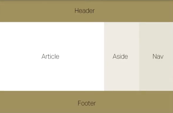
<header>Header</header>
<section>
<article>Article</article>
<aside>Aside</aside>
<nav>Nav</nav>
</section>
<footer>Footer</footer>
</body>
</html>▷ CSS
body{
padding: 0;
margin: 0;
height: 100vh;
line-height: 150px
}
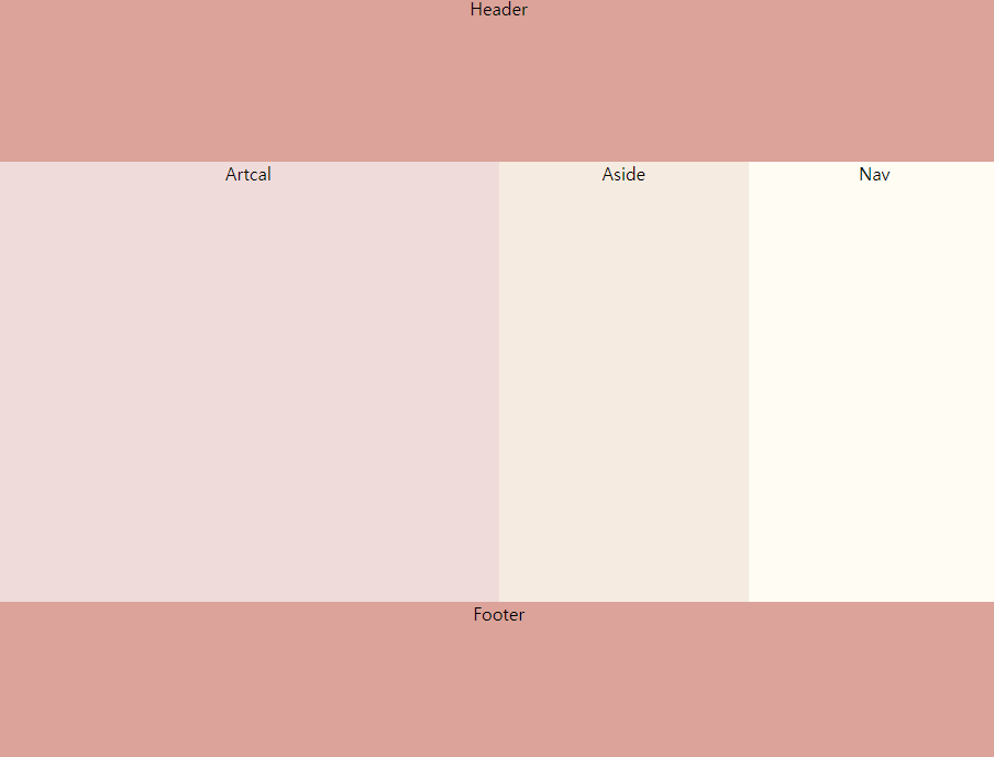
header{
background-color: #DBA39A;
text-align: center;
height: 150px;
line-height: 150px
}
section{
display: flex;
text-align: center;
height: calc(100vh - 300px);
line-height: calc(100vh - 300px);
}
article{
flex: 2;
background-color: #F0DBDB;
}
aside{
flex: 1;
background-color: #F5EBE0;
}
nav{
flex: 1;
background-color: #FEFCF3;
}
footer{
background-color: #DBA39A;
text-align: center;
height: 150px;
line-height: 150px;
}- 짜잔!
▷ 문제와 해결
브라우저 높이의 끝점에 맞춰서 Footer를 위치하고 싶었고, 높이가 커질수록 Section부분이 늘어나게 해주고 싶었다.
- 화면의 단락 높이는 100vh, Header + Footer의 높이는 300px이다.
- 따라서 Section의 크기를 calc(100vh - 300px) 해주면 화면 크기에 따라 Section의 값이 변동된다.
- calc()는 속성값을 사칙연산으로 정할 수 있게 하는 함수이다.
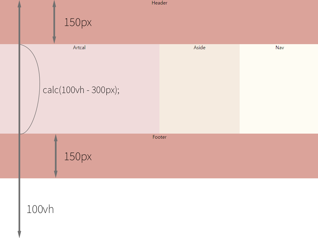
text-align를 사용하여 텍스트가 수평을 기준으로 가운데 정렬은 되었는데, padding값을 주지 않고 수직을 기준으로도 가운데 정렬을 하고 싶었다.
- height와 line-height의 값을 똑같이 줘서 해결하였다.
- line-height는 줄 높이 정하는 속성이다.
▼두 번째
클래스명 빠르게 짓는 법: html폴더 안 .클래스명 하면 div로 클래스명이 생긴다.
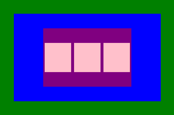
▷ HTML
<!DOCTYPE html>
<html lang="ko">
<head>
    <meta charset="UTF-8">
    <meta http-equiv="X-UA-Compatible" content="IE=edge">
    <meta name="viewport" content="width=device-width, initial-scale=1.0">
    <link rel = "stylesheet" href="style.css">
    <title>flex</title>
</head>
<body class="container">
    <div class="Green">
        <div class="Blue">
            <div class="Purple">
                <div class="Pink"></div>
                <div class="Pink"></div>
                <div class="Pink"></div>
            </div>
        </div>
    </div>
</body>
</html>
▷ CSS
/*부모 요소에 쓰는 속성 만으로 아래의 예제를 만들 수 있다.*/
*{
    margin: 0;
    padding: 0;
}
.container{
    height: 100vh;
    display: flex;
    justify-content: center;
    align-items: center;
}
.Green{
    background-color: green;
    width: 600px;
    height: 400px;
    display: flex;
    justify-content: center;
    align-items: center;

    /*Green은 container의 자식 입장이지만, Blue입장에서 부모요소이다.
    따라서 display: flex;를 써 줘야한다. */
}
.Blue{
    background-color: blue;
    width: 500px;
    height: 300px;
    display: flex;
    justify-content: center;
    align-items: center;
}

.Purple{
    background-color: purple;
    width: 300px;
    height: 200px;
    display: flex;
    justify-content: space-between;
    align-items: center;
}
.Pink{
    background-color: pink;
    width: 100px;
    height: 100px;
    margin: 5px;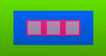
}- 짜잔!

블로그 이전했습니다!