📒 오늘 공부한 내용
🔍수업목차
[8-1] 캐스케이딩
[8-2] 배경
[8-3] 색상
[8-4] 단위 2
[8-5] 단위 심화
[8-6] position
[8-7] transition
✅ Cascading(캐스케이딩)
한 요소가 여러가지를 속성값을 상속받게 되었을 경우 캐스케이딩을 통해 우선순위가 결정된다.
CSS에서의 Cascading과 그 기준
- CSS에서의 Cascading은 브라우저에 어떤걸 먼저 그려줄 지 결정하는 우선순위 적용 원리다.
기준1. 중요도
: CSS가 선언된 위치에 따라 중요도를 판단한다.
중요도 우선순위 정리
- 인라인 스타일 CSS
- style 요소 안에 있는 CSS
- link로 연결한 CSS 파일
- 사용자 스타일 시트
- 브라우저 스타일 시트
기준2. 구체성(명시도)
: 선택할 대상을 구체적으로 특정할수록 명시도가 높아진다.
“구체성” 원리에 의해 아이디 선택자의 속성이 적용됨을 알 수 있다.
이처럼 선택자는 광범위 할수록 우선순위가 낮고, 구체적이고 작은 범위일수록 우선순위가 높다.
만일 명시도(구체성)를 강제로 끌어올리고 싶다면?
!important 라는 명령어를 이용하는 방법이 있다.
해당 명령어는 모든 조건을 무시하고 강제로 명시도를 최상위로 끌어올려준다.
우선순위가 가장 낮았던 전체 선택자 속성값에 해당 명령어를 주게 되면, 전체 선택자의 속성이 적용된다.
하지만 높은 우선순위를 갖고 있는 만큼 주의를 기울여 사용해야 한다.
잘못 사용하면 해당 소스코드 전체의 우선순위를 꼬아버릴 수 있다.
기준3. 선언순서
: 나중에 선언한 스타일이 우선 적용된다.
✅ 배경
요소의 배경을 지정하는 CSS 속성
- background-color :요소의 배경에 색상을 지정한다.
- background-image : 요소의 배경 이미지를 한 개, 혹은 여러개 지정한다.
- background-position : 요소의 배경 이미지의 위치를 지정한다.
- background-repeat : 요소의 배경 이미지의 반복 여부와 반복 방향을 지정한다.
- background-size : 요소의 배경 이미지의 크기를 지정한다.
- background-attachment : 요소의 배경 이미지의 스크롤 여부를 지정한다.
- background 단축 속성 : background 관련 속성들을 한번에 지정할 수 있다.
- object-fit : 대체요소의 내용이 지정된 규격과 맞춰지는 방식을 지정합니다.
- object-position : 대체요소의 콘텐츠 정렬 방식을 지정합니다.
✅ 단위2
상대단위 - vw / vh
- vw 와 vh 는 요소의 규격을 viewport의 너비값과 높이값에 비례하여 결정합니다.
10vw => 1200x0.1 = 120px
50vh => 920x0.5 = 460px
100px => 1200x1 = 1200px
✅ CSS 함수 사용
calc()
- calc() 이라는 함수를 이용하면, 괄호 안의 사칙연산을 수행한 결과를 속성값으로 사용할 수 있다.
.item1{
	background: red;
	width: calc(50px + 50px);
	height: 50px;
}
.item2{
	background: blue;
	width: calc(100% - 120px);
	height: 50px;
}
.item3{
	background: green;
	width: calc(2*100px);
	height: 50px;
}
.item4{
	background: orange;
	width: calc(100%/4);
	height: 50px;
}
✅ position
position이란 HTML 요소가 배치되는 방식을 결정하는 속성
- position : static(기본값) : 문서상 원래 있어야 하는 위치에 배치된다.
- position : relative : 원래 있던 자리를 기준 으로 요소의 위치를 조정할 수 있다.
- position : absolute : 절대 좌표를 기준 으로 요소의 위치를 조정할 수 있다.
- position : fixed : viewport를 기준 으로 요소의 위치를 조정할 수 있다.
- position : sticky : 부모 요소의 좌표 기준 으로 요소의 위치를 조정할 수 있다.
✅ transition
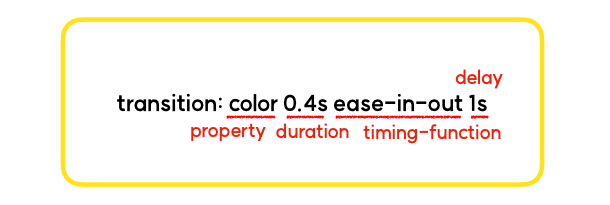
트랜지션 은 css 속성을 이용한 변화의 전, 후 사이에 애니메이션을 추가해서 움직임을 부드럽게 만들어 줄 수 있다.
- transition-property : 어떤 속성(property)에 transition을 적용할 것 인지 를 지정한다.
- transition-duration : transition에 걸리는 시간 을 지정한다.
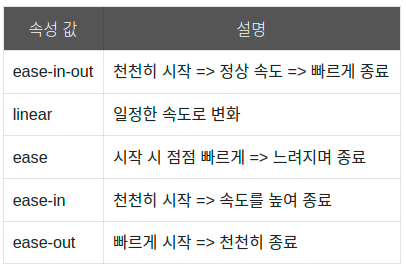
- transition-timing-function : transition의 속도 패턴 을 지정한다.
- transition-delay : transition 요청을 받은 후 실제로 실행되기까지 기다려야 하는 시간의 양 을 지정한다.
📌 오늘 실습 결과
이미지
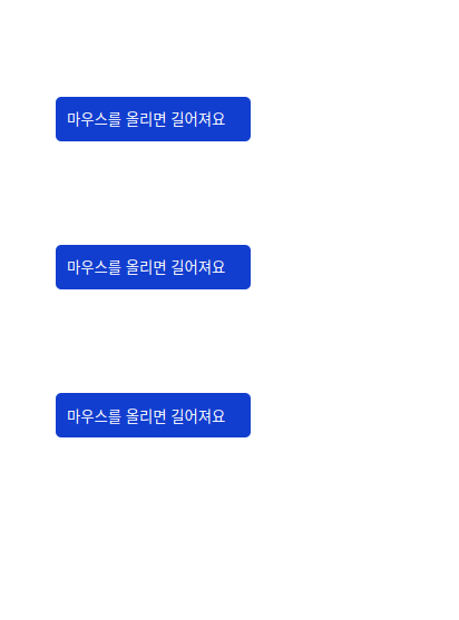
html
<!DOCTYPE html>
<html lang="ko">
<head>
    <meta charset="UTF-8">
    <meta http-equiv="X-UA-Compatible" content="IE=edge">
    <meta name="viewport" content="width=device-width, initial-scale=1.0">
    <title>02.22</title>
    <link rel="stylesheet" href="./index.css">
</head>
<body>
    <div class="background">
        <div class="buttonBox">
            <button class="button-1">마우스를 올리면 길어져요</button>
            <button class="button-2">마우스를 올리면 길어져요</button>
            <button class="button-3">마우스를 올리면 길어져요</button>
        </div>
    </div>
</body>
</html>
css
* {
    box-sizing: border-box;
    margin: 0px;
}

.background {
    width: 400px;
    height: 500px;
    display: flex;
    flex-direction: column;
    justify-content: center;
    align-items: center;
}

.buttonBox{
    width: 300px;
    height: 400px;
    display: flex;
    flex-direction: column;
    justify-content:space-around;
    align-items: flex-start;
    padding-left: 10px;
}

.button-1 {
    width: 175px;
    height: 40px;
    padding-left: 10px;
    border: none;
    border-radius: 5px;
    background-color: #123ecf;
    color: white;
    display: flex;
    flex-direction: column;
    align-items: flex-start;
    justify-content: center;
    transition: width ease-in-out 0.6s;
}

.button-1:hover {
    font-weight: 500;
    width: 250px;
  }

.button-2 {
    width: 175px;
    height: 40px;
    padding-left: 10px;
    border: none;
    border-radius: 5px;
    background-color: #123ecf;
    color: white;
    display: flex;
    flex-direction: column;
    align-items: flex-start;
    justify-content: center;
    transition: width ease-in-out 0.6s;
}

.button-2:hover {
    font-weight: 500;
    background-color:  #002398;
    width: 250px;
  }

.button-3 {
    width: 175px;
    height: 40px;
    padding-left: 10px;
    border: none;
    border-radius: 5px;
    background-color: #123ecf;
    color: white;
    display: flex;
    flex-direction: column;
    align-items: flex-start;
    justify-content: center;
    transition: width 0.6s ease-in-out 0.4s, 0.3s background-color 0.3s;
}

.button-3:hover {
    font-weight: 500;
    background-color:  #002398;
    width: 250px;
  }
✦ 출처
📚 코드캠프자료를 참조했습니다.