1. 뷰포트 란?
- 컴퓨터 화면상으로 보이는 화면
2. position 4가지 속성에 대하여 설명하시오.
- position
- static : 기본(default)
- relative : ↑(원래 자기 자신) 기준으로 떨어짐
(보통 ablsolute를 위해 만들어서 의미없어 보일수도 있음) - absolute : ↑기준으로 떨어짐, 지정하지 않으면 바디가 기준
- fixed : viewport (스크롤 따라오는 상담사 연결 버튼 같은것)
3. 아래를 설명하시오.
- Float
- 3차원 개념이다
- 컨텐츠는 항상 뜬것의 바깥쪽으로 이동하도록 설계됨
(가려지지 않게) - 부모 속성이 없어짐(집나감)
overflow : hidden
집나간 자식 잡아 오는 것
clear : both
right, left 써도 되지만 좌우 관계 없이 편하게 both
4.position 속성중 absolute 의 기준에 대하여 설명하시오.
- relative 기준으로 떨어지고 지정하지 않으면 바디가 기준이다.
5.box-sizing 속성 2개를 설명하시오.
box-sizing:border-box;padding과 border를 기준으로 200px에 맞춘다
box-sizing:content-box;content를 200px에 맞추므로 padding, border 부분은 더 커짐
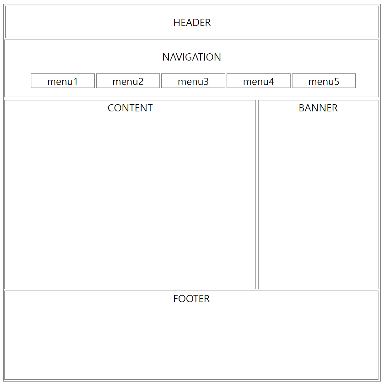
6. html_css_13_1_ex3.html 을 구현하시오.
<!DOCTYPE html>
<html lang="en">
<head>
   <meta charset="UTF-8">
   <meta http-equiv="X-UA-Compatible" content="IE=edge">
   <meta name="viewport" content="width=device-width, initial-scale=1.0">
   <title>RAAYYOUUT</title>
   <style>
      #con{
      width: 600px;
      height: 600px;
      border: 1px solid gray;
      margin: 0 auto;
      overflow: hidden;
      text-align: center;
      }
      #header{
         width: 594px;
         height: 50px;
         line-height: 50px;
         text-align: center;
         border: 1px solid gray;
         position: relative;
         top: 2px;
         left: 2px;
      }
      #nav{
         width: 595px;
         height: 90px;
         text-align: center;
         border: 1px solid gray;
         float: left;
         position: relative;
         top: 5px;
         left: 2px;
      }
      #content{
         width: 399px;
         height: 300px;
         border: 1px solid gray;
         text-align: center;
         position: relative;
         top: 100px;
         left: 1px;
      }
      #banner{
         width: 190px;
         height: 300px;
         border: 1px solid gray;
         text-align: center;
         position: relative;
         left: 405px;
         bottom: 202px;
      }
      #footer{
         width: 594px;
         height: 140px;
         border: 1px solid gray;
         text-align: center;
         float: left;
         position: relative;
         bottom: 200px;
         left: 1px;
      }
      p{
         line-height: 20px;
         text-align: center;
      }
      li{
         float: left;
         border: 1px solid gray;
         width: 100px;
         margin: 1px;
         list-style: none;
      }
      ul{
         align-items: center;
         text-align: center;
      }
   </style>
</head>
<body>
   <div id="con">
      <div id="header">
          HEADER
      </div>

      <div id="nav">
          <p>NAVIGATION</p>
          <ul>
              <li>menu1</li>
              <li>menu2</li>
              <li>menu3</li>
              <li>menu4</li>
              <li>menu5</li>
          </ul>
      </div>

      <div id="wrap">
          <div id="content"> CONTENT </div>
          <div id="banner"> BANNER </div>
      </div>

      <div id="footer">
          FOOTER
      </div>
  </div>
</body>
</html>- 결과물💦
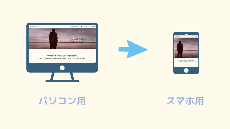
오늘의 CSS
- 반응형
- 1개의 소스코드로 여러 기기에서 사용 가능하도록
<meta name="viewport" content="width=device-width, initial-scale=1.0"> - px 대신 em, rem, %를 사용해야 한다.
- 이미지 처리는 max-width:~%, height:auto
- 미디어 쿼리
- 접속하는 장치(미디어)에 따라 특정한 CSS 스타일을 사용하도록 한다
- @media only screen and (min-width: 320px) {...} 스마트폰 세로
- @media only screen and (min-width: 480px) {...} 스마트폰 가로
- @media only screen and (min-width: 768px) {...} 태블릿 세로
- @media only screen and (min-width: 1024px) {...} 태블릿 가로
- background-cover
그외
- margin 0 auto; 는 content 중앙정렬 (상하0,좌우auto)
- font-family에서 제일 왼쪽부터 순차적으로 적용(없을때 다음으로 넘어감, 다 없으면 Default)
- height와 line-height를 같이 하면 중앙 정렬

s