뇌 연결성 매트릭스와 IQ값 시뮬레이션
주어진 이미지 분석
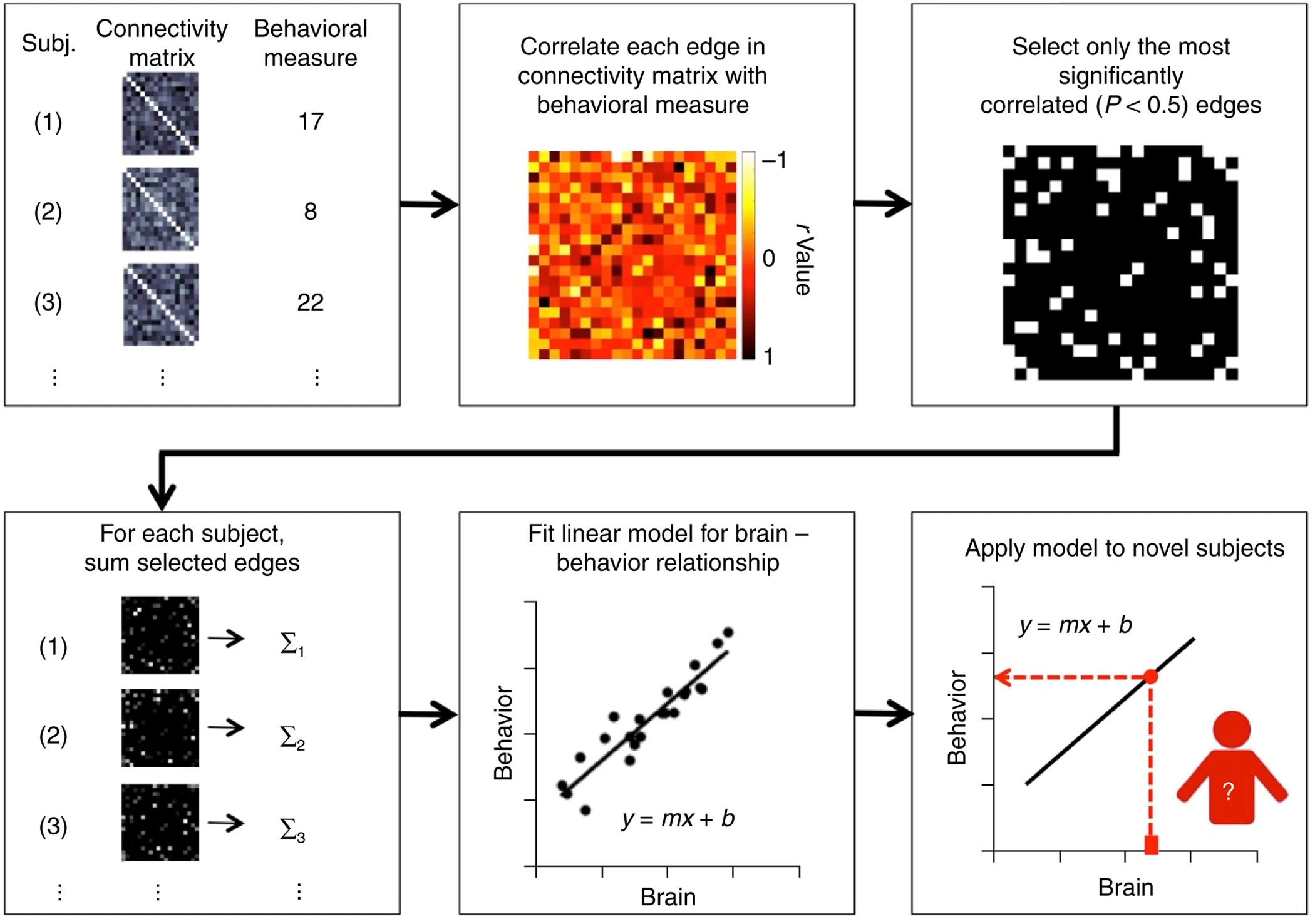
뇌 연결성과 행동 측정 간의 상관 관계를 분석하고 예측하는 과정을 나타냄
-
Subj, Connectivity matrix, Behavioral measure:
- 여러 참가자들의 뇌 연결성 매트릭스와 각각의 행동 측정 값 나타냄
- 뇌 연결성 매트릭스는 다양한 패턴의 그래픽으로 표현됨 → Connectivity matrix
- 행동 측정 값은 숫자로 주어짐 → Behavioral measure
-
Correlate each edge in connectivity matrix with behavioral measure:
- 뇌 연결성 매트릭스의 각 엣지와 행동 측정 값간 상관관계 분석
- 상관관계는 열 지도로 시각화, 다양한 색상 사용
-
Select only the most significantly correlated (P<0.5) edges:
- 가장 유의미하게 상관된 엣지만을 선택
- 선택된 엣지들은 검은색과 하얀색으로 이루어진 그래픽으로 나타남
-
For each subject, sum selected edges:
- 각 참가자에 대한 선택된 엣지 합산
- 합산된 결과는 검은색과 하얀색 그래픽으로 표시
-
Fit linear model for brain – behavior relationship:
- 뇌와 행동 간의 선형 모델 만듦
- 점과 선으로 이루어진 그래프로, 뇌와 행동 사이의 관계를 시각적으로 나타냄
-
Apply model to novel subjects:
- 새로운 참가자에 대해 모델 적용
조건에 따라 코드 작성
조건
1. 10명의 사람
2. 각 사람은 하나의 행동 메이저를 가짐
3. 각 사람마다 하나의 아이큐 점수 가짐
4. 100x100 크기의 연결성 행렬 → 이미지 1번
5. 연결성 행렬은 랜덤함수를 사용하여 생성
6. 9명의 사람으로 모델 만들고, 이 중 하나로 테스트 → 5번까지는 9명으로 모델링
7. 나머지 1명은 테스트
💡참가자에 대해 고유한 연결성 매트릭스를 생성하고 시각화
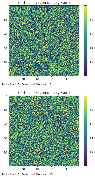
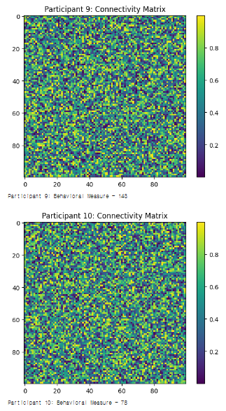
#1. Connectivity matrix, Behavioral measure
import numpy as np
import matplotlib.pyplot as plt

# 10명의 참가자
num_participants = 10

# 뇌 연결성 매트릭스의 크기
matrix_size = 100

# 각 참가자별 뇌 연결성 매트릭스와 행동 측정 값을 생성하고 시각화
for i in range(num_participants):
    # 랜덤한 연결성 행렬 생성
    connectivity_matrix = np.random.rand(matrix_size, matrix_size)

    # 행동 측정 값을 생성
    behavioral_measure = np.random.randint(50, 150)

    # 뇌 연결성 매트릭스 시각화
    plt.imshow(connectivity_matrix, cmap='viridis', interpolation='nearest')
    plt.title(f'Participant {i+1}: Connectivity Matrix')
    plt.colorbar()
    plt.show()

    # 행동 측정 값 출력
    print(f'Participant {i+1}: Behavioral Measure - {behavioral_measure}\n')
#1. 출력결과
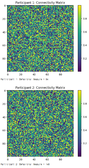
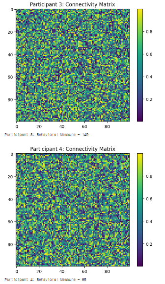
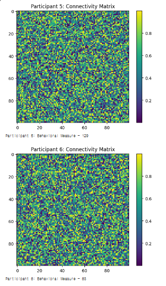
#1. 설명
- 각 참가자마다 고유한 연결성 매트릭스를 생성하고 시각화
- 각 참가자의 행동 측정값을 생성하고 출력
→ 각 참가자에 대해 고유한 뇌 연결성 패턴과 행동 측정 값 출력
#2. Correlate each edge in connectivity matrix with behavioral measure:
import numpy as np
import matplotlib.pyplot as plt
import seaborn as sns

# 참가자 수와 뇌 연결성 매트릭스 크기 설정
num_participants = 10
matrix_size = 10  # 예시로 크기를 10으로 설정;

# 랜덤한 연결성 매트릭스 생성 (각 참가자별)
np.random.seed(42)  # 결과의 일관성을 위해 시드 설정
connectivity_matrices = np.random.rand(num_participants, matrix_size, matrix_size)

# 행동 측정 값
behavioral_measures = np.array([94, 149, 149, 65, 129, 63, 51, 104, 143, 78])

# 각 엣지와 행동 측정 값간 상관관계 저장을 위한 배열 초기화
correlations = np.zeros((matrix_size, matrix_size))

# 각 엣지에 대해 행동 측정 값과의 상관관계 계산
for i in range(matrix_size):
    for j in range(matrix_size):
        edge_values = connectivity_matrices[:, i, j]
        correlation = np.corrcoef(edge_values, behavioral_measures)[0, 1]
        correlations[i, j] = correlation

# 상관관계 열 지도로 시각화
plt.figure(figsize=(10, 8))
ax = sns.heatmap(correlations, cmap='coolwarm', center=0, annot=True, fmt=".2f")
plt.title('Correlation between Connectivity Edges and Behavioral Measures')
plt.xlabel('Brain Region A')
plt.ylabel('Brain Region B')

# 컬러바 라벨 설정
ax.figure.colorbar(ax.collections[0]).set_label('Correlation Coefficient')

plt.show()
#2. 출력결과
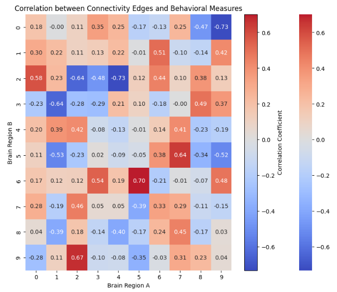
#2. 설명
- 참가자의 연결성 매트릭스 랜덤하게 생성
- 각 두 뇌 영역 간의 연결 값들과 행동 측정 값 간 상관관계를 계산해, 모든 엣지에 대한 상관관계를 히트맵으로 시각화
sns.heatmap으로 생성된 히트맵에 대한 참조 →ax변수에 저장
#3. Select only the most significantly correlated (P<0.5) edges:
import numpy as np
import matplotlib.pyplot as plt
import seaborn as sns

# 참가자 수와 뇌 연결성 매트릭스 크기 설정
num_participants = 10
matrix_size = 10  # 예시로 크기를 10으로 설정

# 랜덤한 연결성 매트릭스 생성 (각 참가자별)
np.random.seed(42)  # 결과의 일관성을 위해 시드 설정
connectivity_matrices = np.random.rand(num_participants, matrix_size, matrix_size)

# 행동 측정 값
behavioral_measures = np.array([94, 149, 149, 65, 129, 63, 51, 104, 143, 78])

# 각 엣지와 행동 측정 값간 상관관계 저장을 위한 배열 초기화
correlations = np.zeros((matrix_size, matrix_size))

# 각 엣지에 대해 행동 측정 값과의 상관관계 계산
for i in range(matrix_size):
    for j in range(matrix_size):
        edge_values = connectivity_matrices[:, i, j]
        correlation = np.corrcoef(edge_values, behavioral_measures)[0, 1]
        correlations[i, j] = correlation

# 유의미한 상관관계를 가지는 엣지만 선택 (P<0.5 기준)
significant_correlations = np.where(np.abs(correlations) >= 0.5, 1, 0)

# 유의미한 상관관계를 가지는 엣지 시각화
plt.figure(figsize=(10, 8))
sns.heatmap(significant_correlations, cmap='binary', cbar=False, annot=True, fmt="d")
plt.title('Significant Correlation between Connectivity Edges and Behavioral Measures')
plt.xlabel('Brain Region A')
plt.ylabel('Brain Region B')
plt.show()
#3. 출력결과
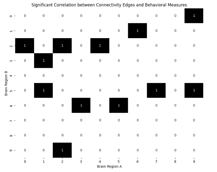
#3. 설명
- 상관관계 계산 후, 유의미한 상관관계를 가진 엣지만 선택하는 과정
→ 해당 엣지 검/흰으로 구분해 그래프 출력 - 유의미한 상관관계 기준 → p<0.5로 설정
→ 유의미한 상관관계를 가지는 엣지는 1로, 그렇지 않은 엣지는 0으로 표시
#4. For each subject, sum selected edges:
import numpy as np
import matplotlib.pyplot as plt

# 참가자 수와 뇌 연결성 매트릭스 크기 설정
num_participants = 10
matrix_size = 10

# 랜덤한 연결성 매트릭스 생성 (각 참가자별)
np.random.seed(42)
connectivity_matrices = np.random.rand(num_participants, matrix_size, matrix_size)

# 유의미한 상관관계를 가지는 엣지 선택 (p<0.5)
significant_correlations = np.random.choice([0, 1], size=(matrix_size, matrix_size))

# 각 참가자에 대해 유의미한 엣지의 값을 합산
summed_edges_per_subject = np.array([np.sum(matrix * significant_correlations) for matrix in connectivity_matrices])

# 합산된 결과를 바탕으로 각 참가자를 검은색(낮은 값)과 하얀색(높은 값)으로 구분하기 위한 이진화
median_value = np.median(summed_edges_per_subject)
binary_summed_edges = np.where(summed_edges_per_subject > median_value, 1, 0)

# 참가자별로 합산된 결과 시각화
plt.figure(figsize=(12, 6))
plt.imshow(binary_summed_edges.reshape(1, num_participants), cmap='binary')
plt.colorbar(ticks=[0, 1], aspect=10)
plt.title("Summed Selected Edges for Each Subject")
plt.yticks([])
plt.xticks(range(num_participants), [f"Subject {i+1}" for i in range(num_participants)])
plt.show()
#4. 출력결과
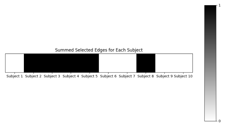
#4. 설명
- 각 참가자의 뇌 연결성 데이터에서 유의미하게 상관된 엣지들의 전체적인 강도
#5. Fit linear model for brain – behavior relationship:
import numpy as np
import matplotlib.pyplot as plt
from sklearn.linear_model import LinearRegression

# 참가자별 선택된 엣지들의 합산값
summed_edges_per_subject = np.random.rand(10)

# 행동 측정값 (1에서 생성한 랜덤값)
behavioral_measures = np.array([94, 149, 149, 65, 129, 63, 51, 104, 143, 78])

# 선형 모델 적합
X = summed_edges_per_subject.reshape(-1, 1)
y = behavioral_measures
model = LinearRegression().fit(X, y)

# 예측값 계산
y_pred = model.predict(X)

# 뇌와 행동 사이의 관계를 나타내는 그래프 생성
plt.figure(figsize=(10, 6))
plt.scatter(X, y, color='blue', label='Actual data')  # 실제 데이터 포인트
plt.plot(X, y_pred, color='red', label='Linear model')  # 선형 모델
plt.title("Brain Connectivity - Behavioral Measure Relationship")
plt.xlabel("Summed Edges")
plt.ylabel("Behavioral Measure")
plt.legend()
plt.show()
#5. 출력결과
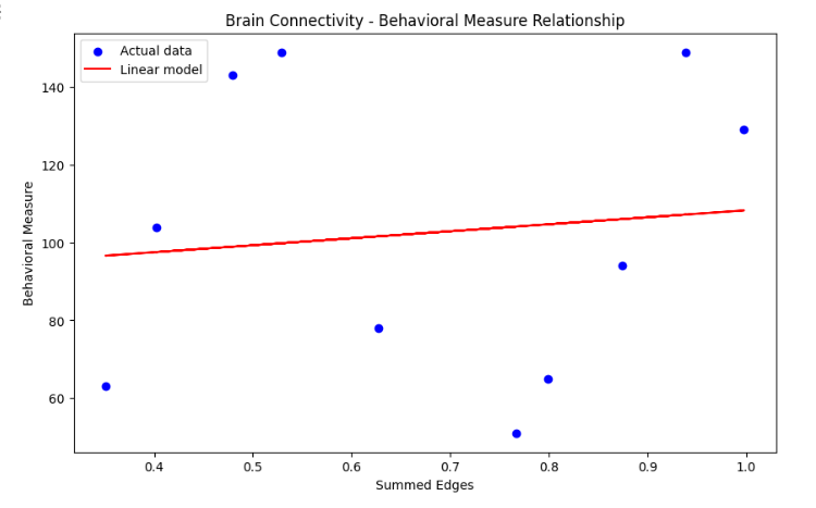
#5. 설명
- 뇌 연결성과 행동 측정 사이 관계 설명위해 선형 모델 적합
- LinearRegression을 사용해
선택된 엣지들의 합산값(summed_edges_per_subject)과행동 측정값(Behavioral Measure)사이에 선형 모델 적합 - 실제 데이터 포인터와 선형 모델을 나타내는 선을 동시에 포함하는 그래프 생성
→ 뇌 연결성과 IQ 사이 관계를 시각적으로 표현
→ 뇌 연결성(선택된 엣지들의 합산값)이 어떻게 특정 행동 측정값과 관련되는지 선형적 추정 제공
#6. Apply model to novel subjects:
import numpy as np
import matplotlib.pyplot as plt
from sklearn.linear_model import LinearRegression

# 새로운 참가자들의 뇌 연결성 데이터 (선택된 엣지들의 합산값)
# 랜덤 데이터 사용
new_summed_edges = np.random.rand(5)

X_new = new_summed_edges.reshape(-1, 1)

# 새로운 참가자들에 대한 행동 측정값 예측
model = LinearRegression().fit(summed_edges_per_subject.reshape(-1, 1), behavioral_measures)
y_new_pred = model.predict(X_new)

# 새로운 참가자들의 예측된 행동 측정값을 이전 데이터와 함께 그래프로 나타내기
plt.figure(figsize=(10, 6))

# 이전 참가자들의 데이터
plt.scatter(summed_edges_per_subject, behavioral_measures, color='blue', label='Original Subjects')

# 새로운 참가자들의 예측 데이터
plt.scatter(new_summed_edges, y_new_pred, color='green', label='Novel Subjects Predictions')

# 적합한 선형 모델
X_combined = np.concatenate((summed_edges_per_subject, new_summed_edges))
y_combined_pred = model.predict(X_combined.reshape(-1, 1))
plt.plot(np.sort(X_combined), np.sort(y_combined_pred), color='red', label='Linear Model')

plt.title("Brain Connectivity - Behavioral Measure Relationship with Novel Subjects")
plt.xlabel("Summed Edges")
plt.ylabel("Behavioral Measure")
plt.legend()
plt.show()
#6. 출력결과
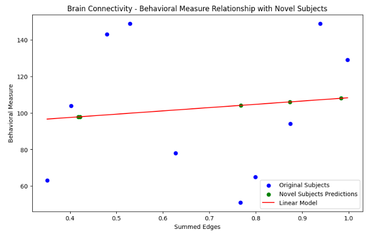
#6. 설명
- 적합한 선형 모델을 이용해 새로운 참가자들에 대한 예측 수행
- 원래 데이터와 함께 시각화
- 새로운 참가자 : 녹색
- 기존 참가자 : 파란색
- 선형 모델 : 빨간색
→ 새로운 참가자들의 예측된 행동 측정값이 모델에 얼마나 잘 부합하는지 확인
* 출처
Yoo K, Rosenberg MD, Kwon YH, Scheinost D, Constable RT, Chun MM. A cognitive state transformation model for task-general and task-specific subsystems of the brain connectome. NeuroImage. 2022 Aug; 257: 119279. [DOI: 10.1016/j.neuroimage.2022.119279]. MATLAB Toolbox. (2022 IF: 5.7; Neuroimaging Top 7.1%, rank 1/14)