View의 크기
모든 SwiftUI는 아래 과정을 거쳐 크기를 조정한다.
1. A parent view proposes a size for its child.
2. Based on that information, the child then chooses its own size and the parent must respect that choice.
3. The parent then positions the child in its coordinate space.
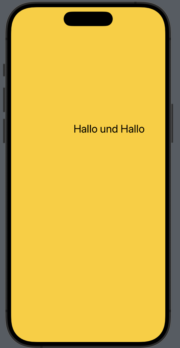
예:
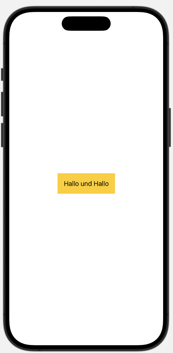
struct ContentView: View {
    var body: some View {
        Text("Hallo und Hallo")
            .padding(10)
            .background(.yellow)
    }
}
위 예시 속 ContentView의 크기는 body의 크기이다. 그리고 text는 background의 padding의 child가 된다.
이는 swift가 view를 그리는 방식으로, 조금 더 설명하자면 이렇다.
1. ContentView가 background의 크기로 결정된다.
2. background가 padding의 크기로 결정된다.
3. padding은 text보다 10 큰 크기로 결정된다.
4. text는 Hallo und Hallo"를 기본 폰트로 표현할 만큼의 가로w 세로h 크기다.
5. padding의 크기는 w+10, h+10이다.
6. background의 크기는 w+10, h+10이다.
7. ContentView의 크기는 w+10, h+10이다.
텍스트와는 반대로 자동적으로 가능한 공간을 모두 차지하는 layout도 있다. 이를 neutral layout이라고 한다. 대표적인 예시로 color가 있다.
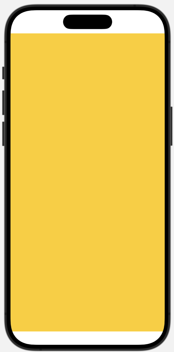
var body: some View {
    Color.yellow
}
마지막으로 fame modifier가 적용된 image(resizable)는 아래와 같다.
struct ContentView: View {
    var body: some View {
        Image(.example)
            .frame(width: 100, height: 100)
    }
}- ContentView는 frame에 의해 크기가 결정된다.
- frame: 나 가로 100에 세로 100인데, image 너는 얼마나 크니?
- image: 나 가로 128 세로 128이야(예시).
- frame: 그래 너 내 중간에 배치할게.
alignment
alignment도 직접 설정해서 나타낼 수 있다.
 |  |
|---|
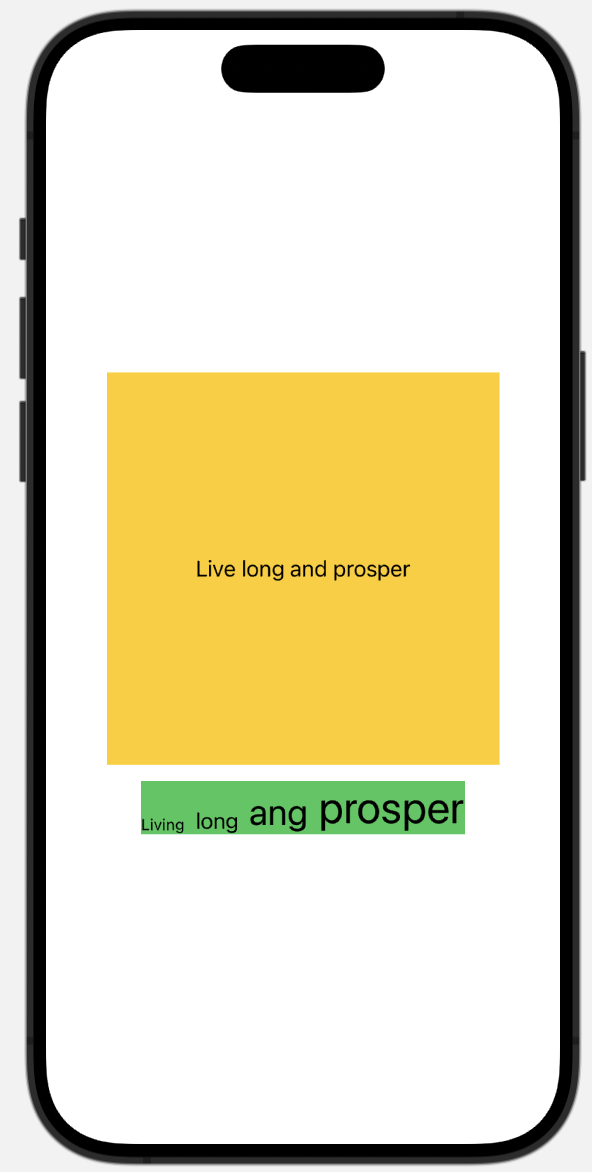
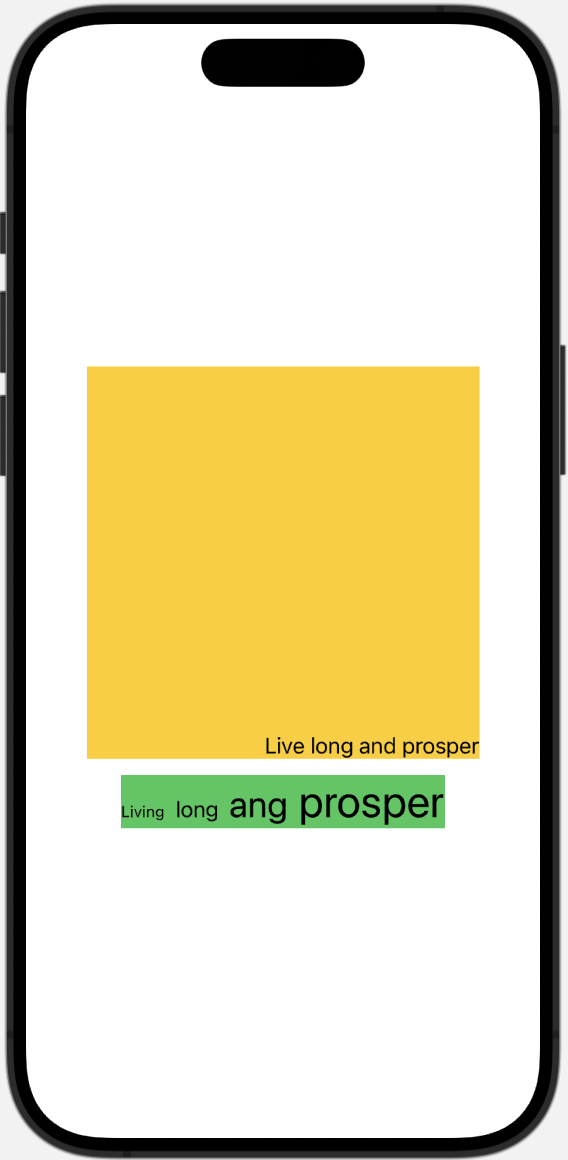
예시로 text를 frame 안에서 나타날 때, stack 안에 크기가 다른 text들을 나타낼 때 기본적으로 왼쪽 사진대로 정렬된다. 특히 크기가 다른 영어로 된 텍스트의 경우 gjpy 같은 글자처럼 막대기를 포함한 크기를 기준으로 정렬한다.
이를 frame 안에서 특정 위치로, text들의 막대기를 제외한 가장 아래 부분을 기준으로 정렬하도록 설정할 수 있다.
// 왼쪽 사진
        VStack {
            Text("Live long and prosper")
                .frame(width: 300, height: 300)
                .background(.yellow)
            HStack(alignment: .bottom) {
                Text("Living")
                    .font(.caption)
                Text("long")
                Text("ang")
                    .font(.title)
                Text("prosper")
                    .font(.largeTitle)
            }
            .background(.green)
        }
// 오른쪽 사진
VStack {
Text("Live long and prosper")
.frame(width: 300, height: 300, alignment: .bottomTrailing)
.background(.yellow)
HStack(alignment: .firstTextBaseline) {
Text("Living")
.font(.caption)
Text("long")
Text("ang")
.font(.title)
Text("prosper")
.font(.largeTitle)
}
.background(.green)
} |  |
|---|
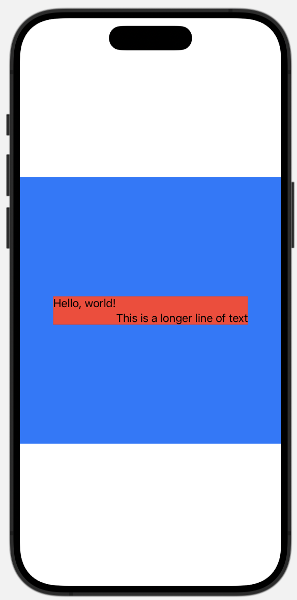
보통은 왼쪽 사진처럼 VStack이라는 View 안의 Text라는 View들이 통일되어 정렬된다. 만약 오른쪽처럼 한 view에 다른 정렬을 적용하고 싶다면 alignmentGuide를 사용할 수 있다.
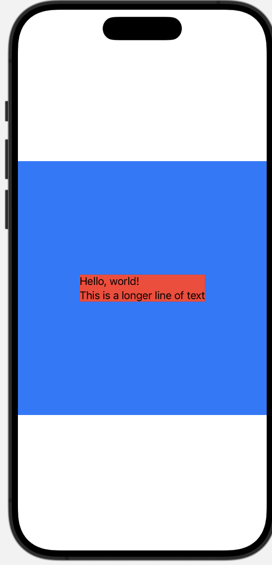
        VStack(alignment: .leading) {
            Text("Hello, world!")
                .alignmentGuide(.leading) { dimension in dimension[.trailing] }
            Text("This is a longer line of text")
        }
        .background(.red)
        .frame(width: 400, height: 400)
.background(.blue)ViewDimensions를 사용하지 않고 하드 코딩으로 정렬을 적용하는 방법도 있다.
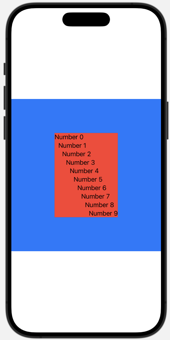
        VStack(alignment: .leading) {
            ForEach(0..<10) { position in
                Text("Number \(position)")
                    .alignmentGuide(.leading) { _ in Double(position) * -10 }
            }
        }
        .background(.red)
        .frame(width: 400, height: 400)
.background(.blue)alignment 커스텀하기
정해진 alignment로는 .top, .bottom, .leading 등이 있는데, 이것 말고 직접 설정하고 적용하는 방법도 있다.
 |  |
|---|
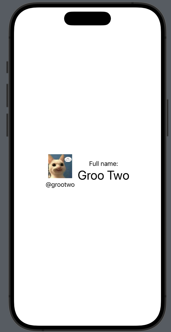
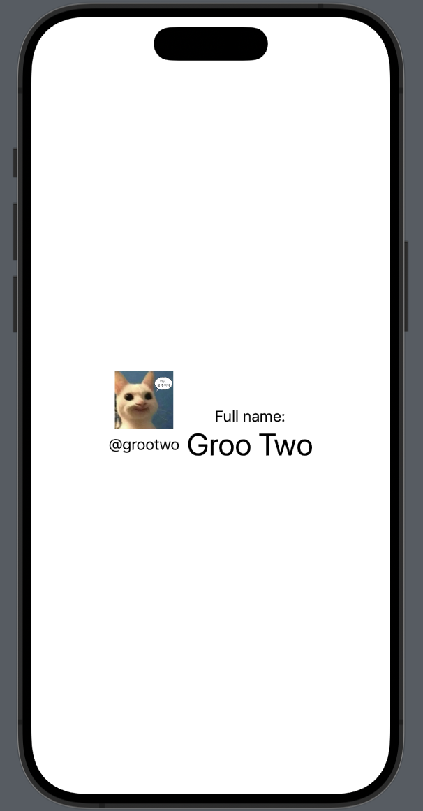
왼쪽 사진이 HStack과 VStack으로 이미지와 내용을 정렬한 것이다. 그 중에서 아이디와 이름을 오른쪽 사진처럼 수직으로 정렬하기 위해서 MidAccountAndName라는 정렬을 설정할 수 있다.
extension VerticalAlignment {
    enum MidAccountAndName: AlignmentID {
        static func defaultValue(in context: ViewDimensions) -> CGFloat {
            context[.top]
        }
    }

    static let midAccountAndName = VerticalAlignment(MidAccountAndName.self)
}
사용자 지정 레이아웃 가이드를 정의하기 위해서 VerticalAlignment 혹은 AlignmentID 프로토콜을 준수하는 HorizontalAlignment의 extension으로 설정해야 한다.
💡 MidAccountAndName를 struct 혹은 enum으로 설정할 수 있고, enum으로 설정하는 것을 추천한다고 한다.
        HStack(alignment: .midAccountAndName) {
            VStack {
                Image(.example)
                    .resizable()
                    .frame(width: 64, height: 64)
                Text("@grootwo")
                    .alignmentGuide(.midAccountAndName) { d in
                        d[VerticalAlignment.center]
                    }
            }

            VStack {
                Text("Full name:")
                Text("Groo Two")
                    .alignmentGuide(.midAccountAndName) { d in
                        d[VerticalAlignment.center]
                    }
                    .font(.largeTitle)
            }
        }
커밋 링크
그리고 수직으로 중앙정렬을 바라는 view에 적용시키면 된다.
절대적/상대적 배치
swiftui에서 view를 절대적으로도 상대적으로도 배치할 수 있다.
 |  |
|---|
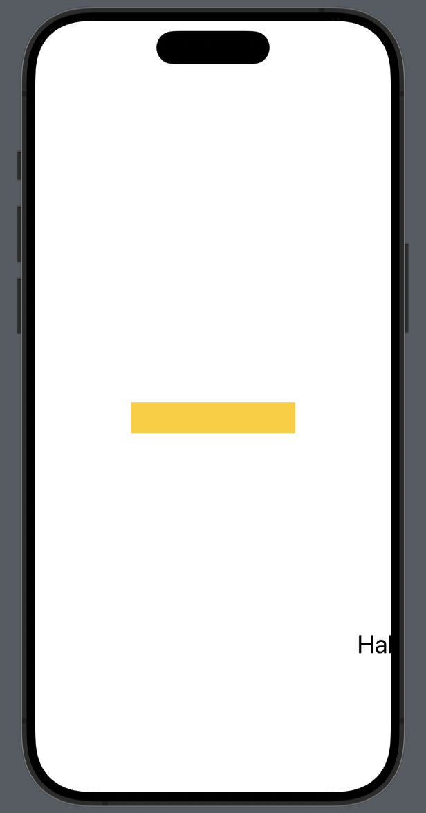
// 왼쪽 사진
        Text("Hallo und Hallo")
            .font(.title)
            .position(x: 250, y: 250)
            .background(.yellow)
왼쪽 사진의 경우 position을 통해서 휴대폰 스크린 상의 (250, 250) 좌표에 view가 표현되었다. 이는 #View의 크기 파트에서 말했듯이 background는 전체 스크린의 크기가 될 수 있고, 그의 child의 크기에 따라 결정된다. child가 스크린 상에서 position이 설정되어 있고, .title인 text라서 background는 스크린 전체에 채워진 것이다.
// 오른쪽 사진
        Text("Hallo und Hallo")
            .font(.title)
            .offset(x: 250, y: 250)
.background(.yellow)반대로 오른쪽 사진은 offset으로 원래 view보다 상대적으로 250, 250 떨어진 위치에 text가 나타난 형태이다. offset으로 인해 view가 다른 위치에 렌더링되더라도 실제 크기(dimension)은 변하지 않기 때문에 background는 차일드의 위치에 그 크기대로 나타나고 title인 text는 상대적으로 250, 250 떨어진 위치에 나타나는 것이다.