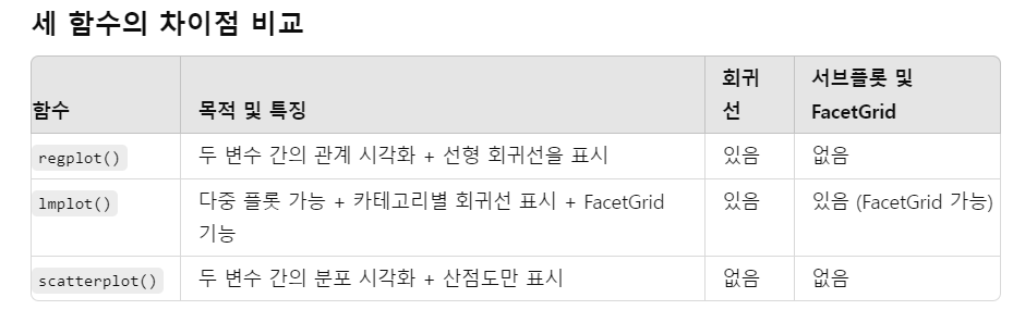
한꺼번에 기본적인 통계 추출하기
describe()
import pandas as pd

# 예시 데이터프레임 생성
data = {
    'mpg': [21, 22, 23, 24, 25],
    'wt': [2.5, 2.7, 2.9, 3.1, 3.3]
}

df = pd.DataFrame(data)

# describe() 함수 사용
summary = df.describe()

print(summary)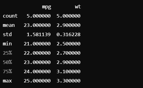
## result 2

# 열 이름을 맞춰줍니다. mpg 데이터셋에는 'weight' 대신 'weight'를 wt로 가정
mpg.rename(columns={'weight': 'wt'}, inplace=True)

# 5-number summary 테이블 출력
summary = mpg[['mpg', 'wt']].describe().loc[['max', '25%', '50%', '75%', 'min']]

print("### Result_2. Five number summary table of mpg, wt")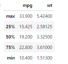
res = mpg.groupby("cyl")["mpg"].agg(["mean","std"])mpg이라는 데이터프레인을 cyl열을 기준으로 그룹화,
["mpg"]는 mpg에 해당되는 컬럼을 선택하여
.agg() 괄호 내 함수를 적용함을 의미
- 각 실린더 수 cyl에 따라 연비의 평균과 표준편차에 대한 데이터프라임을 만듦
plot
regplot
sns.regplot(데이터테이블 이름, x = "컬럼명", y = "컬럼명")
## sns.regplot

## age, fare
fig, ax = plt.subplots()     #subplots : 도화지 생성, 도화지 전체를 나타내는 fig, 축은 ax로 나타냄
sns.regplot(titanic_df, x = "age", y = "fare", color = "green")
plt.show()
#fig.savefig("titanic_reg.png")     #savefig : 사진으로 저장
예제 2
sns.regplot(titanic_df,
            x = "age", y = "fare",
            fit_reg = True,
            color = "gold",
            marker = "o",
            order = 3,                #차원을 말함 : 기본 1차원
            label = "Titanic data",
            scatter_kws = {"fc":"g","ec":"g","s":100, "alpha":0.3},
            line_kws = {"lw":2,"ls":"--","alpha":0.8})

plt.xlabel("나이")
plt.ylabel("요금")
plt.title("나이와 요금")
plt.legend(loc = 2)
plt.show()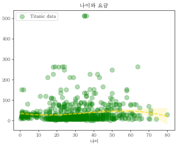
원하는 정보 추출
: df[df["컬럼명"] == "원하는 값"]
문제)cut = ideal, price vs carat (replot)
# Axus - level
diamonds = sns.load_dataset("diamonds")
diamonds.head()

##원하는 값 추출
diamonds_df = diamonds[diamonds["cut"] == "Ideal"]

sns.regplot(diamonds_df.sample(n = 1000),
            x = "carat", y = "price",
            fit_reg = True,
            color = "gold",
            marker = "o",
            order = 2,                #차원을 말함 : 기본 1차원
            label = "diamonds data",
            scatter_kws = {"fc":"k","ec":"k","s":100, "alpha":0.5}, #face color, edge color, size
            line_kws = {"color":"red"})

plt.xlabel("carat size")
plt.ylabel("Price")
plt.title("Carat vs Price")
plt.legend(loc = 1)
plt.show()
Implot
원하는 컬럼으로 구분이 필요한 경우 사용
데이터테이블 명["컬럼명"].value_counts()
=> 해당 컬럼으로 구분하여, 해당 컬럼에 해당되는 값의 갯수가 나옴
## sns.lmplot

penguins = sns.load_dataset("penguins")
print(penguins.head())

print(penguins["species"].value_counts())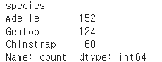
implot
sns.lmplot(penguins,
            x = "bill_length_mm",
            y = "bill_depth_mm",
            hue = "species",
            col = "sex")
plt.show() 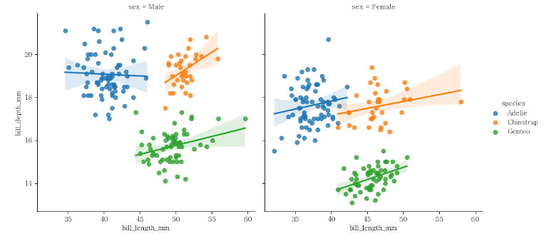
scatterplot
scatterplot(데이터테이블명, x = "컬럼명", y = "컬럼명})
fig, ax = plt.subplots(figsize = (6,6))

x= sns.scatterplot(diamonds_df.sample(n=1000),
                x = "carat",
                y = "price",
                hue = "color",
                style = "cut",
                s = 100,
                ax = ax )
ax.set_title("Diamonds plot",fontsize = 15)
plt.show()
barplot
이산형(x)에 대한 연속형(y) 데이터에 적합
sns.barplot(데이터프레임, x = "컬럼명", y = "컬럼명")
fig, axs = plt.subplots(1,2, figsize = [8,4]) #1행 2열로 그리겠다
sns.barplot(penguins,
            x = "species",
            y = "body_mass_g",
            alpha = 0.6,
            errorbar = "sd",                      #맨 위의 꼭지
            hue = "sex",
            estimator = "median", ax = axs[0])

#표 이름 설정
axs[0].set_title("Mean")
axs[1].set_title("Median")

sns.barplot(penguins,
            x = "species",
            y = "body_mass_g",
            alpha = 0.6,
            errorbar = "sd",
            hue = "sex",
            estimator = "median", ax = axs[1])

plt.subplots_adjust(wspace = 0.5) #그래프의 넓이
plt.show()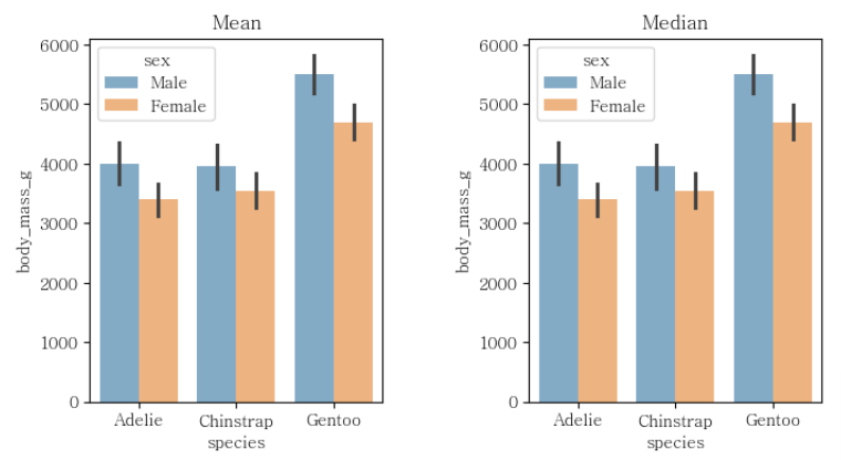
같은 데이터를 여러번 그려야 하는 경우
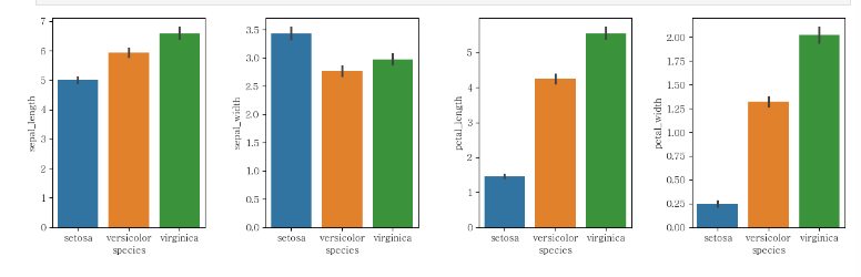
방법 1
fig, axes = plt.subplots(1,4, figsize = (15,4)) #1행 2열로 그리겠다
sns.barplot(iris,
            x = "species",
            y = "sepal_length",                 #맨 위의 꼭지
            hue = "species",
            ax = axes[0])

sns.barplot(iris,
            x = "species",
            y = "sepal_width",
            hue = "species",
            ax = axes[1])

sns.barplot(iris,
            x = "species",
            y = "petal_length",
            hue = "species",
            ax = axes[2])

sns.barplot(iris,
            x = "species",
            y = "petal_width",
            hue = "species",
            ax = axes[3])

plt.subplots_adjust(wspace = 0.4)
plt.show()
방법 2
fig, axes = plt.subplots(1,4, figsize = (15,4)) #1행 2열로 그리겠다
for i in range(4):
    sns.barplot(iris,x = "species",y = "sepal_length",hue = "species",ax = axes[i])

plt.subplots_adjust(wspace = 0.5)
plt.set_title("species")
plt.show()
plt 제목 정하기
plt.set_title("제목")

서현이의 코드 생활 ദ്ദി ( ᵔ ᗜ ᵔ )