[CSS] Transform & Transition
CSSTILdelaydurationfrontendrotatescaleskew()timing-functiontransfertransformtransition-shorthandtranslateweb
CSS
목록 보기
8/14

🔄 Transform
- 요소에 회전, 크기 조절, 기울이기, 이동 효과를 줄 수 있다.
  /* 다중 함수 값은 오른쪽부터 왼쪽으로 하나씩 순서대로 적용한다. */
  transform: translateX(10px) rotate(10deg) translateY(5px);
  transform: perspective(500px) translate(10px, 0, 20px) rotateY(3deg);
<속성>
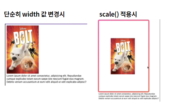
⏹️ scale()
- 2D상의 요소 크기를 재조정 할 수 있다.
- 한가지 값만 입력하면 x축에 대해서만 크기가 움직인다.
- 소수점, 음수 사용 가능하다.
  - scale()
    transform: scale(2, 0.5); - x축 y축 모두
    transform: scaleX(2); - x축만 늘린다.
    transform: scaleY(0.5); - y축만 늘린다.
- 요소의 container자체 크기는 그대로 유지하고, 해당 요소 자체의 크기를 변경한다.
⏹️ rotate()
- <angle>값을 이용하여 요소를 회전시킨다. 단위는 deg이다. 양수는 오른쪽, 음수는 왼쪽으로 회전한다.
transform: rotate(45deg);

⏹️ translate()
- 요소를 원하는 위치로 이동시킨다.
- 한가지 값만 입력하면 x축에 대해서만 이동한다.
- 음수 값도 사용 가능하다.
    transform: translate(12px, 50%);
    transform: translateX(2em);
    transform: translateY(3in);

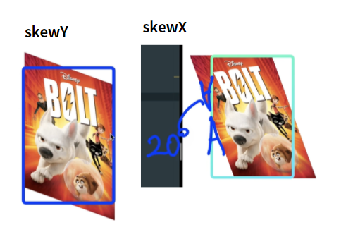
⏹️ skew()
- <angle>값을 이용하여 요소를 회전시킨다. 단위는 deg이다. 양수는 왼쪽, 음수는 오른쪽으로 회전한다.
    transform: skew(30deg, 20deg); -> x,y둘다
    transform: skewX(30deg); -> x축으로만 기울인다.
    transform: skewY(1.07rad); -> y축으로만 기울인다.
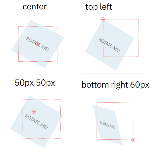
⏹️ transform-origin
transform-origin: 2px;
transform-origin: bottom;
- 요소의 기준점을 변경할 수 있다. 기본값은 center이다.
♾️ Transition
- 요소를 A라는 상태에서 B라는 상태로 시간차를 가지고 변화할 수 있도록 한다.
- 요소와 시간을 필수로 가져야 한다.
- 시간은 s, ms의 단위를 가진다.
transition: margin-right 4s;
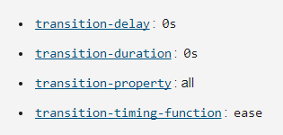
♋ transition-property
- 변화할 요소의 값
♋ transition-duration
- 요소가 설정한 시간 동안 변화한다.
  /* margin은 3초 동안 변화함, color는 1초 동안 변화함 */
  transition-duration: 3s, 1s;
  transition-property: margin-right, color;
♋ transition-delay
- 요소가 설정한 시간 뒤에 변화가 시작된다.
  /* 1초 뒤에 margin 오른쪽이 변화하기 시작 */
  transition-delay: 1s;
  transition-property: margin-right;
♋ transition-timing-function
- 요소가 변화하는 정도의 속도를 정해줄 수 있다.
  transition-timing-function: ease; ->기본값
  transition-timing-function: ease-in; ->줄어들수록 빨라짐
  transition-timing-function: ease-out; -> 늘어날수록 빨라짐
  transition-timing-function: ease-in-out; ->위에거 둘다적용
  transition-timing-function: linear; -> 일정함
  animation-timing-function: steps(6, start);
  animation-timing-function: steps(8, end); -> 점진적으로 변화
✅ transition-shorthand
- 초기값
  /* property name | duration */
  transition: margin-right 4s;

  /* property name | duration | delay */
  transition: margin-right 4s 1s;

  /* property name | duration | easing function */
  transition: margin-right 4s ease-in-out;

  /* property name | duration | easing function | delay */
  transition: margin-right 4s ease-in-out 1s;

  /* Apply to 2 properties */
  transition: margin-right 4s, color 1s;

  /* Apply to all changed properties */
  transition: all 0.5s ease-out;
wanna be bright person✨ Front-End developer