[CSS] Animation
CSSTILanimationanimation-delayanimation-directionanimation-durationanimation-fill-modeanimation-iteration-countanimation-nameanimation-play-stateanimation-shorthandfrontendweb
CSS
목록 보기
9/14
🎬 Animation
- 요소에게 자동으로 진행되는 다수의 스타일을 전환하는 애니메이션을 줄 수 있다.
- keyframes으로 animation을 만들어 놓고, animation-name의 값에 설정하여 사용한다. -참고 문서들
- iteration-count를 지정하지 않으면 기본값은 1로, 한번 재생된다.
webkit-animation: 4s linear 0s infinite alternate move_eye;
animation: 4s linear 0s infinite alternate move_eye;
----
@-webkit-keyframes move_eye { from { margin-left: -20%; } to { margin-left: 100%; }  }
@keyframes move_eye { from { margin-left: -20%; } to { margin-left: 100%; }  }
🎞️ @keyframes
- 재생시킬 animation의 거칠 수 있는 특정 지점들을 설정한다.
- animation을 2개만 사용할거라면 from과 to로 작성해야 한다.
- 2개 이상의 animation을 설정할거면 %로 값을 줘야 한다. 100%가 최대이다.
- 자동으로 재생되게 할 수도 있고, 마우스이벤트가 있을 때만 재생되게 할 수도 있다.
- !important 속성을 이용한 정의는 모두 무시된다.
@keyframes [name] { key1 {...} key2 {...} }/* 2가지만 사용할 경우 */ @keyframes slidein { from { margin-left: 100%; width: 300%; } to { margin-left: 0%; width: 100%; } } -------------------------------- @keyframes identifier { 0% { top: 0; } 50% { top: 30px; left: 20px; } 50% { top: 10px; } -> 50이 2번 있으므로 뒤의 값이 적용됨. 100% { top: 0; } }
🎞️ animation-name
- 사용할 @keyframes의 이름이다.
- 필수 요소
- -,_만 사용 가능하고, global 요소의 이름으로 설정할 수 없다.
- animation을 적용할 부분에 duration과 함께 입력해준다.
- 적용 부분에 다양한 속성을 추가로 줄 수 있다.
@keyframes moveEffect {
    0%{
        font-size: 12px;
    }
    100%{
        font-size: 24px;
    }
}
.visual-text {
    margin: 0;
    animation-name: moveEffect;
    animation-duration: 3000ms;
    animation-fill-mode: forwards;
}
🎞️ animation-duration
- animation이 한 cycle을 완료하는데 걸리는 시간을 결정한다.
- 필수 요소
- 음수 값 사용 불가.
  /* Single animation */
  animation-duration: 6s;
  animation-duration: 120ms;

  /* Multiple animations */
  animation-duration: 1.64s, 15.22s;
  animation-duration: 10s, 35s, 230ms;
🎞️ animation-delay
- animation이 시작할 시점을 지정한다.시작 즉시, animation이 일부 진행한 시점부터도 시작할 수 있다.
- 값을 음수로 지정하면, animation이 값만큼 재생된 시점에서 재생된다.
  /* Single animation */
  animation-delay: 3s;
  animation-delay: 0s;
  animation-delay: -1500ms;
🎞️ animation-timing-function
- animation이 재생되는 정도의 속도를 정해줄 수 있다.
  /* Keyword values */
  animation-timing-function: ease;
  animation-timing-function: ease-in; -> 뒤로 갈수록 가속
  animation-timing-function: ease-out; -> 뒤로 갈수록 느려짐
  animation-timing-function: ease-in-out; -> 중간에 빨라졌다가 다시 느려짐
  animation-timing-function: linear; -> 일정한속도
  animation-timing-function: steps(6, start); -> 6초마다 멈추는데 6초 지점에서 시작
  animation-timing-function: steps(8, end); -> 8초마다 멈추는데 8초 지점에서 끝
🎞️ animation-iteration-count
- animation의 반복 횟수를 지정할 수 있다.
  /* <number> values */
  animation-iteration-count: 3; -> 3번 반복
  animation-iteration-count: infinite; -> 무한히 반복
  animation-iteration-count: 2.4; ->2번 반복한 후 재생되다가 멈춤
🎞️ animation-direction
- animation이 정방향/역방향으로 재생되도록 지정한다.
  /* Single animation */
  animation-direction: normal; -> 정방향으로 재생
  animation-direction: reverse; -> 역방향으로 재생
  animation-direction: alternate; -> normal로 시작해서 매 cycle마다 방향을 바꿈
  animation-direction: alternate-reverse; -> reverse로 시작해서 매 cycle마다 방향을 바꿈
🎞️ animation-play-state
- animation을 재생/일시정지하도록 함
- ex)마우스를 요소에 올리면 일시정지되도록 하고자 경우에 사용 가능
  /* Single animation */
  animation-play-state: running; -> 재생
  animation-play-state: paused; -> 일시정지
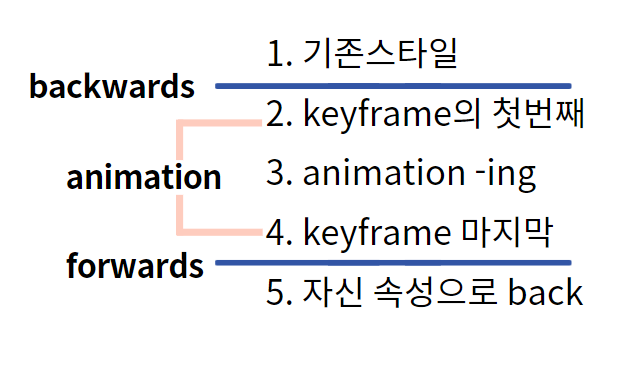
🎞️ animation-fill-mode
- animation이 실행되기 전과 후에 대상에 스타일을 적용하는 방법을 지정한다.
  /* Single animation */
  animation-fill-mode: none;
  animation-fill-mode: forwards; -> 원래 속성 상태에서 시작하고, animation이 끝난 순간의 상태를 유지해라
  animation-fill-mode: backwards; -> animation의 처음 상태를 유지해라. 끝나면 원래 속성으로 돌아감
  animation-fill-mode: both;
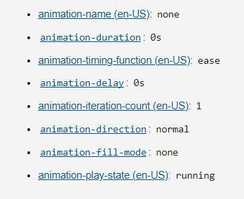
✅animation-shorthand
- 초기값
  /* @keyframes duration | timing-function | delay |
  iteration-count | direction | fill-mode | play-state | name */
  animation: 3s ease-in 1s 2 reverse both paused slidein;

  /* @keyframes duration | timing-function | delay | name */
  animation: 3s linear 1s slidein;

  /* @keyframes duration | name */
  animation: 3s slidein;

wanna be bright person✨ Front-End developer