05_CSS선택자5.html
<!DOCTYPE html>
<html lang="en">
<head>
<meta charset="UTF-8">
<meta name="viewport" content="width=device-width, initial-scale=1.0">
<title>05_CSS선택자5</title>
<link rel="stylesheet" href="css/selector5.css" type="text/css">
</head>
<body>
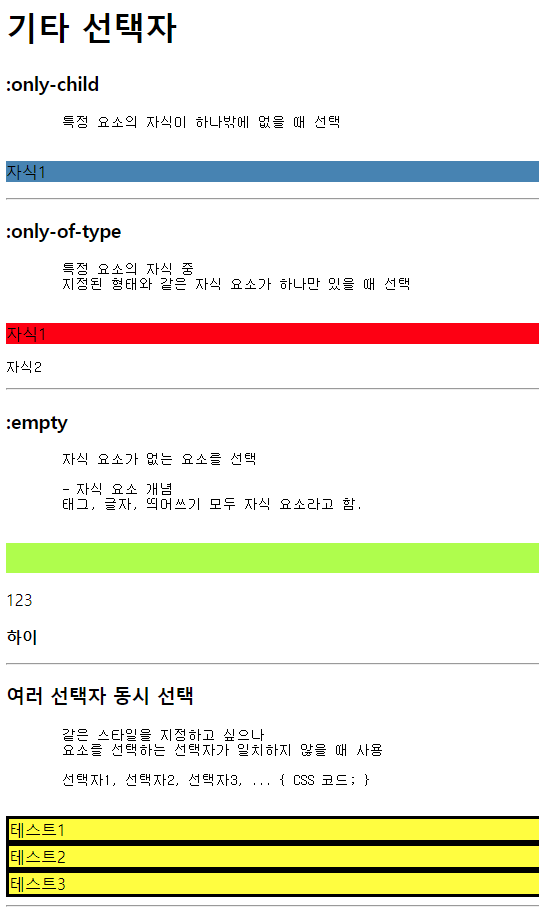
<h1>기타 선택자</h1>
<h3>:only-child</h3>
<pre>
특정 요소의 자식이 하나밖에 없을 때 선택
</pre>
<div id="test1">
<p>자식1</p>
</div>
<hr>
<h3>:only-of-type</h3>
<pre>
특정 요소의 자식 중
지정된 형태와 같은 자식 요소가 하나만 있을 때 선택
</pre>
<div id="test2">
<p>자식1</p>
<pre>자식2</pre>
<!-- <p>자식3</p> -->
</div>
<hr>
<h3>:empty</h3>
<pre>
자식 요소가 없는 요소를 선택
- 자식 요소 개념
태그, 글자, 띄어쓰기 모두 자식 요소라고 함.
</pre>
<div id="test3">
<p></p>
<p>123</p>
<p> </p>
<p><strong>하이</strong></p>
</div>
<hr>
<h3>여러 선택자 동시 선택</h3>
<pre>
같은 스타일을 지정하고 싶으나
요소를 선택하는 선택자가 일치하지 않을 때 사용
선택자1, 선택자2, 선택자3, ... { CSS 코드; }
</pre>
<div id="test4-1">테스트1</div>
<div id="test4-2">테스트2</div>
<div class="test4-3">테스트3</div>
<hr>
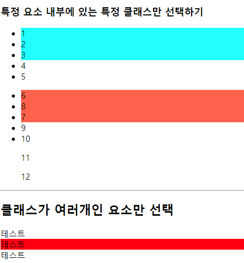
<h3>특정 요소 내부에 있는 특정 클래스만 선택하기</h3>
<ul id="test5-1">
<li class="c5">1</li>
<li class="c5">2</li>
<li class="c5">3</li>
<li>4</li>
<li>5</li>
</ul>
<ul id="test5-2">
<li class="c5">6</li>
<li class="c5">8</li>
<li class="c5">7</li>
<li>
<span class="c5">9</span>
</li>
<li>
<span class="c5">10</span>
</li>
<p class="c5">11</p>
<p class="c5">12</p>
</ul>
<hr>
<h2>클래스가 여러개인 요소만 선택</h2>
<div class="test6">테스트</div>
<div class="test6 c6">테스트</div>
<div class="c6">테스트</div>
</body>
</html>selector5.css
/* :only-child */
#test1 > p:only-child {
    background-color: steelblue;
}

/* :only-of-type */
#test2 > p:only-of-type {
    background-color: red;
}

/* :empty */
#test3 > p:empty {
    background-color: greenyellow;
    height: 30px;
}

/* 여러 선택자 동시 선택 */
#test4-1, #test4-2, .test4-3 {
    background-color: yellow;
    border: 3px solid black;
}

/* 특정 요소 내부에 있는 특정 클래스만 선택 */
#test5-1 .c5 {
    /* #test5-1의 후손 중 클래스가 c5인 요소를 선택 */
    background-color: aqua;
}

#test5-2 > li.c5 {
    /* #test5-2의 자식 중
    클래스가 c5인 li요소만 선택 */
    background-color: tomato;
}

/* 클래스가 여러개인 요소만 선택 */
.test6.c6 {
    background-color: red;
}
06_선택자우선순위.html
<!DOCTYPE html>
<html lang="en">
<head>
<meta charset="UTF-8">
<meta name="viewport" content="width=device-width, initial-scale=1.0">
<title>06_선택자우선순위</title>
<link rel="stylesheet" href="css/selector6.css" type="text/css">
</head>
<body>
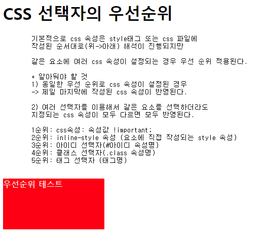
<h1>CSS 선택자의 우선순위</h1>
<pre>
기본적으로 css 속성은 style태그 또는 css 파일에
작성된 순서대로(위->아래) 해석이 진행되지만
같은 요소에 여러 css 속성이 설정되는 경우 우선 순위 적용된다.
* 알아둬야 할 것
1) 동일한 우선 순위로 css 속성이 설정된 경우
-> 제일 마지막에 작성된 css 속성이 반영된다.
2) 여러 선택자를 이용해서 같은 요소를 선택하더라도
지정되는 css 속성이 모두 다르면 모두 반영된다.
1순위: css속성: 속성값 !important;
2순위: inline-style 속성 (요소에 직접 작성되는 style 속성)
3순위: 아이디 선택자(#아이디 속성명)
4순위: 클래스 선택자(.class 속성명)
5순위: 태그 선택자 (태그명)
</pre>
<!-- 2순위 : inline-style -->
<div class="cls1" id="test1" style="background-color: pink;">
우선순위 테스트
</div>
</body>
</html>selector6.css
/* 5순위 : 태그 선택자 */
div {
    width: 200px;
    height: 200px;
    background-color: red !important; /* 1순위 : !important */
}

/* 4순위 : 클래스 선택자 */
.cls1 {
    background-color: green;
}

.cls1 {
    background-color: yellow;
    /* 동일한 우선순위에선 마지막에 작성된 설정값이 적용됨 */
}

/* 3순위 : 아이디 선택자 */
#test1 {
    height: 100px;
    background-color: black;
    color: white;
}
07_레이아웃스타일1.html
<!DOCTYPE html>
<html lang="en">
<head>
<meta charset="UTF-8">
<meta name="viewport" content="width=device-width, initial-scale=1.0">
<title>07_레이아웃스타일1</title>
<link rel="stylesheet" href="css/layout1.css">
</head>
<body>
<h1>레이아웃(layout)</h1>
<pre>
사전적 의미 : 배치 정리
기술적 의미 : 구성 요소를 제한된 공간에 효율적으로 배치하는 것을 의미.
</pre>
<hr>
<h1>화면 배치 방법(형식) : display 속성</h1>
<pre>
요소가 화면에 어떻게 보여질지 형식을 지정하는 속성
- block : 화면을 수직 분할(행을 나눔) + width / height 속성 사용 가능
- inline : 화면을 수평 분할 + width / height 속성 사용 불가능
- inline-block : inline의 수평 분할 + block 크기 조정
- none : 화면에 요소가 표시되지는 않으나 존재하고 있는 상태
- flex : 요소의 정렬되는 방향, 요소간의 간격을 유연하게 처리하는 형식
</pre>
<h3>block 형식의 요소(div)를 inline으로 변경</h3>
<div class="area1 inline">1번 영역</div>
<div class="area2 inline">2번 영역</div>
<div class="area3 inline">3번 영역</div>
<div class="area4 inline">4번 영역</div>
<div class="area5 inline">5번 영역</div>
<h3>inline 형식 요소(span)를 block으로 변경</h3>
<span class="area1 block">1번 영역</span>
<span class="area2 block">2번 영역</span>
<span class="area3 block">3번 영역</span>
<span class="area4 block">4번 영역</span>
<span class="area5 block">5번 영역</span>
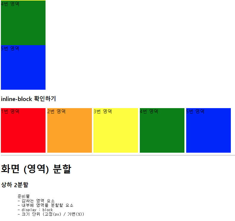
<h3>inline-block 확인하기</h3>
<div class="area1 block inline-block">1번 영역</div>
<div class="area2 block inline-block">2번 영역</div>
<div class="area3 block inline-block">3번 영역</div>
<div class="area4 block inline-block">4번 영역</div>
<div class="area5 block inline-block">5번 영역</div>
<hr>
<h1>화면 (영역) 분할</h1>
<h3>상하 2분할</h3>
<pre>
준비물
- 감싸는 영역 요소
- 내부에 영역을 분할할 요소
- display : block
- 크기 단위 (고정(px) / 가변(%))
</pre>
<!-- 감싸는 영역 요소 -->
<div id="container-1">
<!-- 내부에 영역을 분할할 요소 -->
<div class="div-1"></div>
<div class="div-1"></div>
</div>
<hr>
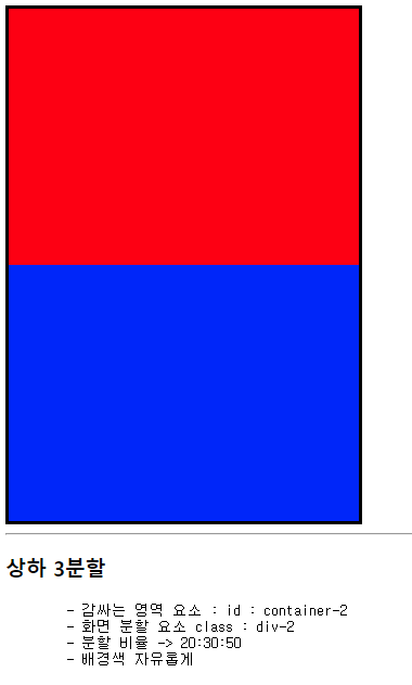
<h3>상하 3분할</h3>
<pre>
- 감싸는 영역 요소 : id : container-2
- 화면 분할 요소 class : div-2
- 분할 비율 -> 20:30:50
- 배경색 자유롭게
</pre>
<div id="container-2">
<div class="div-2"></div>
<div class="div-2"></div>
<div class="div-2"></div>
</div>
<hr>
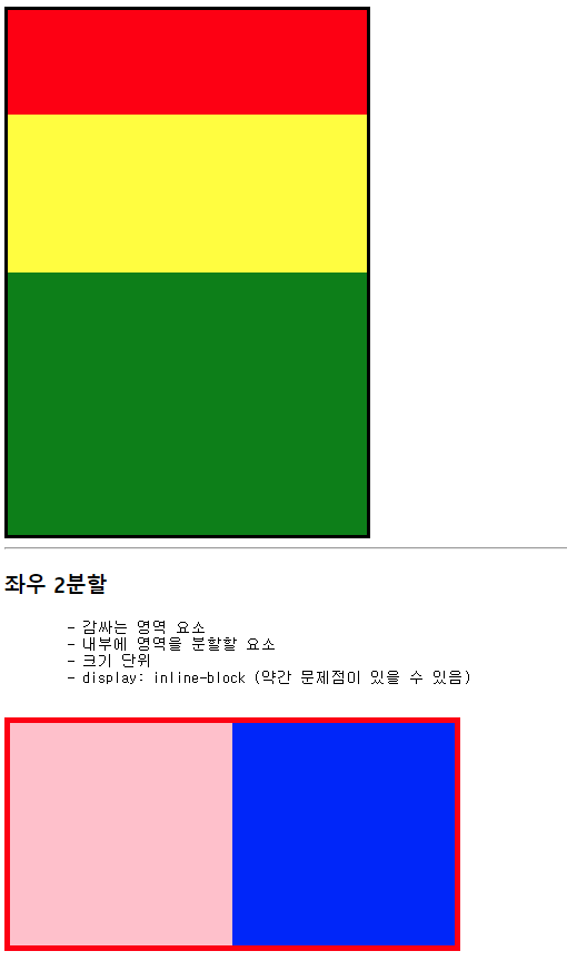
<h3>좌우 2분할</h3>
<pre>
- 감싸는 영역 요소
- 내부에 영역을 분할할 요소
- 크기 단위
- display: inline-block (약간 문제점이 있을 수 있음)
</pre>
<div id="container-3">
<div class="div-3"></div><div class="div-3"></div>
<!-- 내부의 두 요소 사이에 띄어쓰기, 엔터 == 한칸 -->
</div>
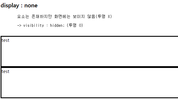
<h3> display : none </h3>
<pre>
요소는 존재하지만 화면에는 보이지 않음(투명 X)
-> visibility : hidden; (투명 O)
</pre>
<div class="div-4">test</div>
<div class="div-4" id="test4">css 적용 요소</div>
<div class="div-4">test</div>
</body>
</html>layout1.css
.area1 { background-color: red; }
.area2 { background-color: orange; }
.area3 { background-color: yellow; }
.area4 { background-color: green; }
.area5 { background-color: blue; }

.block {
    width: 150px;
    height: 150px;

    display: block;
}

.inline {
    display: inline;
}

.inline-block {
    display: inline-block;
}

/* 감싸는 영역 요소 */

#container-1 {
    border: 3px solid black;
    width: 323px;
    height: 472px;
}

/* 내부에 영역을 분할할 요소 */
.div-1 {
    width: 100%;
    height: 50%;
}

#container-1 > .div-1:first-of-type {
    background-color: red;
}

#container-1 > .div-1:last-of-type {
    background-color: blue;
}

#container-2 {
    border: 3px solid black;
    width: 323px;
    height: 472px;
}

/* block 형식의 요소는 별도의
width가 지정되지 않으면 항상 100% */
/* .div-2 {
    width: 100%;
    height: 33%;
} */

#container-2 > .div-2:nth-of-type(1) {
    background-color: red;
    height: 20%;
}

#container-2 > .div-2:nth-of-type(2) {
    background-color: yellow;
    height: 30%;
}

#container-2 > .div-2:nth-of-type(3) {
    background-color: green;
    height: 50%;
}

#container-3 {
    border: 5px solid red;
    width: 400px;
    height: 200px;
}

.div-3 {
    width: 50%;
    height: 100%;

    display: inline-block;
}

#container-3 > .div-3:first-child {
    background-color: pink;
}

#container-3 > .div-3:last-child {
    background-color: blue;
}


/* display:none, visibility : hidden; */

.div-4 {
    border: 3px solid black;
    height: 100px;
}

#test4 {
    background-color: deeppink;

    /* visibility: hidden; */
    display: none;
}

08_레이아웃스타일2.html
<!DOCTYPE html>
<html lang="en">
<head>
<meta charset="UTF-8">
<meta name="viewport" content="width=device-width, initial-scale=1.0">
<title>08_레이아웃스타일2</title>
<link rel="stylesheet" href="css/layout2.css">
</head>
<body>
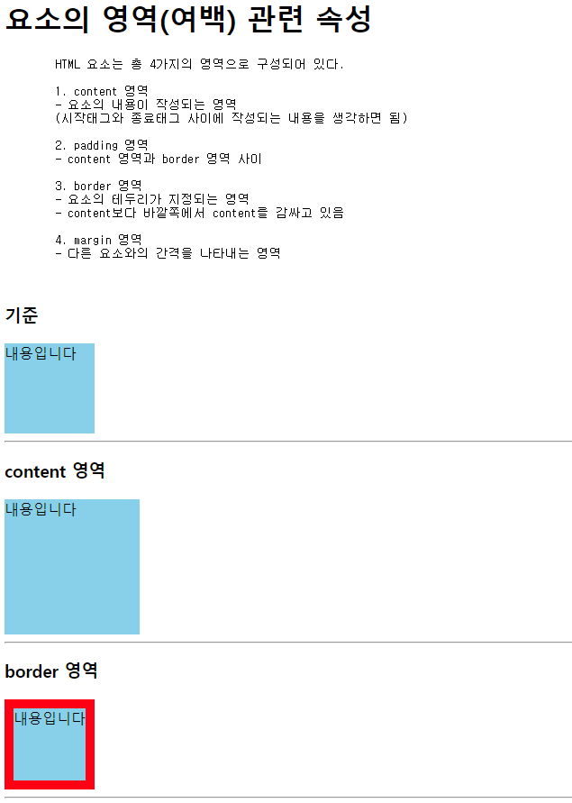
<h1>요소의 영역(여백) 관련 속성</h1>
<pre>
HTML 요소는 총 4가지의 영역으로 구성되어 있다.
1. content 영역
- 요소의 내용이 작성되는 영역
(시작태그와 종료태그 사이에 작성되는 내용을 생각하면 됨)
2. padding 영역
- content 영역과 border 영역 사이
3. border 영역
- 요소의 테두리가 지정되는 영역
- content보다 바깥쪽에서 content를 감싸고 있음
4. margin 영역
- 다른 요소와의 간격을 나타내는 영역
</pre>
<h3>기준</h3>
<div class="box">내용입니다</div>
<hr>
<h3>content 영역</h3>
<div class="box content">내용입니다</div>
<hr>
<h3>border 영역</h3>
<div class="box border">내용입니다</div>
<hr>
<h3>padding 영역</h3>
<div class="box border padding">내용입니다</div>
<hr>
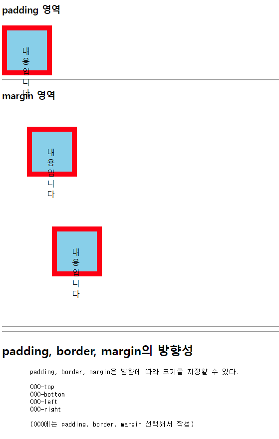
<h3>margin 영역</h3>
<div class="box border padding margin">내용입니다</div>
<div class="box border padding margin" id="m1">내용입니다</div>
<hr>
<hr>
<h2>padding, border, margin의 방향성</h2>
<pre>
padding, border, margin은 방향에 따라 크기를 지정할 수 있다.
OOO-top
OOO-bottom
OOO-left
OOO-right
(OOO에는 padding, border, margin 선택해서 작성)
</pre>
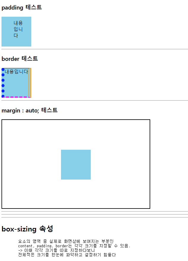
<h3>padding 테스트</h3>
<div class="box padding-test">내용입니다</div>
<hr>
<h3>border 테스트</h3>
<div class="box border-test">내용입니다</div>
<hr>
<h3>margin : auto; 테스트</h3>
<div class="box-container">
<div class="box margin-auto"></div>
</div>
<hr><hr><hr>
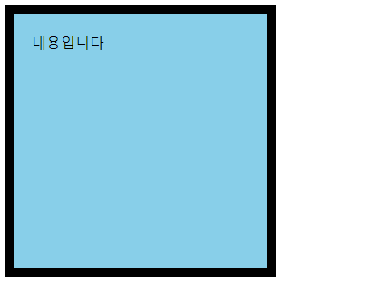
<h2>box-sizing 속성</h2>
<pre>
요소의 영역 중 실제로 화면상에 보여지는 부분인
content, padding, border는 각각 크기를 지정할 수 있음.
-> 이때 각각 크기를 따로 지정하다보니
전체적은 크기를 한눈에 파악하고 설정하기 힘들다
</pre>
<div class="box" id="box-sizing">내용입니다</div>
<div style="height: 500px;"></div>
</body>
</html>layout2.css
.box {
    width: 100px;
    height: 100px;
    background-color: lightblue;
}

/* content 영역 */
.content {
    width: 150px;
    height: 150px;

    /* width/ height 속성은
        기본적으로 content 영역의 크기를 지정하는 속성
    */
}

/* border 영역 */
.border {
    border: 10px solid red;
}

/* padding 영역 */
.padding {
    padding: 30px;
}

/* margin 영역*/
.margin {
    margin: 50px;
}

#m1 {
    margin: 100px;
}

/* 서로 다른 요소의 margin이 겹칠 경우
더 큰 margin을 가진 요소의 값을 따른다.
*/

/***************************************/

/* 방향성 */

.padding-test {
    /*padding-top: 20px;
    padding-bottom: 50px;
    padding-left: 30px;
    padding-right: 30px;*/

    /* padding 속성 :
        작성법에 따라서 padding 특정 방향에 크기를 지정할 수 있다
    */

    /* 값 1개 : 상하좌우 */
    /* padding: 30px;  */

    /* 값2개 : 상하, 좌우*/
    /* padding: 50px 100px; */

    /* 값3개 : 상, 좌우, 하*/
    /* padding: 10px 50px 100px; */

    /* 값4개 : 상, 우, 하, 좌*/
    padding: 10px 20px 30px 40px;
}

/* border (속성이 조금 다름) */
.border-test {
    /* border 속성은 상하좌우 방향을 별도로 지정할수 없음*/
    /* border: 1px 2px 3px 4px solid red; */

    border-top : 1px solid black;
    border-bottom: 5px dashed magenta;
    border-left: 10px dotted blue;
    border-right: 10px double orange;
}

.box-container {
    border: 2px solid black;
    width: 500px;
    height: 300px;
}

/* margin-auto 테스트 */
.margin-auto {
    margin-top: 100px;
    margin-left: 200px;

    margin: auto;
    /* 좌우 요소간의 간격을 자동으로 지정하여 가운데 정렬
    -> 갑자기 margin-top이 무시됐다..
    왜? margin 속성 자체가 상하좌우를 동시 지정하는 속성이라
    상(top) 부분에도 auto가 지정되어 이전 100px 덮어쓰기함

    해결 방법 : margin-top을 auto보다 아래에 작성하여
    auto를 100px 덮어쓴다
    */
    margin-top: 100px;
}

/* box-sizing */
#box-sizing {
    /* 테두리 10px, 패딩 20px, 내용 나머지
        전체 요소 크기가 가로 / 세로 300px 인 정사각형 만들기
    */

    border: 10px solid black;
    padding: 20px;

    width: 300px;
    height: 300px;

    box-sizing: border-box;
}
09_레이아웃스타일3.html
<!DOCTYPE html>
<html lang="en">
<head>
<meta charset="UTF-8">
<meta name="viewport" content="width=device-width, initial-scale=1.0">
<title>09_레이아웃스타일3</title>
<link rel="stylesheet" href="css/layout3.css">
</head>
<body id="body-top">
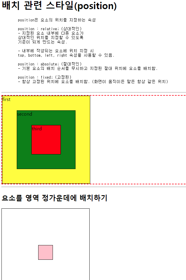
<h1>배치 관련 스타일(position)</h1>
<pre>
position은 요소의 위치를 지정하는 속성
position : relative; (상대적인)
- 지정된 요소 내부에 다른 요소가
상대적인 위치를 지정할 수 있도록
기준이 되게 만드는 속성.
- 내부에 작성되는 요소에 위치 지정 시
top, bottom, left, right 속성을 사용할 수 있음.
position : absolute; (절대적인)
- 기본 요소의 배치 순서를 무시하고 지정된 절대 위치에 요소를 배치함.
position : fixed; (고정된)
- 항상 고정된 위치에 요소를 배치함. (화면이 움직이든 말든 항상 같은 위치)
</pre>
<hr>
<div class="container-1">
<div class="first">first</div>
<div class="second">second</div>
<div class="third">third</div>
</div>
<hr>
<h2> 요소를 영역 정가운데에 배치하기 </h2>
<div class="container-2">
<div id="center"></div>
</div>
<div class="fixed-area">
<a href="#body-top">위쪽으로 이동</a>
</div>
</body>
</html>layout3.css
div {
    border: 1px solid black;
    box-sizing: border-box;
}

.container-1 {
    border: 2px dashed red;
    position: relative;

    /*내부에 작성되는 요소에
    상대적 위치(top/bottom/left/right) 를 지정할 수 있음*/
}

.first {
    width: 300px;
    height: 300px;
    background-color: yellow;
}

.second {
    width: 200px;
    height: 200px;
    background-color: green;

    top: 50px;
    left: 50px;

    position: absolute;
}

.third {
    width: 100px;
    height: 100px;
    background-color: red;

    top: 100px;
    left: 100px;

    position: absolute;
}

/* 정가운데 배치하기 */

.container-2 {
    width: 300px;
    height: 300px;
    position: relative;
}

#center {
    width: 50px;
    height: 50px;
    background-color: pink;

    position: absolute;

    top: 0;
    left: 0;
    bottom: 0;
    right: 0;

    margin: auto;
}

.fixed-area {
    width: 120px;

    position: fixed;

    bottom: 50px;
    right: 50px
}
flexbox.html
<!DOCTYPE html>
<html lang="en">
<head>
<meta charset="UTF-8">
<meta name="viewport" content="width=device-width, initial-scale=1.0">
<title>flexbox</title>
<link rel="stylesheet" href="css/flexbox.css">
</head>
<body>
<h1>Flexbox</h1>
<pre>
* Flexbox를 이용할 때 반드시 알아야 하는 것!
1. Flexbox의 구성
- flex-container : 정렬이 필요한 요소를 감싸는 요소 (부모)
- item : 정렬을 적용할 요소 (자식)
(flex-container와 item에 사용되는 flex 관련 css 속성이 나누어져 있음.)
2. Flexbox의 축
- 중심축
- 교차축, 반대축
</pre>
<hr>
<div class="flex-container">
<div class="item item1">item1</div>
<div class="item item2">item2</div>
<div class="item item3">item3</div>
<div class="item item4">item4</div>
<div class="item item5">item5</div>
<div class="item item6">item6</div>
<div class="item item7">item7</div>
<div class="item item8">item8</div>
<div class="item item9">item9</div>
</div>
<hr>
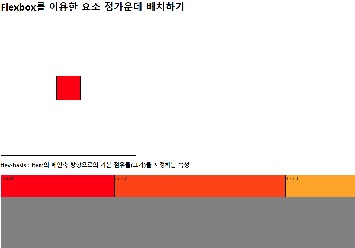
<h1>Flexbox를 이용한 요소 정가운데 배치하기</h1>
<div id="con">
<div id="center"></div>
</div>
<h3>flex-basis :
item의 메인축 방향으로의
기본 점유율(크기)을 지정하는 속성
</h3>
<div class="flex-container">
<div class="item item1 basis-20">item1</div>
<div class="item item2 basis-30">item2</div>
<div class="item item3 basis-50">item3</div>
</div>
</body>
</html>flexbox.css
div{
    border : 1px solid black;
    box-sizing: border-box;
    /* content + padding + border 합으로 width/height 지정 */
}


.item{
    width: 75px;
    height: 75px;
}


.item1{background-color: red;}
.item2{background-color: orangered;}
.item3{background-color: orange;}
.item4{background-color: yellow;}
.item5{background-color: yellowgreen;}
.item6{background-color: green;}
.item7{background-color: lightblue;}
.item8{background-color: blue;}
.item9{background-color: violet;}


.flex-container {
    height: 700px;
    background-color: gray;

    display: flex;
    /*
        item(내부요소)을 감싸는 요소의 형식을 flex 변경
        -> item에 자동으로 지정된 margin 요소가 모두 사라지고
        content영역만큼의 크기만 가지게 됨 -> inline
    */

    /* flex-direction (부모 전용 속성) */
    /* 메인축의 방향과 시작 위치를 지정하는 속성 */

    /* 행 방향 (가로, 기본값) */
    /* flex-direction: row; */

    /* 행 방향 (가로) + 순서 반대 */
    /* flex-direction: row-reverse; */

    /* 열 방향 (세로) */
    /* flex-direction: column; */

    /* 열 방향 (세로) + 순서 반대 */
    /* flex-direction: column-reverse; */

    /* flex-wrap (부모 전용 속성) */
    /* 내부 item들을 포장하는 속성
        item들이 강제로 한줄에 배치되게 할지,
        한줄을 벗어나 여러 줄로 배치할 것인지를 지정
    */

    /* item을 한줄로 배치 (기본값) */
    /* flex-wrap: nowrap; */

    /* item을 여러 줄로 배치 */
    /* flex-wrap: wrap; */

    /* item을 여러 줄로 배치 (뒤에서 배치) */
    /* flex-wrap: wrap-reverse; */

    /* justify-content */
    /* 메인축 방향으로 item의 정렬 방법을 조정함 */

    /*  */
    /* justify-content: flex-start; */
    /* justify-content: flex-end; */

    /* flex-direction: column; */

    /* justify-content: flex-end; */
    /* justify-content: center; */

    /* item 주위에 메인축 방향 양쪽으로 일정한 크기의 공간을 추가
    -> 양끝은 조금, item 중간은 넓게 떨어져있음
    -> 브라우저 크기에 따라 변함
    */
    /* justify-content: space-around; */

    /* item이 메인축 내에서 동일한 간격을 가진다 */
    /* justify-content: space-evenly; */

    /* 양끝쪽을 붙인 상태에서 item들의 간격을 일정하게 정렬시킨다. */
    /* justify-content: space-between; */

    /* flex-direction: column; */
    /* align-items */
    /* item들을 교차축 방향으로 정렬하는 방법을 지정하는 속성
    */

    /* align-items: flex-start; */
    /* align-items: flex-end; */

    /* align-items: center; */
}

/* 요소 정가운데 배치하기 */

#con {
    width: 450px;
    height: 450px;

    display: flex;

    justify-content: center;

    align-items: center;
}

#center {
    width: 80px;
    height: 80px;
    background-color: red;
}

/* item(자식)에게 주는 flex 속성 */
.basis-20 { flex-basis : 20%; }
.basis-30 { flex-basis : 30%; }
.basis-50 { flex-basis : 50%; }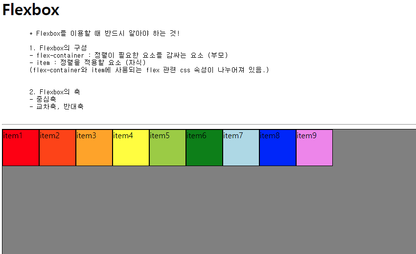

초보자