flex
flex는 쉽게 말해서, 세로로 수직 정렬된 것을 가로로 수평 정렬해준다고 생각하면 편하다.
flex 사용법
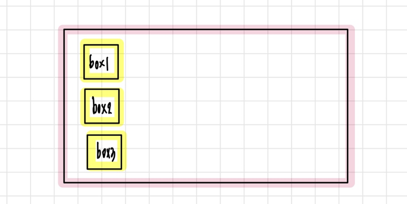
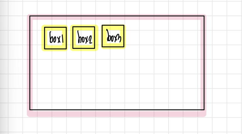
첫 번째 그림을 두 번째 그림처럼 만드려면 어떻게 해야할까?
이럴때 사용하는 것이 바로 flex이다.
그럼 flex 사용법에 대해 더 자세하게 알아보자!
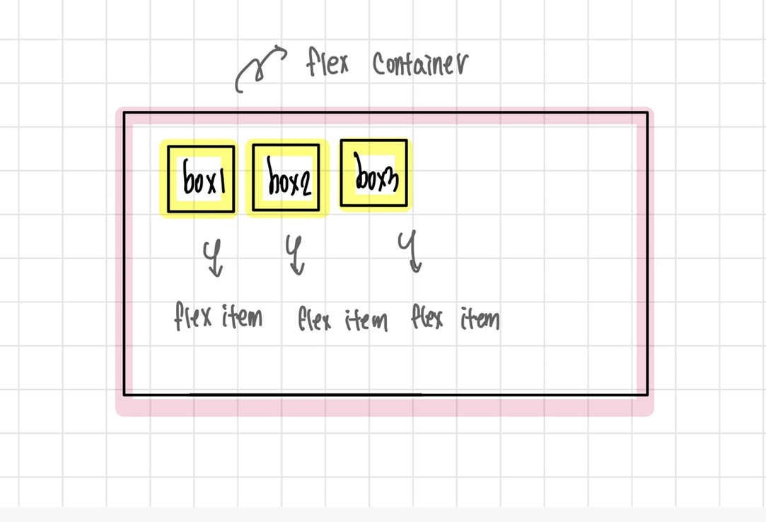
핑크색 가장 밖의 박스를 우리는 flex-container라고 한다. 부모요소라고 할 수 있다.
안에 노란색 박스들은 flex-item이라고 한다. 자식 요소라고 할 수 있다.
부모요소에 display: flex;를 적어주면 flex를 사용할 준비가 끝났다!
첫 번째 사진처럼 만들기 위한 코드
<!DOCTYPE html>
<html lang="en">
<head>
<meta charset="UTF-8">
<meta name="viewport" content="width=!, initial-scale=1.0">
<title>flex에 대해서 알아보자-1</title>
<link rel="stylesheet" href="flex.css">
</head>
<body>
<div class="flex-container">
<div class="flex-item-01">box1</div>
<div class="flex-item-02">box2</div>
<div class="flex-item-03">box3</div>
</div>
</body>
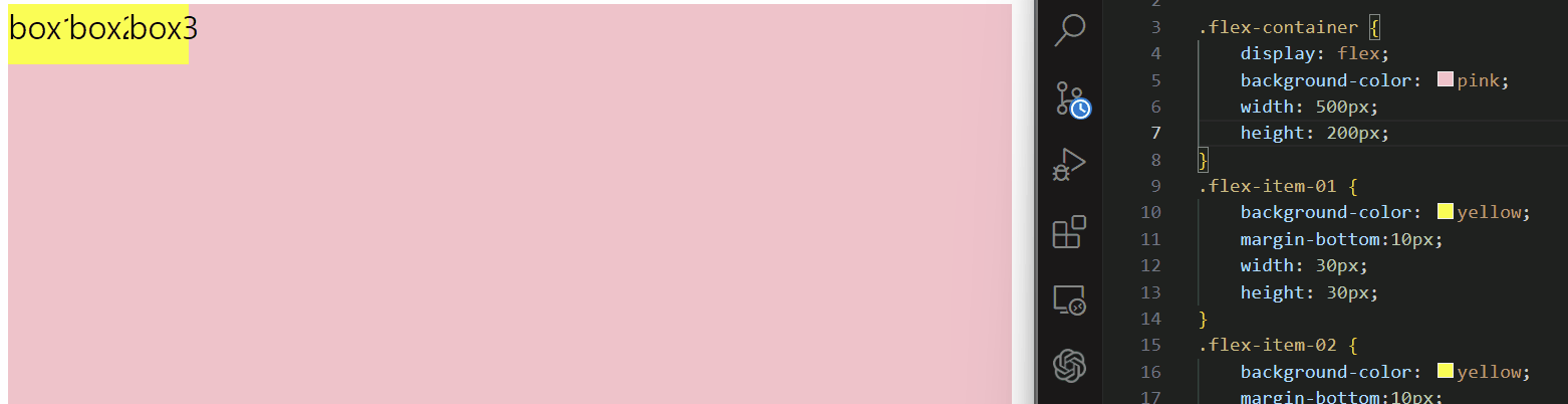
</html>.flex-container {
background-color: pink;
width: 500px;
height: 200px;
}
.flex-item-01 {
background-color: yellow;
margin-bottom:10px;
width: 30px;
height: 30px;
}
.flex-item-02 {
background-color: yellow;
margin-bottom:10px;
width: 30px;
height: 30px;
}
.flex-item-03 {
background-color: yellow;
margin-bottom:10px;
width: 30px;
height: 30px;
}

flex-container에 display: flex; 를 넣으니 가로로 정렬이 되고, 또 align-item: center; 를 넣으니 flex-item들이 중앙정렬된 것을 알 수 있다.
.flex-container {
    display: flex;
    background-color: pink;
    width: 500px;
    height: 200px;
    align-items: center;
}
.flex-item-01 {
    background-color: yellow;
    margin-bottom:10px;
    width: 30px;
    height: 30px;
}
.flex-item-02 {
    background-color: yellow;
    margin-bottom:10px;
    width: 30px;
    height: 30px;
}
.flex-item-03 {
    background-color: yellow;
    margin-bottom:10px;
    width: 30px;
    height: 30px;
}
flex 공부를 위한 개구리 게임

영차영차