CSS에서 크기
PX
PX는 픽셀 단위로 크기를 지정하는 것이다.
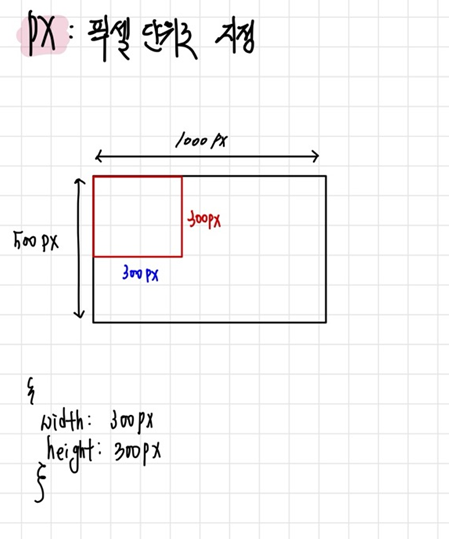
width, height의 크기가 고정이기 떄문에 웹 브라우저의 크기를 늘리거나 줄여도 변하지 않는다는 점이 있다.
%
퍼센트는 부모 태그를 기준으로 단위를 지정한다.
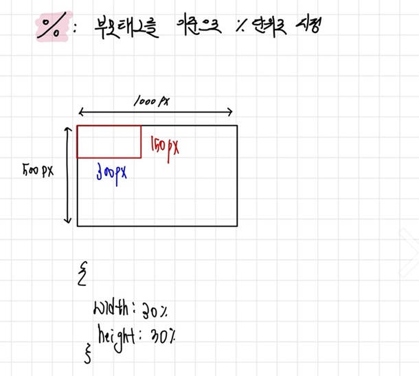
부모 크기에 영향을 미치기 떄문에 부모의 width, height가 각각 1000px, 500px이면, width가 30%로 설정했기 때문에 300px가 되고 height는 30%이기 때문에 150px가 된다.
vw
그런데 만약 웹 브라우저를 줄였을 때, 부모의 영향을 받는 %를 사용하게 된다면 어떤 일이 일어날까?
참고 블로그 보러가기
https://aram5.tistory.com/9
<!DOCTYPE html>
<html lang="en">
<head>
    <meta charset="UTF-8">
    <meta name="viewport" content="width=device-width, initial-scale=1.0">
    <title>percent개념 알기</title>
    <link rel="stylesheet" href="percent.css">
</head>
<body>
    <div class="percent-container">
    </div>
</body>
</html>
body {
width:1000px;
height: 500px;
background-color: aquamarine;
}
.percent-container {
width: 60%; // 600px
height: 60%; // 300px
background-color: pink;
}
위 사진처럼 웹 브러우저의 크기를 줄이면, 옆 부분이 잘리는 걸 알 수 있다.
이런 문제를 해결 하기 위해 나온 것이 바로 vw!
body {
    width:1000px;
    height: 500px;
    background-color: aquamarine;
}
.percent-container {
    width: 60%;
    height: 60%;
    background-color: pink;
}
body {
    width:1000px;
    height: 500px;
    background-color: aquamarine;
}
.percent-container {
    width: 60vw;
    height: 60vh;
    background-color: pink;
}
https://developer.mozilla.org/en-US/docs/Web/CSS/align-items

영차영차