🌱 transition
✏️속도 곡선
<style>
        .box5{
            width: 100px;
            height: 100px;
            background: #0094ff;
            margin: 100px;
        }

        /* 속도 곡선 */
        .box5{transition: transform 2s ease-in;}
        .box5:hover{transform: scale(2) perspective(120px) rotateX(180deg);}
</style>- transition: transform 2s ease-in ➪ 트랜지션 변형 2초로 ease in(느리게 시작)
- transform: scale(2) perspective(120px) rotateX(180deg) ➪ 변형 크기 2배로 3D 원근감 120px로 회전 각도는 x축으로 180도
<body>
    <div class="box5"></div>
</body>
✏️속도
<style>
        #graph{
            width: 610px;
            border: 3px solid black;
        }

        .bar{
            width: 10px;
            height: 50px;
            background-color: orange;
            margin: 5px;
        }

        #graph:hover .bar{
            width: 600px;
            /* transition-property: width, background-color;
            transition-duration: 5s, 5s; */
            transition: all 5s ease;
        }

        /* 속도 */
        .bar:nth-child(1){
            background-color: red;
            transition-timing-function: linear;
        }
        .bar:nth-child(2){
            background-color: blue;
            transition-timing-function: ease;
        }
        .bar:nth-child(3){
            background-color: green;
            transition-timing-function: ease-in;
        }
        .bar:nth-child(4){
            background-color: yellow;
            transition-timing-function: ease-out;
        }
        .bar:nth-child(5){
            background-color: pink;
            transition-timing-function: ease-in-out;
        }
</style>- transition: all 5s ease ➪ 트랜지션 프로퍼티 전부 5초 ease(천천히 시작 빨라지다 천천히 끝)
- transition-timing-function ➪ 트랜지션 속도 곡선
- linear ➪ 시작부터 끝까지 같은 속도로 진행
- ease ➪ 천천히 시작>점점 빨라짐>천천히 끝
- ease-in ➪ 느리게 시작
- ease-out ➪ 느리게 끝
- ease-in-out ➪ 느리게 시작>느리게 끝
- cubic-Bezier(n, n, n, n) ➪ 함수 직접 정의해서 사용
<body>
    <div id="graph">
        <div class="bar"></div>
        <div class="bar"></div>
        <div class="bar"></div>
        <div class="bar"></div>
        <div class="bar"></div>
    </div>
</body>
✏️animation
<style>
        div{
            width: 100px;
            height: 100px;
            border: 1px solid black;
            margin: 50px;
        }

        #box{
            /* background-color: blue;
            animation-name: chang-bg;
            animation-duration: 3s;
            animation-iteration-count: 3;
            animation-direction: alternate;
            animation-timing-function: ease-in-out; */

            animation: chang-bg 3s 1s infinite alternate ease-in-out;
        }

        @keyframes chang-bg {
            from{background-color: blue;}
            50%{background-color: violet;}
            to{
                background-color: yellow;
                border-radius: 50%;
            }
        }
</style>- animation-name: chang-bg ➪ 애니메이션 이름은 chang-bg
- animation-duration: ➪ 애니메이션 지속 시간
- animation-iteration-count ➪ 애니메이션 반복 횟수
- animation-direction: alternate ➪ 애니메이션 방향: 애니메이션이 앞으로 재생된 다음 뒤로 재생
animation
애니메이션 이름 | 지속 시간 | 반복 횟수 | 애니메이션 방향 | 속도 곡선
- @keyframes ➪ 애니메이션 중간 상태 기술
- from{background-color: blue;} ➪ 시작은~ 배경색 파랑
- 50%{background-color: violet;} ➪ 50%지점부터~ 배경색 보라색
- to{background-color: yellow; border-radius: 50%;} ➪ ~로 배경색 노란색, 모서리 둥글게 50%
<body>
    <div id="box"></div>
</body>
✏️box-size
<style>
        .box1{
            width: 400px;
            height: 100px;
            padding: 10px;
            border: 1px solid black;
            background-color: #ff6a00;
        }

        .box2{
            width: 50%;
            height: 100px;
            padding: 10px;
            border: 1px solid black;
            background-color: #006eff;
        }
</style>
width 단위를 px를 쓰는지, %를 쓰는지에 따라 결과가 다르게 나타남. %는 화면 비율에 따른 비율로 변경되어 표현. px은 수치 고정으로 표현.
<body>
    <div class="box1"></div>
    <div class="box2"></div>
</body>
✏️display
inline
콘텐츠 나열 수평 진행. 콘텐츠 영역을 정의.
- width/height 적용 불가
- margin/padding-top/bottom 적용 불가
- line-height 원하는 대로 적용 불가(span에 적용안되고 감싸고 있는 div 전체 크기에만 영향)
block
콘텐츠 나열 수직 진행. 박스형태로 콘텐츠가 위치된 영역 한 줄을 차지하는 영역 정의.
inline-block
콘텐츠 나열 수평 진행.
- width/height 적용 가능
- margin/padding-top/bottom 적용 가능
- line-height 적용 가능
✏️display
<style>
        div{
            margin: 20px;
            border: 1px solid #ccc;
            border-radius: 5px;
        }

        img{width: 300px;}

        .visible{visibility: visible;}

        /* 화면에 보이지 않고 공간도 차지하지 않음 */
        .none{display: none; }

        /* 공간은 차지하지만 내용은 안 보여줌 */
        .hidden{visibility: hidden;}
</style>- display: none ➪ 공간 차지 없이 화면에 안 보임.
- visibility: hidden ➪ 공간 차지 하지만 내용은 안 보임.
<body>
    <div>
        <img class="visible" src="./선생님 자료/실습/de1.jpg">
        <img class="none" src="./선생님 자료/실습/de2.jpg">
        <img class="visible" src="./선생님 자료/실습/de3.jpg">
    </div>

    <div>
        <img class="visible" src="./선생님 자료/실습/de1.jpg">
        <img class="hidden"src="./선생님 자료/실습/de2.jpg">
        <img class="visible" src="./선생님 자료/실습/de3.jpg">
    </div>
</body>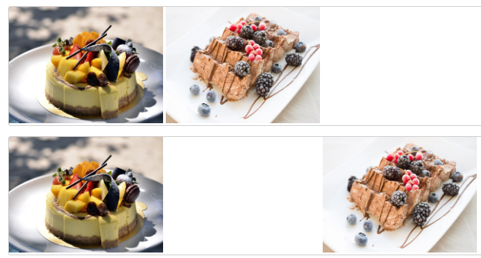
✏️border
<style>
		div {
			width:200px;
			height:100px;
			display:inline-block;
			margin:15px;
			border-width:10px;  /* 2. 테두리 굵기 : 사방 같은 값, 다른 값, 키워드(thin, medium, thick) */
            border-top-color:aquamarine; /* 3. 색깔: 사방 같은 값(border-color), 다른 값(top, right, bottom, left ),*/
            /* 4. 속성 묶어 표현 가능, 순서 상관 없음 */
		}

		/* 1. 선 형태 */
		.box1 {border-style:solid;}  /* 실선 */
		.box2 {border-style:dotted;}  /* 점선 */
		.box3 {border-style:dashed;}  /* 선으로 된 점선 */
        .box4 {border-style: double;}
        .box5 {border-style: groove;}
        .box6 {border-style: inset;}
        .box7 {border-style: outset;}
        .box8 {border-style: ridge;}
</style>- border-width ➪ 선 굵기
- border-top-color ➪ 선 상단 색상
<body>
	<div class="box1">solid </div>
	<div class="box2">dotted </div>
	<div class="box3">dashed </div>
	<div class="box4">double </div>
	<div class="box5">groove </div>
	<div class="box6">inset </div>
	<div class="box7">outset </div>
	<div class="box8">ridge </div>
</body>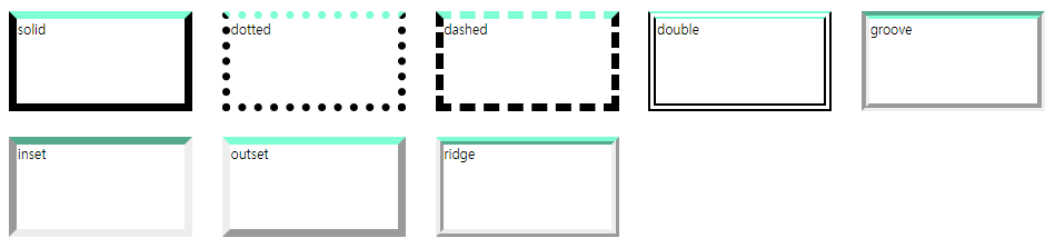
✏️border-radius
<style>
		div {
			width: 300px; /* 너비 */
			height: 200px; /* 높이 */
			margin: 20px; /* 영역간 마진 */
			display: inline-block; /* 가로로 배치 */
			border:5px solid cadetblue; /* 2px짜리 빨강 실선 */
		}
		.round {/* 사방 동일 */
			border-radius:20px;  /* 모서리 20px 만큼 라운딩 */
		}
		.round-top{/* 위쪽만 */
			border-top-left-radius:20px;
			border-top-right-radius:20px;
		}
		.round-four {/* 사방 다르게 */
			border-radius:70px 20px;
		}

		/* 모서리를 타원처럼 */
		.round1 {border-top-left-radius:100px 50px;} /* 왼쪽 위 라운딩 */
		.round2 {border-bottom-right-radius:50% 30%;}
</style>- border-radius ➪ 테두리 둥글게
<body>
	<div class="round bg"></div>
	<div class="round-top bg"></div>
	<div class="round-four bg"></div>
	<br>
	<div class="round1"></div>
	<div class="round2"></div>
</body>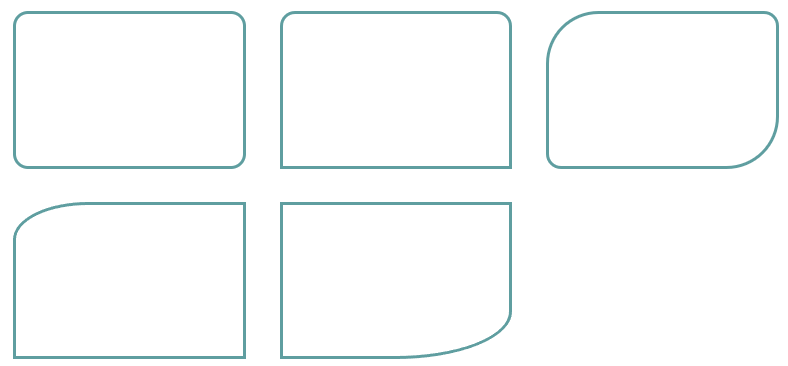
✏️margin-overlap
<style>
    * {
      box-sizing:border-box;
    }
		div {
			width:200px;  /* 너비 */
			height:100px;  /* 높이 */
  		    margin:30px;  /* 마진 */
		}
    #box1 {
      background:rgb(0, 77, 243);
    }
    #box2 {
      background:rgb(255, 72, 0);
    }
    #box3 {
      background:rgb(18, 219, 0);
    }
</style>
margin-overlap
요소를 세로로 배치시 마진과 마진이 만나면 마진 값이 큰 쪽으로 겹쳐지는 것
-> 여러 요소를 세로로 배치할 때 마진이 너무 커지는 것을 방지하기. 위한 것 위, 아래 마진은 큰 값으로 합쳐지고
오른쪽 왼쪽 마진은 만나도 중첩되지 않는다
<body>
	<div id="box1"></div>
	<div id="box2"></div>
	<div id="box3"></div>
</body>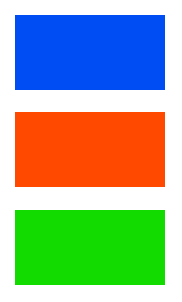
✏️padding
패딩(padding)이란 콘텐츠 영역과 테두리 사이의 여백.

Life is experience:)