[React Native TIL]스타일링,StyleSheet, flexbox,flexDirection,shadow,Platform,elevation,select
React Native TIL
1. 스타일링
- React Native에서는 인라인 스타일은 객체로 입력해야 한다.
- React Native에서는 카멜 케이스로 작성해야 한다.
style={{backgroundColor: 'red', padding:10, margin:10}}1-1. StyleSheet
css에서 클래스 속성과 비슷한 것. StyleSheet를 사용하여 스타일을 적용하면 인라인 스타일로 작성했을 때에 비해 적용된 스타일의 이유를 명확하게 확인할 수 있고 코드의 수정도 수월하다는 장점이 있다.
import React,{useState} from 'react';
import { StyleSheet,Text, View, TextInput} from 'react-native';
//StyleSheet를 import하고
export default function App() {
  return (
    <View style={styles.container}>
      <Text style={{backgroundColor:"black",color: "white", fontSize:20}}>style Code</Text>
      <Text style={styles.errorText}>Error Text</Text>
    </View>
  );
}

const styles = StyleSheet.create({
  //StyleSheet.create함수 안에 **객체 형태**로 스타리 작성
  container: {
    flex: 1,
    backgroundColor: '#fff',
    alignItems: 'center',
    justifyContent: 'center',
  },
  errorText:{
    backgroundColor: 'black',
    color:"red",
    fontSize:20
  }
});
스타일 코드에서 중복되는 코드를 줄이고 여로개의 스타일을 적용하는 방법
아래 스타일 코드를 보면 fontsize, backgroundcolor가 중복되는 것을 볼수 있다.
const styles = StyleSheet.create({
  container: {
    flex: 1,
    backgroundColor: '#fff',
    alignItems: 'center',
    justifyContent: 'center',
  },
  text:{
    backgroundColor:"black",
    color: "white",
    fontSize:20},
  errorText:{
    backgroundColor: 'black',
    color:"red",
    fontSize:20
  }
});
스타일을 여러개 적용할 때는 배열을 이용해서 적용하고 싶은 스타일을 나열하면 된다.
여러개의 스타일이 적용되었을 때 뒤에 있는 스타일 코드가 앞에 있는 스타일 코드를 덮어 쓰게 된다.
import React,{useState} from 'react';
import { StyleSheet,Text, View, TextInput} from 'react-native';

export default function App() {
  return (
    <View style={styles.container}>
      <Text style={styles.text}>style Code</Text>
      <Text style={[styles.text, styles.errorText]}>Error Text</Text>
    </View>
  );
}

const styles = StyleSheet.create({
  container: {
    flex: 1,
    backgroundColor: '#fff',
    alignItems: 'center',
    justifyContent: 'center',
  },
  text:{
    backgroundColor:"black",
    color: "white",
    fontSize:20},
  errorText:{
    color:"red",
  }
});
여러개의 스타일을 적용할 때 StyleSheet에 적용된 스타일과 인라인 스타일을 혼용해서 사용하는 것도 가능하다.
<Text style={[styles.text,{color:'orange'}]}>style Code</Text>1-2. 스타일 외부에서 관리
//style.js
import { StyleSheet } from "react-native";

export const styles = StyleSheet.create({
    container: {
      flex: 1,
      backgroundColor: '#fff',
      alignItems: 'center',
      justifyContent: 'center',
    },
    text:{
      backgroundColor:"black",
      color: "white",
      fontSize:20},
    errorText:{
      color:"red",
    }
  });

  //StyleSheet가 아닌 그냥 객체 형태도 가능
export const orangeText ={
    color:'orange'
}
//App.js
import React from 'react';
import {,Text, View} from 'react-native';
import {styles, orangeText} from './style'
export default function App() {
return (
<View style={styles.container}>
<Text style={[styles.text,orangeText]}>style Code</Text>
<Text style={[styles.text, styles.errorText]}>Error Text</Text>
</View>
);
}2. flexbox
flexbox는 컨테이너 안에 요소간 공간 배분과 정렬 기능을 제공하는 레이아웃 모델입니다.
2-1. flex
flex는 높이나 너비를 지정하는 것이 아니라 비율로 차지할 공간을 설정한다.
3개의 컴포넌트가 각각 1, 1, 2로 flex가 설정했을 때
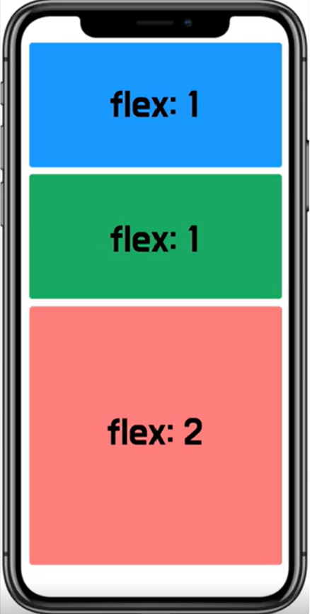
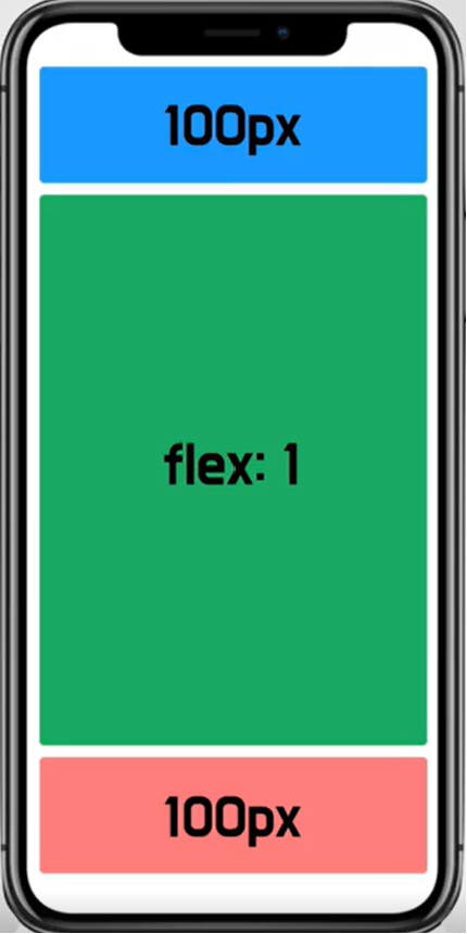
양 끝에 고정된 높이를 제외하고 가운데 컴포넌트를 flex 1로 설정하면 기기가 변경되어 높이가 달라진다 하더라도 양 끝네 100px 높이는 고정이 되어있고 가운데 컴포넌트는 그 외에 나머지 영역을 모두 차지하게 된다.
//Box.js
import React from 'react';
import { View } from 'react-native';

const Box =({style})=>{
    return <View style={[{borderWidth:2, width:'100%'},style]}></View>
}

export default Box;
//App.js
import React from 'react';
import { StyleSheet, View} from 'react-native';
import Box from './Box';
import { StatusBar } from 'expo-status-bar';
export default function App() {
return (
<View style={styles.container}>
<StatusBar style='auto'/>
<Box style={{backgroundColor:"red", height:100}}/>
<Box style={{backgroundColor:"green", flex:1}}/>
<Box style={{backgroundColor:"blue", height:100}}/>
</View>
);
}
const styles = StyleSheet.create({
container: {
flex: 1,
backgroundColor: '#fff',
alignItems: 'center',
justifyContent: 'center',
}
});3. flexDirection
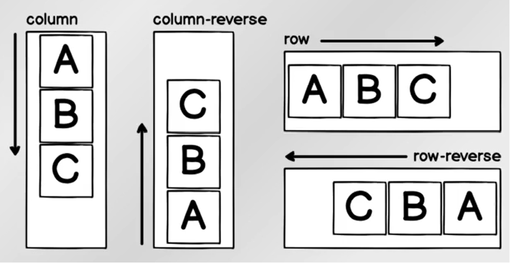
felx-direction은 컴포넌트가 쌓이는 방향을 결정한다. 정확히는 flex-direction이 설정된 컴포넌트에서 자식 컴포넌트가 쌓이는 방향을 설정한다.
3-1. 정렬
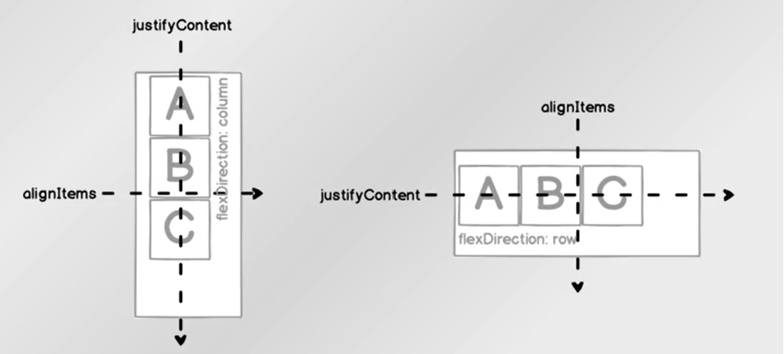
justifyCotent는 항상 flexdirection과같은 방향으로 정렬 방식을 설정alignItem은 flexdirection과수직 방향으로 정렬하는 방식
3-2 justifyContent
flex-direction이 row인 상태에서 예시
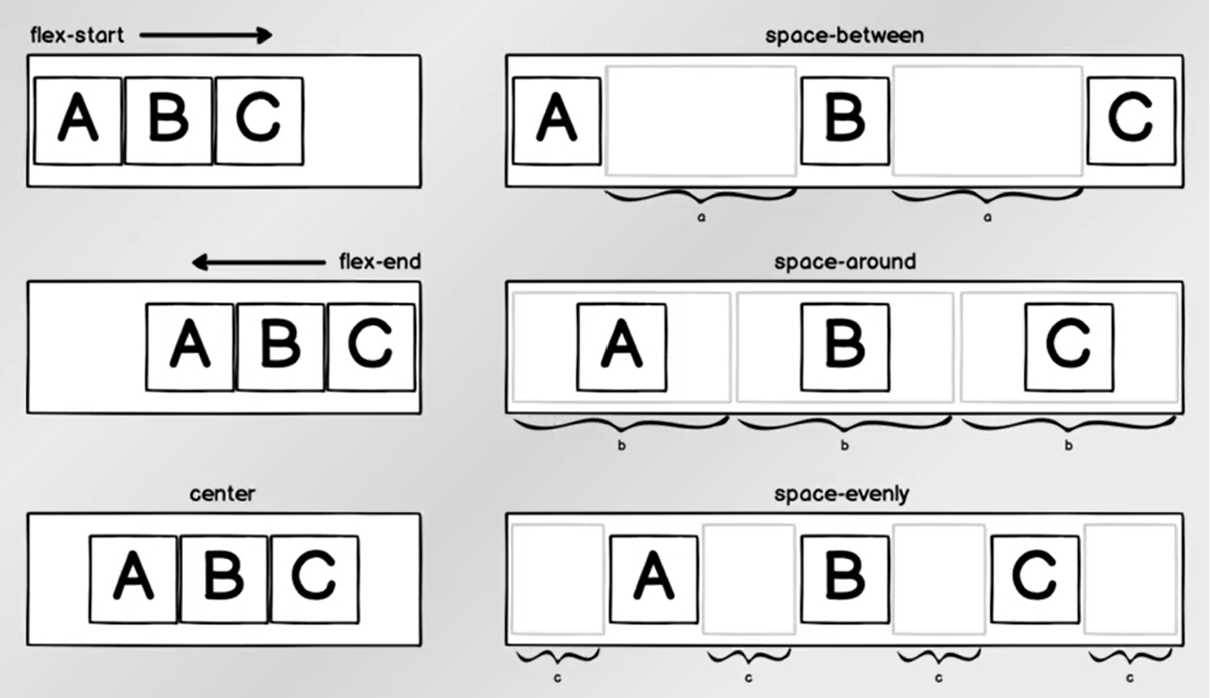
space-between은 컴포넌트의 사이 공간을 동일하게 정렬space-around는 컴포넌트의 주변 공간까지 포함해서 동일한 공간을 차지하도록 정렬space-evenly는 컴포넌트 상이와 양 끝 빈 공간 너비가 일정하도록 정렬
3-3 alignItems
flex-direction이 row인 상태에서 예시
stretch는 alignItems의 방향으로 확장한다. 위 예시에서는 세로 방향baseline은 컴포넌트 내부의 text baseline을 기준으로 정렬
정렬을 테스트해볼 수 있는 사이트
https://yoksel.github.io/flex-cheatsheet/
4. 그림자
React Native에서 그림자를 표현할 수 있는 속성은 ios에서만 적용된다. 안드로이도에서 그림자를 표현하고 싶으면
elevation속성을 이용해야 한다.
4-1. Platform
그림자는 속성 자체가 플랫폼에 따라 적용될 수도 있고 안될 수 도 있다. 플랫폼에 따라 다르게 적용되도록 Platform을 이용하면 os마다 다르게 동작하게 만드는 것이 가능하다.
//Shadow.js

import React from "react";
import { StyleSheet,View } from "react-native";

const Shadow = ()=>{
    return <View style={style.Shadow}></View>
}

const style = StyleSheet.create({
    Shadow:{
        backgroundColor: "#ffffff",
        width:200,
        height:200,
        shadowColor:'#000000',
        shadowOffset:{ //shadowOffset은 객체 형태여야 한다.
            width:10,
            height:10,
        },
        shadowOpacity:0.5,
        shadowRadius:10
    }
})

export default Shadow;
//App.js
import React from 'react';
import { StyleSheet, View, TextInput} from 'react-native';
import { StatusBar } from 'expo-status-bar';
import Shadow from './Shadow';
export default function App() {
return (
<View style={styles.container}>
<StatusBar style='auto'/>
<Shadow/>
</View>
);
}
const styles = StyleSheet.create({
container: {
flex: 1,
backgroundColor: '#fff',
alignItems: 'center',
justifyContent: 'center',
}
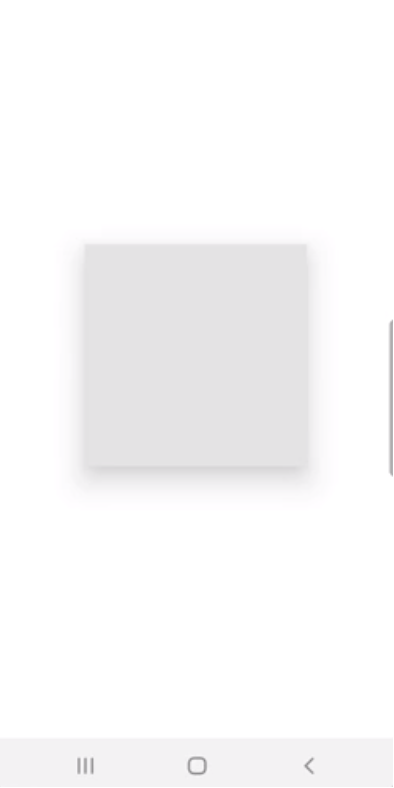
});ios에서는 그림자가 정상적으로 나타나지만 안드로이드에서는 그림자를 볼 수 없다.

안드로이드는 elevation을 적용해야 그림자를 확인할 수 있다.
//Shadow.js
const style = StyleSheet.create({
    Shadow:{
        backgroundColor: "red",
        width:200,
        height:200,
        shadowColor:'#000000',
        shadowOffset:{
            width:10,
            height:10,
        },
        shadowOpacity:0.5,
        shadowRadius:10,
        elevation:20 //elevation
    }
})
platform을 사용하여 플랫폼마다 다르게 적용되도록 설정
//Shadow.js

import React from "react";
import { StyleSheet,View, Platform, Text } from "react-native";

const Shadow = ()=>{
    return <View style={style.Shadow}>
        {/* 플랫폼의 OS가 ios면 ios로 출력 아니면 안도로이드 출력 */}
        <Text>{Platform.OS ==="ios"? 'ios':'android'}</Text>
    </View>
}

const style = StyleSheet.create({
    Shadow:{
        backgroundColor: "red",
        width:200,
        height:200,
        shadowColor:'#000000',
        shadowOffset:{
            width:10,
            height:10,
        },
        shadowOpacity:0.5,
        shadowRadius:10,
        elevation:20
    }
})

export default Shadow;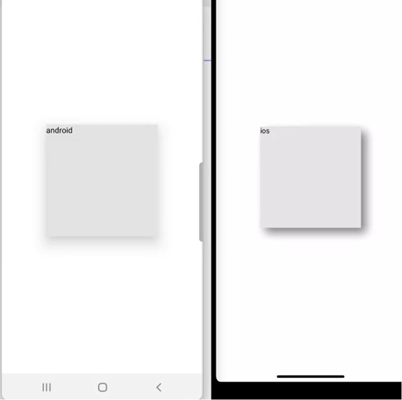
select()를 사용하여 플랫폼마다 코드가 다르게 적용하도록 설정
//Shadow.js
import React from "react";
import { StyleSheet,View, Platform, Text } from "react-native";

const Shadow = ()=>{
    return <View style={style.Shadow}>
        <Text>{Platform.OS ==="ios"? 'ios':'android'}</Text>
    </View>
}

const style = StyleSheet.create({
    Shadow:{
        width:200,
        height:200,
        ...Platform.select({//select는 객체형태로 들어가야 한다.
            ios:{
                backgroundColor: "blue",
                shadowColor:'#000000',
                shadowOffset:{
                    width:10,
                    height:10,
                },
                shadowOpacity:0.5,
                shadowRadius:10,
            },
            android:{
                backgroundColor: "green",
                elevation:20

            }
        })
    }
})

export default Shadow;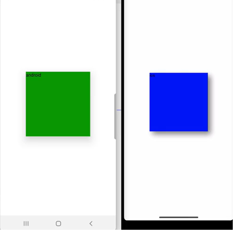
styled-components에서 platform, selcet 사용하기
const StyledInput = styled.TextInput.attrs(({ theme }) => ({
    placeholderTextColor: theme.inputPlaceholder,
}))`
    background-color: ${({ theme }) => theme.inputBackground};
    color: ${({ theme }) => theme.text2};
    ${Platform.select({
        ios: `
            padding: 20px 10px;
        `,
        android: `
            padding: 15px 10px;
        `,
    })}
    font-size: 16px;
    border: 1px solid ${({ theme, isFocused }) => (isFocused ? theme.main : theme.inputBorder)};
    border-radius: 4px;
`;