1. Tagged Template Literals
- import할 때 native에서 styled-components/native를 import해야한다.
- 컴포넌트는 react native에서 제공하는 컴포넌트여야한다.(ex. View, Text)
import styled from 'styled-components/native';
//컴포넌트는 react native에서 제공하는 컴포넌트여야한다.(ex. View, Text)
const 컴포넌트 이름 = styeld.컴포넌트`
	스타일코드
`
스타일드 컴포넌트 적용
//App.js
import React from 'react';
// import { StyleSheet, View, TextInput} from 'react-native';
import { StatusBar } from 'expo-status-bar';
import styled from 'styled-components/native';

// View컴포넌트를 실제로 사용한 것이 아니기에 View를 import할 필요 없다.
const Container = styled.View`
    flex: 1;
    background-color: #e3e3e3;
    align-items: center;
    justify-content: center;
`
const StyledText= styled.Text`
  font-size:20px;
  font-weight: 600;
  color:blue
`

export default function App() {
  return (
    <Container>
      <StatusBar style='auto'/>
      <StyledText>styled components</StyledText>
    </Container>
  );
}
Button
React Native에서 제공하는 Button 컴포넌트를 이용하여 만들었기에 Button 컴포넌트에서 필수 항목으로 지정되어 있는 title이 StyledButton컴포넌트에서도 동일하게 필수항목으로 설정되어 있다.
const StyledText= styled.Text`
  font-size:20px;
  font-weight: 600;
  color:blue
`
const StyledButton = styled.Button``;

export default function App() {
  return (
    <Container>
      <StatusBar style='auto'/>
      <StyledButton title="Styled"/>
    </Container>
  );
}
스타일드 컴포넌트안에 인라인 css 가능
<StyledText style={{color:'red'}}>styled components</StyledText>
2. 스타일 재사용(상속)
상속받고 싶은 컴포넌트를 소괄호 안에 넣어준다.
const 컴포넌트이름 = styled(컴포넌트)`
	스타일 코드
`
스타일드 컴포넌트 사용
import React from 'react';
import { StatusBar } from 'expo-status-bar';
import styled from 'styled-components/native';

const Container = styled.View`
    flex: 1;
    background-color: #e3e3e3;
    align-items: center;
    justify-content: center;
`;
const StyledText= styled.Text`
  font-size:20px;
  font-weight: 600;
  color:blue;
`;
const ErrorText = styled(StyledText)`
  color:red
`;
const StyledButton = styled.Button``;

export default function App() {
  return (
    <Container>
      <StatusBar style='auto'/>
      <StyledText style={{color:'yellow'}}>styled components</StyledText>
      <ErrorText>Error !</ErrorText>
      <StyledButton title="Styled" onPress={()=>alert('haha')}/>
    </Container>
  );
}
3. 스타일 코드만 따로 재사용하는 법
import {css} from 'styled-components/native';

const 스타일이름 =css`
	스타일 코드
`
const 컴포넌트이름 = styled.컴포넌트`
	${스타일이름}
	스타일 코드
`
스타일드 컴포넌트 적용 예시
import React from 'react';
import { StatusBar } from 'expo-status-bar';
import styled,{css} from 'styled-components/native';


const cssText =css`
  font-size:20px;
  font-weight: 600;
`
const StyledText= styled.Text`
  ${cssText}
  color:blue;
`;

export default function App() {
  return (
    <Container>
      <StatusBar style='auto'/>
      <StyledText>styled components</StyledText>
    </Container>
  );
}
4. props
5. attrs
styled components를 사용하면 스타일을 정의하는 곳에서 컴포넌트의 속성도 설정할 수 있다.
- styled components를 사용해서 컴포넌트의 속성을 설정하는 방법은 styled components를 정의할때 컴포넌트와 백틱 상이에 attrs 함수를 사용하고 설정하고 싶은 속성을 객체로 전달하면 된다.
styled.컴포넌트.attrs({속성설정})`스타일 코드`- props를 전달받아 그 값에 따라 속성 설정을 변경할 수 있다.
styled.컴포넌트.attrs(props=>{
	return { 속성 설정};
})`스타일 코드`
5-1. 기본예시
//Input2.js
import React from 'react';
import styled from 'styled-components/native';

const StyledInput = styled.TextInput.attrs({
    placeholder:'hi other',
    placeholderTextColor:"red"
})`
    padding: 20px;
    font-size: 20px;
    border: 1px solid red;
`;

const Input2 =()=>{
    return (<StyledInput />)

}

export default Input2;
5-2. props로 전달받은 값 attrs 설정
//App.js

<Input2 placeholder="Type a message..."/>
//Input2.js
import React,{useState} from 'react';
import styled from 'styled-components/native';
const StyledInput = styled.TextInput.attrs(({placeholder})=>({
// props로 받은 placeholder이 있으면 그것 표시 아니면 그전의 값 출력
placeholder:placeholder||'hi other',
placeholderTextColor:"#111111"
}))`
padding: 20px;
font-size: 20px;
border: 1px solid ${({text})=> text?"blue": "#111111"};
`;
const Input2 =({placeholder})=>{
const [text,setText] = useState('')
return (<StyledInput
onChangeText={text => setText(text)}
text ={text}
placeholder={placeholder}/>)
}
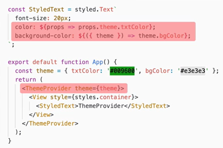
export default Input2;6. ThemeProvider
ThemeProvider은 미리 정의된 값들을 지정해서 해당 값을 사용할 수 있도록 해주는 역할을 한다.
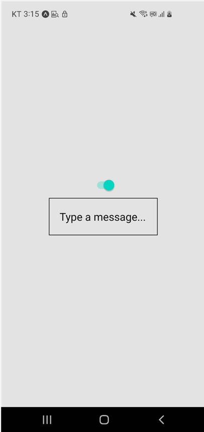
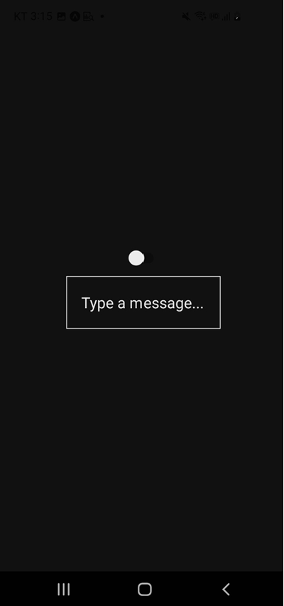
6-1. ThemeProvider와 switch 컴포넌트를 사용하여 다크테마 변경 구현
//App.js

import React,{useState} from 'react';
import { StatusBar } from 'expo-status-bar';
import styled,{ThemeProvider} from 'styled-components/native';
import { Switch } from 'react-native';
import Input2 from './Input2';

const Container = styled.View`
    flex: 1;
    background-color: ${({theme})=>theme.bgColor};
    align-items: center;
    justify-content: center;
`;

//라이트 테마
const lightTheme = {
  inputColor:'#111111',
  inputBoder: "#111111",
  bgColor: "#e3e3e3"
}

//다크 테마
const darkTheme = {
  inputColor: '#e3e3e3',
  inputBoder: "#e3e3e3",
  bgColor: "#111111"
}

export default function App() {
  const [isLight, toggleTheme] = useState(true);
  return (
    <ThemeProvider theme={isLight?lightTheme:darkTheme}>
    <Container>
      <StatusBar style='auto'/>
      <Switch value={isLight} onValueChange=
        {isLight=>toggleTheme(isLight)}/>
// toggleTheme(isLight)여기서 isLight를 !isLight를 하지 않아도 돌아감... 신기
      <Input2 placeholder="Type a message..."/>
    </Container>
    </ThemeProvider>
  );
}
// Input2.js
import React,{useState} from 'react';
import styled from 'styled-components/native';

const StyledInput = styled.TextInput.attrs(({placeholder,theme})=>({
    placeholder:placeholder||'hi other',
    placeholderTextColor:theme.inputColor,
}))`
    padding: 20px;
    font-size: 20px;
    border: 1px solid ${({theme})=> theme.inputBoder};
`;

const Input2 =({placeholder})=>{
    const [text,setText] = useState('')
    return (<StyledInput
        onChangeText={text => setText(text)}
        text ={text}
        placeholder={placeholder}/>)

}

export default Input2;