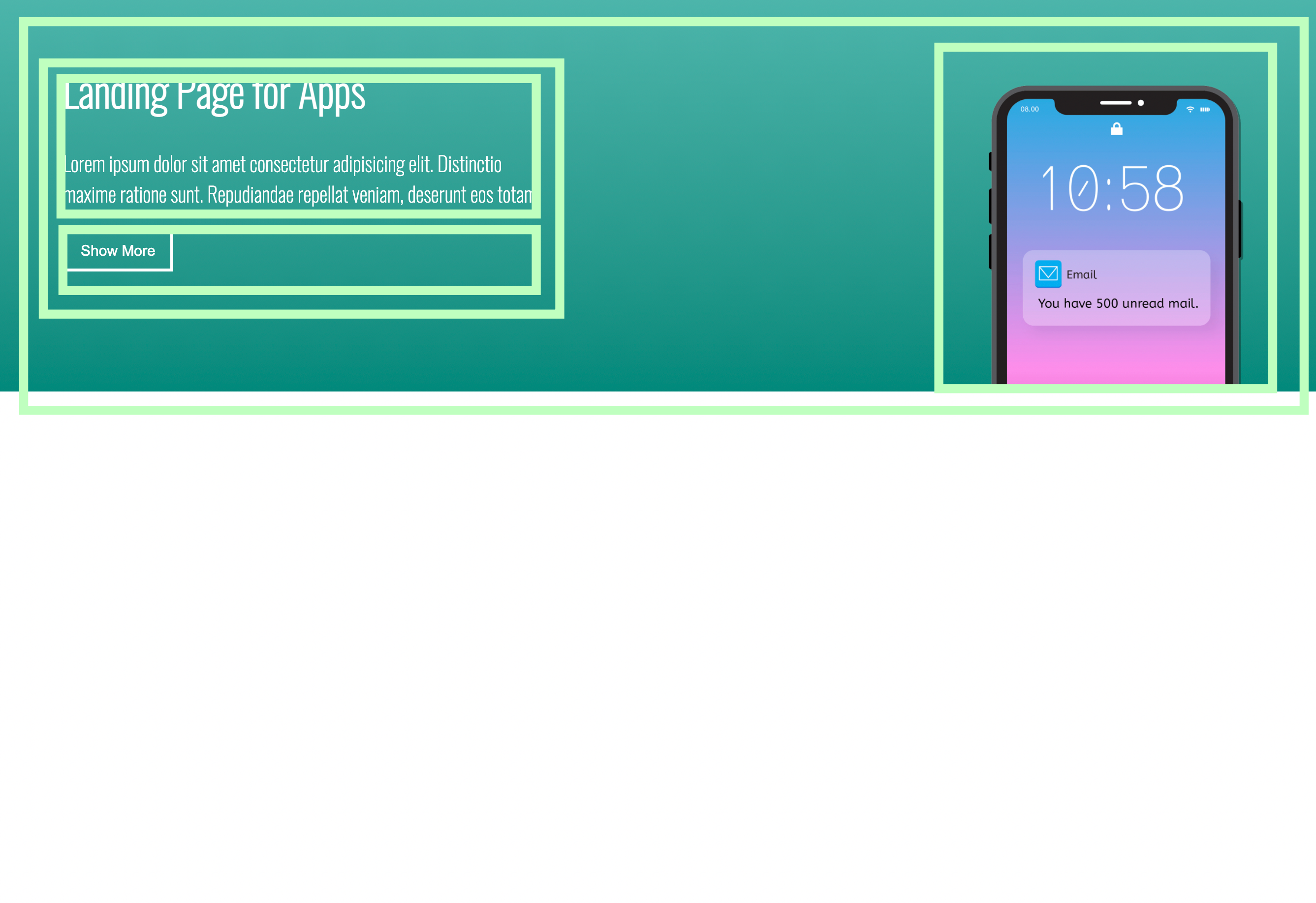
HTML구조 만들기
눈으로 대략적으로 박스들을 나누어서 HTML구조를 완성했다!
코드
HTML
  <header class="header">
    <div class="header__title">
      <div class="header__title-text">
        <h1>Landing Page for Apps</h1>
        <p>Lorem ipsum dolor sit amet consectetur adipisicing elit. Distinctio <br>maxime ratione sunt. Repudiandae repellat veniam, deserunt eos totam.</p>
      </div>
      <button class="header__title-button">Show More</button>
    </div>
    <img class="header__img" src="/picture/iphone.png">
  </header>
CSS
1. background: linear-gradient 속성을 활용해서 뒷배경에 그라데이션을 넣어 주었다.
2. 버튼 배경 속성에서 background: transparent;을 활용하면, 뒷배경과 어우러지게 적용할 수 있다.
3.사진에는 보이지 않지만 버튼에 Hover, Couser 속성을 활용하였다.
* {
  box-sizing: border-box;
}

body {
  margin: 0;
  font-family: 'Oswald', sans-serif;
}

.header {
  display: flex;
  justify-content: space-between;
  background: linear-gradient(to bottom, #4db6ac, #00897b);
  width: 100%;
  padding: 40px 70px;
}

.header__title-text {
  font-size: 21px;
  color: white;
}

.header__title-button {
  border: 3px solid white;
  padding: 10px 15px;
  font-size: 15px;
  background: transparent;
  color: white;
  cursor: pointer;
}

.header__title-button:hover {
  background-color: turquoise;
}

header img {
  display: flex;
  position: relative;
  top: 39px;
  width: 300px;
}
웹 프론트엔드 개발자