애니메이션들
코드
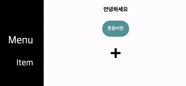
왼쪽 Nav bar
HTML
<!-- animation 3 -->

  <div class="black-box">
    <div class="box-text1">Menu</div>
    <div class="box-text2">Item</div>
  </div>
CSS
a -> b 단반향 애니메이션을 구현할 땐 : transition;
a -> b -> c <- d 양뱡향 애니메이션을 구현할 땐: @keyframes 이름 { };
transition, @keyframes을 통한 애니메이션 중첩이 가능하다.
@keyframes 이름 { }; 적용시
.ani-text:hover {
animation-name: 이름;
}
/* animation 3 */

@keyframes 왼쪽에서오른쪽 {
  0% {
    transform: translateX(0px),;
  }

  50% {
    transform: translateX(100px) skew(-30deg);
  }

  /* 75% {
    transform: translateX(50px);
  }  */

  100% {
    transform: translateX(0px);
  }
}

html {
  height: 100%;
}

body{
  display: flex;
  flex-direction: column;
  height: 100%;
  margin: 0;
  padding: 0;
}

.black-box {
  text-align: right;
  padding: 100px 30px;
  position: fixed;
  width: 33%;
  height: 100%;
  background-color: black;
  color: white;
  transform: translateX(-150px);
  transition: all 1s;
}

.black-box:hover {
  transform: translateX(0px);
  text-align: center;

}

.black-box:hover .box-text2 {
  animation-name: 왼쪽에서오른쪽;
  animation-duration: 0.8s;
}

.box-text1 {
  font-size: 30px;
}

.box-text2 {
  margin-top: 30px;
  font-size: 25px;
}
좌우 움직이기
HTML
<!-- 예시 -->

  <h4 class="ani-text">안녕하세요</h4>
CSS
좌우 움직임 구현할 땐: transform: translateX();
/* 예시 */

@keyframes 왔다갔다 {
  0% {
    transform: translateX(0px);
  }

  50% {
    transform: translateX(-100px);
  }

  75% {
    transform: translateX(100px);
  }

  100% {
    transform: translateX(0px);
  }
}

.ani-text {
  text-align: center;
}

.ani-text:hover {
  animation-name: 왔다갔다;
  animation-duration: 1s;
}
좌우 흔들어주기
HTML
  <div class="container">
    <button class="ani-button">흔들버튼</button>
  </div>
CSS
좌우 회전을 해주고 싶을땐: transform: rotate();
/* animation 1  */

@keyframes 요리조리 {
  0% {
    transform: rotate(0deg);
  }

  25% {
    transform: rotate(-8deg);
  }

  50% {
    transform: rotate(8deg);
  }

  75% {
    transform: rotate(-8deg);
  }

  100% {
    transform: rotate(0deg);
  }
}


.container {
  display: flex;
  justify-content: center;
}

.ani-button {
  padding: 15px;
  background-color: cadetblue;
  color: white;
  border: none;
  border-radius: 50px;
}

.ani-button:hover {
  animation-name: 요리조리;
  animation-duration: 0.6s;
}
확대하기
HTML
<!-- animation 2 -->

  <div class="container">
    <i class="fas fa-plus fa-2x ani-2"></i>
  </div>
CSS
크기를 확대하고 싶을 땐: transform: scale(2.0);
@keyframes 회전확대 {
  0% {
    transform: rotate(0deg);
  }

  25% {
    transform: rotate(-15deg);
  }

  100% {
    transform: rotate(45deg) scale(2.0);
  }

  /* 100% {
    transform: rotate(30deg);
    transform: scale(2.0);
  } */
}

.ani-2 {
  margin-top: 30px;
}

.ani-2:hover {
  animation-name: 회전확대;
  animation-duration: 1s;
  animation-fill-mode: forwards;
}
5개의 댓글

Hello! Melbet Brasil is a real find for gamblers in Brazil. They offer betting on over 30 sports, including soccer, basketball and even eSports. I especially appreciate the speed of payouts and compatibility with Brazilian payment systems. Thanks to this site, I can place bets and receive winnings easily and safely. I highly recommend it.

I’ve always been curious about how to set up a trading platform without getting bogged down by all the tech stuff. I found a guide at https://merehead.com/blog/create-white-label-trading-platform/ that really simplified things for me. It covers the essentials in a way that’s approachable, even if you don’t have a lot of background knowledge. If you're thinking of exploring this option, it's worth taking a look.

Lena always looked forward to family game nights, where the stakes were usually limited to bragging rights and a bit of playful competition. However, one rainy Saturday evening, her usual board games were replaced by a new online casino slot game that her cousin had recommended. With a mix of skepticism and curiosity, Lena decided to give it a try. The slot game, themed around a bustling carnival, immediately https://stakecasinoapp.in/ caught her eye with its vibrant colors and lively music. She started with small bets, figuring it would be a fun distraction from the usual game night routine.
As Lena continued to play, she was surprised to find herself engrossed in the game’s whimsical atmosphere. The carnival-themed slot featured various mini-games and bonus rounds that added an element of surprise to each spin. What began as a casual pastime soon turned into an exhilarating experience when Lena hit a series of bonus features that led to a significant jackpot. Her family, who had initially watched with mild interest, became genuinely excited as Lena’s screen filled with celebratory graphics and impressive winnings. This unexpected windfall not only added a new layer of excitement to their game night but also showed Lena how an ordinary evening could transform into a memorable adventure.
Gaming platforms in Australia often lack a personal touch, but this one feels tailored to players in our region. The bonuses are generous and perfect for extending playtime. I clicked on True Fortune Casino to check out the options and was impressed with the variety of pokies and table games. The platform’s commitment to responsible gaming also adds a layer of trust, which is important to me.
Hi again from Canada! I’ve been exploring different online casinos, and Jackpot City quickly became one of my favorites. The slots are varied and exciting, and after a few sessions with little success, I finally hit a massive jackpot that left me thrilled. The seamless experience, from playing to withdrawing my winnings, was top-notch. Jackpot City has quickly become my go-to site for online gaming.