우리가 사용하는 앱에는 다양한 버튼이 존재하고, 당연하게도 플러터에서 이러한 버튼들 또한 위젯이다. 오늘은 이런 버튼 위젯들을 살펴보고 정리하고자 한다.
TextButton
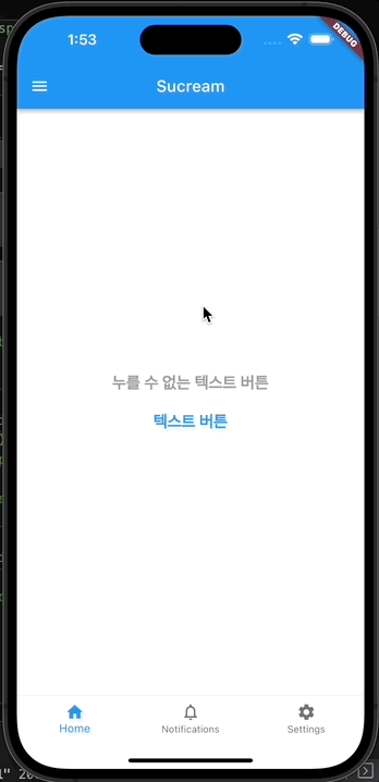
가장 기본적인 형태의 버튼으로, 원하는 텍스트에 버튼 기능을 사용할 수있게 해준다. 크게 특별한 건 없고 TextButton 자체에 스타일을 지정할 수 있으며, 기본 스타일은 defaultStyleOf에 의해 지정되며 자유롭게 변경이 가능하다.
onPressed를 null로 지정하면 버튼이 클릭되지 않게 된다. 아래 예시는 버튼을 클릭하면 SnackBar가 화면에 보이는 예시이다.
class TextButtonTest extends StatelessWidget {
const TextButtonTest({Key? key}) : super(key: key);
// 버튼이 눌렸을 때 사용할 함수를 별도로 정의
// SnackBar라고 하는걸 화면에 잠깐 출력해줌
void _onPressed(BuildContext context) {
var snackBar = SnackBar(
content: const Text(
'버튼이 눌렸어요!',
textAlign: TextAlign.center,
),
behavior: SnackBarBehavior.floating,
shape: RoundedRectangleBorder(
borderRadius: BorderRadius.circular(20),
),
width: 150,
);
ScaffoldMessenger.of(context).showSnackBar(snackBar);
}
Widget build(BuildContext context) {
return Column(
mainAxisAlignment: MainAxisAlignment.center,
children: [
TextButton( // 클릭이 없는 텍스트 버튼
onPressed: null,
style: TextButton.styleFrom(
textStyle: const TextStyle(
fontSize: 20,
fontWeight: FontWeight.bold,
),
),
child: const Text('누를 수 없는 텍스트 버튼'),
),
TextButton( // 클릭이 가능한 텍스트 버튼
onPressed: () => _onPressed(context),
style: TextButton.styleFrom(
textStyle: const TextStyle(
fontSize: 20,
fontWeight: FontWeight.bold,
),
),
child: const Text('텍스트 버튼'),
),
],
);
}
}
OutlinedButton
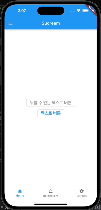
OutlinedButton은 위에서 본 텍스트 버튼에 아웃라인이 있는 형태의 버튼으로, 큰 차이는 없다.
class OutlinedButtonTest extends StatelessWidget {
const OutlinedButtonTest({Key? key}) : super(key: key);
// 버튼이 눌렸을 때 사용할 함수를 별도로 정의
// SnackBar라고 하는걸 화면에 잠깐 출력해줌
void _onPressed(BuildContext context) {
var snackBar = SnackBar(
content: const Text(
'버튼이 눌렸어요!',
textAlign: TextAlign.center,
),
behavior: SnackBarBehavior.floating,
shape: RoundedRectangleBorder(
borderRadius: BorderRadius.circular(20),
),
width: 150,
);
ScaffoldMessenger.of(context).showSnackBar(snackBar);
}
Widget build(BuildContext context) {
return Column(
mainAxisAlignment: MainAxisAlignment.center,
children: [
OutlinedButton(
onPressed: null,
style: OutlinedButton.styleFrom(
textStyle: const TextStyle(
fontSize: 20,
fontWeight: FontWeight.bold,
),
),
child: const Text('누를 수 없는 텍스트 버튼'),
),
OutlinedButton(
onPressed: () => _onPressed(context),
style: OutlinedButton.styleFrom(
textStyle: const TextStyle(
fontSize: 20,
fontWeight: FontWeight.bold,
),
),
child: const Text('텍스트 버튼'),
),
],
);
}
}
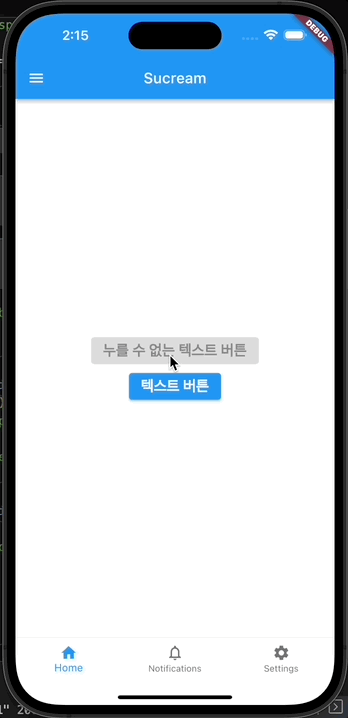
ElevatedButton
공식 문서에 다음과 같이 ElevatedButton을 설명하고 있다.
Use elevated buttons to add dimension to otherwise mostly flat layouts...
설명과 같이 레이아웃 내에 다른 디자인과 구별하기 위해 사용하는 버튼으로, 입체감이 있는 버튼이다. 물론 위 텍스트 및 아웃라인 버튼으로도 입체감있게 만들 수 있지만 이미 잘 구현되어있는 ElevatedButton을 잘 사용해 보도록 하자.
class ElevatedButtonTest extends StatelessWidget {
const ElevatedButtonTest({Key? key}) : super(key: key);
// 버튼이 눌렸을 때 사용할 함수를 별도로 정의
// SnackBar라고 하는걸 화면에 잠깐 출력해줌
void _onPressed(BuildContext context) {
var snackBar = SnackBar(
content: const Text(
'버튼이 눌렸어요!',
textAlign: TextAlign.center,
),
behavior: SnackBarBehavior.floating,
shape: RoundedRectangleBorder(
borderRadius: BorderRadius.circular(20),
),
width: 150,
);
ScaffoldMessenger.of(context).showSnackBar(snackBar);
}
Widget build(BuildContext context) {
return Column(
mainAxisAlignment: MainAxisAlignment.center,
children: [
ElevatedButton(
onPressed: null,
style: ElevatedButton.styleFrom(
textStyle: const TextStyle(
fontSize: 20,
fontWeight: FontWeight.bold,
),
),
child: const Text('누를 수 없는 텍스트 버튼'),
),
ElevatedButton(
onPressed: () => _onPressed(context),
style: ElevatedButton.styleFrom(
textStyle: const TextStyle(
fontSize: 20,
fontWeight: FontWeight.bold,
),
),
child: const Text('텍스트 버튼'),
),
],
);
}
}
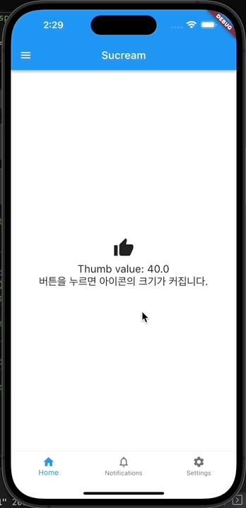
IconButton
아이콘을 버튼으로 사용할 수 있도록 해주는 버튼 위젯으로, 아이콘과 관련된 여러가지를 활용하여 버튼으로 사용이 가능하다.
아래 예시는 아이콘 버튼을 클릭하면 아이콘의 크기가 커지도록 한 코드다.
class IconButtonTest extends StatefulWidget {
const IconButtonTest({super.key});
State<IconButtonTest> createState() => _IconButtonTestState();
}
class _IconButtonTestState extends State<IconButtonTest> {
double thumbValue = 40; // 아이콘의 기본 크기
// 아이콘을 클릭했을 때 크기가 커지도록 하는 함수
void pressThumb() {
setState(() {
thumbValue += 15;
});
}
Widget build(BuildContext context) {
return Column(
mainAxisAlignment: MainAxisAlignment.center,
children: [
IconButton(
iconSize: thumbValue,
icon: const Icon(Icons.thumb_up),
onPressed: () => pressThumb(),
),
Text(
'Thumb value: $thumbValue',
style: const TextStyle(fontSize: 20),
),
const Text(
'버튼을 누르면 아이콘의 크기가 커집니다.',
style: TextStyle(fontSize: 20),
),
],
);
}
}
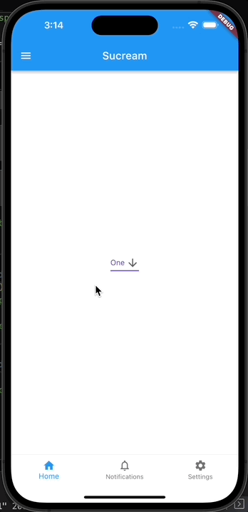
DropdownButton
드롭다운을 위해 사용하는 위젯으로, DropdownButton 아래에 DropdownMenuItem을 위치하여 사용하며, onChanged 에 변경 내역 반영을 위해 Stateful해야 한다.
class DropdownButtonTest extends StatefulWidget {
const DropdownButtonTest({super.key});
State<DropdownButtonTest> createState() => _DropdownButtonTestState();
}
class _DropdownButtonTestState extends State<DropdownButtonTest> {
final List<String> _items = <String>['One', 'Two', 'Three', 'Four'];
late String selectedValue = _items[0];
Widget build(BuildContext context) {
return DropdownButton<String>(
value: selectedValue,
icon: const Icon(Icons.arrow_downward),
iconSize: 24,
style: const TextStyle(color: Colors.deepPurple),
underline: Container(
height: 2,
color: Colors.deepPurpleAccent,
),
onChanged: (String? newValue) {
setState(() {
selectedValue = newValue!;
});
},
items: _items.map<DropdownMenuItem<String>>((String value) {
return DropdownMenuItem<String>(
value: value,
child: Text(value),
);
}).toList(),
);
}
}
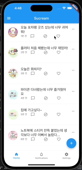
FloatingActionButton
우측 하단에 떠 있는 형태의 버튼으로, 다양하게 사용되는 버튼이다. 아래 예시는 + 버튼을 클릭하면 새로운 페이지로 이동하는 것이다.
class FloatingActionButtonTest extends StatelessWidget {
const FloatingActionButtonTest({Key? key}) : super(key: key);
Widget build(BuildContext context) {
return FloatingActionButton(
onPressed: () => Navigator.push(context,
MaterialPageRoute(builder: (context) => const SecondScreen())),
backgroundColor: Colors.blue,
child: const Icon(Icons.add),
);
}
}
class SecondScreen extends StatelessWidget {
const SecondScreen({Key? key}) : super(key: key);
Widget build(BuildContext context) {
return Scaffold(
appBar: AppBar(
leading: IconButton(
icon: const Icon(Icons.close_outlined),
onPressed: () => Navigator.pop(context),
),
actions: [
Padding(
padding: const EdgeInsets.all(8.0),
child: OutlinedButton(
onPressed: () {},
style: OutlinedButton.styleFrom(
backgroundColor: Colors.white,
shape: RoundedRectangleBorder(
borderRadius: BorderRadius.circular(20),
),
textStyle: const TextStyle(
fontSize: 20,
fontWeight: FontWeight.bold,
),
),
child: const Text('포챠'),
),
),
],
// title: const Text('Second Screen'),
),
body: Column(
children: [
Padding(
padding: const EdgeInsets.all(8.0),
child: ListTile(
leading: ClipRRect(
borderRadius: BorderRadius.circular(50),
child: Image.asset('images/sucream.png'),
),
title: const Text('sucream'),
),
),
const Padding(
padding: EdgeInsets.only(left: 20, top: 10, right: 20, bottom: 10),
child: TextField(
keyboardType: TextInputType.multiline,
maxLines: 10,
decoration: InputDecoration(
// border: OutlineInputBorder(),
hintText: '무슨 일이 일어나고 있나요?',
alignLabelWithHint: true),
),
)
],
),
);
}
}
Refference
- Buttons - flutter.dev