오늘은 플러터 개발을 하면서 유용하게 사용될 수 있는 유틸 위젯들에 대해 알아보고자 한다.
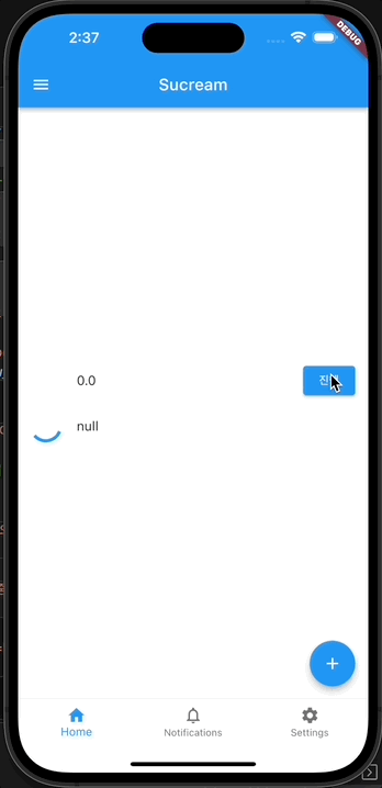
CircularProgressIndicator
무언거를 수행하고 있거나 오래 걸리는 작업에 대한 사용자 피드백으로 사용할 수 있는 위젯이다. CircularProgressIndicator에 대한 예제 및 설명이지만, 직선형의 LinearProgressIndicator도 존재한다.
value 파라미터에 특정 0.0~1.0 사이의 값을 주어 현재 진행도를 나타내는 방법과 null을 넘겨 해당 프로그레스바가 언제 끝날지 알 수 없음을 나타낼 수 있다. 또한 여타 위젯들과 마찬가지로 색상 등을 조정할 수 있다.
class CircularProgressIndicatorTest extends StatefulWidget {
const CircularProgressIndicatorTest({Key? key}) : super(key: key);
State<CircularProgressIndicatorTest> createState() =>
_CircularProgressIndicatorTestState();
}
class _CircularProgressIndicatorTestState
extends State<CircularProgressIndicatorTest> {
double _nowCirclueValue = 0.0;
Widget build(BuildContext context) {
return Center(
child: Column(
mainAxisAlignment: MainAxisAlignment.center,
children: [
ListTile(
leading: CircularProgressIndicator(
// 원형 프로그레스바
value: _nowCirclueValue, // 0.0 ~ 1.0 사이의 값을 지정 가능
),
title: Text(_nowCirclueValue.toString()),
trailing: ElevatedButton(
onPressed: () {
if (_nowCirclueValue >= 1.0) {
setState(() {
_nowCirclueValue = 0.0;
});
} else {
setState(() {
_nowCirclueValue += 0.1;
});
}
},
child: const Text('진행'),
),
),
const ListTile(
leading: CircularProgressIndicator(
value: null), // value에 null을 지정하면 무한히 돌아감
title: Text('null'),
),
],
),
);
}
}
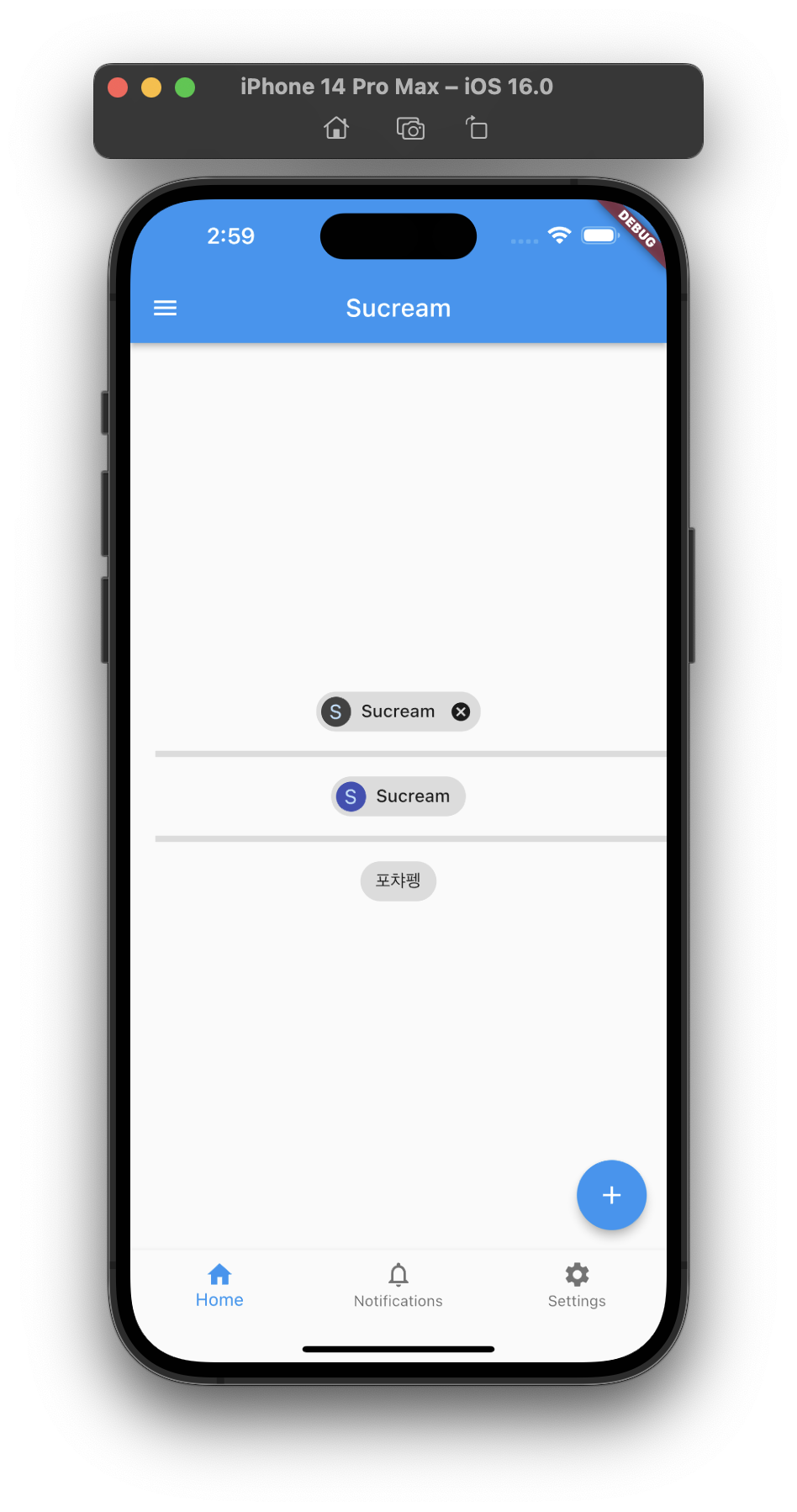
Chip
특정 속성, 텍스트, 엔티티, 액션 등을 나타내는 컴팩트한 엘리먼트로, 자주 사용하진 않지만 필터 정보 등을 나타낼 때 본 것 같다.
기본적으로 avatar 영역에 칩에 들어갈 이미지 정보를, label 영역에 해당 라벨정보를, 추가적으로 onDeleted를 추가하여 칩을 삭제할 함수를 지정할 수 있다.
class ChipTest extends StatefulWidget {
const ChipTest({Key? key}) : super(key: key);
State<ChipTest> createState() => _ChipTestState();
}
class _ChipTestState extends State<ChipTest> {
Widget build(BuildContext context) {
return Center(
child: Column(
mainAxisAlignment: MainAxisAlignment.center,
children: [
Chip(
// onDeleted를 지정하면 삭제 버튼이 생김
avatar: CircleAvatar(
backgroundColor: Colors.grey.shade800,
child: const Text('S'),
),
label: const Text('Sucream'),
onDeleted: () => print('deleted'),
),
const Divider(
height: 20,
thickness: 5,
indent: 20,
endIndent: 0,
),
const Chip(
// onDeleted가 없으면 삭제 버튼이 없음
avatar: CircleAvatar(
backgroundColor: Colors.indigo,
child: Text('S'),
),
label: Text('Sucream'),
deleteIcon: Icon(Icons.delete),
onDeleted: null,
),
const Divider(
height: 20,
thickness: 5,
indent: 20,
endIndent: 0,
),
const Chip(
// avatar를 지정하지 않을 수도 있음
label: Text('포챠펭'),
deleteIcon: Icon(Icons.delete),
onDeleted: null,
),
],
),
);
}
}
Tooltip
위젯을 길게 눌렀을 때 표시될 메시지를 지정할 수 있는 위젯으로, 기존의 버튼들에서 지정 가능한 툴팁 속성을 다른 위젯에도 사용 가능하게 해줄 수 있다.
message 영역에 표시하고 싶은 툴팁 메시지를 작성하고, child 영역에 해당되는 위젯을 위치하면 끝이다! 아래 예제는 위 칩 예제와 결과 화면은 동일하지만, 각 Chip 위젯을 Tooltip위젯으로 감싸 각 위젯에 툴팁을 추가하였다.
class ChipTest extends StatefulWidget {
const ChipTest({Key? key}) : super(key: key);
State<ChipTest> createState() => _ChipTestState();
}
class _ChipTestState extends State<ChipTest> {
Widget build(BuildContext context) {
return Center(
child: Column(
mainAxisAlignment: MainAxisAlignment.center,
children: [
Tooltip(
message: '제거가 가능한 Sucream 칩 위젯입니다!',
child: Chip(
// onDeleted를 지정하면 삭제 버튼이 생김
avatar: CircleAvatar(
backgroundColor: Colors.grey.shade800,
child: const Text('S'),
),
label: const Text('Sucream'),
onDeleted: () => print('deleted'),
),
),
const Divider(
height: 20,
thickness: 5,
indent: 20,
endIndent: 0,
),
const Tooltip(
message: '제거가 불가능한 Sucream 칩 위젯입니다!',
child: Chip(
// onDeleted가 없으면 삭제 버튼이 없음
avatar: CircleAvatar(
backgroundColor: Colors.indigo,
child: Text('S'),
),
label: Text('Sucream'),
deleteIcon: Icon(Icons.delete),
onDeleted: null,
),
),
const Divider(
height: 20,
thickness: 5,
indent: 20,
endIndent: 0,
),
const Tooltip(
message: '귀여운 포챠펭 칩 위젯입니다!',
child: Chip(
// avatar를 지정하지 않을 수도 있음
label: Text('포챠펭'),
deleteIcon: Icon(Icons.delete),
onDeleted: null,
),
),
],
),
);
}
}
Card
자식 위젯에 코너 라운딩 처리 및 elevation 그림자를 제공하는 위젯으로, 연관된 여러 정보를 하나의 영역으로 처리하기 위해 사용하는 위젯으로 보인다. 꼭 이 위젯을 사용해야만 하는건 아니고 일관성 있는 material 디자인을 위해 사용하는 것 같다.
class CardTest extends StatefulWidget {
const CardTest({Key? key}) : super(key: key);
State<CardTest> createState() => _CardTestState();
}
class _CardTestState extends State<CardTest> {
Widget build(BuildContext context) {
return Center(
child: Column(
mainAxisAlignment: MainAxisAlignment.center,
children: [
Column(
mainAxisSize: MainAxisSize.min,
children: const <Widget>[
ListTile(
leading: Icon(Icons.album),
title: Text('카드가 없는 데이터입니다.'),
subtitle: Text('카드가 없기 때문에 데이터가 같은 영역에 있는지 확인이 어렵습니다.'),
),
ButtonBar(
children: <Widget>[
TextButton(
child: Text('취소'),
onPressed: null,
),
TextButton(
child: Text('확인'),
onPressed: null,
),
],
),
],
),
const Divider(
height: 20,
thickness: 5,
indent: 20,
endIndent: 0,
),
Card(
// 카드 위젯
child: Column(
mainAxisSize: MainAxisSize.min,
children: const <Widget>[
ListTile(
leading: Icon(Icons.album),
title: Text('카드가 있는 데이터입니다.'),
subtitle: Text('카드가 있기 때문에 같은 영역의 데이터 확인이 보다 쉽습니다.'),
),
ButtonBar(
children: <Widget>[
TextButton(
child: Text('취소'),
onPressed: null,
),
TextButton(
child: Text('확인'),
onPressed: null,
),
],
),
],
),
),
],
),
);
}
}
Refference
- Information displays - flutter.dev