배틀필드의 2042의 메뉴 UI를 UI Tool Kit으로 비슷하게 구현해보자.
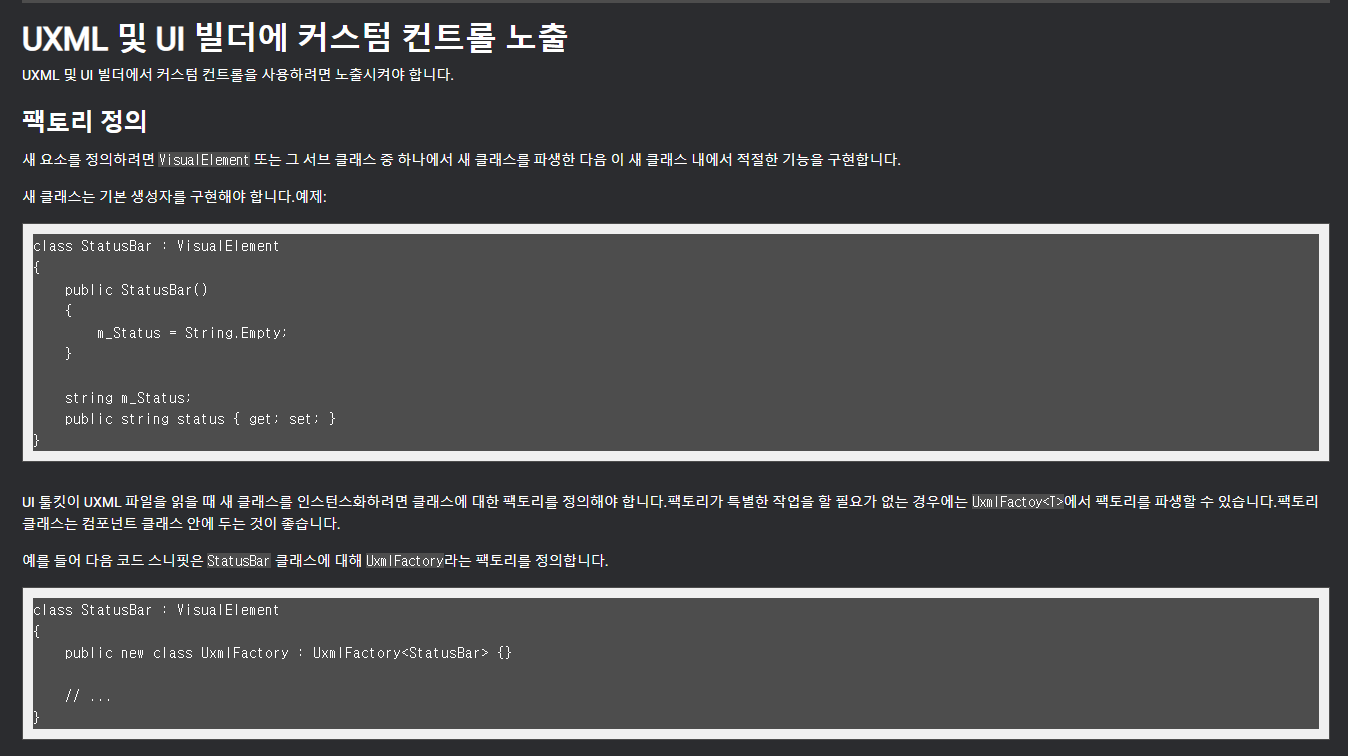
먼저 커스텀 메뉴를 만들기 위해서 UXML 및 UI 빌더에 커스텀 컨트롤 노출 문서를 참고해서 아래와 같이 커스텀 컨트롤 버튼을 만들어주었다.
https://docs.unity3d.com/kr/2023.1/Manual/UIE-expose-custom-control-to-uxml.html
Control_Button.cs
using System;
using System.Collections.Generic;
using TMPro;
using Unity.VisualScripting;
using UnityEngine.UIElements;

public class Control_Button : VisualElement
{
    internal new class UxmlFactory : UxmlFactory<Control_Button, UxmlTraits> { }

    internal new class UxmlTraits : VisualElement.UxmlTraits {
        private readonly UxmlIntAttributeDescription m_CardNum
            = new UxmlIntAttributeDescription { name = "card_Number", defaultValue = 4 };
        private readonly UxmlStringAttributeDescription m_ButtonLabel
            = new UxmlStringAttributeDescription { name = "button_Label", defaultValue = "Menu Button" };

        public override IEnumerable<UxmlChildElementDescription> uxmlChildElementsDescription
        {
            get {yield break;}
        }

        public override void Init(VisualElement ve, IUxmlAttributes bag, CreationContext cc)
        {
            base.Init(ve, bag, cc);
            ((Control_Button)ve).CardNumber = m_CardNum.GetValueFromBag(bag, cc);
            ((Control_Button)ve).ButtonLabel = m_ButtonLabel.GetValueFromBag(bag, cc);
        }
    }

    public int CardNumber { get; set; }
    public string ButtonLabel { get; set; }

    private VisualElement _fill;
    private VisualElement _icon;
    private Label _label;

    public event Action<Control_Button> OnHover;

    public event Action<Control_Button, int> OnSelect;

    public Control_Button()
    {
        // 버튼 클릭할 떄
        _fill = new VisualElement();
        Add(_fill);

        // 버튼 아이콘
        _icon = new VisualElement();
        Add(_icon);

        // 버튼 레이블
        _label = new Label();
        Add(_label);

        this.name = "Background";
        _fill.name = "Fill";
        _label.name = "Label";
        _icon.name = "Icon";

        //Preventing Clicks
        _fill.pickingMode = PickingMode.Ignore;
        _label.pickingMode = PickingMode.Ignore;
        _icon.pickingMode = PickingMode.Ignore;
    }
}
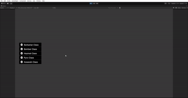
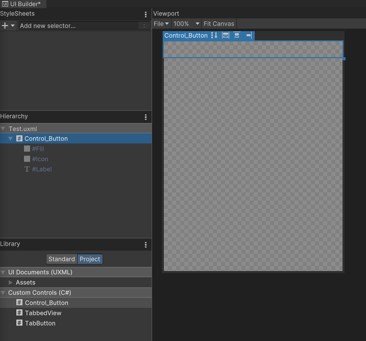
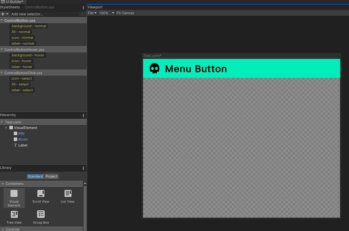
이제 Text.uxml을 하나 만들어주고 들어가보면 Project탭에서 Control_Button을 만들어줄 수가 있다.
하지만 현재 추가해도 아무런 스타일이 적용되어있지 않기 때문에 어떤 것도 보이지 않는다.
새로운 Visual Element를 배치하고 스타일을 디자인 해준 다음 각각을 스타일 시트에 저장해준다.
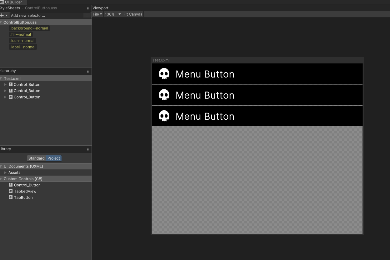
ControlButton.uss
.background--normal {
    flex-direction: row;
    background-color: rgb(0, 0, 0);
    padding-top: 5px;
    padding-bottom: 5px;
    height: 50px;
    margin-bottom: 2px;
}

.fill--normal {
    height: 100%;
    width: 0;
    flex-grow: 0;
    top: 0;
    margin-top: 0;
    margin-bottom: 0;
    margin-right: 0;
    margin-left: 0;
    flex-shrink: 0;
    position: absolute;
}

.icon--normal {
    flex-grow: 0;
    background-image: url("project://database/Assets/Texture/Skull.png?fileID=2800000&guid=c481b217719937a429894b2dae54255d&type=3#Skull");
    margin-left: 10px;
    margin-right: 5px;
    width: 40px;
    height: 40px;
}

.label--normal {
    flex-grow: 1;
    color: rgb(255, 255, 255);
    -unity-text-align: middle-left;
    font-size: 24px;
}
그 다음 Control_button.cs에서 스타일을 적용시켜주도록 한다.
Control_button.cs
// Load and apply the stylesheet
_fill.AddToClassList("fill--normal");
_icon.AddToClassList("icon--normal");
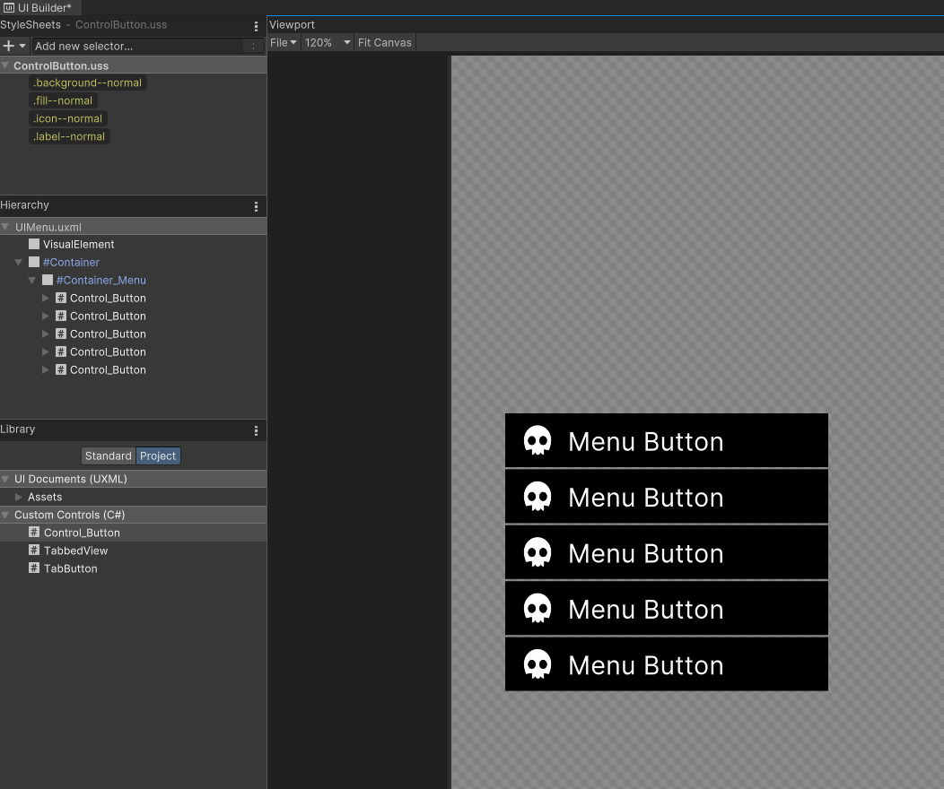
_label.AddToClassList("label--normal");이제 실제 메뉴 UI를 배치시켜보자.
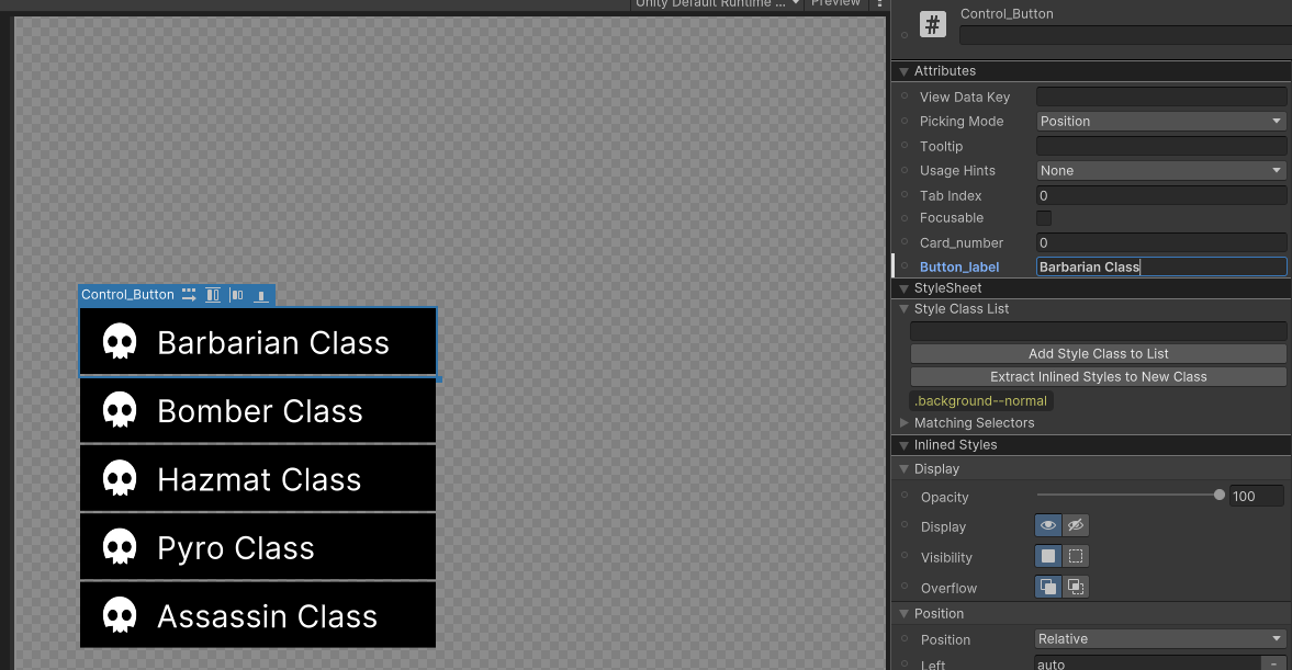
그런데 아직 Button_label을 수정해도 실제 _label.text에는 적용되지 않는다. ButtonLabel과 _label을 연결해주자.
Control_Button.cs
public int CardNumber { get; set; }
public string ButtonLabel {
    get { return _label.text; }
    set{ _label.text = value; }
}
추후에 icon image도 card Number에 따라서 수정되도록 업데이트 해주자.
이제 인스펙터의 Button_label 필드에 값을 넣어주면 해당 값으로 Label의 Text가 바뀐다.
Hover Event
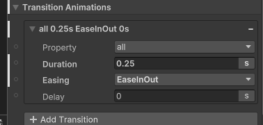
USS Transition으로 Hover Animation을 넣어보자.
background--normal 스타일을 눌러 Transition Animation을 설정해준다.
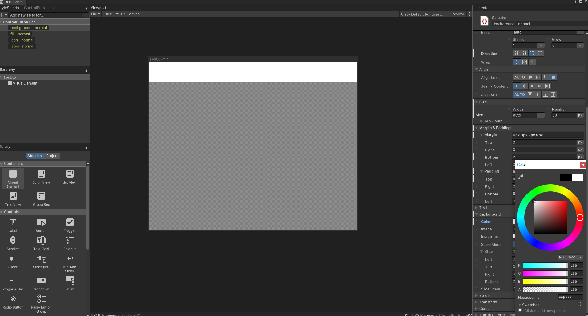
VisualElement를 하나 만든 다음에 background--normal 스타일 클래스를 적용시켜 준 다음 이제 background Color를 다시 흰색으로 바꾼다. 그 다음에 스타일 클래스를 저장해준다.
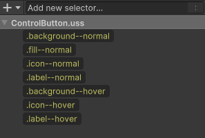
동일하게 icon과 label도 스타일 hover를 만들어준다. icon과 label은 별도의 transition Animation을 설정해주지 않는다.
이제 스크립트에 RegisterCallback으로 이벤트에 따른 작동을 연결해준다.
public Control_Button()
{
//(생략)
// Load and apply the stylesheet
this.AddToClassList("background--normal");
_fill.AddToClassList("fill--normal");
_icon.AddToClassList("icon--normal");
_label.AddToClassList("label--normal");
// On Event Manager
this.RegisterCallback<MouseEnterEvent>(OnMouseEnter);
this.RegisterCallback<MouseLeaveEvent>(OnMouseLeave);
}
//On Mouse Enter Control_Button
private void OnMouseEnter(MouseEnterEvent evt)
{
this.AddToClassList("background--hover");
_icon.AddToClassList("icon--hover");
_label.AddToClassList("label--hover");
}
//On Mouse Leave Control_Button
private void OnMouseLeave(MouseLeaveEvent evt)
{
this.RemoveFromClassList("background--hover");
_icon.RemoveFromClassList("icon--hover");
_label.RemoveFromClassList("label--hover");
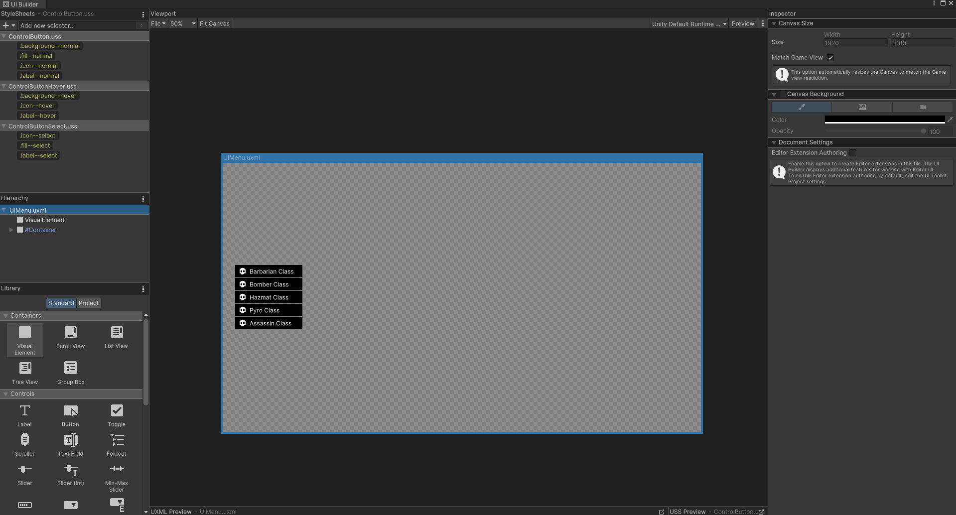
}아래와 같은 결과물을 얻을 수 있다.

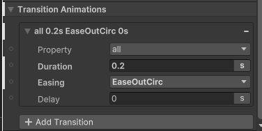
이제 Click 애니메이션을 추가해보자. 동일하게 스타일을 추가해준다. 추가적으로 Fill Select를 추가해준다.
Fill Visual Element의 Transition Animation
클릭하면 버튼이 토글되는 효과가 필요하기 때문에 아래와 같이 코드를 작성한다.
// On Mouse Click Control_Button
private void OnClick(ClickEvent evt) {
    _fill.ToggleInClassList("fill--select");
    _icon.ToggleInClassList("icon--select");
    _label.ToggleInClassList("label--select");
}UI요소.ToggleInClassList("끄거나 켤 스타일")이 ToggleInClassList는 스타일의 유무를 알아서 파악해서 추가, 삭제를 진행해준다. 그래서 이 함수를 사용하면 스타일의 존재 유무를 확인할 필요 없이 반대로 바꿀 수 있다.
이제 uss를 실제 UI Document에 추가해준다.
문제가 생겼는데 버튼을 선택한 상태에서 다른 버튼을 클릭하면 이미 선택된 버튼이 해제되어야하는데 그렇게 작동하지 않는다. 추후에 업데이트해보자.