matplotlib 정리
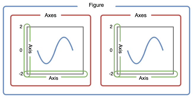
matplotlib.pyplot
import matplotlib.pyplot as plt
plt.show()
📌 기본

plt.plot([1, 2, 3, 4]) # values를 y값으로 가정, x값 [0, 1, 2, 3] 자동으로 만듦
plt.plot([1, 2, 3, 4], [1, 4, 9, 16]). # x-y 값
스타일 지정
plt.plot([1, 2, 3, 4], [1, 4, 9, 16], 'ro')
plt.axis([0, 6, 0, 10])- Format string을 세 번째 인자에 입력
-ro: 빨간색(red), 원형(o) 마커
-b-: 파란색(blue), 실선('-')
-r red,b blue,g green
-o 원형,- 실선,-- 점선,^ 삼각형,s 사각형 - ex. plt.plot([1, 2, 3], [4, 4, 4], '-', color='C0', label='Solid')
여러 개의 그래프
# 200ms 간격으로 균일하게 샘플된 시간
t = np.arange(0., 5., 0.2)

# 빨간 대쉬, 파란 사각형, 녹색 삼각형
plt.plot(t, t, 'r--', t, t**2, 'bs', t, t**3, 'g^')
plt.show()
레이블이 있는 데이터
data_dict = {'x': [1, 2, 3], 'y': [2, 3, 5]}

plt.plot('x', 'y', data=data_dict)
📑 축
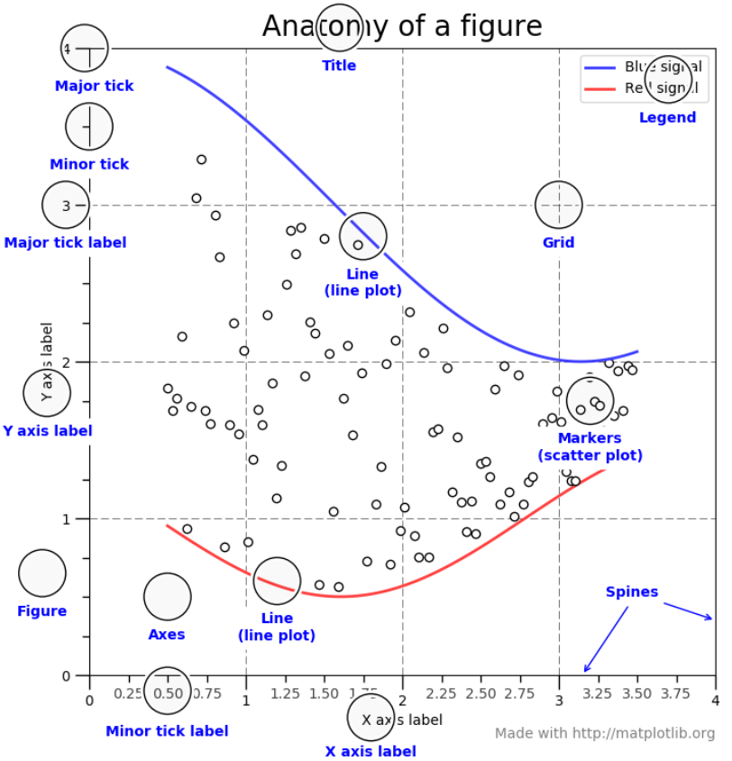
축 레이블
| 기능 | 파라미터 | xlabel()의 인자 | ylabel()의 인자 |
|---|---|---|---|
| 레이블 여백 | labelpad | int(정수) | int(정수) |
| 레이블 위치 | loc | 'left', 'center', 'right' | 'bottom', 'center', 'top' |
plt.xlabel(),plt.ylabel(): x, y축에 대한 레이블 - ex. plt.xlabel('X-axis')plt.axis(): 축의 범위 - ex. plt.axis([xmin, xmax, ymin, ymax])plt.xlim(),plt.ylim()fontdict={...}: 폰트 - family, color, weight, sizeplt.legend(): 범례ncols=n: 열 개수 지정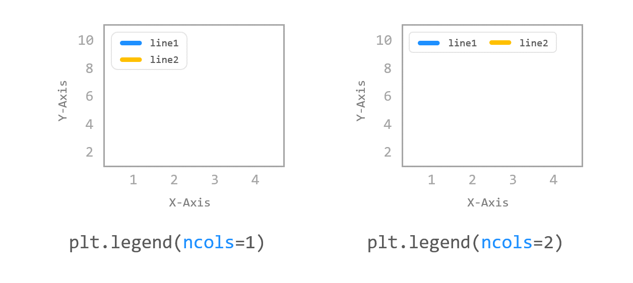
fontsize=n: 폰트 크기framon=True: 범레 상자 테두리 표시shadow=True: 범례 상자 그림자 표시
plt.plot([1, 2, 3, 4], [2, 3, 5, 10], label='Price ($)')
plt.legend(loc=(1.0, 1.0))plt.plot([1, 2, 3, 4], [2, 3, 5, 10])
plt.xlabel('X-Axis', labelpad=15, # X축 레이블 여백 15pt
fontdict={'family': 'serif', # font 설정
'color': 'b',
'weight': 'bold',
'size': 14}))
plt.ylabel('Y-Axis', labelpad=20, loc='top')# 폰트 따로 설정 가능
font1 = {'family': 'fantasy',
'color': 'deeppink',
'weight': 'normal',
'size': 'xx-large'
}
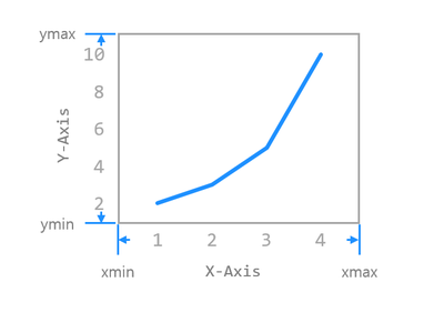
plt.xlabel('X-Axis', labelpad=15, fontdict=font1)축 범위
-
plt.axis()
- 축 옵션:on,off,equal,scaled,tight,auto,normal,image,square -
plt.xlim(): X축 범위 설정
- xlim(xmin, xmax) - xmin, xmax 직접 입력 / 리스트 형태 / 튜플 형태 -
plt.ylim(): Y축 범위 설정
- ylim(xmin, xmax) - ymin, ymax 직접 입력 / 리스트 형태 / 튜플 형태 -
축 범위 얻기

축 스케일
plt.xscale(),plt.yscale()- linear(기본), log, symlog, logit
- ex. plt.xscale('symlog')
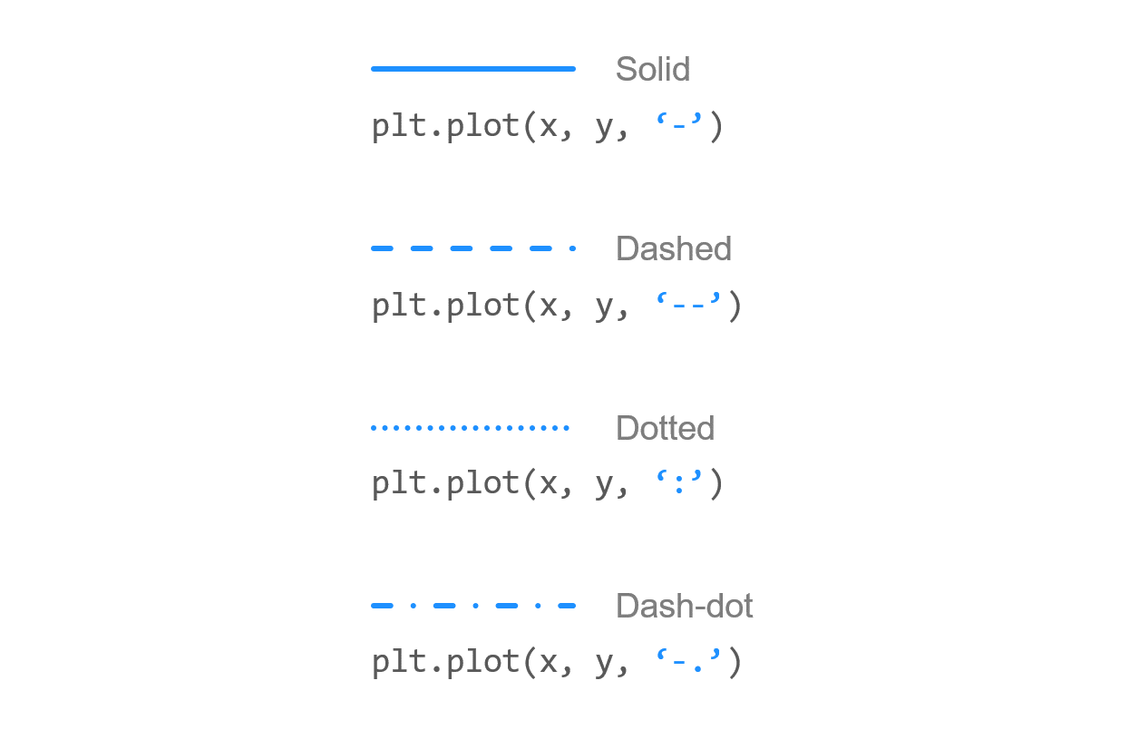
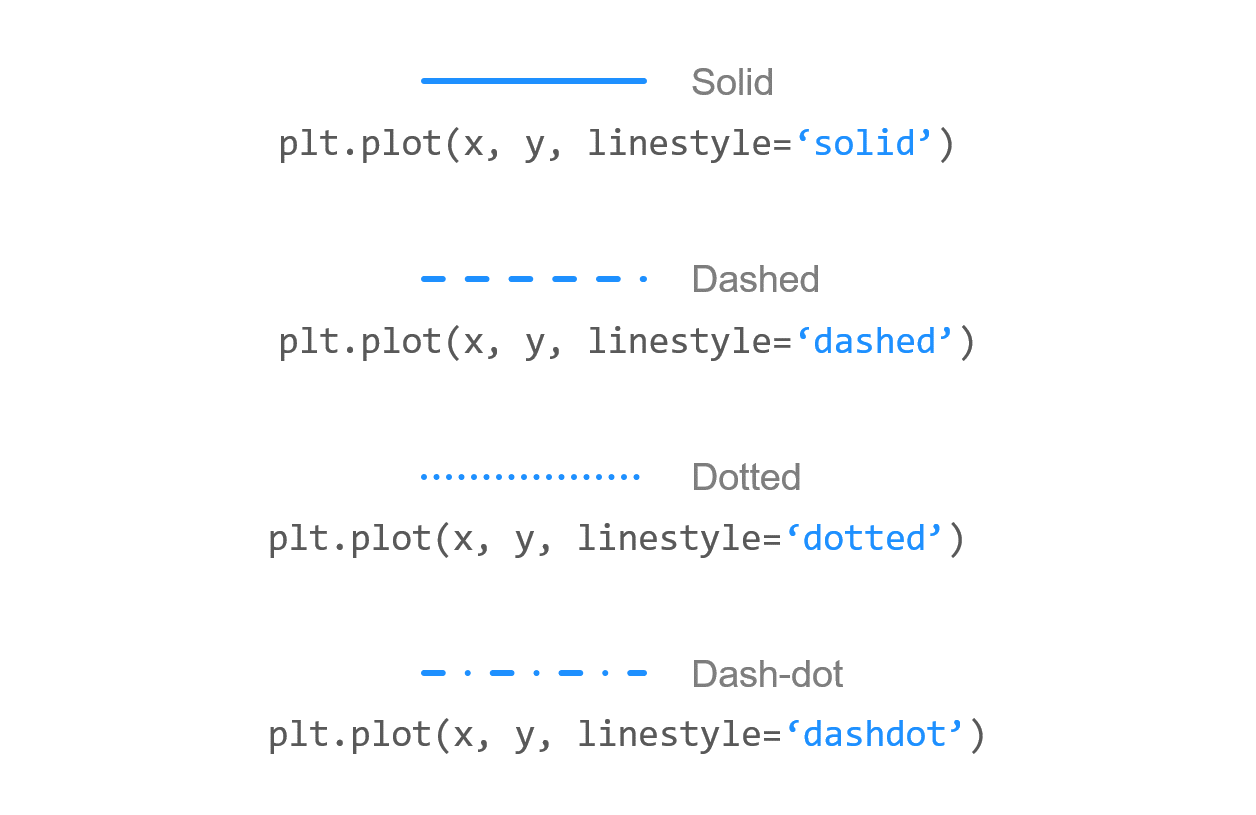
📑 선
linestyle, linewidth
 |  |
|---|
-
plot() 의
linestyle='': solid, dashed, dotted, dashdot -
plt.plot([1, 2, 3], [4, 4, 4], '-', linestyle='solid', color='C0', label='Solid')
-
linewidth=n: 선 굵기
선 끝 모양
-
plot() 의
dash_capstyle='',solid_capstyle='': butt 날카로운 끝, round 둥근 끝plt.plot([1, 2, 3], [4, 4, 4], linestyle='solid', solid_capstyle='butt') plt.plot([1, 2, 3], [2, 2, 2], linestyle='dashed', dash_capstyle='butt')
📑 마커
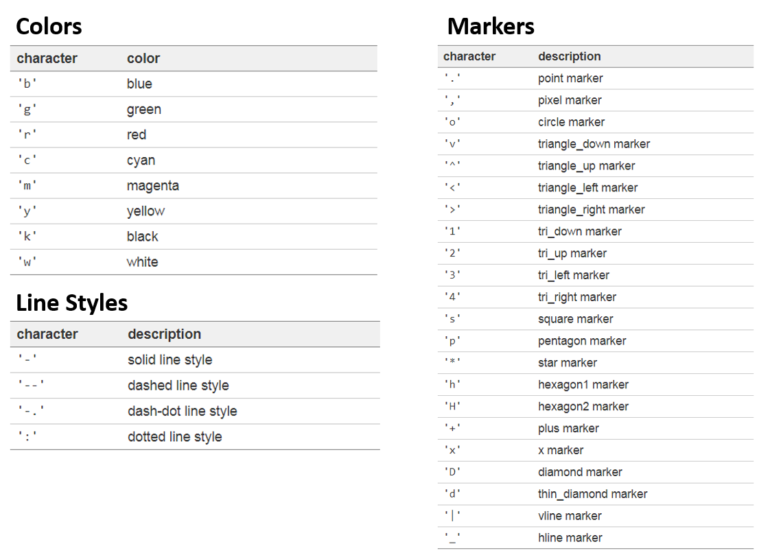
- plot()의 marker 파라미터
-plt.plot([4, 5, 6], marker="r-")
📑 색상
- plot()의 color 파라미터
color='':- 기본 색상:
b,g,r,c,m,y,k,w(blue, green, red, cyan, magenta, yellow, black, white) - Hex code
- Tableau 색상:
tab:blue... - CSS 색상:
slategrey,tomato,midnightblue...
- 기본 색상:
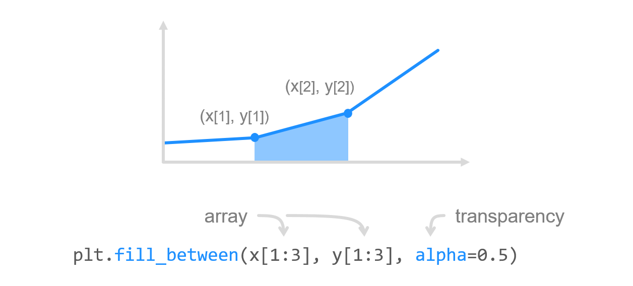
📑 그래프 영역 채우기
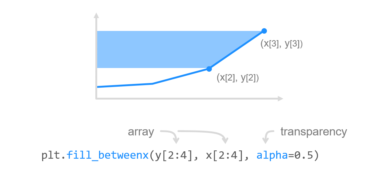
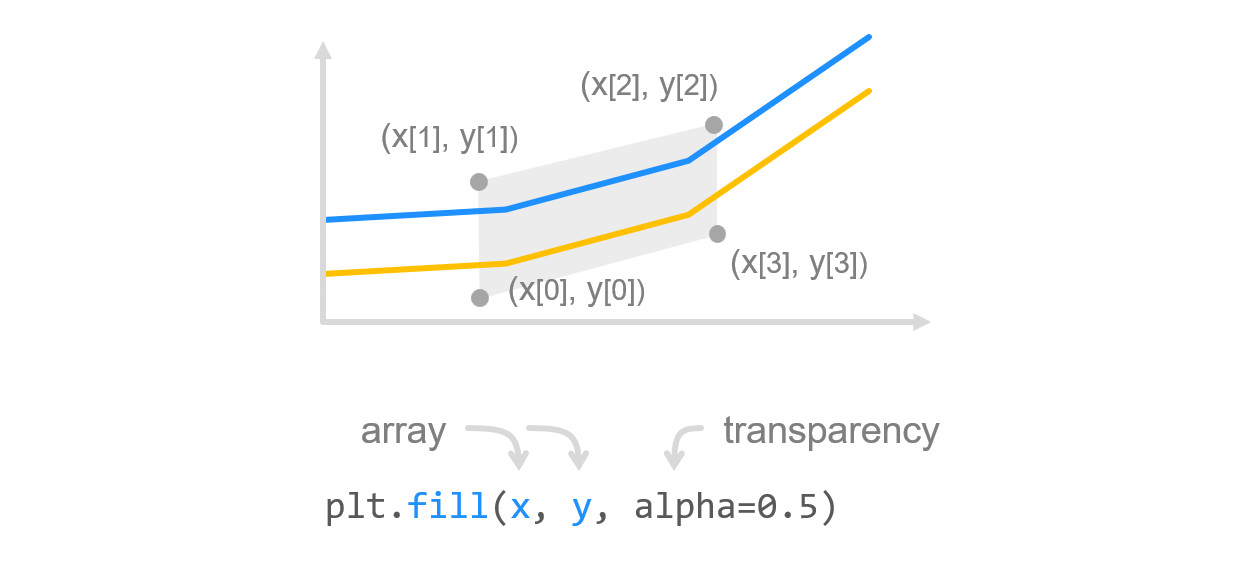
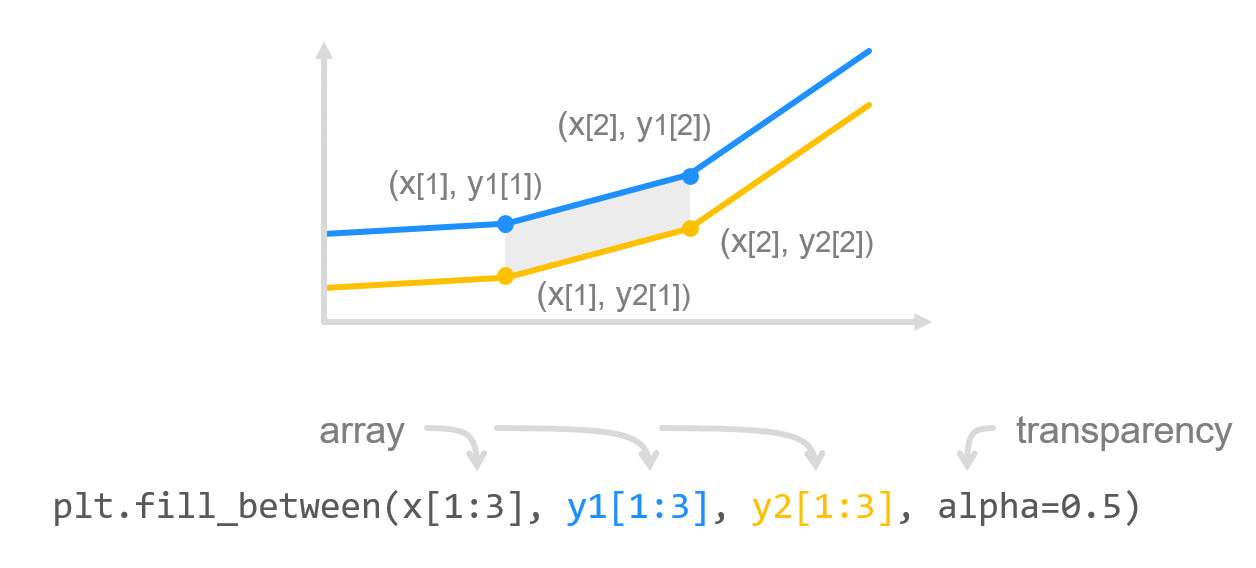
fill_between()- 두 수평 방향의 곡선 사이를 채움fill_betweenx()- 두 수직 방향의 곡선 사이를 채움fill()- 다각형 영역을 채움
 |  |  |
|---|
- 두 그래프 사이 영역 채우기
📑 grid
plt.grid=(True)- 축 지정:
plt.grid(True, axis='x')(전체 그리드, default),plt.grid(True, axis='x')(세로 그리드),plt.grid(True, axis='y)(가로 그리드)
| 기능 | 파라미터 | 인자 | 기본값 |
|---|---|---|---|
| 라인 색상 | color | 'gray' | |
| 라인 스타일 | linestyle | '-' (실선) | |
| 라인 투명도 | alpha | 0~1.0 사이의 float | 1 |
| 라인 굵기 | linewidth | int (정수) | 1 |
📑 눈금(tick)
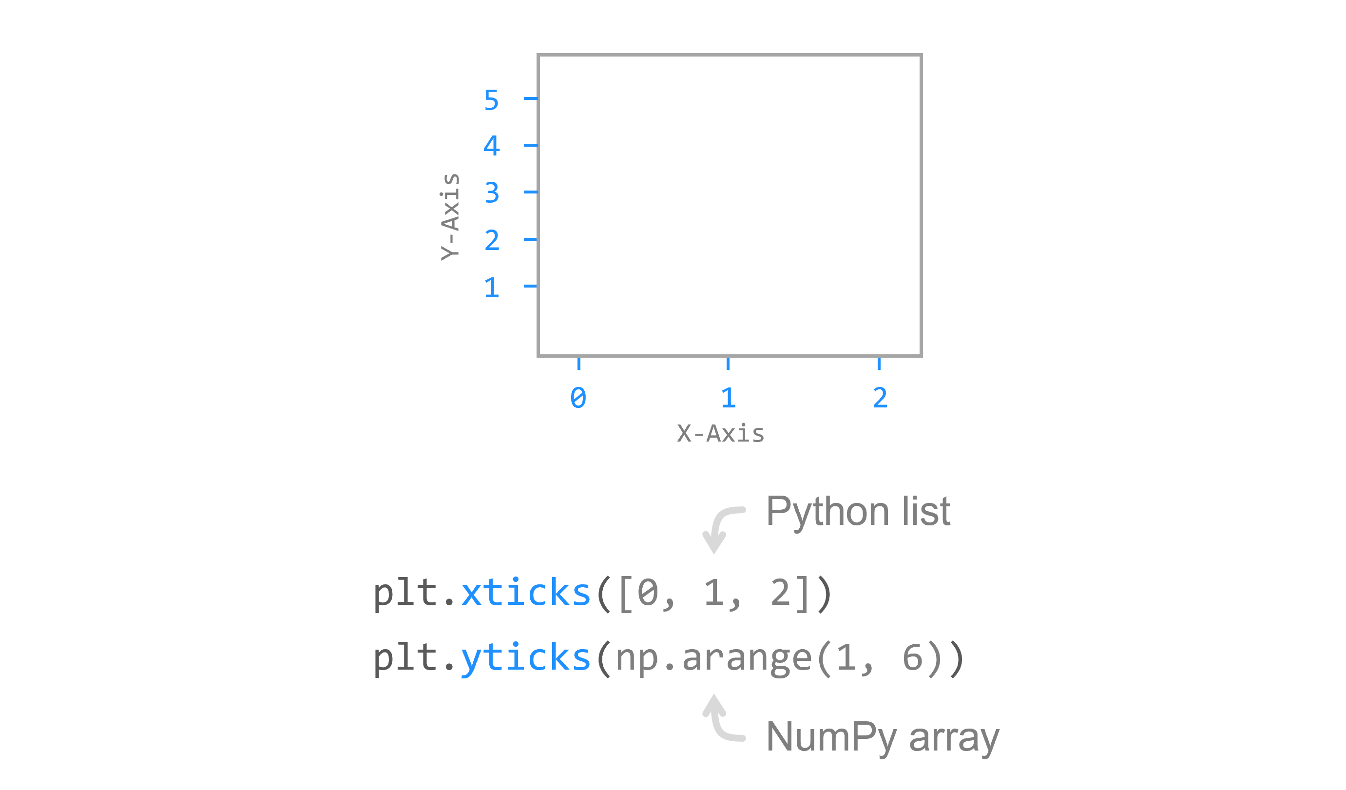
plt.xticks(),plt.yticks()
- x축, y축 눈금 표시
- 파이썬 리스트나 numpy array 입력
눈금 레이블
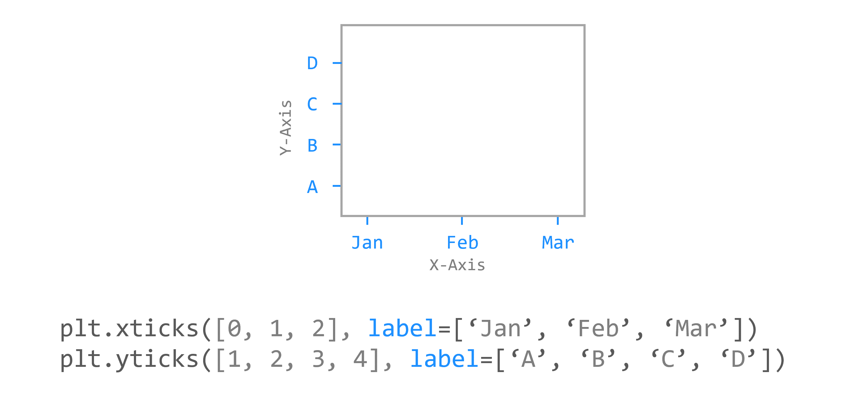
labels=[]파라미터: 눈금 레이블을 문자열 형태로 지정
눈금 스타일
| 기능 | 파라미터 | 인자 | 기본값 |
|---|---|---|---|
| 적용축 선택 | axis | 'x', 'y', 'both' | 'both' |
| 눈금 방향 | direction | 'in', 'out', 'inout' | 'out' |
| 눈금 길이 | length | int(정수) | 3 |
| 눈금 위치 | top/bottom/left/right | True, False | bottom/left=True top/right=False |
| 눈금 굵기 | width | int(정수) | 1 |
| 눈금 색상 | color | 'black' | |
| 여백 (눈금과 레이블 간격) | pad | int(정수) | 3 |
| 레이블 크기 | labelsize | int(정수) | 10 |
| 레이블 색상 | labelcolor | 'black' |
📑 제목
plt.title()loc=: 위치 - left, center, rightpad=npt: 타이틀과 그래프와의 간격fontdict={...}- 정보 얻기:
title.get_position(),title.get_text()
📌 bar
plt.bar(x, y)
x = np.arange(3)
years = ['2018', '2019', '2020']
values = [100, 400, 900]

plt.bar(x, values)
plt.xticks(x, years)

plt.show()color='color',colors=[],width=nalign=: 눈금과 막대의 위치 = center, edgeedgecolor,linewidth: 막대 테두리 색, 테두리 두께tick_label=[]: 틱에 문자열/array 지정
📌 barh
plt.barh(y, x)
height=n: 막대의 높이
plot(kind='barh')
📌 산점도 scatter plot
plt.scatter(x, y)
s,c: 마커의 크기, 색상alpha=n,cmap: 투명도, colormap(ex. Spectral)- ex.
plt.scatter(x, y, s=size, c=colors
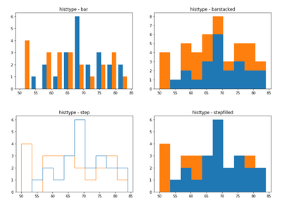
📌 히스토그램
plt.hist()
히스토그램: 도수분포표를 그래프로 나타낸 것으로서 가로축은 계급, 세로축은 도수 (횟수나 개수 등)
bins=n: 가로축 구간의 개수density=True: 밀도함수가 되어서 막대의 아래 면적이 1이 됨
누적 히스토그램
cumulativeplt.hist(values, cumulative=True)
종류
histype=bar, barstacked, step, stepfilled
파이
heatmap
여러 개의 그래프
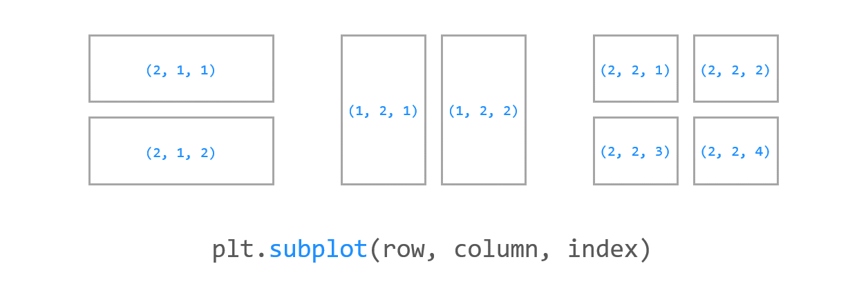
subplot