[ML] Linear Regression
Linear Regression
- 지도학습 - 분류 Classification, 회귀 Regression
- 비지도학습 - 군집, 차원 축소
📌 Regression
OLS: ordinary linear least square
import pandas as pd

data = {'x': [1, 2, 3, 4, 5], 'y': [1, 3, 4, 6, 5]}
df = pd.DataFrame(data)
df
# 가설 세우기
import statsmodels.formula.api as smf
lm_model = smf.ols(formula='y ~ x', data=df).fit()lm_model.params # y절편: 0.5, x계수: 1.1>>>
Intercept 0.5
x 1.1
dtype: float64import matplotlib.pyplot as plt
import seaborn as sns
plt.figure(figsize=(10, 7))
sns.lmplot(x='x', y='y', data=df);
plt.xlim([0, 5]) # x축 0부터 시작하게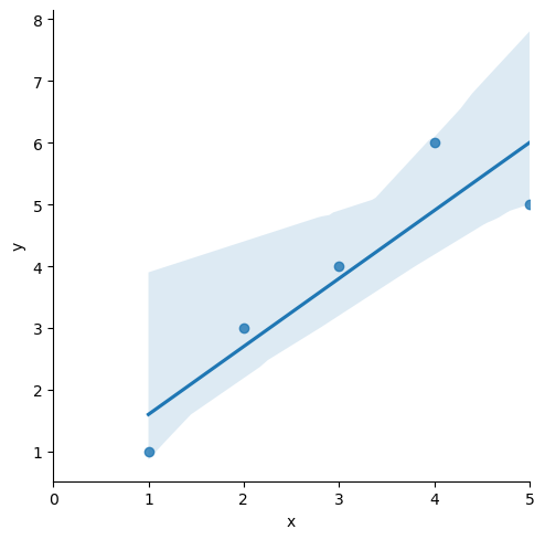
# 잔차 평가 residue
# 잔차 확인

resid = lm_model.resid
resid
>>>
0 -0.6
1 0.3
2 0.2
3 1.1
4 -1.0
dtype: float64결정게수 R-Squared
- R-Squared = SSR / SST
# numpy로 결정계수 직접 계산
import numpy as np

mu = np.mean(df.y)  # df['y']
y = df.y
yhat = lm_model.predict()
np.sum((yhat - mu)**2 / np.sum((y-mu)**2))
0.8175675675675673
# 간단
lm_model.rsquared
0.8175675675675677
sns.distplot(resid, color='black')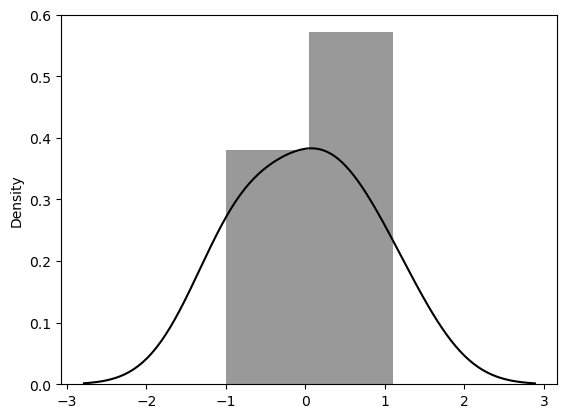
📌 Stats_Regression
통계적 회귀
회귀를 통해 이해하는 cost function
import pandas as pd
import numpy as np
import matplotlib.pyplot as plt
import seaborn as sns

data_url = 'https://raw.githubusercontent.com/PinkWink/ML_tutorial/master/dataset/ecommerce.csv'
data = pd.read_csv(data_url)

data.head()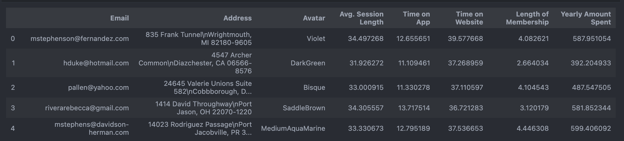
# 필요없는 컬럼 삭제
data.drop(['Email', 'Address', 'Avatar'], axis=1, inplace=True)
data.info()plt.figure(figsize=(12, 6))
sns.boxplot(data=data);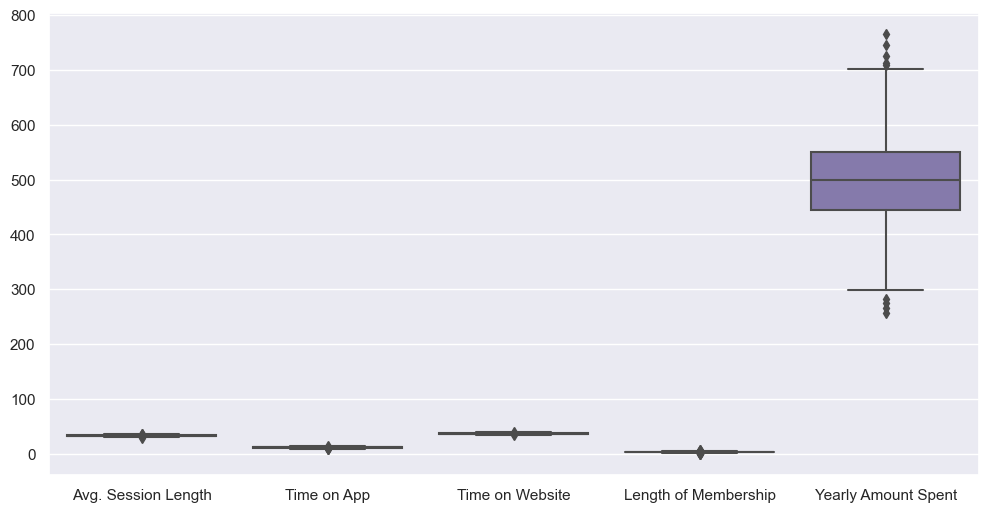
# 특성들만 다시 boxplot

plt.figure(figsize=(12, 6))
sns.boxplot(data=data.iloc[:, :-1]);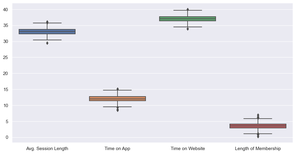
# label 값 boxplot
plt.figure(figsize=(12, 6))
sns.boxplot(data=data['Yearly Amount Spent'])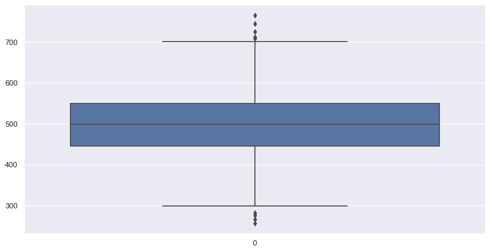
# pairplot
plt.figure(figsize=(12, 6))
sns.pairplot(data=data);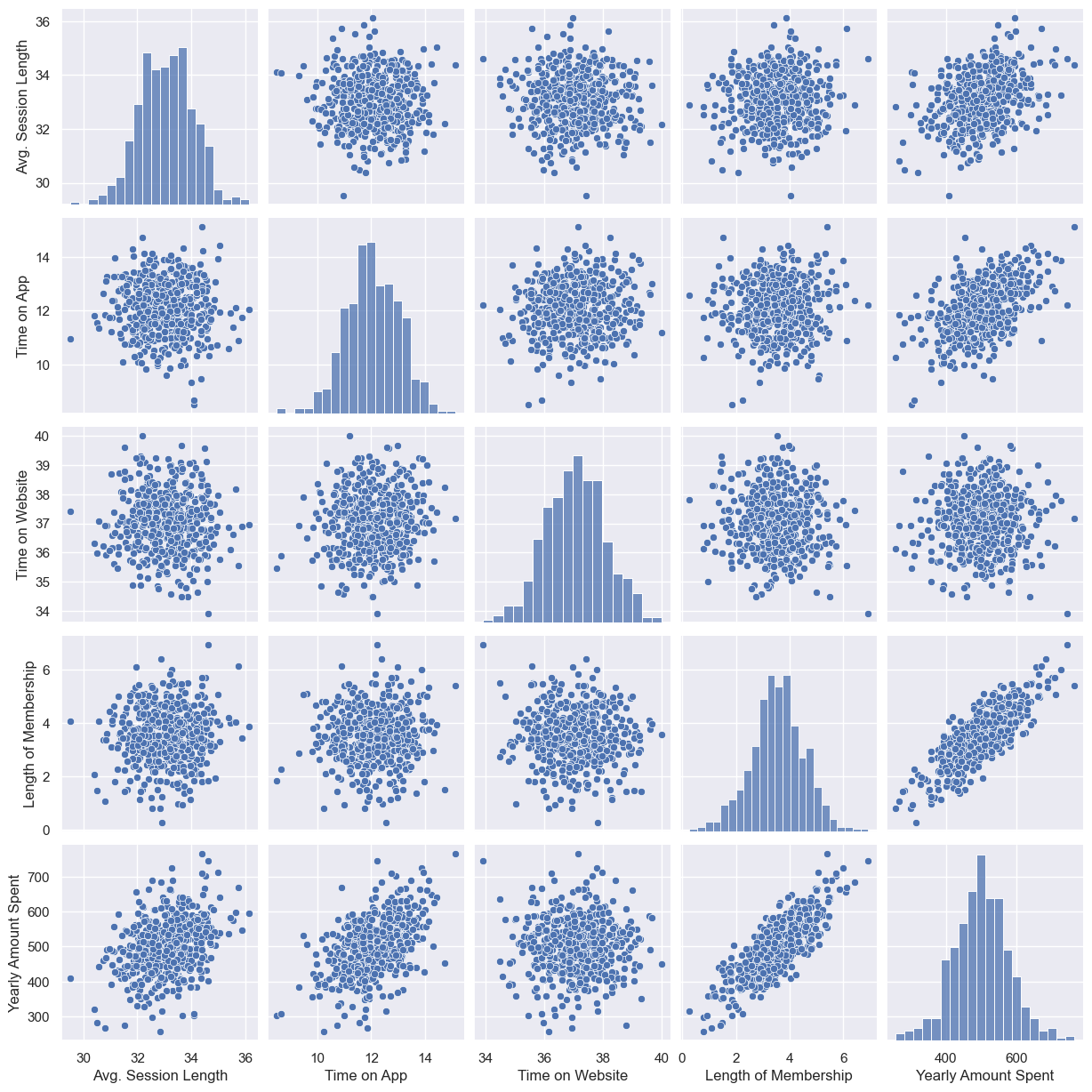
--> length of membership, yearly amount spent 만 상관 있어보임
# lmplot
plt.figure(figsize=(12, 6))
sns.lmplot(x='Length of Membership', y='Yearly Amount Spent', data=data);
# 상관이 높은 멤버쉽 유지기간만 가지고 통계적 회귀
import statsmodels.api as sm

X = data['Length of Membership']
y = data['Yearly Amount Spent']
lm = sm.OLS(y, X).fit()
# 회귀 리포트
lm.summary()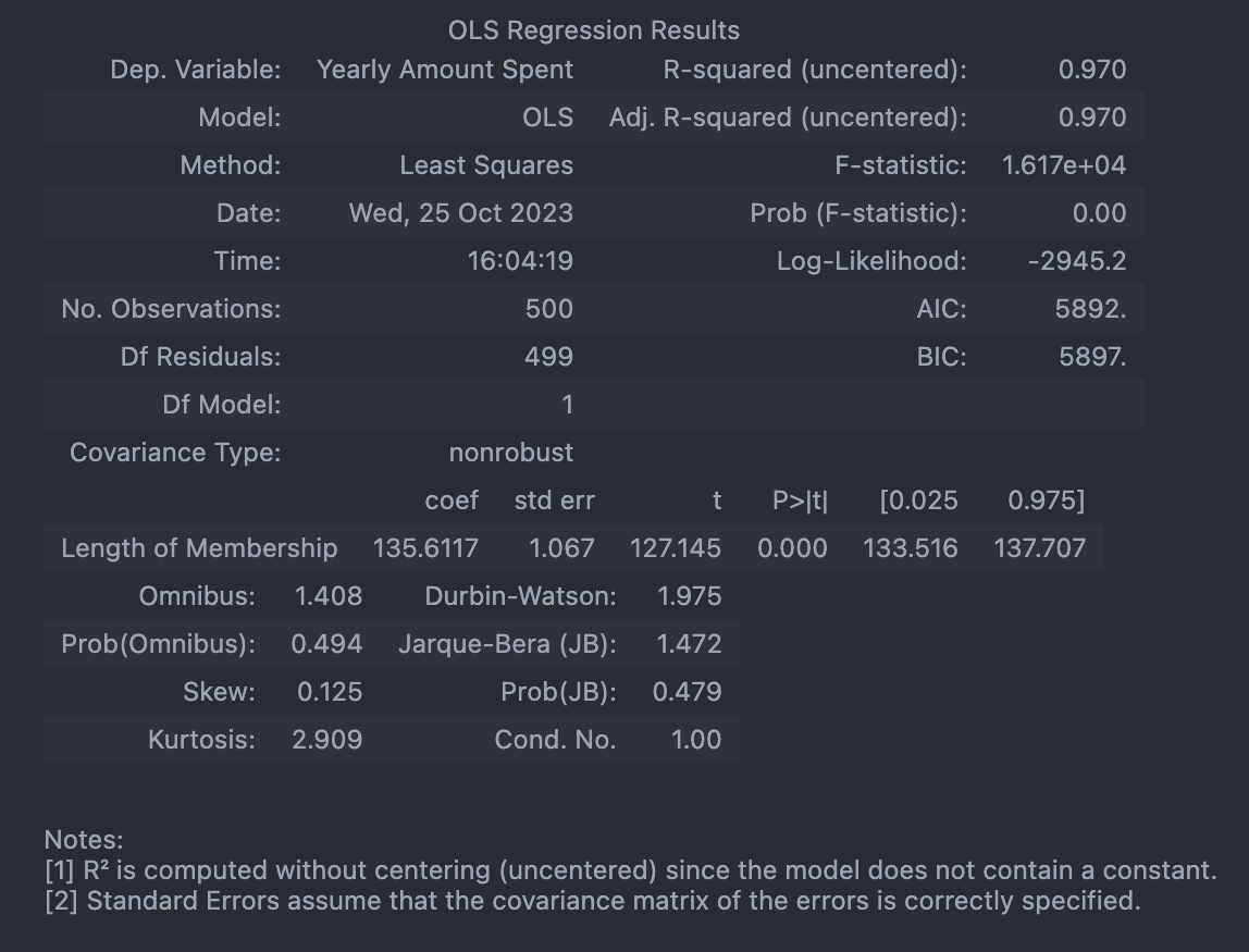
# 회귀 모델 그려보기
pred = lm.predict(X)

sns.scatterplot(x=X, y=y)
plt.plot(X, pred, 'r', ls='dashed', lw=3)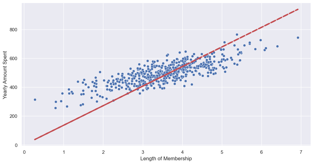
--> 상수항 없어서 그럼
sns.scatterplot(x=y, y=pred)
plt.plot([min(y), max(y)], [min(y), max(y)], 'r', ls='dashed', lw=3)  # 아까 그린 성
plt.plot([0, max(y)], [0, max(y)], 'blue', ls='dashed', lw=3)  # (0, 0) 부터 그린 선
plt.axis([0, max(y), 0, max(y)]);
# 상수항 넣어주기
# numpy 열 추가: c_
X = np.c_[X, [1]*len(X)]
X[:5]
>>>
array([[4.08262063, 1. ],
[2.66403418, 1. ],
[4.1045432 , 1. ],
[3.12017878, 1. ],
[4.44630832, 1. ]])# model fit
# const(상수) 잡힘, R-squared 작아짐, AIC 낮아짐(=좋아짐)
lm = sm.OLS(y, X).fit()
lm.summary()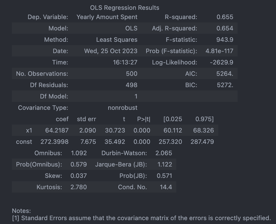
pred = lm.predict(X)

sns.scatterplot(x=y, y=pred)
plt.plot([min(y), max(y)], [min(y), max(y)], 'r', ls='dashed', lw=3)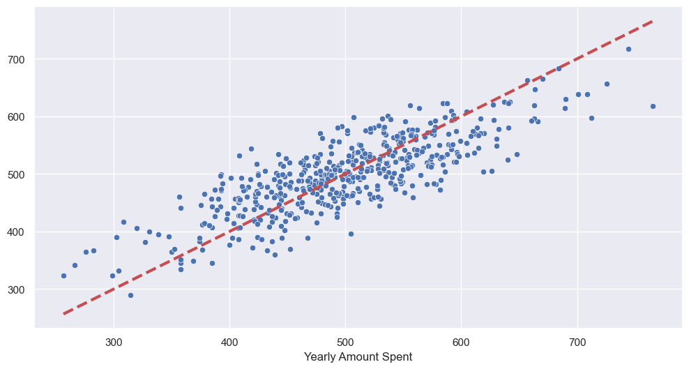
# 데이터 분리해서 평가
from sklearn.model_selection import train_test_split

X = data.drop('Yearly Amount Spent', axis=1)
y = data['Yearly Amount Spent']

X_train, X_test, y_train, y_test = train_test_split(X, y, test_size=0.2, random_state=13)- train 데이터로 학습
# 네 개 column을 모두 변수로 보고 회귀
lm = sm.OLS(y_train, X_train).fit()
lm.summary()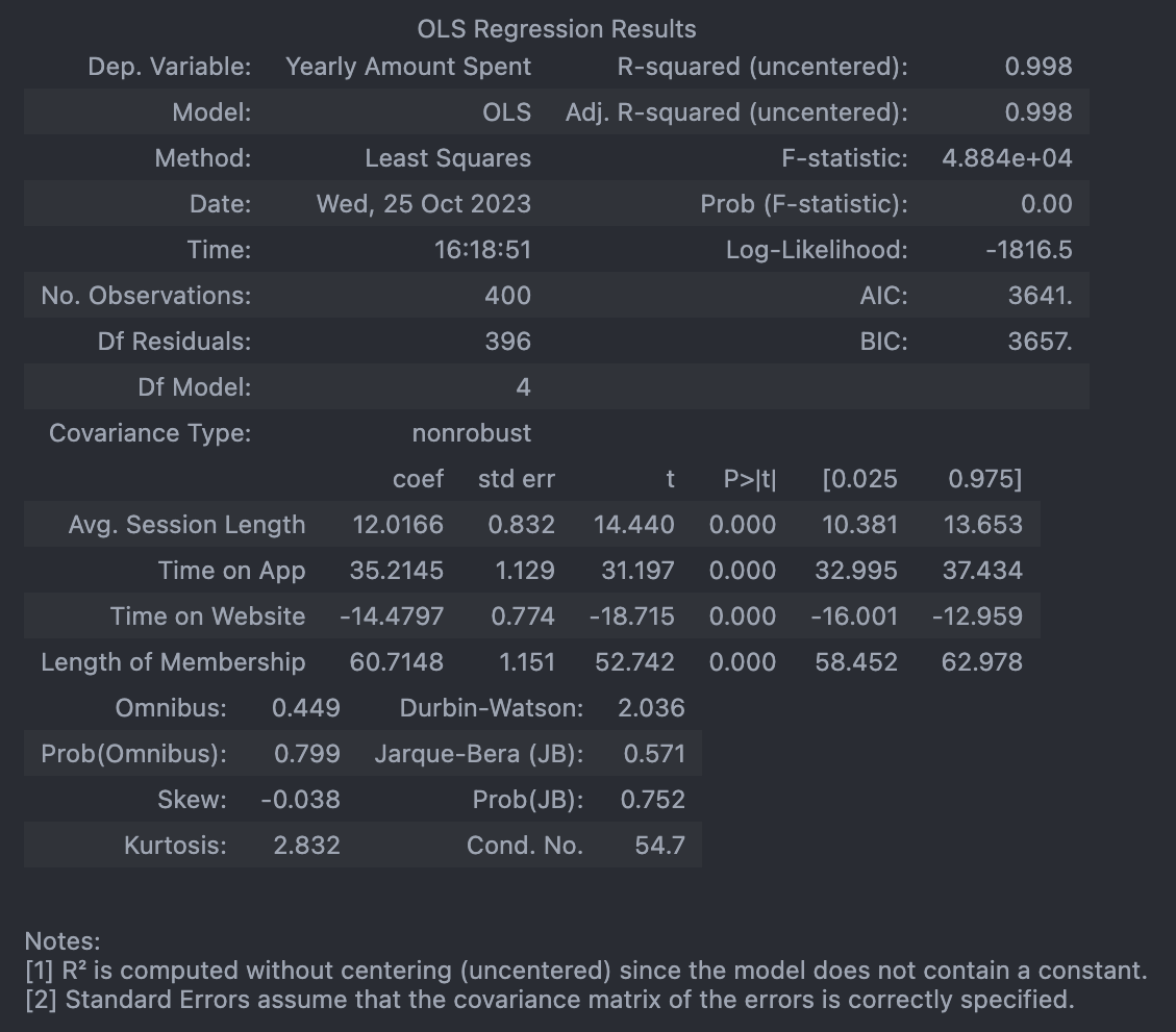
- test 데이터로 확인
# 참값 vs 예측값

pred = lm.predict(X_test)

sns.scatterplot(x=y_test, y=pred)
plt.plot([min(y_test), max(y_test)], [min(y_test), max(y_test)], 'r', ls='dashed', lw=3)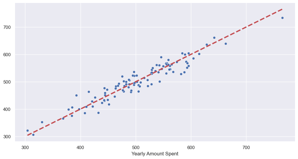
📌 Cost Function
최솟값
# symbolic 연산

import sympy as sym

theta = sym.Symbol('theta')
diff_th = sym.diff(38*theta**2 - 94*theta + 62, theta)
diff_th
76θ−94
94/761.236842105263158
--> 최솟값: 1.2
Cost Function
: 에러를 표현하는 도구
- Gradient desent: 미분을 통해 cost function의 최솟값 찾음
- Learning Rate
📌 Boston 집값 예측
from sklearn import datasets
X, y = datasets.fetch_openml('boston', return_X_y=True)

boston = X

boston_pd = boston.copy()
boston_pd['PRICE'] = y
# Price 에 대한 histogram
import plotly.express as px
fig = px.histogram(boston_pd, x='PRICE')
fig.show()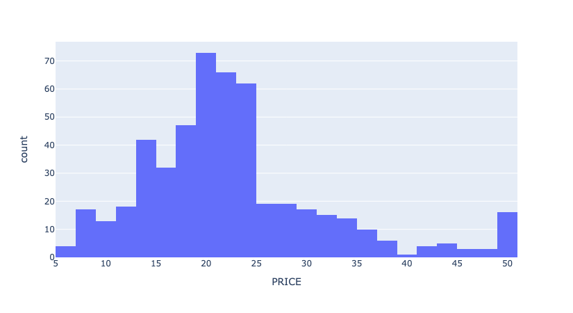
# 상관계수
import matplotlib.pyplot as plt
import seaborn as sns

corr_mat = boston_pd.corr().round(1)

sns.heatmap(data=corr_mat, annot=True, cmap='bwr');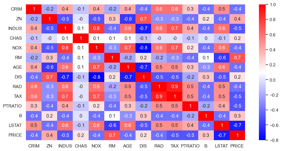
--> Price와 방의 수(RM), 저소득층 인구(LSTAT)와 높은 상관관계가 보임
# RM과 LSTAT 와 PRICE의 관계에 대해 좀 더 관찰
sns.set_style('darkgrid')
sns.set(rc={'figure.figsize':(12, 6)})
fig, ax = plt.subplots(ncols=2)
sns.regplot(x='RM', y='PRICE', data=boston_pd, ax=ax[0])
sns.regplot(x='LSTAT', y='PRICE', data=boston_pd, ax=ax[1])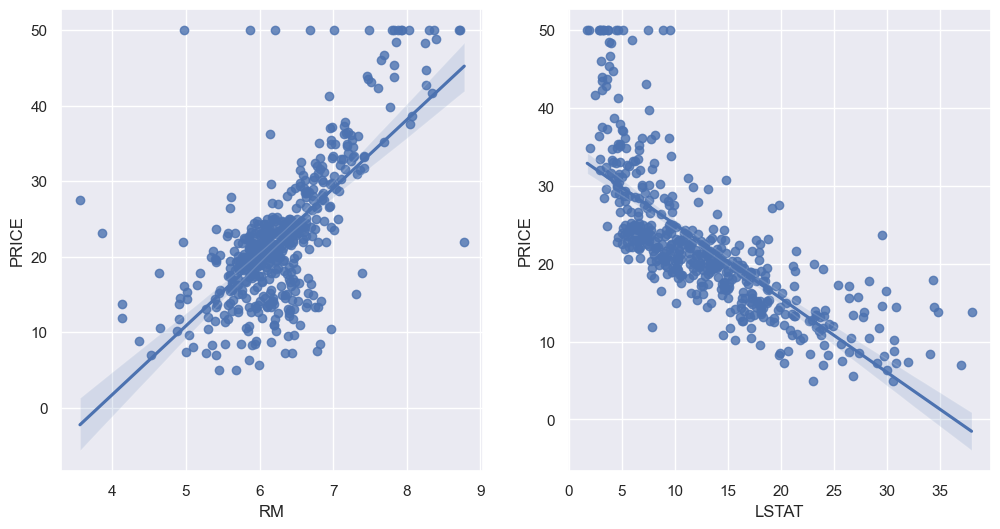
- train, test 나누기
# 두 column 이 data type = category 라서 reg.predict 안됐음

boston_pd['RAD'] = boston_pd['RAD'].astype('float')
boston_pd['CHAS'] = boston_pd['CHAS'].astype('float')

# train, test set 나누기
from sklearn.model_selection import train_test_split

X = boston_pd.drop('PRICE', axis=1)
y = boston_pd['PRICE']

X_train, X_test, y_train, y_test = train_test_split(X, y, test_size=0.2, random_state=13)- linear regression model 학습
# LinearRegression
from sklearn.linear_model import LinearRegression

reg = LinearRegression()
reg.fit(X_train, y_train)- 평가(RMS)
# 모델 평가: RMS
import numpy as np
from sklearn.metrics import mean_squared_error
pred_tr = reg.predict(X_train)
pred_test = reg.predict(X_test)
rmse_tr = np.sqrt(mean_squared_error(y_train, pred_tr))
rmse_test = np.sqrt(mean_squared_error(y_test, pred_test))
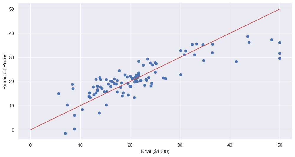
print('RMSE of Train Data: ', rmse_tr)
print('RMSE of Test Data: ', rmse_test)RMSE of Train Data: 4.642806069019824
RMSE of Test Data: 4.931352584146708
- 성능 확인
plt.scatter(y_test, pred_test)
plt.xlabel('Real ($1000)')
plt.ylabel('Predicted Prices')
plt.plot([0, 50], [0, 50], 'r')
plt.show()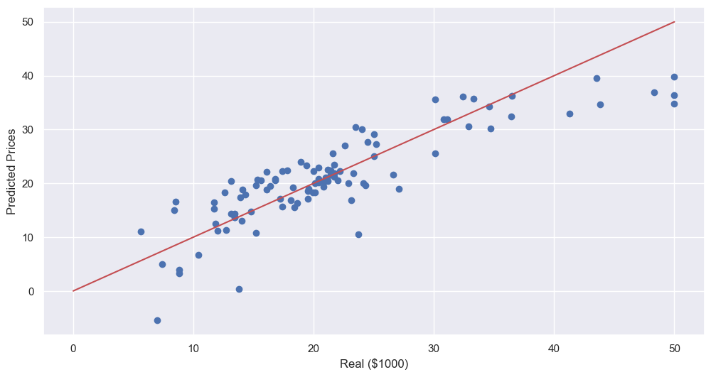
- LSTAT 빼고 테스트해보기
# train, test set 나누기

X = boston_pd.drop(['PRICE', 'LSTAT'], axis=1)
y = boston_pd['PRICE']

X_train, X_test, y_train, y_test = train_test_split(X, y, test_size=0.2, random_state=13)reg.fit(X_train, y_train)
pred_tr = reg.predict(X_train)
pred_test = reg.predict(X_test)
rmse_tr = np.sqrt(mean_squared_error(y_train, pred_tr))
rmse_test = np.sqrt(mean_squared_error(y_test, pred_test))
print('RMSE of Train Data: ', rmse_tr)
print('RMSE of Test Data: ', rmse_test)RMSE of Train Data: 5.165137874244864
RMSE of Test Data: 5.295595032597158
--> RMSE 올라감, 성능 나빠짐 -> but 뺴도 될지는 분석자 판단
plt.scatter(y_test, pred_test)
plt.xlabel('Real ($1000)')
plt.ylabel('Predicted Prices')
plt.plot([0, 50], [0, 50], 'r')
plt.show()