주특기 주차를 맞이하고 어느덧 금요일을 맞이했다. 오늘은 이전에 공부했던 모바일 우선 반응형 웹의 또다른 부분에 대해 조사해보기로 했다.
▶ 모바일 우선 반응형 웹 디자인 (2)
css 단위
rem, em
◻ 소개
- rem: root element에 지정된 font 크기.
- em: 현재 element의 font 크기.
◻ 사용법
- 'rem' for global sizing, 'em' for local sizing
참고: Use 'rem' for Global Sizing; Use 'em' for Local Sizing-css tricks
.wrapper1 {
	font-size: 2rem;
}
.wrapper1 .heading {
	font-size: 3em;
}
.wrapper1 .content {
   	font-size: 1em;
}

.wrapper2 {
	font-size: 3rem;
}
.wrapper2 .heading {
   	font-size: 2em;
}
.wrapper2 .content {
   	font-size: 0.5em;
}
◻ 주의사항
- em의 남용은 레이아웃이 깨졌을 때 어디서부터 잘못됐는지 모르는 사태를 초래할 수 있음.
// 혼돈의 카오스
html {
	font-size: 100%
}
body {
	font-size: 1em;
}
.article {
	font-size: 1.5em;
}
.article .wrapper {
	font-size: 2em;
}
.article .wrapper .heading {
	font-size: 3em;
}
.article .wrapper .content {
   	font-size: 1em;
}
✔ 해결 방법
- 가능한 low-level에서 em을 선언함.
- rem을 우선적으로 사용하고, em은 local에서 부모와 자식 요소의 상대적 크기를 지정할 때 사용함.
vw, vh, vmin, vmax
◻ 소개
- vw: 1vw는 뷰포트 너비의 1%
- vh: 1vh는 뷰포트 높이의 1%
- vmin: 1vmin은 뷰포트의 작은 방향의 1%
- vmax: 1vmax는 뷰포트의 큰 방향의 1%
ex) width: 1000px, heigth: 2000px인 뷰포트의 경우
1vmin = 10px
1vmax = 20px
◻ 사용법
- responsive typhography 구현에 사용할 수 있음.
- full-height layout, hero image, sticky footer 구현에 사용할 수 있음.
- fluid aspect ratio 구현에 사용할 수 있음.
출처: Fun with viewport units-css tricks
◻ 주의사항
- 블록 요소의 width 단위로 vw를 사용할 시, 스크롤바를 고려하지 못할 수 있음.
- 브라우저 호환성이 %, rem, em 등 여타 단위들보다 좋지 않음.
반응형 콘텐츠
이미지
◻ img vs background-image
이미지가 사용자의 페이지에 대한 이해를 돕는다면 img를 사용하고, 오로지 디자인이나 배경 이미지로 사용할 목적이라면 background-image를 사용함.
img vs background-image__stack overflow
안티 패턴으로서의 CSS background-image 속성__velog
html의 img와 css의 background-image 각각 ppi와 사이즈를 고려한 반응형 이미지를 만들 수 있는 방법 ▶ developers.google.com: Responsive images
◻ width, height
🙌 상대 크기를 사용할 것.
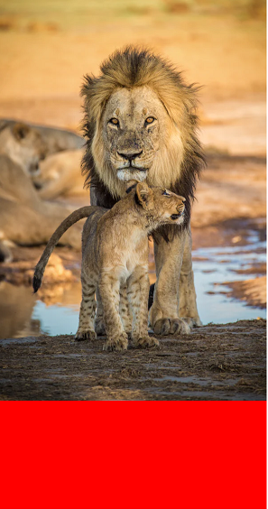
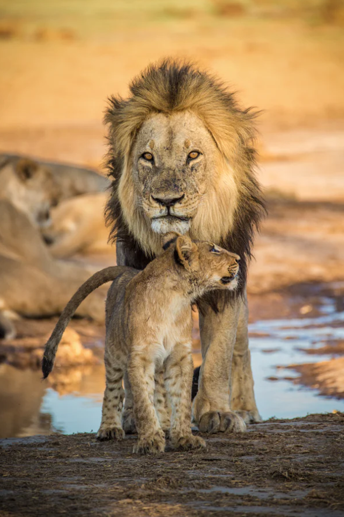
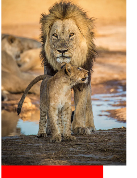
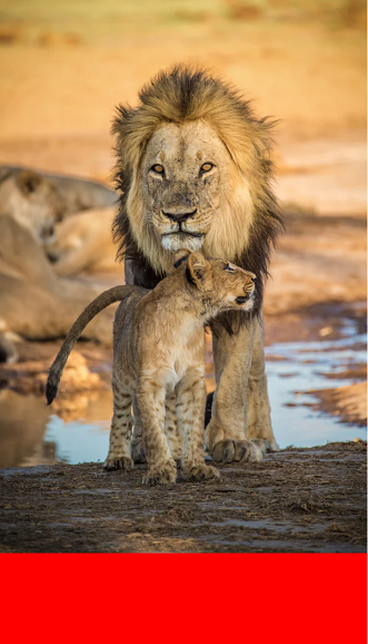
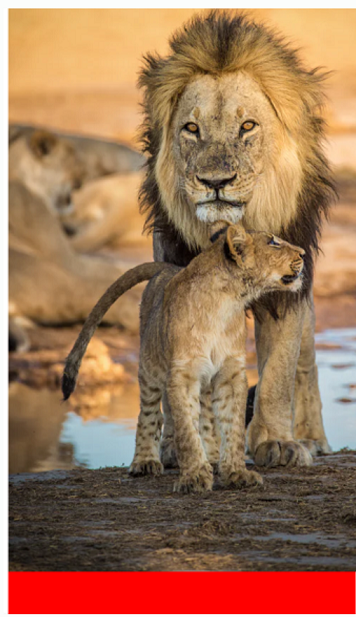
ex) 예시로서의 html 구조
<div class="container">
    <img src="lion image from unsplash" alt="lion-father and baby">
</div>- 기본적으로 이미지에 하나의 치수만 선언하면 늘 종횡비가 유지됨.
.containing-block {
  width: 50%;
  height: 100vh;
  background-color: red;
}

.containing-block img {
  width: 100%;
}- 기존 이미지의 크기가 줄어들거나 늘어나는 것에 상관없이 컨테이닝 블록의 width에 이미지 크기를 딱 맞추고 종횡비를 유지하길 원한다면 이미지 태그의 width에 100%, height에 auto를 주면 됨.
.containing-block {
width: 100%;
height: 100vh;
background-color: red;
}
.containing-block img {
width: 100%;
height: auto;
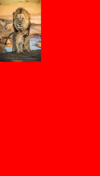
}아래 사진처럼 기존 이미지의 크기가 컨테이닝 블록을 벗어날 때가 있음.
.containing-block {
  width: 50%;
  height: 100vh;
  background-color: red;
}
이럴 땐 max-width: 100%, height: auto를 주면 컨테이닝 블록의 width에 맞게 줄어들면서 종횡비를 유지함.
.containing-block {
  width: 50%;
  height: 100vh;
  background-color: red;
}

.containing-block img {
  max-width: 100%;
  height: auto;
}
벗어난 부분만 자르고 싶다면 부모 요소에 overflow:hidden을 줄 수도 있음.
.containing-block {
  width: 50%;
  height: 100vh;
  background-color: red;
  overflow: hidden;
}- 기존 종횡비를 유지하되 가로 세로 크기를 임의로 제한하고자 한다면 max-width와 max-height가 매우 유용함.
.containing-block {
  width: 50%;
  height: 100vh;
  background-color: red;
}

.containing-block img {
  max-width: 300px;
  max-height: 300px;
}
위에 더해 이미지가 반응형이길 원한다면 상대적 단위값(%, vw 등)을 가지는 width를 img에 선언하여 max-width와 함께 활용할 수 있음.
.containing-block {
  width: 50%;
  height: 100vh;
  background-color: red;
}

.containing-block img {
  max-width: 300px;
  max-height: 300px;
  width: 40%;
}
참고: 100% width or height while keeping aspect ratio?__stack overflow
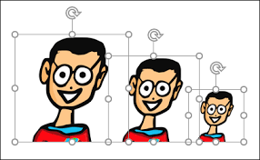
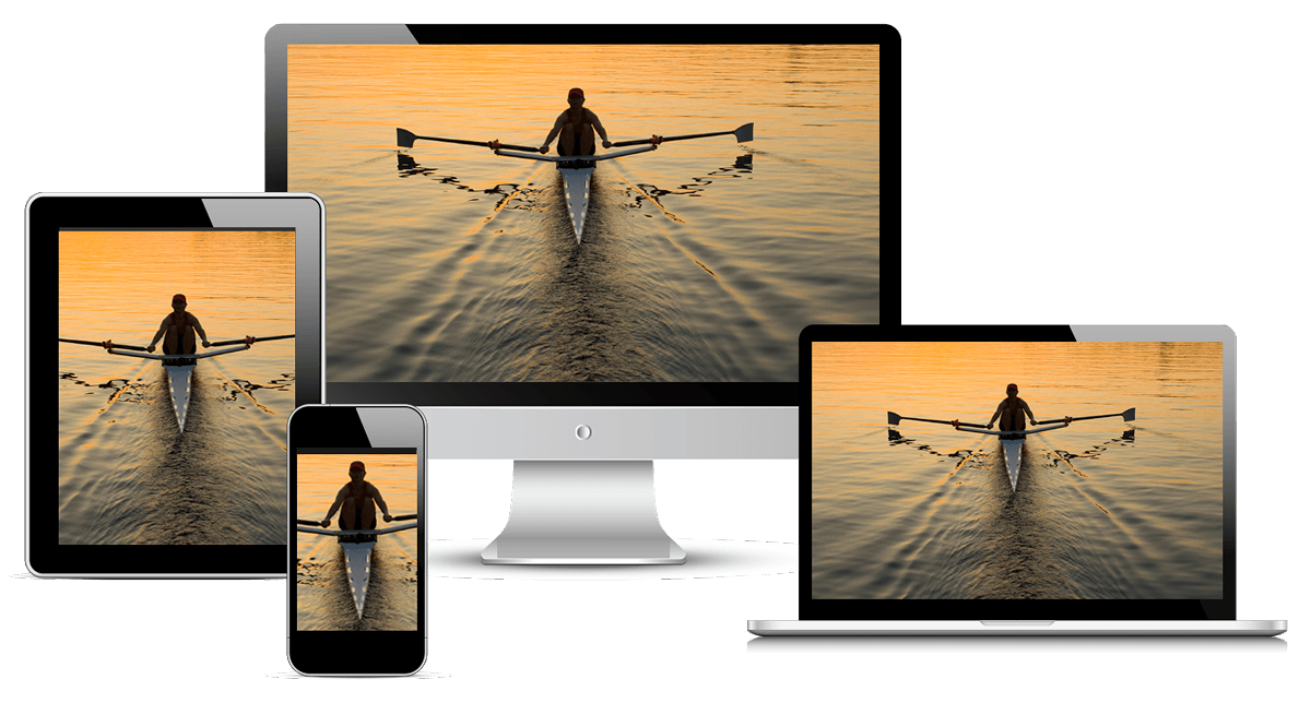
◻ 해상도 전환
- 기기의 특성(화면 크기, 픽셀 밀도)에 따라 적합한 사이즈의 이미지를 제공하는 문제.
- 같은 이미지 다른 크기.
 출처: howtogeek-how to automatically size pictures in powerpoint
- img 요소의 srcset을 활용하며 sizes 프로퍼티는 w(width descriptor)를 사용한다면 필수이고, x(display density descriptor)를 사용한다면 필수가 아님.
- x는 화면 픽셀 밀도를 계산해 적합한 이미지를 다운로드 하지만, w는 화면 픽셀 밀도와 함께 이미지의 최종 사이즈를 고려해 최적의 이미지를 다운로드 하기 때문임.
- w 사용 시 sizes가 없으면 이미지의 최종 사이즈가 어떻게 될 지 판단할 수 없는데 그 이유는 이미지 다운로드가 css와 javascript를 로딩하고 해석하는 과정이 끝나지 않은 상태에서 이루어지기 때문임.
- 사용자 화면의 레이아웃과 이미지의 사이즈가 아직 결정되지 않은 상태인데 최적의 이미지를 골라 다운로드 하라고 하는 것은 아직 침대 사이즈를 어떤 걸로 살 지 결정되지도 않았는데 침대 커버를 사이즈에 맞게 사오라는 것과 같은 뜻이라 할 수 있음.
▶참고
cloudfour: Responsive Images 101, Part 4: Srcset Width Descriptors
developers.google.com: Responsive images
// w

<img src="400.png"
     sizes="(min-width: 600px) 25vw, (min-width: 500px) 50vw, 100vw"
     srcset="100.png 100w, 200.png 200w, 400.png 400w,
             800.png 800w, 1600.png 1600w" alt="an example image">
// x
<img src="photo.png" srcset="photo@2x.png 2x, photo@3x.png 3x, ...">-
따라서 크기가 정해진 이미지에 한해 x descriptor를 사용하는 것이 권장되고, 나머지 반응형에서는 w descriptor 사용이 권장됨.
-
srcset과 sizes가 지원되지 않는 브라우저에서는 src 내부의 이미지가 사용되기에 src에 1x의 이미지를 잘 적용하는 것은 중요함.
◻ 아트 디렉션
-
기기의 특성(화면 크기, 픽셀 밀도)에 따라 특정 부분을 자르거나 강조해서 보여주고 싶은 문제.
-
같은 이미지 다른 부분.
- picture 요소를 활용하며 기본적으로 활용될 이미지를 img 태그에 선언하고, 브레이크 포인트별로 사용될 이미지들은 source에 선언함.
- source도 img와 동일하게 srcset, sizes, w, x를 상황에 맞게 사용할 수 있음.
▶참고
cloudfour: Responsive Images 101, Part 6: Picture Element
MDN: 반응형 이미지
<picture>
  <source media="(min-width: 800px)" srcset="head.jpg, head-2x.jpg 2x">
  <source media="(min-width: 450px)" srcset="head-small.jpg, head-small-2x.jpg 2x">
  <img src="head-fb.jpg" srcset="head-fb-2x.jpg 2x" alt="a head carved out of wood">
</picture>
동영상
◻ video
- 이미지와 동일하게 width, max-width, height를 적절히 섞어 쓰면 됨.
video {
  width: 100%;
  max-height: 100%;
  height: 100%;
}
◻ iframe
- 컨테이닝 블록의 특성을 이용함.
- 요소의 position이 absolute인 경우, position이 static이 아닌 부모의 패딩 영역(내부 여백 영역)이 컨테이닝 블록이 됨.
// html
<div class="videoWrapper">
    <iframe width="560" height="349" src="https://www.youtube.com/embed/tgbNymZ7vqY" frameborder="0" allowfullscreen></iframe>
</div>

// css
.videoWrapper {
  position: relative;
  padding-bottom: 56.25%; /* 16:9 Aspect Ratio (divide 9 by 16 = 0.5625) */
  height: 0;
}
.videoWrapper iframe {
  position: absolute;
  top: 0;
  left: 0;
  width: 100%;
  height: 100%;
}
혹은 이렇게도 사용가능함.
<div class="videoWrapper" style="--aspect-ratio: 3 / 4;">
  <iframe ...>
</div>

.videoWrapper {
  ...
  /* falls back to 16/9, but otherwise uses ratio from HTML */
  padding-bottom: calc(var(--aspect-ratio, .5625) * 100%);
}
▶참고
css tricks: fluid width video
MDN: var()
MDN: css custom properties
유동적 레이아웃
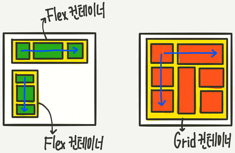
flexbox
◻ 개념
1차원에서 강력한 공간 배분 및 정렬 기능을 보유한 css3의 새로운 레이아웃 기능.
◻ 특징
- 수직, 혹은 수평 중 한 방향으로 정렬하거나 공간 배분을 하는 내비게이션과 같은 레이아웃을 만드는데 탁월함.
- container와 item으로 구성됨.
- container에 display: flex를 선언함으로써 적용됨.
- 주축(Main Axis)과 교차축(Cross Axis)으로 구성됨.
◻ 참조
MDN: flexbox의 기본 개념
heropy님 블로그: css flex 완벽 가이드
네이버 D2: flexbox로 만들 수 있는 10가지 레이아웃
grid
◻ 개념
2차원의 레이아웃 시스템으로 수평선과 수직선이 교차해서 이루어지며, 각각 가로행과 세로열을 정의함.
◻ 특징
- 바둑판이라고 생각하면 이해하기 쉬우며 flexbox와 마찬가지로 container와 item으로 구성되고 flexbox와 함께 사용하면 매우 강력함.
- container에 display: grid를 선언함으로써 적용됨.
- column 축과 row 축으로 구성됨.
스튜디오밀 1분코딩: 이번에야말로 CSS Grid를 익혀보자
◻ 참조
MDN: CSS 그리드 레이아웃
MDN: Basic concepts of grid layout
heropy님 블로그: css grid 완벽 가이드
Box 정렬 가이드 by 야무