Python Plotly 2
미션 목록
- Plotly 축 / 그리드
- Plolty 그래프 겹쳐/나눠 그리기
- Plotly 범례
- Plotly 템플릿
- Pandas-Plotly 설정
- 기술 블로그 작성하기
사용한 자료의 출처
https://fdc.nal.usda.gov/api-key-signup
코드
import requests
import plotly.express as px
import plotly.graph_objects as go
from plotly.subplots import make_subplots
import pandas as pd
pd.options.plotting.backend = 'plotly' # 사용하지 않음
# 1) API 키 발급 후
API_KEY = "---"
food_id = 1750340 # 예: 사과 FDC ID
url = f"https://api.nal.usda.gov/fdc/v1/food/{food_id}?api_key={API_KEY}"
resp = requests.get(url).json()
# 2) 주요 영양소만 추출
description = resp.get('description', '')
foodNutrients = resp["foodNutrients"]
nutrientList = []
majorNutrientList = []
minorNutrientList = []
for nutrient in foodNutrients:
amount = nutrient.get('amount', 0)
if amount == 0:
continue # 값이 0이면 건너뛰기
nutrient_info = nutrient.get('nutrient', {})
name = nutrient_info.get('name')
unit = nutrient_info.get('unitName')
# 세 가지 키만 있는 딕셔너리 생성
nutrientList.append({
"name": name,
"amount": amount,
"unit": unit
})
if amount > 4:
majorNutrientList.append({
"name": name,
"amount": amount,
"unit": unit
})
else:
minorNutrientList.append({
"name": name,
"amount": amount,
"unit": unit
})
df = pd.DataFrame(nutrientList)
df_major = pd.DataFrame(sorted(majorNutrientList, key = lambda nu : nu['amount'], reverse=True))
df_minor = pd.DataFrame(sorted(minorNutrientList, key = lambda nu : nu['amount'], reverse=True))
# 데이터 편집하기
Gram = df.loc[df["unit"]=="g", :]
Milligram = df.loc[df["unit"]=="mg", :]
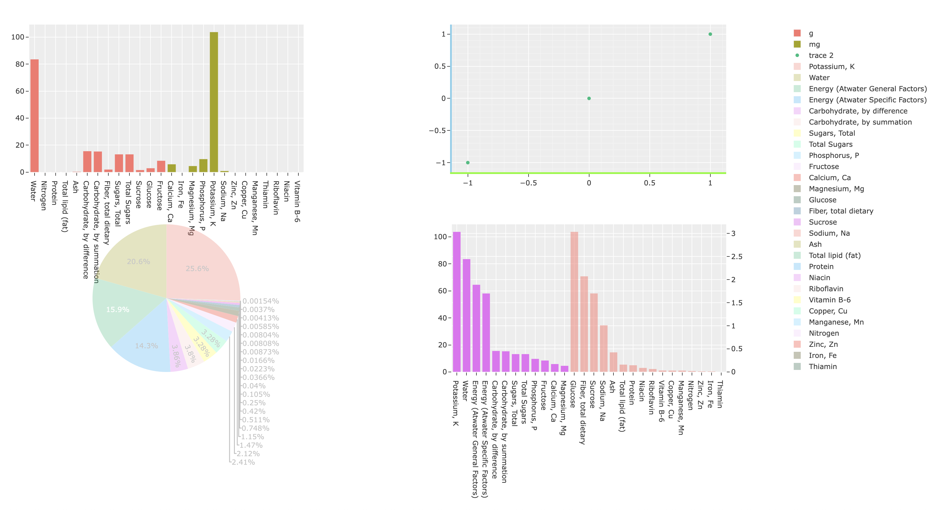
fig = make_subplots(rows = 2, cols = 2,
specs=[
[{"type": "xy"}, {"type": "xy"}],
[{"type": "domain"}, {"type": "xy", "secondary_y": True}] # ← (2,1)은 원형 차트용, (2,2) 이중 Y축
])
# [1, 1]
fig.add_trace(go.Bar(x=Gram['name'], y=Gram['amount'], name='g'), row=1, col=1)
fig.add_trace(go.Bar(x=Milligram['name'], y=Milligram['amount'], name='mg'), row=1, col=1)
# [1, 2]
fig.add_trace(go.Scatter(x=[-1,0,1], y=[-1,0,1], mode='markers'), row=1,col=2)
fig.update_xaxes(showline=True, linewidth=3, linecolor='lawngreen', showgrid=True, minor_showgrid=True, row=1,col=2)
fig.update_yaxes(showline=True, linewidth=3, linecolor='skyblue', showgrid=True, minor_showgrid=True, row=1,col=2)
# [2, 1]
fig.add_trace(go.Pie(labels=df['name'], values=df['amount'], name=description, opacity=0.3), row=2, col=1)
fig.update_layout(template='ggplot2')
# [2, 2]
fig.add_trace(go.Bar(x=df_major['name'], y=df_major['amount']), row=2, col=2, secondary_y=False,)
fig.add_trace(go.Bar(x=df_minor['name'], y=df_minor['amount'], opacity=0.5), row=2, col=2, secondary_y=True)
fig.show()코드 실행 결과

참고 사이트

개발자