Blogrow Project
🌱 Blogrow 란 ?
blog+grow를 합친 말로,
내적인 성장을 위한 블로그 라는 의미로 타이틀을 지어본 프로젝트임.
📝 DAY 01 - 220518
- 기획
- 컴포넌트 / 페이지 구성 (UI)
- styled-components
- 리덕스 설정 (module, store, provider)
기획
Back-end Part
- 회원가입 / 로그인 + 로그아웃 (미들웨어 / koa-bodyparser)
- 비밀번호 해싱 (bcrypt)
- 회원정보, 포스트 (mongoDB + mongoose)
- 서버 구축 (Koa) / 라우터 (koa-router)
- 환경변수 (dotenv)
Front-end Part
- CRA(create-react-app) 기반
- react-router-dom
- 각 routes에 대한 UI 개발
- 회원 인증 UI 구현
- 데이터 관리 -
Redux- 글쓰기 (posts/write) - WYSIWYG 에디터 라이브러리
- 스타일링 -
styled-components
작업 환경 준비
create-react-app
- /blog (프로젝트 루트 디렉터리)에 /blog-frontend 폴더를 생성함.
- cra 기반.
$ yarn create react-app blog-frontendblog-backend 를 연 상태에서 우클릭 - [작업 영역에 폴더 추가] 클릭.
[파일]-[작업 영역을 다른 이름으로 저장] 클릭시 나중에도 이렇게 열 수 있게 저장됨.
🛠 기본 설정 (+파비콘)
- 쓸모없는 파일 (.css) 등을 모두 제거해주고,
- public/index.html에 파비콘을 등록해주고 설정함.
-> 이번에 블로그로우(blogrow) 컨셉에 맞게 파비콘을 제작해봄.
(프로젝트 할때마다 항상 파비콘은 필수로 만들게 되는듯! 재밌다 🙂)

설정 파일
blog-frontend 폴더에 설정 파일 생성.
- prettier 설정
{
  "singleQuote": true,
  "semi": true,
  "useTabs": false,
  "tabWidth": 2,
  "trailingComma": "all",
  "printWidth": 80
}
- jsconfig.json 생성 (자동 import)
{
  "compilerOptions": {
    "target": "es6"
  }
}
라우터 적용
react-router-dom설치
$ yarn add react-router-dom1. 페이지 생성
- src/pages 디렉터리에 아래 페이지들을 만듬.
| 페이지 | 설명 |
|---|---|
| LoginPage | 로그인 |
| RegisterPage | 회원가입 |
| WritePage | 글쓰기 |
| PostPage | 포스트 읽기 |
| PostListPage | 포스트 목록 |
2. index.js
- react-router-dom의 BrowserRouter을 감싸줌.
import React from 'react';
import ReactDOM from 'react-dom/client';
import App from './App';
import { BrowserRouter } from 'react-router-dom';

const root = ReactDOM.createRoot(document.getElementById('root'));
root.render(
  <BrowserRouter>
    <App />
  </BrowserRouter>,
);
3. App.js
- Routes, Route로 라우트 설정해줌.
- 지난 백엔드에서 설정해준 path대로 해주면 됨.
import { Routes, Route } from 'react-router-dom';

import LoginPage from './pages/LoginPage';
import WritePage from './pages/WritePage';
import PostListPage from './pages/PostListPage';
import PostPage from './pages/PostPage';
import RegisterPage from './pages/RegisterPage';

function App() {
  return (
    <Routes>
      <Route path="/" element={<PostListPage />} />
      <Route path="/login" element={<LoginPage />} />
      <Route path="/register" element={<RegisterPage />} />
      <Route path="/write" element={<WritePage />} />
      <Route path="/@:username">
        <Route index element={<PostListPage />} />
        <Route path=":postId" element={<PostPage />} />
      </Route>
    </Routes>
  );
}

export default App;
- Route 컴포넌트에
indexprops를 주면, path="/"와 같은 의미이다. - 중첩된 라우트 형식 사용. -> /@:username 에서 :postId를 누르면 포스트를 볼 수 있음.
즉, 아래와 같이 풀어서 작성도 가능!
<Route path="/@:username" element={<PostListPage />} />
<Route path="/@:username/:postId" element={<PostPage />} />
/@:username은 해당 username에 들어간 값을 파라미터로 읽을 수 있게 해줌.- 즉, http://localhost:3000/@yjin을 하면 yjin을 username 파라미터로 읽게 해줌.
-> velog도 마찬가지임. 계정명을 주소 경로안에 넣을 때, 경로에 @를 넣는 방식.
velog.io/@thisisyjin스타일 설정
styled-components
$ yarn add styled-components색상 팔레트 파일 생성
src/lib/styles 디렉터리를 생성하고, 그 안에 palette.js 파일을 작성.
// src: https://yeun.github.io/open-color

const palette = {
  gray: [
    '#f8f9fa',
    '#f1f3f5',
    '#e9ecef',
    '#dee2e6',
    '#ced4da',
    '#adb5bd',
    '#868e96',
    '#495057',
    '#343a40',
    '#212529',
  ],
  teal: [
    '#e6fcf5',
    '#c3fae8',
    '#96f2d7',
    '#63e6be',
    '#38d9a9',
    '#20c997',
    '#12b886',
    '#0ca678',
    '#099268',
    '#087f5b',
  ],
};

export default palette;
open-color 라이브러리를 직접 설치해서 사용해도 됨.
(나는 일부 색상만 사용할 것이고, 자동으로. import 되도록 하기 위해 파일을 생성했음.)
Button 컴포넌트 생성
- styled-components를 'styled'로 불러옴.
- [styled-components 사용법] 참고!(https://mywebproject.tistory.com/434)
import styled from 'styled-components';
import palette from '../lib/styles/palette';

const StyledButton = styled.button`
  border: none;
  border-radius: 4px;
  font-size: 1rem;
  font-weight: 700;
  padding: 0.5rem 1rem;
  color: #fff;
  outline: none;
  cursor: pointer;

  background: ${palette.gray[8]};
  &:hover {
    background: ${palette.gray[6]};
  }
`;

const Button = (props) => {
  return <StyledButton {...props} />;
};

export default Button;
StyledButton을 바로 export 해도 되지만, 추후 자동으로 import 할 수 없기 때문에
Button으로 한번 감싸주고 렌더링 해준 것.
PostListPage.js 에서 렌더링
- 위에서 만든 Button 컴포넌트를 PostListPage에서 렌더링함.
import Button from '../components/Button';

const PostListPage = () => {
  return (
    <div>
      <Button>버튼테스트</Button>
    </div>
  );
};

export default PostListPage;
프로젝트 글로벌 스타일
- index.js에 임포트할
index.css를 수정함.
* {
  margin: 0;
  box-sizing: border-box;
}

body {
  font-family: -apple-system, BlinkMacSystemFont, 'Segoe UI', Roboto, Oxygen,
    Ubuntu, Cantarell, 'Open Sans', 'Helvetica Neue', sans-serif;
  -webkit-font-smoothing: antialiased;
  -moz-osx-font-smoothing: grayscale;
  min-height: 100%;
}

#root {
  min-height: 100%;
}

html {
  height: 100%;
}

/* reset CSS */
a {
  color: inherit;
  text-decoration: none;
}

code {
  font-family: 'Courier New', Courier, monospace;
}
리덕스 적용
- 상태관리 = redux / react-redux
- 편리성 = redux-actions (코드 짧게 작성)
- 불변성 관리 = immer
- devtool = redux-devtools-extention
- 리덕스 미들웨어 = redux-saga
라이브러리 설치
yarn add redux react-redux redux-actions immer redux-devtools-extension- immer : 불변성을 더 편하게 관리하기 위해. (spread 대신)
❗️ 참고 -
redux-toolkit.js을 사용하면immer,redux, redux-devtools-extension이 내장되어 있다!
우선 프로젝트 진행한 후, 추후 수정과정에서 redux-toolkit으로 바꿔보자.
리덕스 모듈 생성
- 지난 실습에서 했던대로 Ducks 패턴을 사용하여 모듈 작성.
src/modules 디렉터리 생성 후, auth.js 모듈 생성.
- 액션 이름 + 액션 생성함수
- initialState + 리듀서 함수 (auth)
- 리듀서 함수 export
import { createAction, handleActions } from 'redux-actions';

const SAMPLE_ACTION = 'auth/SAMPLE_ACTION';

export const sampleAction = createAction(SAMPLE_ACTION);

/* 🔻 redux-actions 미사용시
export const sampleAction = () => ({type: SAMPLE_ACTION});
*/

const initialState = {};

const auth = handleActions(
  {
    [SAMPLE_ACTION]: (state, action) => state,
  },
  initialState,
);

/* 🔻 redux-actions 미사용시
const auth = (state = initialState, action) => {
    switch (action.type) {
      case SAMPLE_ACTION:
        return {
          ...state,
        }
    }
} */

export default auth;
1. createAction
필요한 추가 데이터 (type필드 외에)는
payload라는 이름을 사용함.2. handleActions
첫번째 인자로는
{[type]: state 업데이트 함수}형태의 객체를 넣어주고, (액션 개수대로)
두번째 인자로는 초기값인initialState를 넣어준다.
루트 리듀서 생성
src/modules/index.js
import { combineReducers } from 'redux';
import auth from './auth';

const rootReducer = combineReducers({
  auth,
});

export default rootReducer;
스토어 생성
- src/index.js (=엔트리 파일)에서 스토어 생성
- Provider 컴포넌트로 감싸주기.
src/index.js 수정
import React from 'react';
import ReactDOM from 'react-dom/client';
import App from './App';
import { BrowserRouter } from 'react-router-dom';
import './index.css';
import { Provider } from 'react-redux';
import { createStore } from 'redux';
import { composeWithDevTools } from 'redux-devtools-extension';
import rootReducer from './modules';

const store = createStore(rootReducer, composeWithDevTools());
// 추후 redux-toolkit의 configureStore로 바꿀 예정.

const root = ReactDOM.createRoot(document.getElementById('root'));
root.render(
  <Provider store={store}>
    <BrowserRouter>
      <App />
    </BrowserRouter>
  </Provider>,
);
🔻 redux devtool의 state에 auth가 있는지 확인.
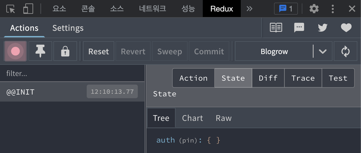 -> 여기서 auth의 값 = state임. (지금은 initialState)
회원가입 구현
- UI를 먼저 개발하고, 리덕스를 통해 상태관리 + API 요청(redux-saga) 할 예정.
- 프레젠테이셔널 컴포넌트는
/components에 작성하고,
그 안에 기능별로 컴포넌트를 분류할 예정.
AuthForm 컴포넌트
import styled from 'styled-components';

const AuthFormBlock = styled.div``;

const AuthForm = () => {
  return <AuthFormBlock>AuthForm</AuthFormBlock>;
};

export default AuthForm;
AuthTemplate 컴포넌트
import styled from 'styled-components';

const AuthTemplateBlock = styled.div``;

const AuthTemplate = () => {
  return <AuthTemplateBlock></AuthTemplateBlock>;
};

export default AuthTemplate;
📝 snippet 제작
- 컴포넌트를 만들 때 snippet을 사용하면 훨씬 편리함.
- snippet을 직접 만들어서 사용해보자.
우선, 템플릿을 성한다.
import styled from 'styled-components';

const AuthTemplateBlock = styled.div``;

const AuthTemplate = () => {
  return (
    <AuthTemplateBlock>

    </AuthTemplateBlock>
  );
};

export default AuthTemplate;snippet-generator.app에 접속해서 좌측에 코드를 붙여넣고,
AuthTemplate을 모두 ${TM_FILENAME_BASE} 로 바꺼줌.
-> 확장자를 제외한 파일명.
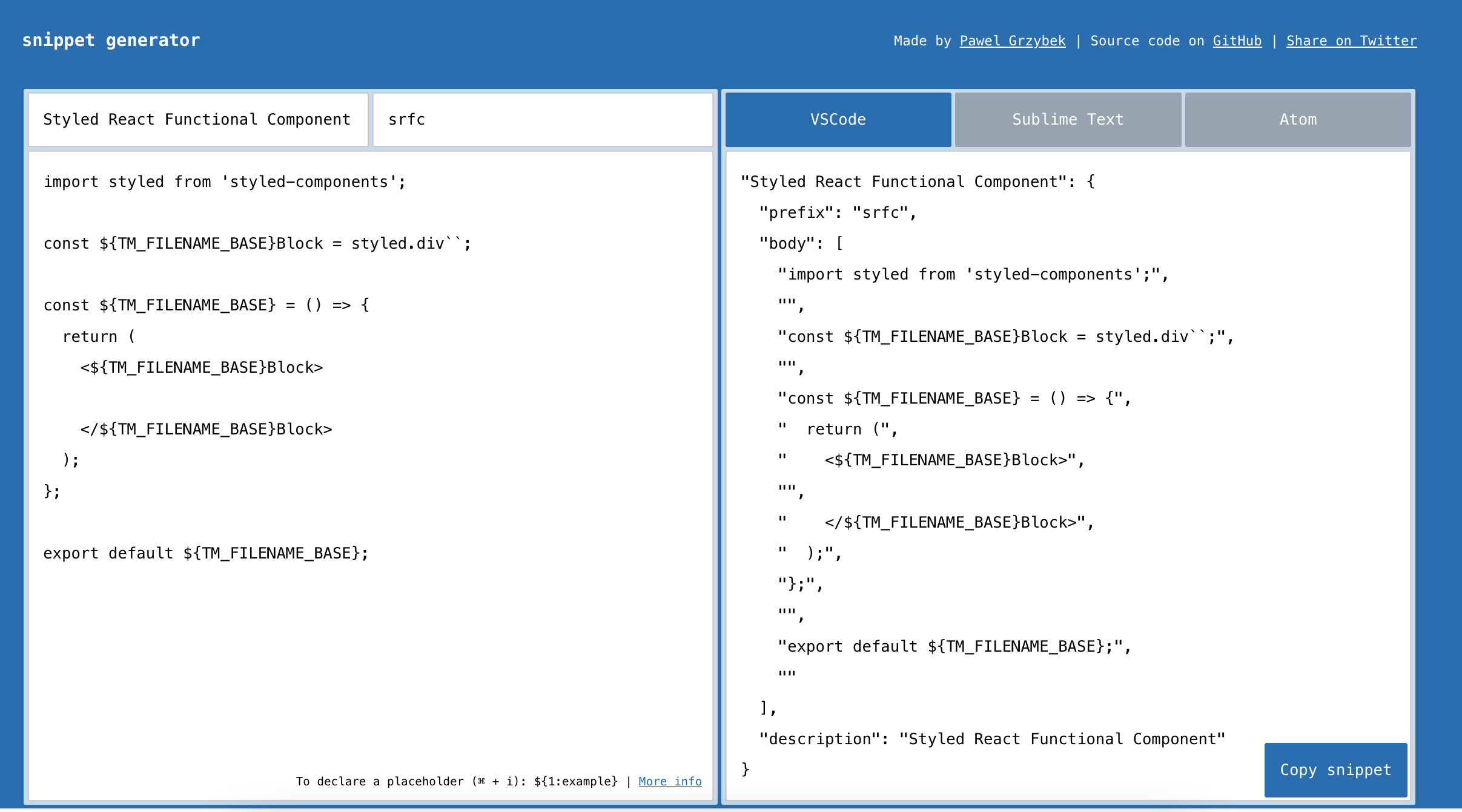
코드를 복사하고, VSCODE 설정 > 사용자 코드 조각 메뉴를 클릭.
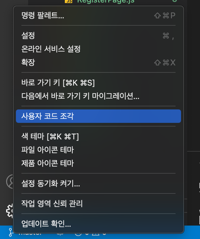
입력창에 javascriptreact 를 입력함.

그리고 아까 복사한 snippet을 붙여넣고 저장함. (주석 전부 지우고)
{
  "Styled React Functional Component": {
    "prefix": "srfc",
    "body": [
      "import styled from 'styled-components';",
      "",
      "const ${TM_FILENAME_BASE}Block = styled.div``;",
      "",
      "const ${TM_FILENAME_BASE} = () => {",
      "  return (",
      "    <${TM_FILENAME_BASE}Block>",
      "",
      "    </${TM_FILENAME_BASE}Block>",
      "  );",
      "};",
      "",
      "export default ${TM_FILENAME_BASE};",
      ""
    ],
    "description": "Styled React Functional Component"
  }
}
Header 컴포넌트
- snippet을 사용해서 제작해보자. (srfc 입력)
- src/components/base 디렉터리에 저장.
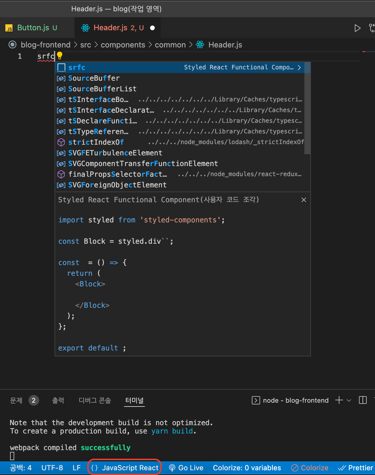
하단바에 JavaScript 라고 적힌 부분을 클릭하여 javaScriptReact로 바꿔준 후,
srfc를 입력하고 엔터를 누르면 위와 같이 스니펫을 사용 가능함.
- 참고로, 확장자명을 .jsx로 하면 바로 사용 가능함.
나중에 제작할 컴포넌트임.
스니펫 테스트를 위해 생성했으므로, 다시 아까 생성한 AuthTemplate 컴포넌트로 가기.
AuthTemplate 컴포넌트
- components/auth/AuthTemplate.js
import styled from 'styled-components';

const AuthTemplateBlock = styled.div``;

const AuthTemplate = ({ children }) => {
  return <AuthTemplateBlock>{children}</AuthTemplateBlock>;
};

export default AuthTemplate;
페이지에서 컴포넌트 렌더링
- LoginPage, RegisterPage 에서 방금 만든 컴포넌트들을 렌더링함.
1. LoginPage
import AuthForm from '../components/auth/AuthForm';
import AuthTemplate from '../components/auth/AuthTemplate';

const LoginPage = () => {
  return (
    <AuthTemplate>
      <AuthForm />
    </AuthTemplate>
  );
};

export default LoginPage;
2. RegisterPage
import AuthForm from '../components/auth/AuthForm';
import AuthTemplate from '../components/auth/AuthTemplate';

const RegisterPage = () => {
  return (
    <AuthTemplate>
      <AuthForm />
    </AuthTemplate>
  );
};

export default RegisterPage;
-> AuthTemplate의 props.children이 AuthForm 이므로 렌더링됨.
컴포넌트 완성
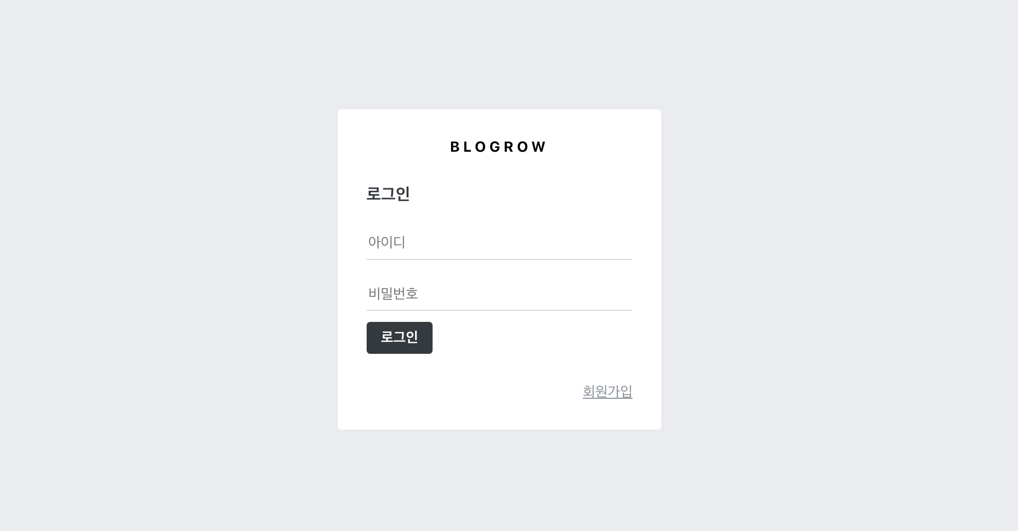
AuthTemplate 완성
import styled from 'styled-components';
import palette from '../../lib/styles/palette';
import { Link } from 'react-router-dom';

const AuthTemplateBlock = styled.div`
  position: absolute;
  left: 0;
  right: 0;
  top: 0;
  bottom: 0;

  background: ${palette.gray[2]};
  display: flex;
  flex-direction: column;
  justify-content: center;
  align-items: center;
`;

const WhiteBox = styled.div`
  .logo-area {
    display: block;
    padding-bottom: 2rem;
    text-align: center;
    font-weight: 700;
    letter-spacing: 0.25em;
  }
  box-shadow: 0 0 8px rgba(0, 0, 0, 0.025);
  padding: 2rem;
  width: 360px;
  background: #fff;
  border-radius: 4px;
`;

const AuthTemplate = ({ children }) => {
  return (
    <AuthTemplateBlock>
      <WhiteBox>
        <div className="logo-area">
          <Link to="/">BLOGROW</Link>
        </div>
        {children}
      </WhiteBox>
    </AuthTemplateBlock>
  );
};

export default AuthTemplate;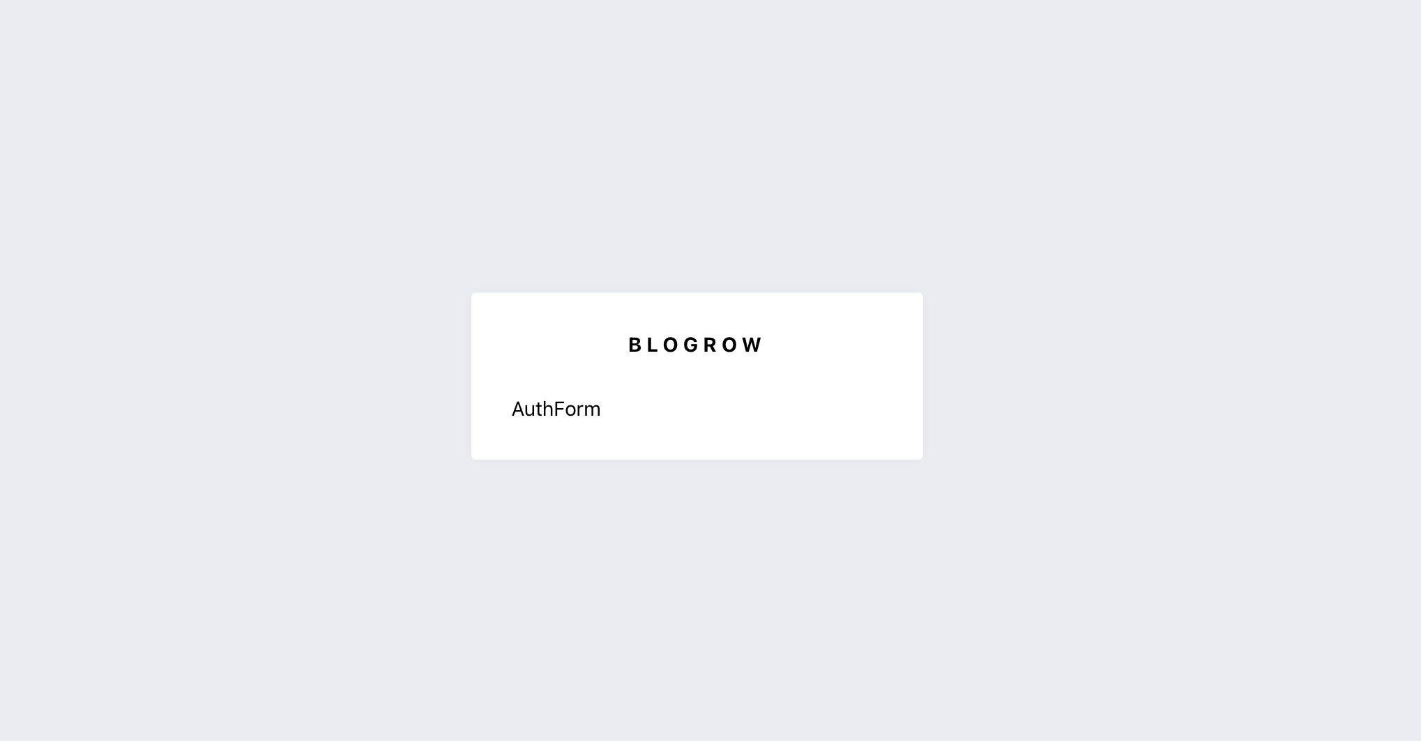
구조
- AuthTemplateBlock (꽉차게 / 가운데정렬)
--> WhiteBox (하얀 박스. logo와 form을 감싸줌)
---> logo-area : Link태그. (홈으로 가는 로고)
----> children : 하위 컴포넌트인 AuthForm이 렌더링됨.
AuthForm 완성
import styled from 'styled-components';
import palette from '../../lib/styles/palette';
import { Link } from 'react-router-dom';
import Button from '../common/Button';

const AuthFormBlock = styled.div`
  h3 {
    margin: 0;
    color: ${palette.gray[8]};
    margin-bottom: 2rem;
  }
`;

const StyledInput = styled.input`
  font-size: 1rem;
  border: none;
  border-bottom: 1px solid ${palette.gray[5]};
  padding-bottom: 0.5rem;
  outline: none;
  width: 100%;
  margin-bottom: 0.8rem;

  &:focus {
    color: ${palette.teal[7]};
    border-bottom: 1px solid ${palette.gray[7]};
  }

  & + & {
    margin-top: 1rem;
  }
`;

const Footer = styled.div`
  margin-top: 2rem;
  text-align: right;

  a {
    color: ${palette.gray[6]};
    text-decoration: underline;

    &:hover {
      color: ${palette.gray[9]};
    }
  }
`;

const AuthForm = () => {
  return (
    <AuthFormBlock>
      <h3>로그인</h3>
      <form>
        <StyledInput
          autoComplete="username"
          name="username"
          placeholder="아이디"
        />
        <StyledInput
          type="password"
          autoComplete="new-password"
          name="password"
          placeholder="비밀번호"
        />
        <Button>로그인</Button>
      </form>
      <Footer>
        <Link to="/register">회원가입</Link>
      </Footer>
    </AuthFormBlock>
  );
};

export default AuthForm;
구조
AuthFormBlock : 컨테이너. (h3 스타일링)
-> StyledInput : input
--> Footer : 회원가입 페이지로 이동하는 Link 존재. (/register)
Button 컴포넌트 - 조건부 스타일링
Button 컴포넌트에 teal 과 fullWidth라는 props를 줄때,
styled-components의 css() 함수를 이용하여 조건부 스타일링을 적용하도록.
<Button teal fullWidth>로그인</Button>common/Button.js 수정
import styled, { css } from 'styled-components';
import palette from '../../lib/styles/palette';

const StyledButton = styled.button`

  ...

  ${(props) =>
    props.fullWidth &&
    css`
      padding-top: 0.75rem;
      padding-bottom: 0.75rem;
      width: 100%;
      font-size: 1.2rem;
    `}

  ${(props) =>
    props.teal &&
    css`
      background: ${palette.teal[7]};
      &:hover {
        background: ${palette.teal[6]};
      }
    `}
`;

  ...
버튼 상단에 margin-top 주기
방법 1. 컴포넌트에 style props 주기
<Button teal fullWidth style={{marginTop: '1rem'}}>방법 2. styled 함수로 새 컴포넌트로 정의.
import styled from 'styled-components';
import palette from '../../lib/styles/palette';
import { Link } from 'react-router-dom';
import Button from '../common/Button';

  ...

// 컴포넌트를 꾸밀때는 ()안에 넣어줘야함.
const ButtonWithMarginTop = styled(Button)`
  margin-top: 1rem;
`;


const AuthForm = () => {
  return (
    <AuthFormBlock>
      		...

        <ButtonWithMarginTop teal fullWidth>
          	로그인
        </ButtonWithMarginTop>

      		...
    </AuthFormBlock>
  );
};

export default AuthForm;
-> props(teal, fullWidth)는 자동으로 Button 컴포넌트로 전달됨.
(styled.Button은 Button이기 때문)
props를 이용한 UI 구현
AuthForm.js 수정
import styled from 'styled-components';
import palette from '../../lib/styles/palette';
import { Link } from 'react-router-dom';
import Button from '../common/Button';

const AuthFormBlock = styled.div`
  h3 {
    margin: 0;
    color: ${palette.gray[8]};
    margin-bottom: 2rem;
  }
`;

const StyledInput = styled.input`
  font-size: 1rem;
  border: none;
  border-bottom: 1px solid ${palette.gray[5]};
  padding-bottom: 0.5rem;
  outline: none;
  width: 100%;
  margin-bottom: 0.8rem;

  &:focus {
    color: ${palette.teal[7]};
    border-bottom: 1px solid ${palette.gray[7]};
  }

  & + & {
    margin-top: 1rem;
  }
`;

const ButtonWithMarginTop = styled(Button)`
  margin-top: 1rem;
`;

const Footer = styled.div`
  margin-top: 2rem;
  text-align: right;

  a {
    color: ${palette.gray[6]};
    text-decoration: underline;

    &:hover {
      color: ${palette.gray[9]};
    }
  }
`;

const textMap = {
  login: '로그인',
  register: '회원가입',
};

const AuthForm = ({ type }) => {
  const text = textMap[type];
  return (
    <AuthFormBlock>
      <h3>{text}</h3>
      <form>
        <StyledInput
          autoComplete="username"
          name="username"
          placeholder="아이디"
        />
        <StyledInput
          type="password"
          autoComplete="new-password"
          name="password"
          placeholder="비밀번호"
        />
        {type === 'register' && (
          <StyledInput
            autoComplete="new-password"
            name="passwordConfirm"
            placeholder="비밀번호 확인"
            type="password"
          />
        )}
        <ButtonWithMarginTop teal fullWidth>
          {text}
        </ButtonWithMarginTop>
      </form>
      <Footer>
        {type === 'login' ? (
          <Link to="/register">회원가입</Link>
        ) : (
          <Link to="/login">로그인</Link>
        )}
      </Footer>
    </AuthFormBlock>
  );
};

export default AuthForm;
AuthForm의 props로 type값을 받고,
LoginPage에서의 AuthForm과 RegisterPage에서의 AuthForm의 UI를 다르게 구분함.
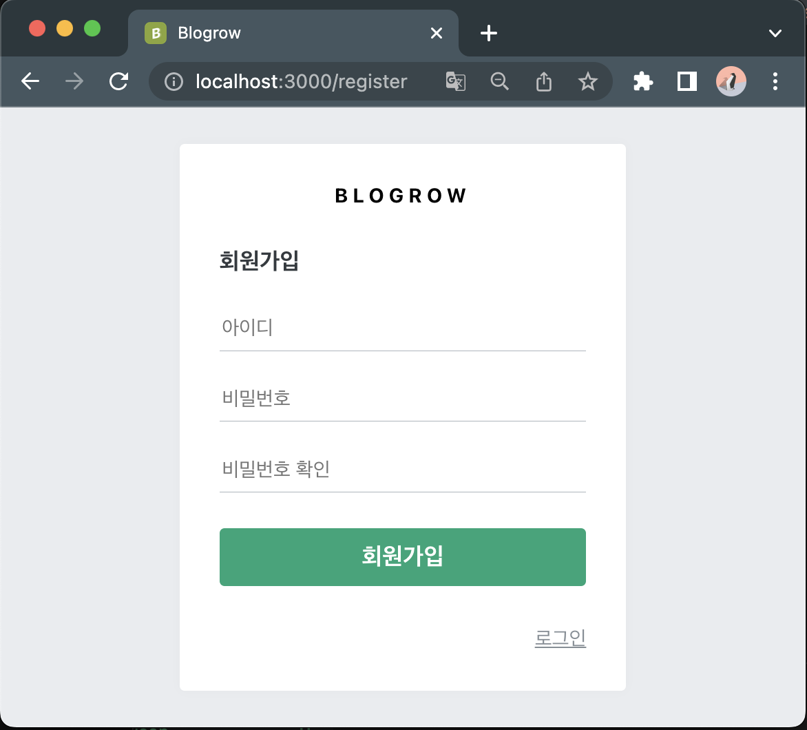
| 로그인 창 | 회원가입 창 |
|---|---|
| h3와 버튼의 텍스트가 '로그인' 임. 비밀번호 창만 존재. footer에 회원가입 Link. | h3와 버튼의 텍스트가 '회원가입' 임. 비밀번호 확인 창도 존재. footer에 로그인 Link. |
-> 삼항연산자 또는 단축평가(&&)로 type===register인지 확인하기.
props 전달
LoginPage.js에서는 AuthForm에 props로 type='login'을 전달해줌.
import AuthForm from '../components/auth/AuthForm';
import AuthTemplate from '../components/auth/AuthTemplate';

const LoginPage = () => {
  return (
    <AuthTemplate>
      <AuthForm type="login" />
    </AuthTemplate>
  );
};

export default LoginPage;
RegisterPage.js에서는 AuthForm에 props로 type='register'을 전달해줌.
import AuthForm from '../components/auth/AuthForm';
import AuthTemplate from '../components/auth/AuthTemplate';

const RegisterPage = () => {
  return (
    <AuthTemplate>
      <AuthForm type="register" />
    </AuthTemplate>
  );
};

export default RegisterPage;