- 각 위젯에 어떤 속성 이용할지 모르면 ctrl + space
- 글자 위젯
- Text('')
- 이미지 위젯
- Image.asset('이미지 경로')
- new 눌러서 디렉토리 만들어서 assets파일만들고
- assets 파일에 이미지 넣고
- Image.asset('assets/profile.png') 입력
- pubspec.yaml에서 아래 내용 입력
- Image.asset('이미지 경로')
flutter:
  assets :
- assets/- 아이콘 위젯
- Icon(Icons.star)
- 박스 위젯
- Container()
- SizedBox()
- 위젯( child: 위젯() )
- child 쓸수 있는 위젯이 따로 있다.
- 위젯의 위치를 조절하고 싶을 때는 부모 위젯으로 위치를 잡는다.
Widget build(BuildContext context) {
    return MaterialApp(
      home: Center(
        child: Container( width: 50, height: 50, color: Colors.amber,),
      )
    );
}- Scaffold() : 상중하로 나눠주는 위젯
- 가로, 세로 배치
- Row(children:[ ]) : 여러 위젯을 가로로 배치
- Column(children:[ ]) : 여러 위젯을 세로로 배치
- Row,Column 요소를 정렬하려면 mainAxisAlignment 사용,crossAx isAlignment 사용
- 즉 Row에서 mainAxis는 가로, crossAxis는 세로
import 'package:flutter/material.dart';
void main() {
runApp(const MyApp());
}
class MyApp extends StatelessWidget {
const MyApp({super.key});
Widget build(BuildContext context) {
return MaterialApp(
home: Scaffold(
appBar: AppBar(),
body: Container(),
bottomNavigationBar: BottomAppBar(),
)
);
}
}- Container()는 남용하면 안되고, width, height, child만 필요한 박스는 SizedBox() 사용
class MyApp extends StatelessWidget {
const MyApp({super.key});
Widget build(BuildContext context) {
return MaterialApp(
home: Scaffold(//상중하
appBar: AppBar(
backgroundColor: Colors.yellow[100],
title: Text('이성은',style: TextStyle(color: Colors.black45),)
), //AppBar 같은건 이미 만들어 진 위젯
body: Column(
mainAxisAlignment: MainAxisAlignment.spaceEvenly,
children: [
Icon(Icons.star),
Icon(Icons.star),
Icon(Icons.star),
]
),
bottomNavigationBar:
BottomAppBar(
child: Container(// Container 는 남용 하지 말기
color: Colors.yellow[100],
height: 70,
child: Row(
mainAxisAlignment: MainAxisAlignment.spaceEvenly,
children: [
Icon(Icons.phone),
Icon(Icons.message),
Icon(Icons.contact_page)
],
),
),
)
)
);
}
}박스 디자인하기
- margin,padding 넣기
- EdgeInsets.all() : 전체에 넣음
- EdgeInsets.fromLTRB(left, top, right, bottom) : 각각 여백을 넣음
- 나머지 박스 스타일들은 decoration 속성을 사용
- decoration: BoxDecoration()
- 박스 자체를 전체화면의 가운데 정렬
- 전체를 Center()로 묶음
- 박스 자페를 다른 방향으로 정렬할때는 박스자체를 Align()으로 묶음
- Align(alignment: Alignment.topCenter)
- width를 가로로 꽉 차게, height를 세로로 꽉 차게
- 단 부모박스를 넘어가지 않게
- width: double.infinity
- height: double.infinity
class MyApp extends StatelessWidget {
const MyApp({super.key});
Widget build(BuildContext context) {
return MaterialApp(
home: Scaffold(//상중하
appBar: AppBar(
backgroundColor: Colors.yellow[100],
title: Text('이성은',style: TextStyle(color: Colors.black45),)
), //AppBar 같은건 이미 만들어 진 위젯
body: Align(
alignment: Alignment.topCenter,
child: Container(
width: double.infinity, height: 80,
margin: EdgeInsets.fromLTRB(0, 30, 0, 0),
padding: EdgeInsets.all(20),
decoration: BoxDecoration(
//BoxDecoration 넣으면 위에 따로 같은 부분에 컬러 넣을수 없다.
color: Colors.deepOrange[50],
border: Border.all(color: Colors.red),
borderRadius: BorderRadius.all(Radius.circular(30))
),
),
),
)
);
}
}디자인 넣기
- 글자 디자인
- Text('안녕', style:TextStyle(color: Color(0xffaaaaaa), fontSize: 40, fontWeight: FontWeight.w900 ),)
- 글자 색
- Colors.칼라명
- Color(0xffaaaaaa) : 왼쪽에 칼라피커 생김, 선택해서 사용 가능
- Color.fromRGBO(r, g, b, opacity)
class MyApp extends StatelessWidget {
const MyApp({super.key});
Widget build(BuildContext context) {
return MaterialApp(
home: Scaffold(//상중하
appBar: AppBar(
title: Text('이성은',style: TextStyle(color: Colors.black45),)
), //AppBar 같은건 이미 만들어 진 위젯
body:SizedBox(
child: Text('안녕',
style:TextStyle(color: Color(0x88E10DA7),fontSize: 40,
fontWeight: FontWeight.w900
),
),
),
)
);
}
}- 아이콘 디자인
- Icon(Icons.star, color:Colors.amber , size: 100)
class MyApp extends StatelessWidget {
const MyApp({super.key});
Widget build(BuildContext context) {
return MaterialApp(
home: Scaffold(//상중하
appBar: AppBar(
title: Text('이성은')
), //AppBar 같은건 이미 만들어 진 위젯
body:SizedBox(
child: Icon(Icons.star, color:Colors.amber , size: 100)
),
)
);
}
}- 버튼
- TextButton()
- child, onPressed(){} 속성이 필수
- IconButton()
- icon, onPressed(){} 속성이 필수
- ElevatedButton()
- child, onPressed(){} 속성이 필수
- TextButton()
- 버튼 디자인
class MyApp extends StatelessWidget {
const MyApp({super.key});
Widget build(BuildContext context) {
return MaterialApp(
home: Scaffold(//상중하
appBar: AppBar(
title: Text('이성은')
), //AppBar 같은건 이미 만들어 진 위젯
body:SizedBox(
child: Padding(
padding: const EdgeInsets.all(20.0),
child: ElevatedButton(
onPressed: (){},
style: ButtonStyle(alignment: Alignment.center,
backgroundColor: MaterialStateProperty.all(Colors.redAccent),
padding: MaterialStateProperty.all(EdgeInsets.all(10)),
minimumSize: MaterialStateProperty.all(Size(50, 50)) ),
child: Text('버튼') ,
),
))
)
);
}class MyApp extends StatelessWidget {
const MyApp({super.key});
Widget build(BuildContext context) {
return MaterialApp(
home: Scaffold(//상중하
appBar: AppBar(
title: Text('이성은')
), //AppBar 같은건 이미 만들어 진 위젯
body:SizedBox(
child: IconButton(
icon: Icon(Icons.star),
onPressed: (){},
),
),
)
);
}
}AppBar
- AppBar에 자주사용하는 속성들
- title : 왼쪽 제목
- title: Text('이성은')
- leading : 왼쪽에 넣을 아이콘
- leading: Icon(Icons.access_alarm)
- actions : 오른쪽 아이콘들
- actions : [Icon(Icons.star),Icon(Icons.star) ... ]
- title : 왼쪽 제목
class MyApp extends StatelessWidget {
const MyApp({super.key});
Widget build(BuildContext context) {
return MaterialApp(
home: Scaffold( //상중하
appBar: AppBar(
title: Text('이성은'),
leading: Icon(Icons.contact_page),
actions: [Icon(Icons.star),Icon(Icons.star),Icon(Icons.star)],
), //AppBar 같은건 이미 만들어 진 위젯
body: SizedBox()
)
);
}
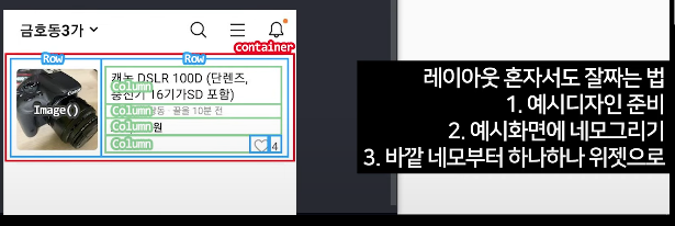
}레이아웃 혼자서 짜는 팁
- 예시디자인 준비
- 예시화면에 네모 그리기(빈공간없이)
- 바깥 네모부터 하나하나 위젯으로
- 마무리 디자인 : margin, padding, size, 색상, 정렬....
함께 일하는 프론트엔드 개발자 이성은입니다🐥