학습내용
시각화
- 시각화의 목적
- 데이터의 trend 확인 및 탐색
- insight 얻기
- insight 강조
-
공통
Location : 어디에
Shape : 어떤것이
Size : 어느정도로 -
강조
Color
Annotation / Legend / Text -
Pallete
목적에 따라서 사용하려는 색상그룹, 잘 선택해야 됨
seaborn
import pandas as pd
import matplotlib.pyplot as plt
import seaborn as sns

df = pd.read_csv()

sns.set_style('whitegrid') #테마 설정, = sns.set(style = 'whitegrid')
#그 외 set을 이용한 설정
#sns.set_style('ticks') 흰 배경에 격자없앰
#sns.set_color_code(palette = 'pastel') palette 지정가능

fig, ax = plt.subplots() #fig : plot전체, ax : 각각의 plot

plot = sns.(plot 종류)(
	x = '',
	y = '',
	data = df,
	order = [] #stripplot에서 설정된 순서대로 그래프 표시
	hue = '',	#특정 값에 따라 그래프의 색상 표현해줌.
	palette = '', #색상 지정 ex. sns.cubehelix_palette(len(tips['day'].unique()))
	legend = False # legend 안나옴
    	#color = 'r' color도 지정가능

)
plot.set_xlabel('xlabel', weight = 'bold', fontsize = 13)
plot.set_ylabel('ylabel', weight = 'bold', fontsize = 13)
plot.set_title('title', weight = 'bold', fontsize = 16)
plot.set_xlim(30,60)
plot.set_ylim(2000,6000) # x,y 범위 지정가능

ax.text(0, 0, 'TEXT 0, 0'); #각 위치에 text삽입
ax.text(0, 1, 'TEXT 0, 1');
ax.text(1, 0, 'TEXT 1, 0');
ax.text(1, 1, 'TEXT 1, 1');

sns.rugplot(data=df, x="bill_length_mm", y='bill_depth_mm', hue = 'species') #rug 추가

plt.legend(title = 'title', loc ='위치 지정가능(lower left 등)', labels=[]) #label 지정하니까 색깔이 같지않게 나오는 경우가 보임, 같은 값으로 인식을 못해서 그런듯?
#Grouping(facet) #그래프 한번에 표시
g = sns.FacetGrid(data = tips, row = '지정가능', col = 'island') #row 지정하면 2차원으로 나옴
g.map_dataframe(
sns.scatterplot,
x = 'bill_length_mm',
y = 'body_mass_g',
hue = 'species',
data = df,
alpha = 0.7, #투명도
palette = {'Adelie' : '#ff9ff3', 'Gentoo' : '#4000c7', 'Chinstrap' : '#1dd1a1'}
)
g.add_legend() #legend추가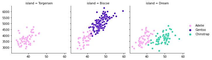
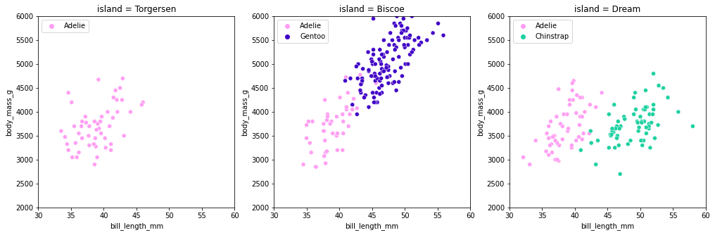
#Grouping 그래프 FacetGrid 사용하지않고 따라해보기
plt.figure(figsize=(17,5))

plt.subplot(131)

plot1 = sns.scatterplot(
    x = 'bill_length_mm',
    y = 'body_mass_g',
    data = df[df['island']=='Torgersen'],
    hue = 'species',
    palette = {'Adelie' : '#ff9ff3', 'Gentoo' : '#4000c7', 'Chinstrap' : '#1dd1a1'}

)
plot1.set_xlim(30,60)
plot1.set_ylim(2000,6000)
plot1.set_title('island = Torgersen')
plt.legend(loc = 'upper left')

plt.subplot(132)

plot2 = sns.scatterplot(
    x = 'bill_length_mm',
    y = 'body_mass_g',
    data = df[df['island']=='Biscoe'],
    hue = 'species',
    palette = {'Adelie' : '#ff9ff3', 'Gentoo' : '#4000c7', 'Chinstrap' : '#1dd1a1'}
)
plot2.set_xlim(30,60)
plot2.set_ylim(2000,6000)
plot2.set_title('island = Biscoe')
plt.legend(loc = 'upper left')

plt.subplot(133)

plot3 = sns.scatterplot(
    x = 'bill_length_mm',
    y = 'body_mass_g',
    data = df[df['island']=='Dream'],
    hue = 'species',
    palette = {'Adelie' : '#ff9ff3', 'Gentoo' : '#4000c7', 'Chinstrap' : '#1dd1a1'}
)
plot3.set_xlim(30,60)
plot3.set_ylim(2000,6000)
plot3.set_title('island = Dream')
plt.legend(loc = 'upper left')
plt.show()