ResourceDictionary 란?
Style만 묶어서 별도의 파일로 만들 수 있게 해주는것
ResourceDictionary구조
<ResourceDictionary xmlns="http://schemas.microsoft.com/winfx/2006/xaml/presentation"
                    xmlns:x="http://schemas.microsoft.com/winfx/2006/xaml">
    <Style TargetType="" x:key"">
            <Setter Property = "" Value = ""/>
    </Style>
</ResourceDictionary>
App.xaml 에 적용하기
예제
아래의 글처럼 사용하여야 복수의 Resourcedictionary를 이용할수있다.
<Application.Resources>
    <ResourceDictionary>
        <ResourceDictionary.MergedDictionaries>
            <ResourceDictionary Source="/Styles/UIColors.xaml"></ResourceDictionary>
            <ResourceDictionary Source="/Styles/ButtonStyles.xaml"></ResourceDictionary>
        </ResourceDictionary.MergedDictionaries>
    </ResourceDictionary>
</Application.Resources>
Window 기본 위에 탭과 배경 없애기
WindowStyle="None"
Background="Transparent"
AllowsTransparency="True" // 투명화해버리는것
Button 모음
RadioButton
해외 youtuber의 코드
출처 https://rjcodeadvance.com/wpf-mvvm-diseno-de-iu-principal-moderno-parte-1/
 <Style x:Key="menuButton" TargetType="RadioButton">
     <!--Normal button style-->
     <Setter Property="Height" Value="50"/>
     <Setter Property="Margin" Value="-5,0,0,5"/>
     <Setter Property="Background" Value="Transparent"/>
     <Setter Property="Foreground" Value="{StaticResource plainTextColor3}"/>
     <Setter Property="BorderBrush" Value="Transparent"/>
     <Setter Property="Template">
         <Setter.Value>
             <ControlTemplate TargetType="RadioButton">
                 <Border Background="{TemplateBinding Background}"
                         BorderThickness="4,0,0,0"
                         BorderBrush="{TemplateBinding BorderBrush}">
                     <ContentPresenter HorizontalAlignment="Left" VerticalAlignment="Center"/>
                 </Border>
             </ControlTemplate>
         </Setter.Value>
     </Setter>
     <Style.Triggers>
         <!--Button Style on hover-->
         <Trigger Property="IsMouseOver" Value="True">
             <Setter Property="Margin" Value="0,0,0,5"/>
             <Setter Property="Background" Value="{StaticResource panelOverColor}"/>
             <Setter Property="Foreground" Value="{StaticResource titleColor3}"/>
             <Setter Property="BorderBrush" Value="{Binding Path=Tag, RelativeSource={RelativeSource Self}}"/>
         </Trigger>
         <!--Activated button style-->
         <Trigger Property="IsChecked" Value="True">
             <Setter Property="Margin" Value="0,0,0,5"/>
             <Setter Property="Background" Value="{StaticResource panelActiveColor}"/>
             <Setter Property="Foreground" Value="{Binding Path=Tag, RelativeSource={RelativeSource Self}}"/>
             <Setter Property="BorderBrush" Value="{Binding Path=Tag, RelativeSource={RelativeSource Self}}"/>
         </Trigger>
     </Style.Triggers>
 </Style>
둥근 Button
알아보기위해 배경색을 입힘
 <Style x:Key="xButtonRoundStyle" TargetType="Button">
     <Setter Property="Width" Value="180"></Setter>
     <Setter Property="Height" Value="30"></Setter>
     <Setter Property="Background" Value="Transparent"></Setter>
     <Setter Property="BorderBrush" Value="Transparent"></Setter>
     <Setter Property="Foreground" Value="White"></Setter>
     <Setter Property="Template">
         <Setter.Value>
             <ControlTemplate TargetType="Button">
                 <Border
                 CornerRadius="5"
                 Background="{TemplateBinding Background}"
                 BorderThickness="4,0,0,0"
                 BorderBrush="{TemplateBinding BorderBrush}">
                     <ContentPresenter HorizontalAlignment="Center" VerticalAlignment="Center"></ContentPresenter>
                 </Border>
             </ControlTemplate>
         </Setter.Value>
     </Setter>
     <Style.Triggers>
         <Trigger Property="IsMouseOver" Value="True">
             <Setter Property="Background" Value=" #2d2f33"></Setter>
             <Setter Property="Foreground" Value="#BCBEE0"></Setter>
             <Setter Property="BorderBrush" Value="#6745EB"></Setter>
         </Trigger>
     </Style.Triggers>
 </Style>
TextBox 모음
둥근TextBox
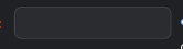
<Style TargetType="TextBox" x:Key="xTextBoxInput">
    <Setter Property="Background" Value="#2A2C2F"></Setter>
    <Setter Property="BorderBrush" Value="#414345"></Setter>
    <Setter Property="BorderThickness" Value="1"></Setter>
    <Setter Property="Width" Value="120"></Setter>
    <Setter Property="Height" Value="25"></Setter>
    <Setter Property="Template">
        <Setter.Value>
            <ControlTemplate TargetType="TextBox">
                <Border
                    CornerRadius="5"
                    Background="{TemplateBinding Background}"
                    BorderBrush="{TemplateBinding BorderBrush}"
                    BorderThickness="1"
                    >
// TextBox는 Scrollviewer를 사용해야 안에 내용을 볼수있다.
                    <ScrollViewer x:Name="PART_ContentHost"/>
                </Border>
            </ControlTemplate>
        </Setter.Value>
    </Setter>
</Style>
LinearGradientBrush
말 그대로 그라데이션 효과를 주기위한 것
예제
 <LinearGradientBrush StartPoint="0,0" EndPoint="1,1">
    <GradientStop Color="{StaticResource winBorderColor1}" Offset="0"></GradientStop>
    <GradientStop Color="{StaticResource winBorderColor2}" Offset="0.5"></GradientStop>
    <GradientStop Color="{StaticResource winBorderColor3}" Offset="1"></GradientStop>
</LinearGradientBrush>
WindowDrag
윈도우창 드래그로 움직일수있게하기
// 윈도우 자체에 추가
MouseDown="Window_MouseDown"

// 비하인드 코드에다가 이거 드레그하면 움직임 메서드 추가
private void Window_MouseDown(object sender, MouseButtonEventArgs s)
        {
            this.DragMove();
        }
디버깅 도구 안뜨게하기
도구 -> 옵션 -> 디버깅 -> 일반 -> XAML용 UI 디버깅 도구 사용 -> 응용 프로그램에서런타임 도구 표시 이부분 CHECK해제 하면된다.

....