서울시 CCTV 현황 분석 프로젝트
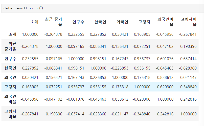
상관관계
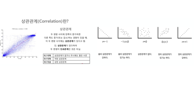
- 데이터의 관계를 찾을 때, 최소한의 근거가 있어야 해당 데이터를 비교하는 의미가 존재
- 상관계수를 조사해서 0.2 이상의 데이터를 비교하는 것은 의미가 있다.
상관계수
- corr() (correlation) : 상관계수가 0.2 이상인 데이터를 비교
matplotlib 기초
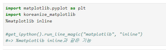
matplotlib 코드 가져오기
matplotlib 그래프 기본 형태
- plt.figure(figsize=(10,6)) : 격자 사이즈
- plt.plot(x, y) : x축, y축
- plt.show() : 출력
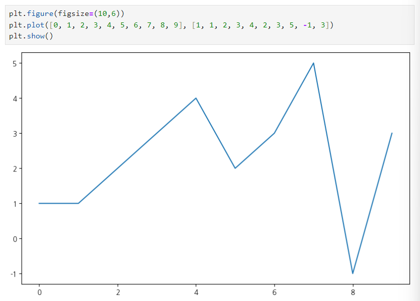
예제 1 : 그래프 기초
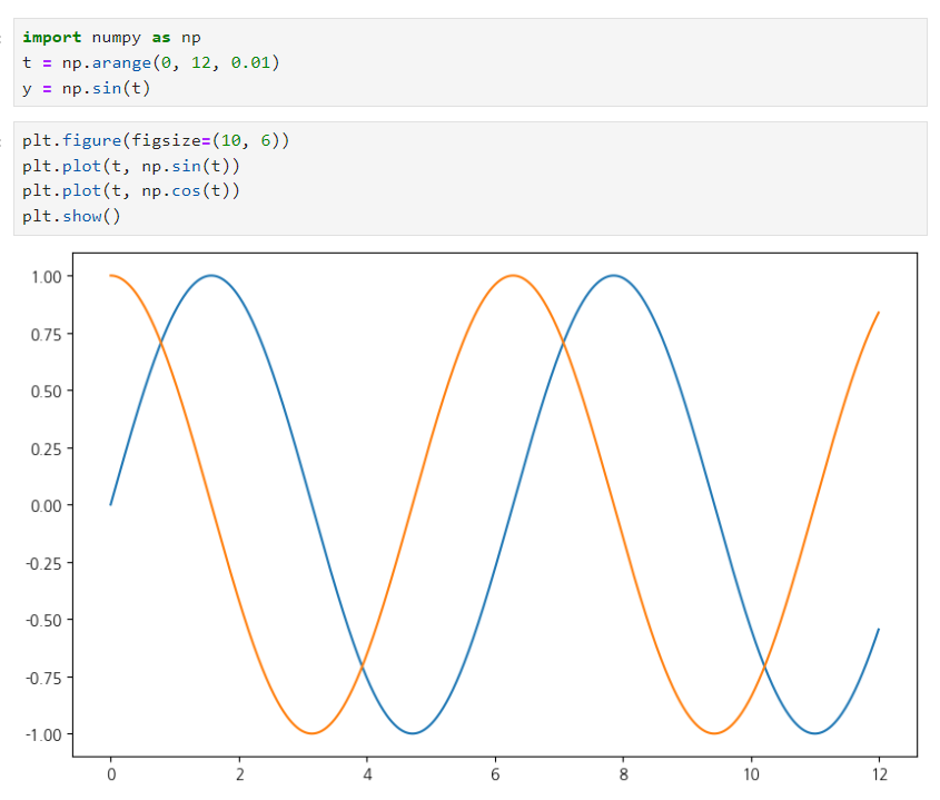
삼각함수 그리기
- np.arange(a, b, s) : a부터 b까지 s의 간격
- np.sin(value)
그래프 보기 쉽게 만들기
def drawGraph():

    plt.figure(figsize=(10, 6))
    plt.plot(t, np.sin(t), label="sin") # 선 데이터 의미 구분
    plt.plot(t, np.cos(t), label="cos")
    plt.grid(True) # 격자무늬 추가 / False: 격자 무늬 없앰
    plt.legend(loc=3) # 라벨 위치 바꾸기
    plt.title("example of sinewave") # 그래프 제목
    plt.xlabel("time") # x축, y축 이름 지어주기
    plt.ylabel("amplitude")# amplitude : 진폭
    plt.show()
drawGraph()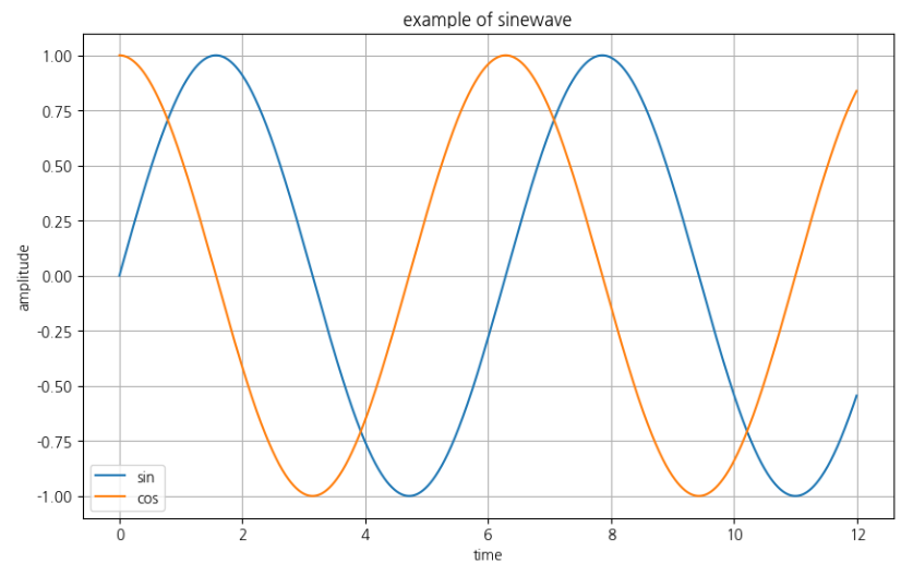
예제 2: 그래프 커스텀
def drowGraph():
    plt.figure(figsize=(10, 6))
    plt.plot(
        t,
        y,
        color="green",
        linestyle="dashed", ## -- 표현 가능
        marker="o",
        markerfacecolor="blue",
        markersize=15
    )

    plt.xlim([-0.5, 6.5])
    plt.ylim([0.5, 9.5])
    plt.show()
drowGraph()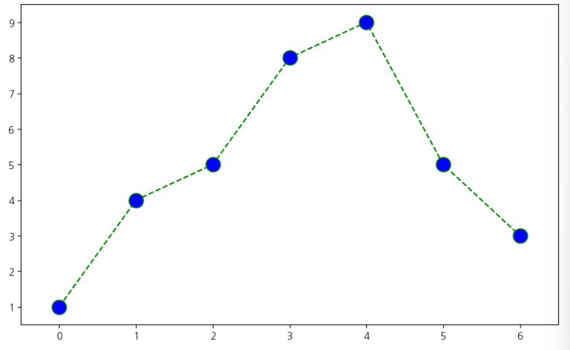
예제 3: scatter plot
t = np.array(range(0, 10)) # array 행렬 데이터
y = np.array([9, 8, 7, 9, 8, 3, 2, 4, 3, 4])

def drawGraph():
    plt.figure(figsize=(10, 6))
    plt.scatter(t, y)
    plt.show()
drawGraph()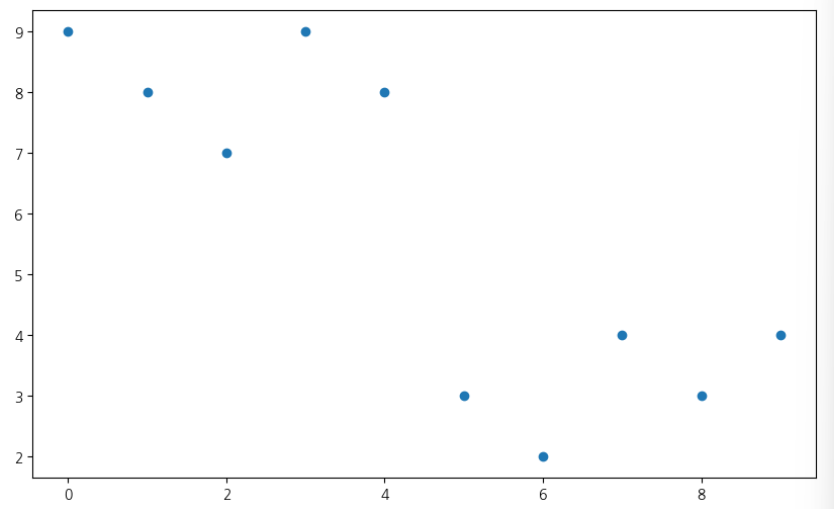
colormap = t

def drawGraph():
    plt.figure(figsize=(20, 6))
    plt.scatter(t, y, s=50, c=colormap, marker="<")
    plt.colorbar()
    plt.show()
drawGraph()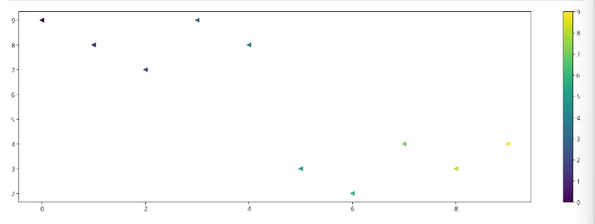
예제 4.pandas에서 plot 그리기
- matplotlib을 가져와서 사용합니다
- data_result["인구수"].plot(kind="bar", figsize=(10, 10))
=> 세로 막대 그래프 - data_result["인구수"].plot(kind="barh", figsize=(10, 10))
=> 가로 막대 그래프
데이터의 경향 표시
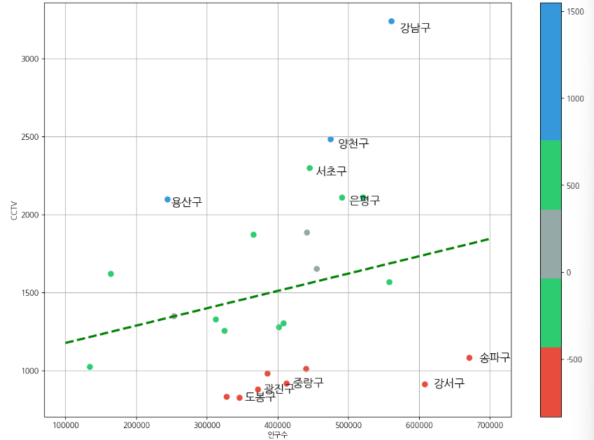
인구수와 소계 칼럼으로 scatter plot 그리기
def drawGraph():
    plt.figure(figsize=(14, 10))
    plt.scatter(data_result["인구수"], data_result["소계"], s=50)
    plt.xlabel("인구수")
    plt.ylabel("CCTV")
    plt.grid(True)
    plt.show()
drawGraph()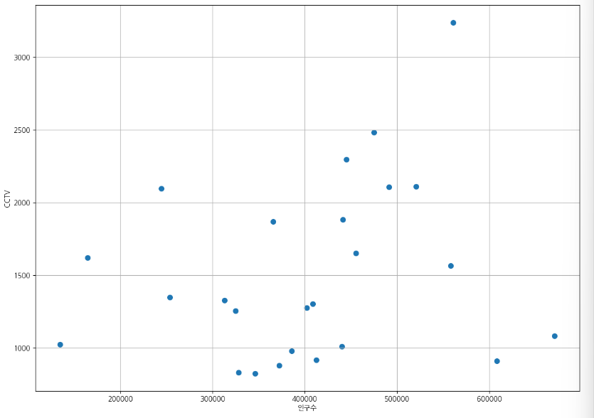
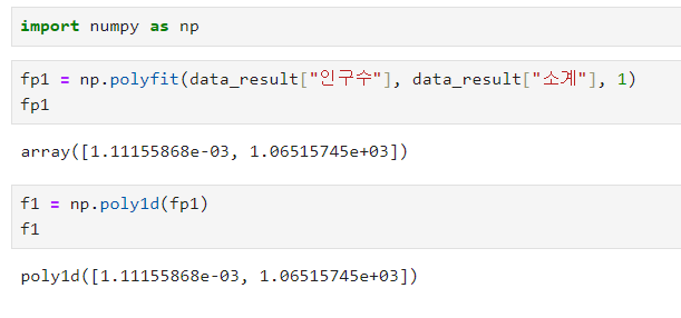
numpy를 이용한 1차 만들기
-
np.polyfit() : 직선을 구성하기 위한 계수를 계산
-
np.poly1d : polyfit으로 찾은 계수로 파이썬에서 사용할 수 있는 함수로 만들어주는 기능
-
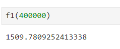
인구가 40만인 구에서 서울시의 전체 경향에 맞는 적당한 CCTV 수는?
-
경향선을 그리기 위한 x 데이터 생성
-
np.linespace(a,b,n) : a부터 b까지 n개의 등간격 데이터 생성
def drawGraph():
    plt.figure(figsize=(14, 10))
    plt.scatter(data_result["인구수"], data_result["소계"], s=50)
    plt.plot(fx, f1(fx), ls="--", lw=3, color="g")
    plt.xlabel("인구수")
    plt.ylabel("CCTV")
    plt.grid(True)
    plt.show()
drawGraph()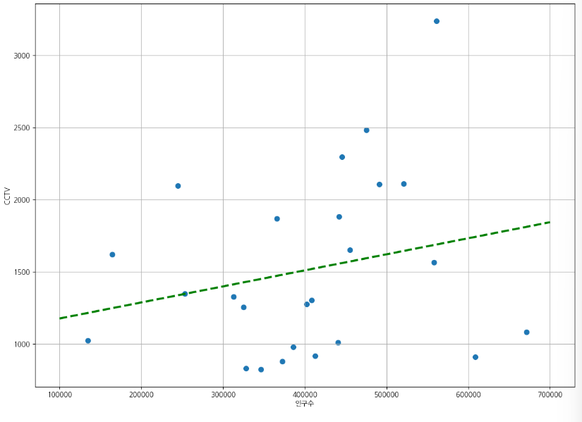
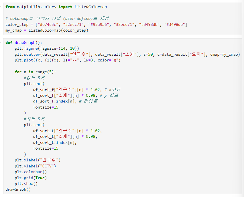
강조하고 싶은 데이터 시각화 하기
그래프 다듬기
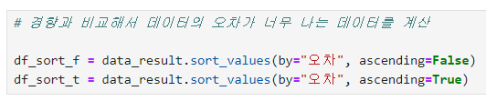
경향과의 오차 만들기
- 경향(trend)과의 오차 만들기
- 경향은 f1 함수에 해당 인구를 입력
- f1(data_result["인구수"])

“이 글은 제로베이스 데이터 취업 스쿨의 강의 자료 일부를 발췌하여 작성되었습니다.”

데이터 공부 기록