1. grid-template-areas
• 그리드 영역(아이템)의 이름을 이용해 레이아웃의 형태를 정의할 수 있다.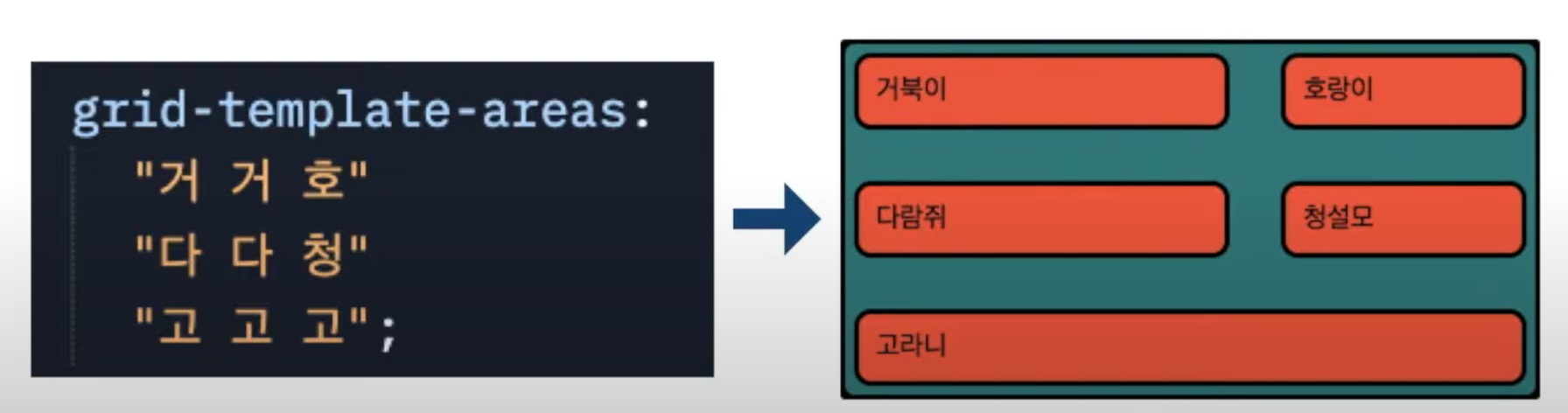
2. grid-area
• 그리드 영역(아이템)의 이름을 지정할 때 사용하는 속성이다.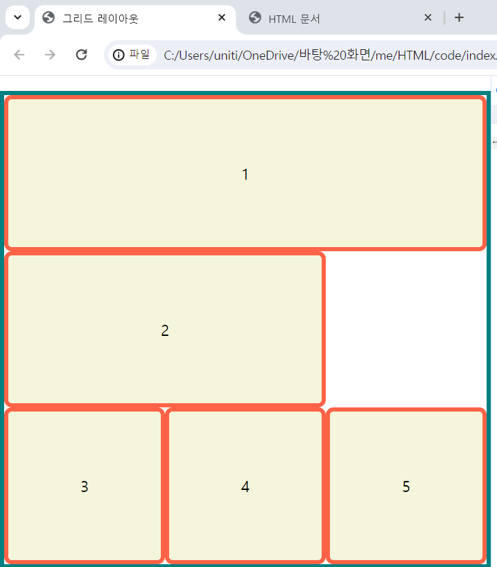
3. 실습
1) html 코드
<!DOCTYPE html>
<html lang="en">
    <head>
        <meta charset="UTF-8">
        <meta http-equiv="X-UA-Compatible" content="IE-edge">
        <meta name="viewport" content="width=device-width, inital-scale=1">
        <title>그리드 레이아웃</title>
        <link href="./style.css" rel="stylesheet">
    </head>
    <body>

        <ul class="container">
            <li class="item">1</li>
            <li class="item">2</li>
            <li class="item">3</li>
            <li class="item">4</li>
            <li class="item">5</li>
        </ul>

    </body>
</html>
2) css 코드
*{
    box-sizing:border-box;
}

body{
    margin:0;
}

ul{
    padding:0;
    list-style-type: none;
    border:5px solid teal;
}

li{
    display:flex;
    justify-content: center;
    align-items: center;
    background-color: beige;
    border:5px solid tomato;
    border-radius:8px;
}

.container{
    display:grid;
    height:500px;

    grid-template-columns:repeat(3,1fr);

    grid-template-areas:
    "a a a"
    "b b ."
    "c d e";
}

li:nth-child(1){grid-area:a;}
li:nth-child(2){grid-area:b;}
li:nth-child(3){grid-area:c;}
li:nth-child(4){grid-area:d;}
li:nth-child(5){grid-area:e;}
3) 결과

블로그 이전했습니다 -> https://young-code.tistory.com