1. flex-direction
• 플렉스 컨테이너의 주축을 결정하는 속성이다.
• 행은 가로 축을, 열은 세로 축을 주축으로 한다.

ex) flex-direction:row;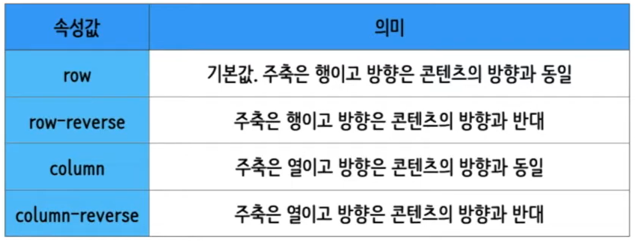
2. flex-wrap
• 플렉스 아이템들이 강제로 한줄에 배치되게 할 것인지, 또는 가능한 영역 내에서 벗어나지 않고
  여러행으로 나누어 표현할 것인지 결정하는 속성이다.

  ex) flex-direction:wrap;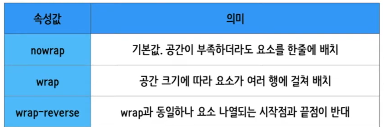
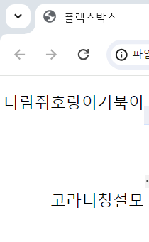
3. flex-flow
• flex-direction, flex-wrap을 한번에 지정할 수 있다.
• flex-flow = flex-direction + flex-wrap

ex) flex-flow : row-reverse wrap;
4. 실습
1) html 코드
<!DOCTYPE html>
<html lane="en">
    <head>
        <meta charset="UTF-8">
        <meta http-equiv="X-UA-Compatible" content="IE=edge">
        <meta name="viewport" content="width=device-width, initial-scale=1">
        <title>플렉스박스</title>
        <link href="./style.css" rel="stylesheet">
    </head>
    <body>

        <ul>
            <li>거북이</li>
            <li>호랑이</li>
            <li>다람쥐</li>
            <li>청설모</li>
            <li>고라니</li>
        </ul>

    </body>
</html>
2) css 코드
*{
    box-sizing:border-box;
}
body{
    margin:0;
}

ul{
    display:flex;
    padding:0;
    list-style-type:none;
    height:200px;

    /* flex-direction:row;
    flex-wrap:wrap-reverse; */

    flex-flow:row-reverse wrap;
}
3) 결과

블로그 이전했습니다 -> https://young-code.tistory.com