1. justify-content
• 플렉스아이템들이 플렉스박스 주축을 따라 배치될 때, 요소 사이의 공간을 분배하는 방식을 결정한다.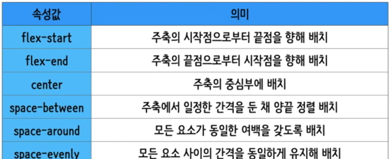
2. 실습
1) html 코드
<!DOCTYPE html>
<html lane="en">
<head>
<meta charset="UTF-8">
<meta http-equiv="X-UA-Compatible" content="IE=edge">
<meta name="viewport" content="width=device-width, initial-scale=1">
<title>플렉스박스</title>
<link href="./style.css" rel="stylesheet">
</head>
<body>
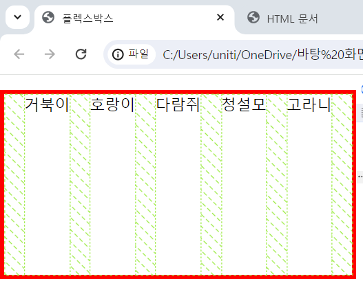
<ul>
<li>거북이</li>
<li>호랑이</li>
<li>다람쥐</li>
<li>청설모</li>
<li>고라니</li>
</ul>
</body>
</html>2) css 코드
*{
    box-sizing:border-box;
}
body{
    margin:0;
}

ul{
    display:flex;
    padding:0;
    list-style-type:none;
    height:200px;

    border:5px solid red;

    flex-direction:row;

    justify-content: space-evenly;
}
3) 결과

블로그 이전했습니다 -> https://young-code.tistory.com