1. order
• 플렉스 아이템의 배치 순서를 설정할 수 있으며, 지정한 숫자에 맞춰 오름차순으로 배치가 진행된다.
• 코드에 영향을 끼치는 것이 아닌, 보여지는 순서에만 영향을 준다.
2. 실습
1) html 코드
<!DOCTYPE html>
<html lang="en">
    <head>
        <meta charset="UTF-8">
        <meta http-equiv="X-UA-Compatible" content="IE-edge">
        <meta name="viewport" content="width=device-width, inital-scale=1">
        <title>플렉스박스</title>
        <link href="./style.css" rel="stylesheet">
    </head>
    <body>
        <ul>
            <li>거북이</li>
            <li>호랑이</li>
            <li>다람쥐</li>
            <li>청설모</li>
            <li>고라니</li>
        </ul>
    </body>
</html>
2) css 코드
*{
box-sizing:border-box;
}
body{
margin:0;
}
ul{
display:flex;
padding:0;
list-style-type:none;
height:200px;
border:5px solid red;
flex-direction: row;
}
li{
background-color: beige;
}
li:nth-child(2n){
background-color: coral;
}
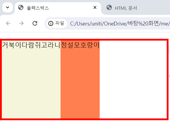
li:nth-child(1){order:-5;}
li:nth-child(2){order:4;}
li:nth-child(3){order:-3;}
li:nth-child(4){order:2;}
li:nth-child(5){order:1;}3) 결과

블로그 이전했습니다 -> https://young-code.tistory.com