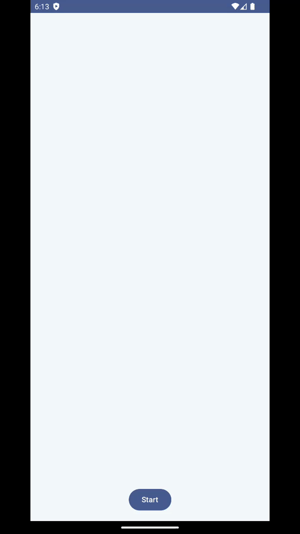
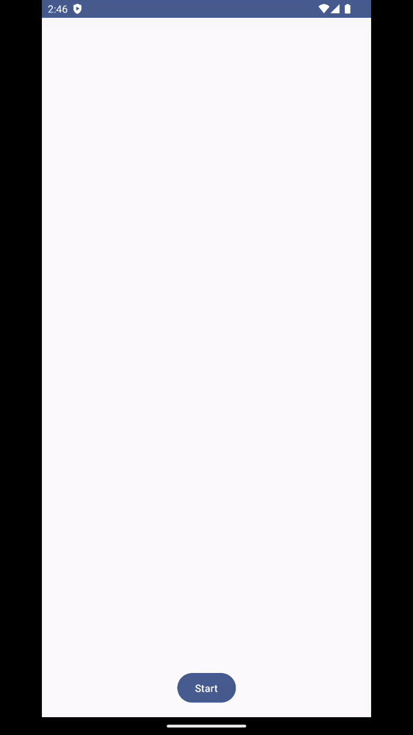
미리보는 결과
| HorizontalExpand | VerticalExpand |
|---|---|
 |  |
다이얼로그의 내용, 특성에 따라서 애니메이션이 추가된다면 더욱 앱이 생동감 있어지고 사용자도 다이얼로그의 내용을 더 잘 이해할 수 있을 거라고 생각했다. 그러나 개발시간에 쫓겨 매번 못하다가 이번에 다른 앱에서 재미있는 다이얼로그 애니메이션을 발견해서 따라해보면서 여러가지 애니메이션이 포함된 다이얼로그들을 만들어보았다.
사이즈 변경
animateXAsState
Compose에서 단일 값을 애니메이션 처리하는 가장 간단한 Animation API이다. 타겟 값만 제공하면 API가 현재 값에서 지정된 값으로 애니메이션을 시작한다.
 val scaleX by animateFloatAsState(
        targetValue = if (visible) 1f else 0f,
        label = "scaleX"
)
- 다이얼로그가 보여지면 1f로 지정된 사이즈만큼 커지고 아니면 다시 줄어들도록 값을 설정했다.
Modifier.graphicsLayer
canvas 대신에 modifier 단계에서 쉽게 콘텐츠를 변환하고 그릴 수 있는 modifier이다.
- 간단하게 콘텐츠 크기를 키우거나, 이동하거나, 회전하는 등의 작업을 할 수 있다.
Box(
	modifier = Modifier
				.graphicsLayer {
                    this.scaleX = scaleX

                }
)-
scaleX값이 변경되는 것에 맞춰 다음과 같이 가로로 사이즈가 커지는 다이얼로그를 만들 수 있다.
DialogState 만들기
지금은 다이얼로그 배경이 보여짐과 동시에 콘텐츠 내용이 나오지만 미리 보는 결과에서처럼 배경이 먼저 생성되고 나서 콘텐츠 내용이 생기면 좋을 것 같았다.
그러기 위해서는 배경이 생기는 중 -> 배경 생성완료 -> 컨텐츠 보여짐 -> 컨텐츠 사라짐 -> 배경 사라지는 중 -> 배경 사라짐 과 같이 좀 더 세분화된 상태값이 필요하다고 느꼈다.
enum class DialogState { Ready, Opening, Opened, Closing, Closed }그래서 다음과 같이 5개의 상태값을 생성했고
var dialogState by remember { mutableStateOf(DialogState.Ready) }

 LaunchedEffect(dialogState) {
        if (dialogState == DialogState.Ready) {
            delay(500)
            dialogState = DialogState.Opening
        }
}

Box(
	modifier = Modifier
				.graphicsLayer {
                    this.scaleX = scaleX

                    if (scaleX == 1f) {
                        dialogState = DialogState.Opened
                    }
                }
)- LauncedEffect를 통해 다이얼로그가 보여지기 시작하면 Opening이 되어서 배경이 생성되고 graphicLayer에서 scaleX가 1f이 되었을 때 즉, 배경이 다 생성이 된 순간에 Opened로 상태값을 바뀌도록 하였다.
val contentAlpha by animateFloatAsState(
        targetValue = when (dialogState) {
            DialogState.Ready -> 0f
            DialogState.Opening -> 0f
            DialogState.Opened -> 1f
            DialogState.Closing -> 0f
            DialogState.Closed -> 0f
        },
        animationSpec = tween(300, easing = Ease),
        label = "contentAlpha"
    )

 Box(modifier = Modifier
       			.graphicsLayer {
                    this.alpha = contentAlpha
                }) {
                content()
}
그리고 배경 내부 content에 대한 Box에 Opened 상태가 될 경우 1f로 alpha값을 바꾸어서 컨텐츠가 드러나도록 하였다.
alpha값을 넣는 김에 배경에도 alpha값을 적용해서 자연스럽게 확장되는 것처럼 보이도록 하자
val scaleX by animateFloatAsState(
        targetValue = when (dialogState) {
            DialogState.Ready -> 0f
            DialogState.Opening -> 1f
            DialogState.Opened -> 1f
            DialogState.Closing -> 0f
            DialogState.Closed -> 0f
        },
        animationSpec = tween(300, easing = Ease), label = "scaleX"
)

val alpha by animateFloatAsState(
        targetValue = when (dialogState) {
            DialogState.Ready -> 0f
            DialogState.Opening -> 1f
            DialogState.Opened -> 1f
            DialogState.Closing -> 0f
            DialogState.Closed -> 0f
        },
        animationSpec = tween(300, easing = Ease),
        label = "alpha"
)

Box(
        modifier = Modifier
                .graphicsLayer {
                    this.scaleX = scaleX
                    this.alpha = alpha

                    if (scaleX == 1f && alpha == 1f) {
                        dialogState = DialogState.Opened
                    }
         		}
)
이제 미리보기처럼 자연스럽게 확장되고 컨텐츠가 보여진다.
사라지게 하기
Box(modifier = Modifier.clickable {
                    dialogState = DialogState.Closing
                }
)

Dialog(
        onDismissRequest = {
            dialogState = DialogState.Closing
        },
        properties = dialogProperties
    )
다이얼로그 배경을 클릭하거나 외부 화면을 클릭하면 Closing으로 상태값이 바뀌도록 하였다.
contentAlpha는 Closing이 되면 0f로 바뀌면서 콘텐츠가 사라진다. 그러나 scaleX와 alpha는 1f로 그대로다
 LaunchedEffect(dialogState) {
        if (dialogState == DialogState.Ready) {
            delay(500)
            dialogState = DialogState.Opening
        } else if (dialogState == DialogState.Closing) {
            delay(500)
            dialogState = DialogState.Closed
        } else if (dialogState == DialogState.Closed) {
            onDismissRequest()
        }
}- LaunchedEffect에서 Closing을 감지하고 0.5초 뒤에 Closed로 상태값을 변경해준다. 이때 scaleX와 alpha가 0f로 바뀌면서 배경도 사라지게 된다.
- Closed가 되면 onDimissRequest를 호출하는데 이 때는 다이얼로그를 호출한 외부에서 다이얼로그 composition을 삭제하여서 화면에서 없어지게 된다.
최종결과물
HorizontalExpand

VerticalExpand
- 위아래로 확장되며 나타나는 다이얼로그다.
- HorizontalExpand에서
.graphicsLayer {
         this.scaleY = scaleY
         this.alpha = alpha

         if (scaleY == 1f && alpha == 1f) {
                  dialogState = DialogState.Opened
         }
}
scaleX대신 scaleY를 사용하였다.
DropDown
- 위에서부터 내려오는 듯한 다이얼로그다.
 val configuration = LocalConfiguration.current
    val screenHeightDp = configuration.screenHeightDp.dp
    val screenHeightPx = with(
        LocalDensity.current
    ) {
        screenHeightDp.toPx()
    }

 val positionY by animateFloatAsState(
        targetValue = when (dialogState) {
            DialogState.Ready -> -screenHeightPx / 2
            DialogState.Opening -> 0f
            DialogState.Opened -> 0f
            DialogState.Closing -> -screenHeightPx / 2
            DialogState.Closed -> -screenHeightPx / 2
        },
        animationSpec = tween(300, easing = Ease), label = "positionY"
)- 이동해야하는 시작위치와 최종위치를 설정하고 (최종이 0f 시작이 최종 0f를 기준으로 상대적 위치다)
.graphicsLayer {
       this.translationY = positionY
       this.alpha = alpha

       if (alpha == 1f) {
            dialogState = DialogState.Opened
       }
}
translationY를 이용해서 위치값을 적용해주었다.
PopUp

- 튀어나오는 듯한 다이얼로그다.
.graphicsLayer {
        this.scaleX = scaleX
        this.scaleY = scaleY
        this.alpha = alpha

        if (scaleX == 1f) {
            dialogState = DialogState.Opened
        }
}
scaleX와 scaleY를 동시에 설정해주었다.
커스텀
containerProperties: ContainerProperties = ContainerProperties(
        color = if (isSystemInDarkTheme()) {
            MaterialTheme.colorScheme.surfaceVariant
        } else {
            MaterialTheme.colorScheme.surface
        },
        shape = RoundedCornerShape(12.dp),
        padding = 12.dp
    ),
ContainerProperties를 이용해 다이얼로그 배경의 모양, 색상, 콘텐츠와의 padding을 설정할 수 있다.
라이브러리로 배포하기
깃헙링크