1. Exploratory Data Analysis(EDA)
import numpy as np
import pandas as pd
import matplotlib.pyplot as plt
import seaborn as sns
plt.style.use('fivethirtyeight')
import warnings
warnings.filterwarnings('ignore')
%matplotlib inline
data = pd.read_csv('../titanic/train.csv')# NULL값 Check
data.isnull().sum()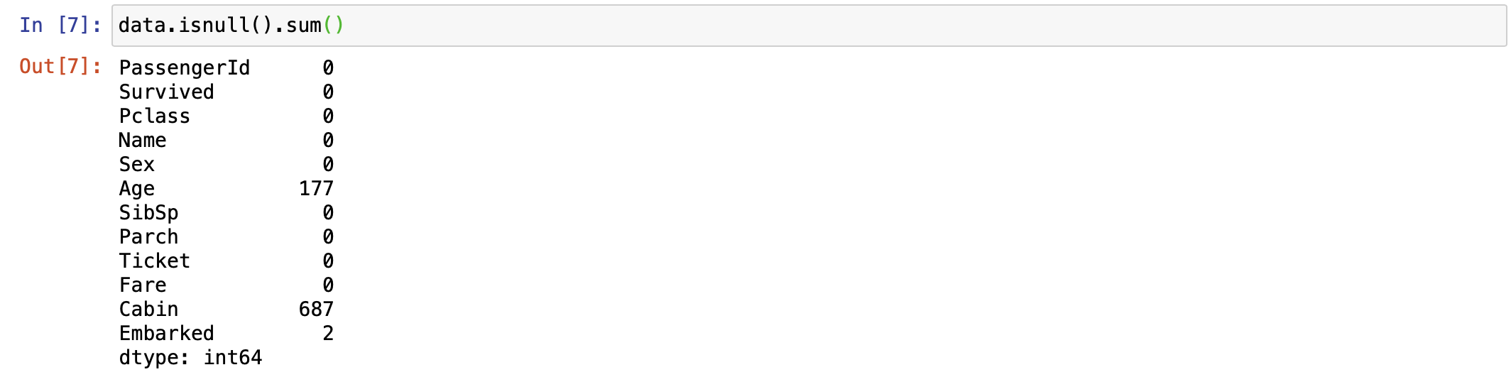
생존자를 파악해보자
f, ax = plt.subplots(1, 2, figsize=(18, 8))
data['Survived'].value_counts().plot.pie(explode=[0, 0.1], autopct='%1.1f%%', shadow=True, ax=ax[0])
ax[0].set_title('Survived')
ax[0].set_ylabel('')
sns.countplot(data=data, x='Survived', ax=ax[1])
ax[1].set_title('Survived')
plt.show()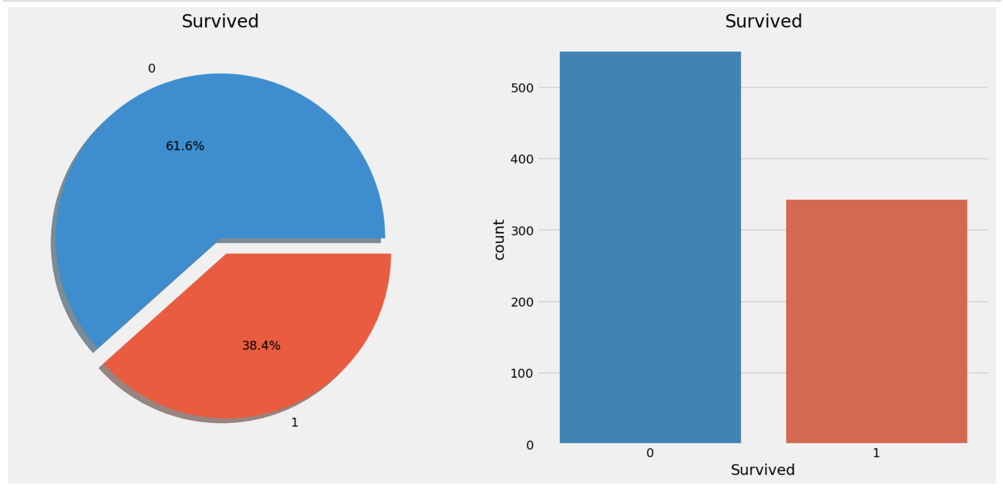
2. Analysing the Features
1. Sex --> Categorical Feature
data.groupby(['Sex', 'Survived'])['Survived'].count()
#count() 대신 value_counts()해도 됨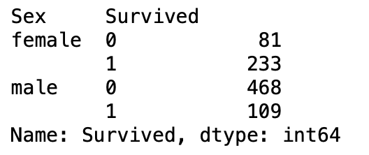
f, ax = plt.subplots(1, 2, figsize=(18, 8))
data[['Survived', 'Sex']].groupby(['Sex']).mean().plot.bar(ax=ax[0],color='black')
ax[0].set_title('Survived vs Sex')
sns.countplot(data=data, x='Survived', hue='Sex', ax=ax[1])
ax[1].set_title('Survived vs Sex')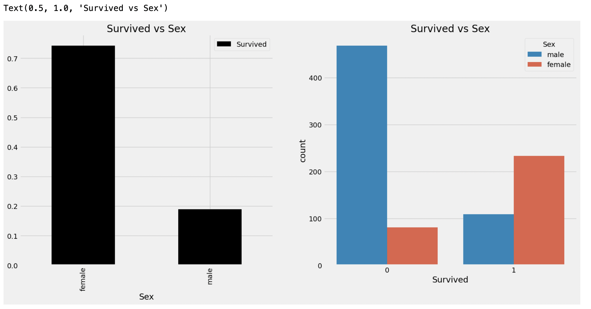
2. Pclass --> Ordinal Feature
f, ax = plt.subplots(1, 2, figsize=(18, 8))
data['Pclass'].value_counts().plot.bar(color=['#CD7F32','#FFDF00','#D3D3D3'], ax=ax[0])
ax[0].set_title('Number of Passengers By Pclass')
ax[0].set_ylabel('count')
sns.countplot(data=data, x='Pclass', hue='Survived', ax=ax[1])
ax[1].set_title('Survived vs Pclass')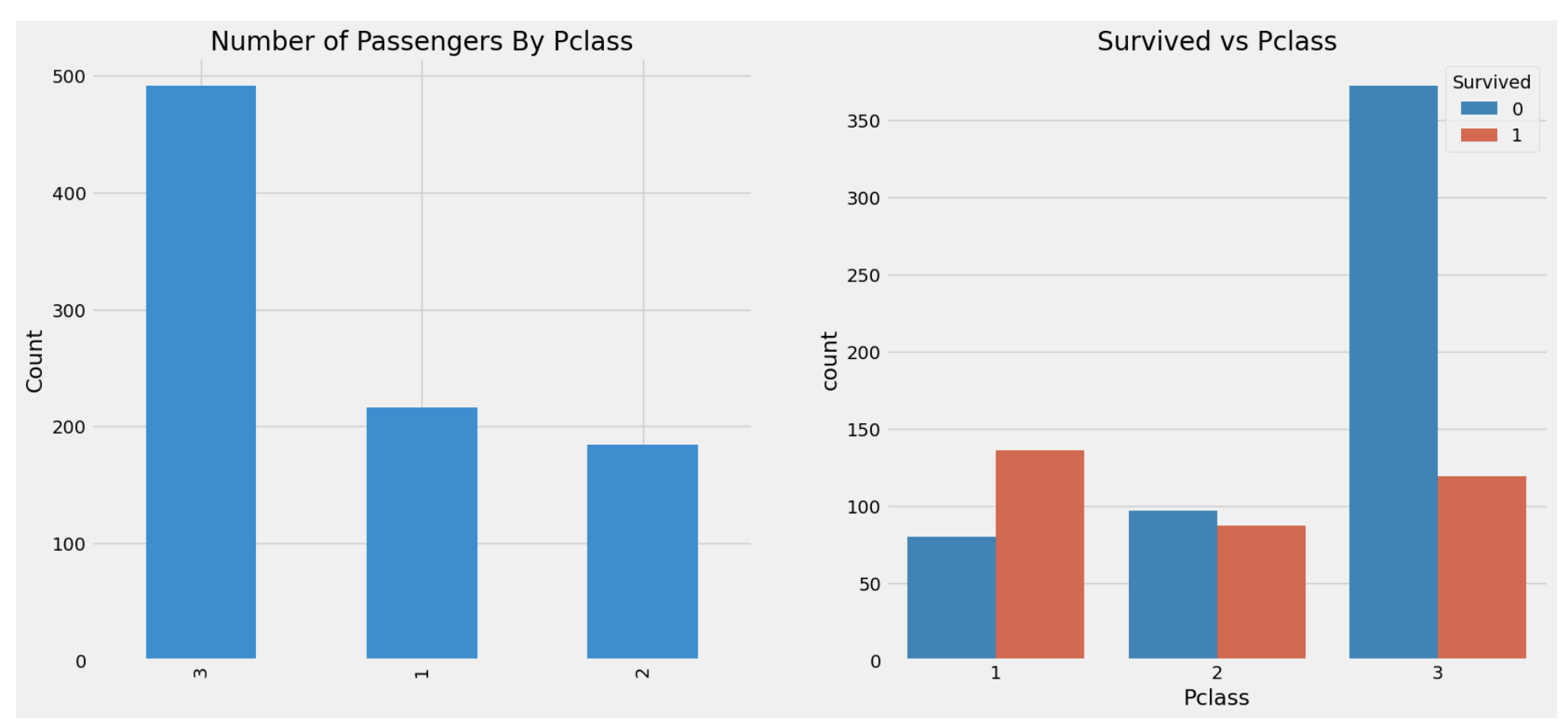
data[['Pclass', 'Survived']].groupby(['Pclass']).mean().plot.bar()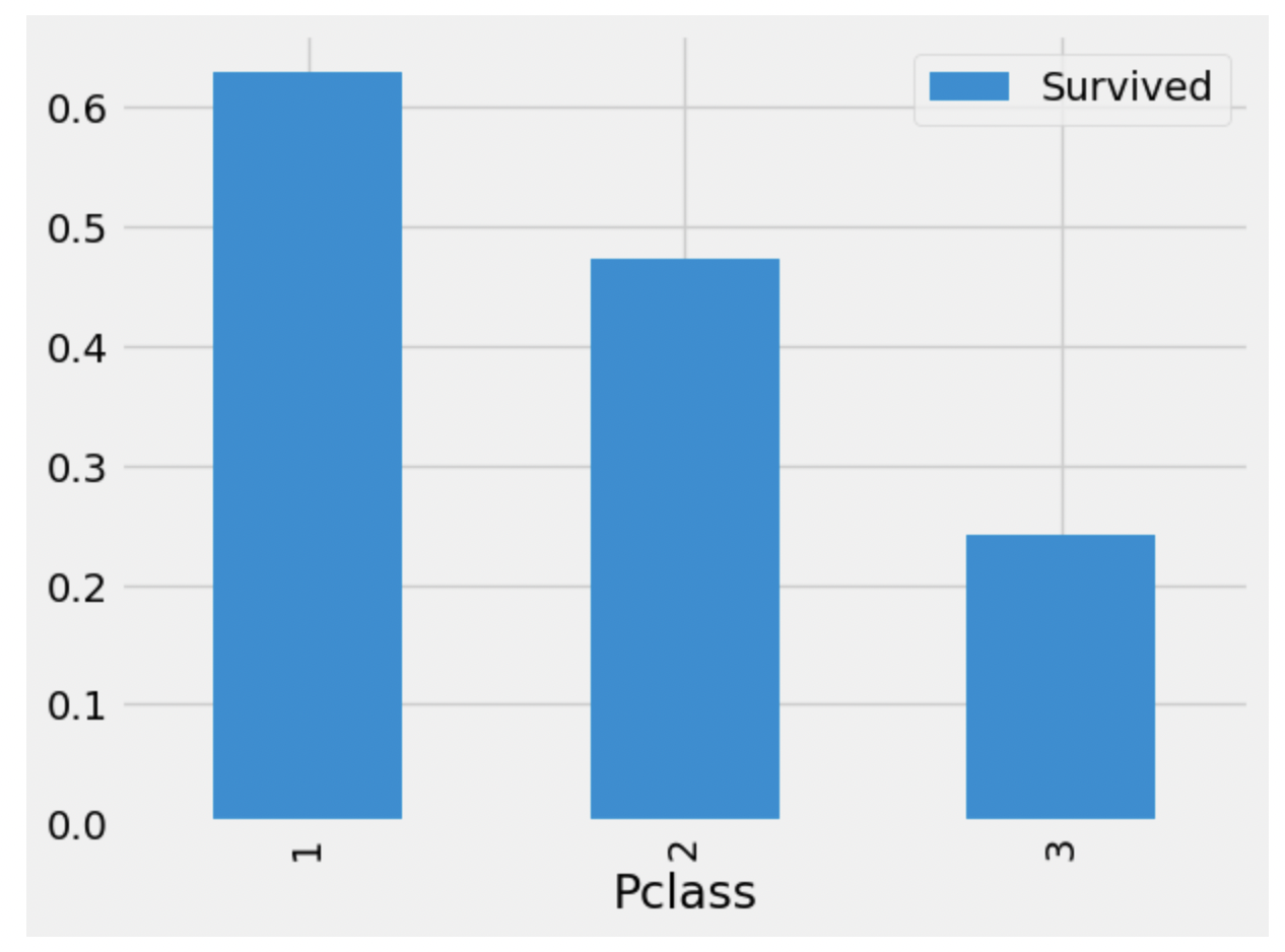
pd.crosstab([data.Sex, data.Survived], data.Pclass, margins=True).style.background_gradient(cmap='summer_r')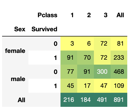
sns.lineplot(data=data, x='Pclass', y='Survived', hue='Sex')
plt.show()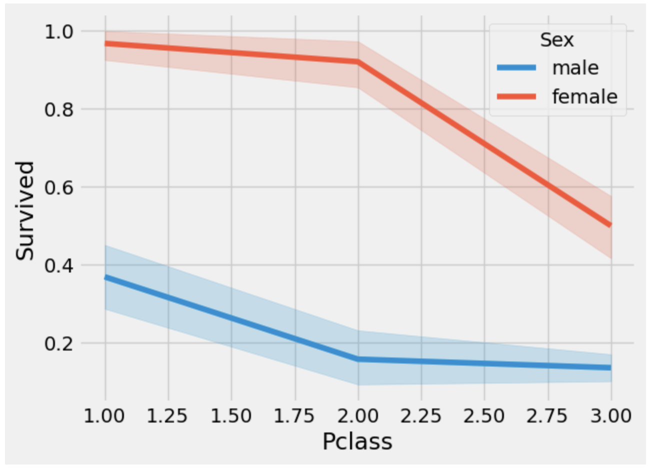
3. Age --> Continous Feature
print("Oldest Passenger was of : ", data['Age'].max(), 'Years' )
print("Youngest Passenger was of : ", data['Age'].min(), 'Years')
print("Average Age on the ship : ", data['Age'].mean(), 'Years')
f, ax = plt.subplots(1, 2, figsize=(18, 8))

sns.violinplot(data=data, x='Pclass', y='Age', hue='Survived', split=True, ax=ax[0])
ax[0].set_title('Pclass and Age vs Survived')
ax[0].set_yticks(range(0,110,10))

sns.violinplot(data=data, x='Sex', y='Age', hue='Survived', split=True, ax=ax[1])
ax[1].set_title('Sex and Age vs Survived')
ax[1].set_yticks(range(0, 110, 10))

plt.show()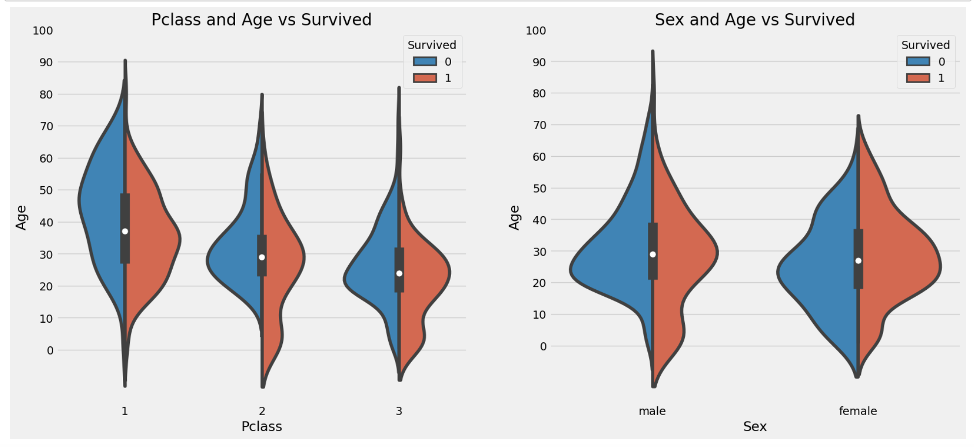
Pclass가 3으로 갈수록 아이의 수가 증가- 10살 미만의 애들은
Pclass상관없이 생존률이 높다 (사망자 수 대비 생존자 수가 월등히 많음), 남자아이의 생존률이 여자아이보다 높다. - 20 ~ 40살의 사람이 생존자 수가 가장 많음. 그 중에서도 여자가 남자보다 높음
- 남자는 나이가 들수록 생존 기회가 줄어듦
NULL값 채우기
나이는 177개의 결측값이 있는데, 이를 평균값으로 채울 수 있지만 여기서는 이름의 특징을 가지고 결측값을 채우려고 한다.
이 데이터에는 이름에 Mr, Mrs같은 단어가 들어가는데 이 단어를 가지고 나이를 유추해보자.
data['Initial'] = 0
for i in data:
    data['Initial'] = data.Name.str.extract('([A-Za-z]+)\.')
# [A-Za-z]+).의 의미는 뒤에 .가 있고 A-Z와 a-z 사이에 있는 문자열을 찾아준다.
pd.crosstab(data.Initial, data.Sex).T.style.background_gradient(cmap='summer_r')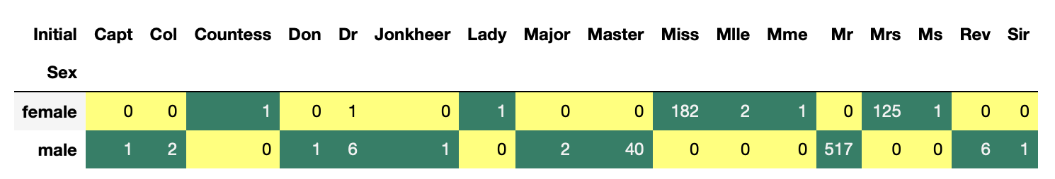
data['Initial'].replace(['Mlle','Mme','Ms','Dr','Major','Lady','Countess','Jonkheer','Col','Rev','Capt','Sir','Don'],
                       ['Miss','Miss','Miss','Mr','Mr','Mrs','Mrs','Other','Other','Other','Mr','Mr','Mr'], inplace=True)
data.groupby('Initial')['Age'].mean()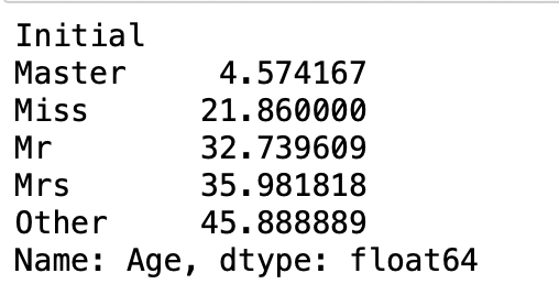
위 결과를 토대로 Null값에 데이터 값을 채워넣어보면
data.loc[(data.Age.isnull()) & (data.Initial=='Mr'), 'Age']=33
data.loc[(data.Age.isnull()) & (data.Initial=='Mrs'), 'Age'] = 36
data.loc[data.Age.isnull() & (data.Initial=='Master'), 'Age'] = 5
data.loc[data.Age.isnull() & (data.Initial=='Miss'), 'Age'] = 22
data.loc[data.Age.isnull() & data.Initial=='Other', 'Age'] = 46
data.isnull().any()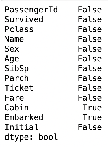
Age의 Null값이 사라진 것을 알 수 있다.
f, ax = plt.subplots(1, 2, figsize=(20, 10))
data[data['Survived']==0].Age.plot.hist(ax=ax[0], bins=20, edgecolor='black',color='red')
ax[0].set_title('Survived = 0')
x1=list(range(0, 85, 5))
ax[0].set_xticks(x1)
data[data['Survived']==1].Age.plot.hist(ax=ax[1], bins=20, edgecolor='black', color='blue')
ax[1].set_title('Survived = 1')
ax[1].set_xticks(x1)
plt.show()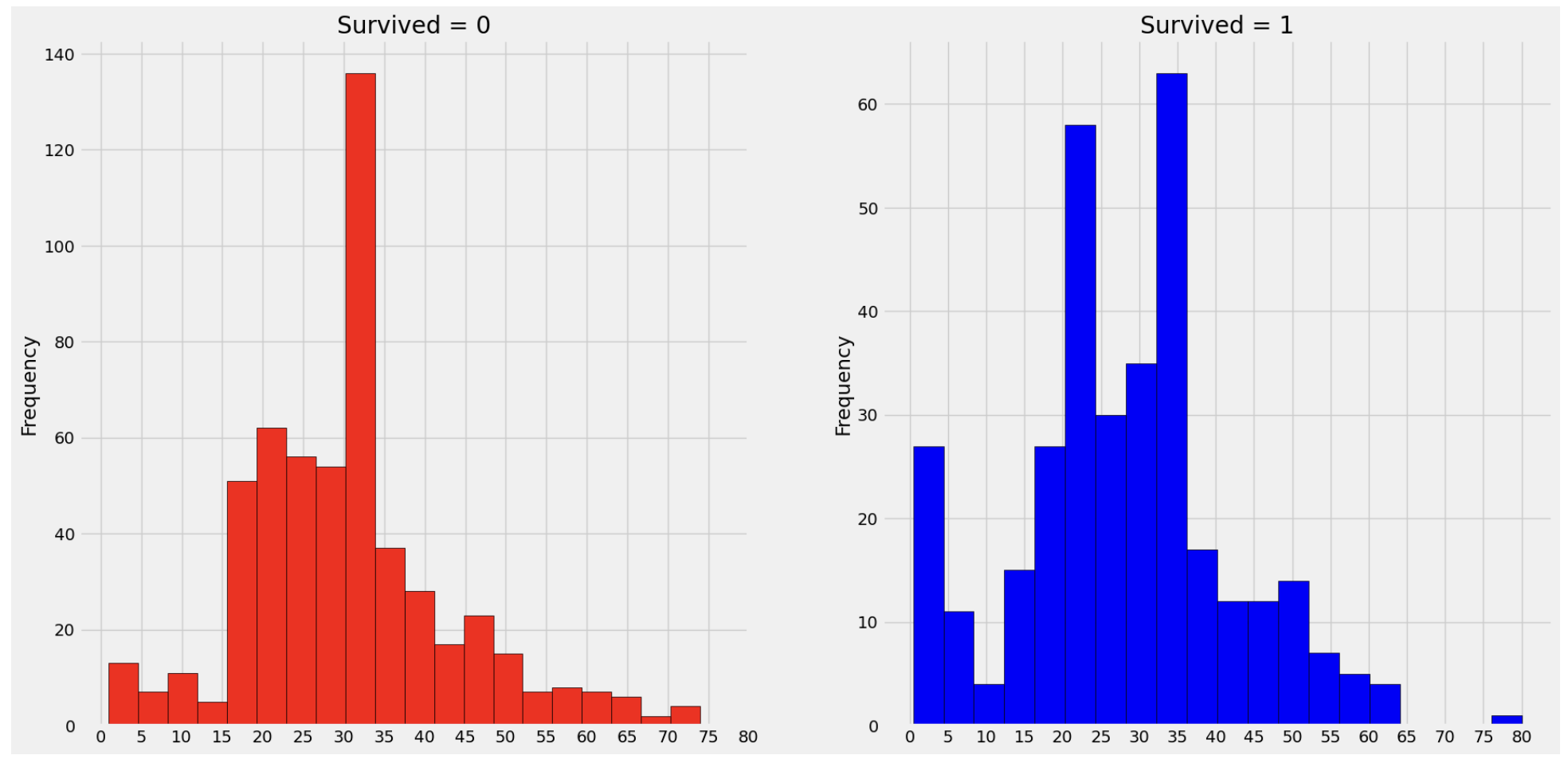
facet = sns.FacetGrid(data, col='Initial', aspect=1)
facet = facet.map(sns.lineplot, 'Pclass', 'Survived')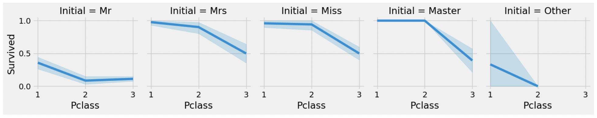
4.Embarked --> Categorical Value
pd.crosstab([data.Embarked, data.Pclass], [data.Sex, data.Survived], margins=True).style.background_gradient(cmap='summer_r')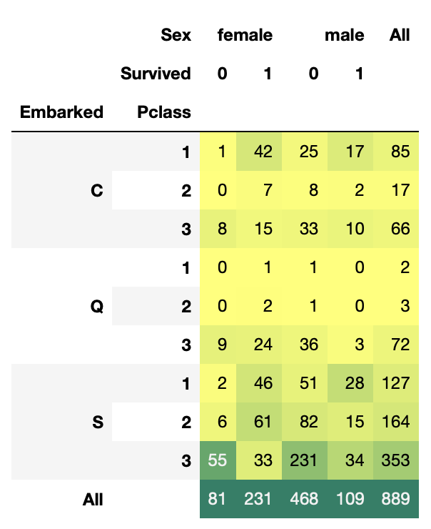
Chances for Survival by Port of Embarked
sns.lineplot(data=data, x='Embarked', y='Survived')
fig=plt.gcf()
fig.set_size_inches(5, 3)
plt.show()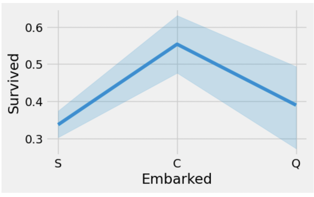
가장 생존률이 높은 Embarked는 C에서 탑승한 사람들이다(평균 0.55).
S에서 탑승한 사람들이 대략 0.35로 가장 낮다.
f, ax = plt.subplots(2, 2, figsize=(20, 15))
sns.countplot(data=data, x='Embarked', ax=ax[0,0])
ax[0,0].set_title('No. Of Passengers Boarded')
sns.countplot(data=data, x='Embarked', hue='Sex', ax=ax[0,1])
ax[0,1].set_title('Male-Female Split for Embarkd')
sns.countplot(data=data, x='Embarked', hue='Survived', ax=ax[0,1])
ax[0,1].set_title('Embarked vs Survived')
sns.countplot(data=data, x='Embarked', hue='Pclass', ax=ax[1,1])
plt.subplots_adjust(wspace=0.2, hspace=0.5)
plt.show()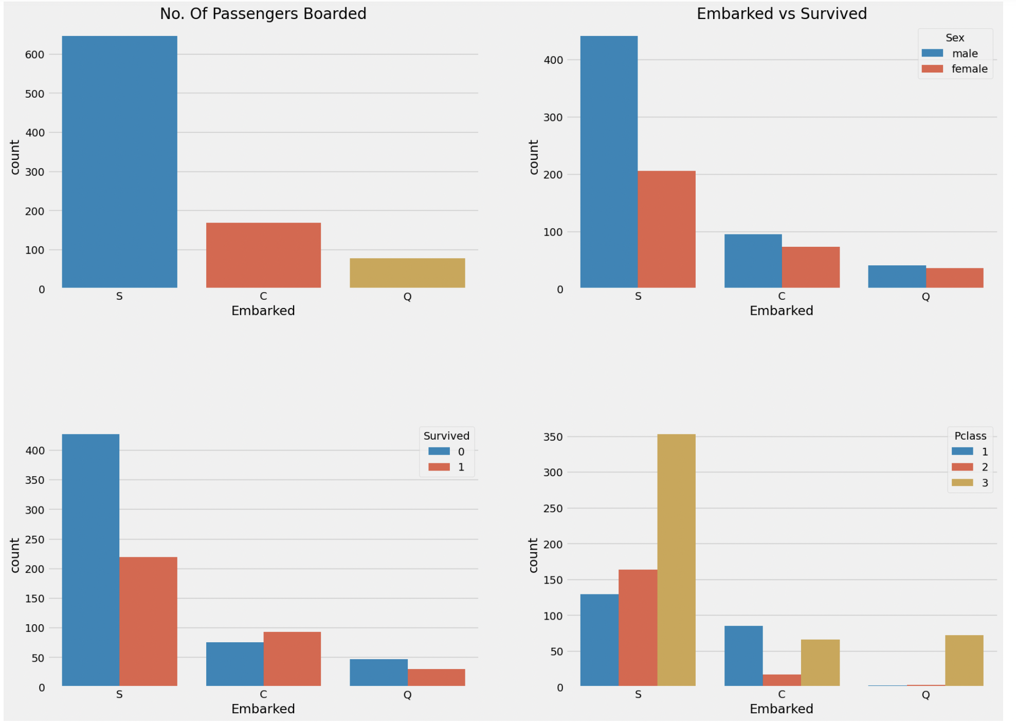
위 그래프에 대해서 분석하자면,
1.대부분의 승객은 'S'에서 탑승했고, 이 승객들의 대부분은 남자이며 3 Class이다.
  --> 이로 인해 사망자 수가 높다.
2. C는 생존자 수가 사망자수보다 높다.
  -->1,2 Class의 사람들이 3Class 사람보다 많기 때문이다.
3. Q에서 탑승한 사람들은 대략 90%이상이 3Class사람들이다.
pal = {'male' : 'violet', 'female' : 'gray'} #색상 수동 변경
facet = sns.FacetGrid(data, col='Embarked',hue='Sex', aspect=1, palette=pal,
hue_order=['female', 'male'])
facet = facet.map(sns.lineplot, 'Pclass', 'Survived')
facet = facet.add_legend()
facet = facet.fig.subplots_adjust(wspace = 0.2)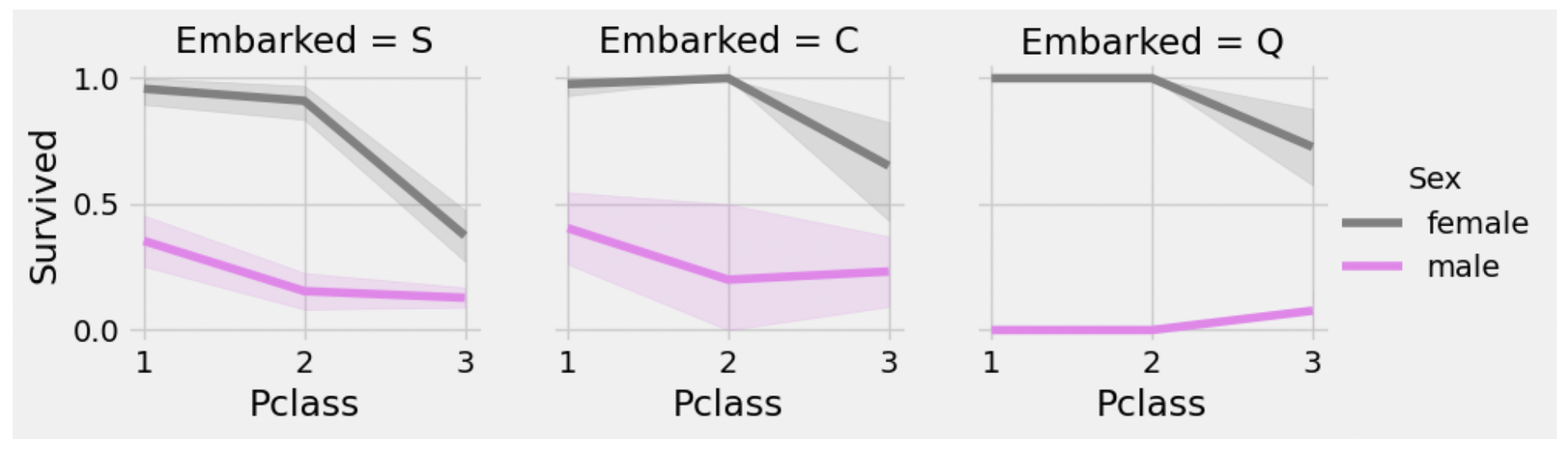
1. 어느 Embarked에서든 Pclass 1,2의 여성은 생존율이 90%이상이다.
2. Port S에서는 불행히도 Class 3의 남, 녀 모두 생존율이 낮다. port C랑 Q에서는 여자는 높은 편
3. Port Q에서는 어느 Class에서든 남자의 생존율은 낮다.
data['Embarked'].fillna('S', inplace=True) #결측값 제거
data.Embarked.isnull().any()
5.SibSp --> Discrete Feature(이산)
pd.crosstab(data.SibSp, data.Survived).style.background_gradient(cmap='summer_r')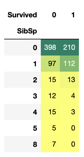
형제,자매,부부가 없이 혼자일 때 승객이 가장 많지만, 동반 1인일 때가 생존율이 가장 높다.
f, ax = plt.subplots(1, 2, figsize=(20, 8))
sns.barplot(data=data, x='SibSp', y='Survived', ax=ax[0])
ax[0].set_title('SibSp vs Survived')
sns.lineplot(data=data, x='SibSp', y='Survived', ax=ax[1])
ax[1].set_title('SibSp vs Survived')
plt.show()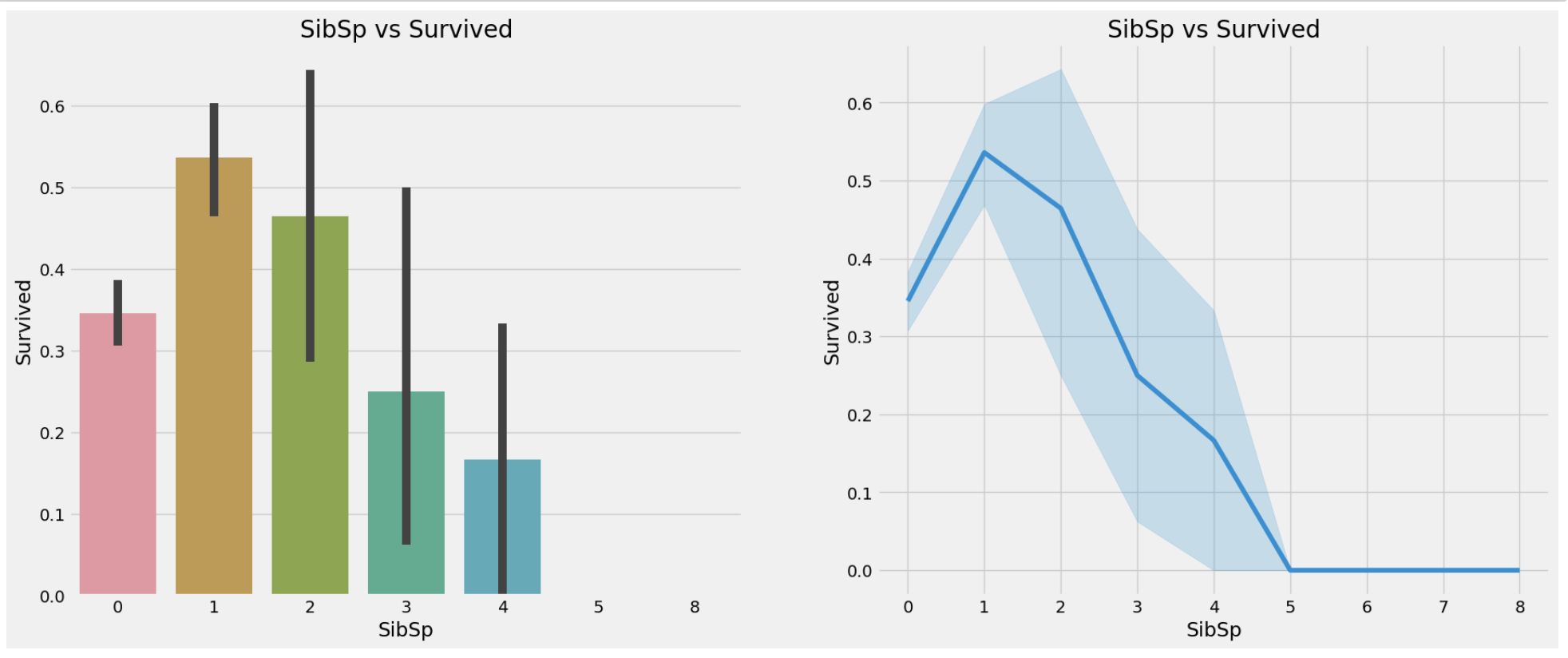
형제,자매,부부가 많아짐에 따라 생존율이 감소하는 것을 알 수 있다. 이는 다음과 같이 추론할 수 있다. 형제,자매,부부가 있으면 자기자신만 챙기기보단 가족의 목숨까지 챙기다 사망했을 수도 있다는 식으로 말이다.
pd.crosstab(data.SibSp, data.Pclass).style.background_gradient(cmap='summer_r')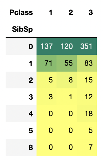
SibSp가 3명 이상이면 Class가 대부분 3이다. 이로 인해 생존율이 감소하는 것이고, 5명 이상부터는 생존율이 0%대이다.
6.Parch
f, ax = plt.subplots(1, 2, figsize=(20, 8))
sns.barplot(data=data, x='Parch', y='Survived', ax=ax[0])
ax[0].set_title('Parch vs Survived')
sns.lineplot(data=data, x='Parch', y='Survived', ax=ax[1])
ax[1].set_title('Parch vs Survived')
plt.close(2)
plt.show()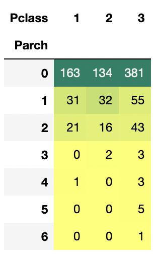
f, ax = plt.subplots(1, 2, figsize=(20, 8))
sns.barplot(data=data, x='Parch', y='Survived', ax=ax[0])
ax[0].set_title('Parch vs Survived')
sns.lineplot(data=data, x='Parch', y='Survived', ax=ax[1])
ax[1].set_title('Parch vs Survived')
plt.close(2)
plt.show()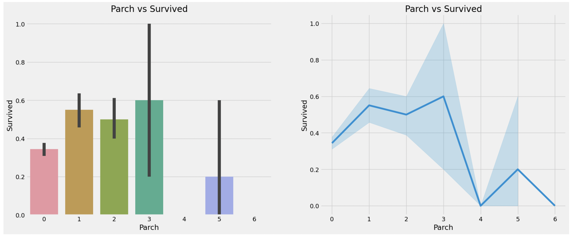
Parch가 1~3명일 때 생존율이 가장 높고 4명 이상부터 생존율이 급감한다.
7.Fare --> Continous Feature
print('Highest Fare : ',data.Fare.max())
print('Lowest Fare : ',data.Fare.min())
print('Average Fare : ',data.Fare.mean())
f, ax = plt.subplots(1, 3, figsize=(20,8))
sns.distplot(data[data['Pclass']==1].Fare, ax=ax[0])
ax[0].set_title('Fares in Pclass 1')
sns.distplot(data[data['Pclass']==2].Fare, ax=ax[1])
ax[1].set_title('Fares in Pclass 2')
sns.distplot(data[data['Pclass']==3].Fare, ax=ax[2])
ax[2].set_title('Fares in Pclass 3')
plt.show()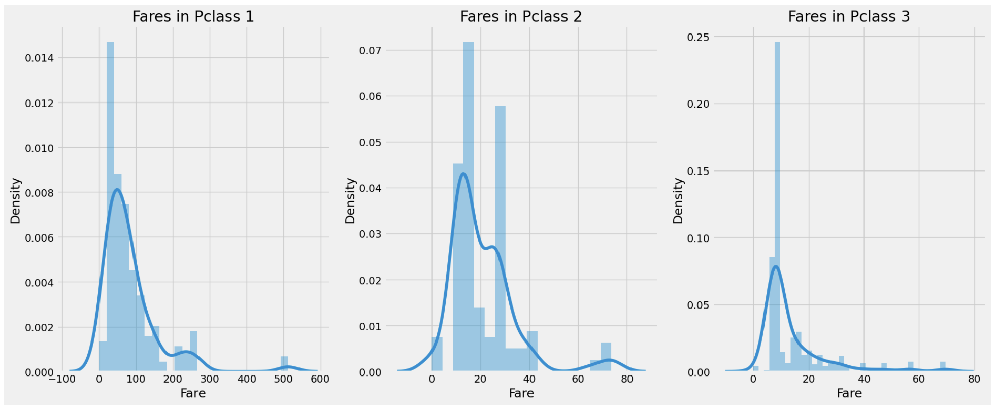
Fare을 보면 Pclass가 1일때 0 ~ 600불까지 분포가 크다. 이와 같은 연속적인 변수는 binning을 통해 이산 변수로 변환할 수 있다.
8. Observations in a Nutshell for all features
- Sex : 남자에 비해 여자의 생존율이 높다.
- Pclass : 1등석 승객들의 생존율이 높은 것을 볼 수 있다.
- Age : 5 ~ 10살 미만의 애들의 생존율은 높지만 15 ~ 35살의 사람들의 생존율은 낮다.
- Embarked : 1등석의 대부분은 S에서 탑승했지만 생존율은 C가 높아보인다. Q의 탑승객들은 대부분 3등석이다.
- Parch + SibSp : 1 ~ 2의 형재자매나 부부 또는 1 ~ 3명의 부모와 같이 탑승한 경우 혼자 또는 대가족인 경우보다 생존율이 높다.
9. Correlation Between The Features
sns.heatmap(data.corr(), annot=True, cmap='RdYlGn', linewidths=0.2) #data.corr() --> Correlation matrix
fig=plt.gcf()
fig.set_size_inches(10, 7)
plt.show()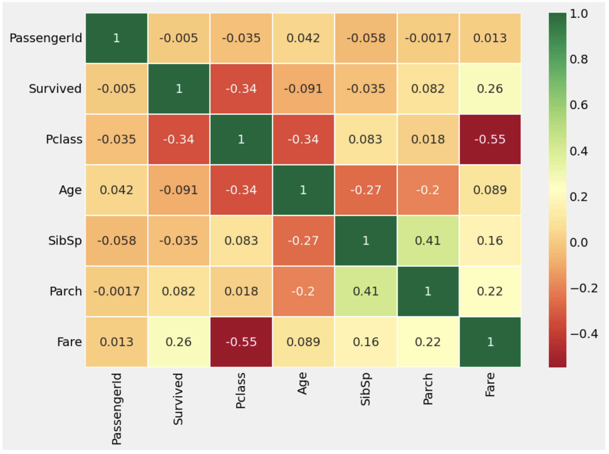

개발자로 전직해보자