*1분코딩 자료를 공부하고 복습 차원에서 정리했습니다.
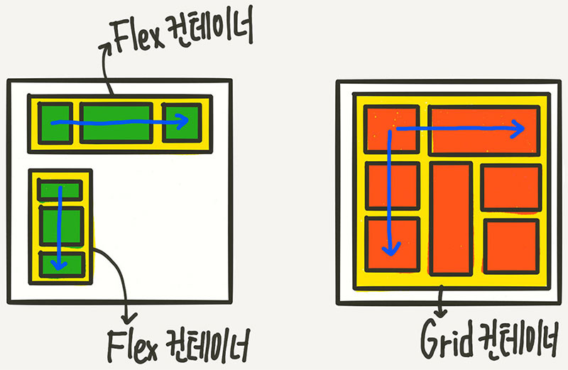
1) Flex와 Grid의 차이점
- Flex는 한 방향 레이아웃 시스템(1차원)
- Grid는 두 방향(가로-세로) 레이아웃 시스템(2차원)
2) 기본 HTML 구조
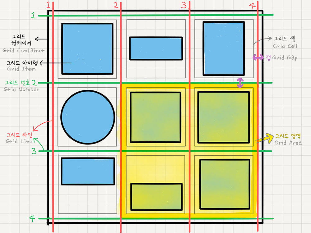
Grid Container와 Grid Item으로 구성됨
“컨테이너가 Grid의 영향을 받는 전체 공간이고, 설정된 속성에 따라 각각의 아이템들이 어떤 형태로 배치되는 것”
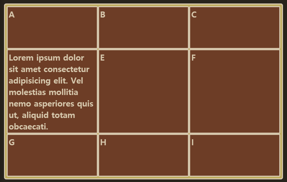
<div class="container">
	<div class="item">A</div>
	<div class="item">B</div>
	<div class="item">C</div>
	<div class="item">D</div>
	<div class="item">E</div>
	<div class="item">F</div>
	<div class="item">G</div>
	<div class="item">H</div>
	<div class="item">I</div>
</div>
3) Grid
.container {
	display: grid;
}
-
Grid Container
display:grid;를 적용하는, Grid의 전체 영역이다. -
Grid Item
Grid 컨테이너의 자식 요소들 -
Grid Track
Grid의 행(Row) 또는 열(column) -
Grid Cell
Grid의 한 칸을 가리키는 말로, Grid 아이템 하나가 들어가는 "가상의 칸(틀)"이라고 생각하면 된다. -
Grid Line
Grid 셀을 구분하는 선 -
Grid Gap
Grid 셀 사이의 간격 -
Grid Area
Grid 라인으로 둘러싸인 사각형 영역으로, 그리드 셀의 집합이다.
4) Grid Container 속성
- display: grid;
: 아이템들이 block 요소라면 이 한 줄로는 딱히 변화가 없다.
.container{
	display: grid;
	*/display: inline-grid;/*
}
- grid-template-rows/columns
: 컨테이너에 Grid 트랙의 크기들을 지정해주는 속성
(여러가지 단위 사용 O, 섞어서 사용 O)
-
grid-template-rows
: 행(row)의 배치 -
grid-template-columns
: 열(column)의 배치
.container{
	grid-template-columns: 200px 200px 500px;
	/* grid-template-columns: 1fr 1fr 1fr */
	/* grid-template-columns: repeat(3, 1fr) */
	/* grid-template-columns: 200px 1fr */
	/* grid-template-columns: 100px 200px auto */

	/* grid-template-rows도 위와 같음 */
}-
고정크기
grid-template-columns: 200px 200px 500px;
➡ 3개의 열을 각각 위 pixel과 같은 너비로 만든다. -
가변 크기
grid-template-columns: 1fr 1fr 1fr;
➡ 3개의 열을 1:1:1 비율의 너비로 만든다. -
고정+가변 크기
grid-template-columns: 100px 2fr 1fr;
➡ 첫번째 열은 100px로 고정되고, 나머지 두세번째 열은 2:1의 비율로 유연하게 움직인다.
*fr: fraction(비율)
- repeat function
반복되는 값을 자동으로 처리할 수 있는 CSS 함수
repeat(반복횟수, 반복값)
즉, repeat(5,1fr)은 1fr 1fr 1fr 1fr 1fr과 같다.
repeat(3, 1fr 4fr 2fr); 이런 패턴도 가능
▫ repeat values
1. minmax 함수
최솟값과 최댓값을 지정할 수 있는 함수
minmax(100px, auto) : 최소한 100px, 최대는 자동으로(auto) 늘어나게한다.
.container{
	grid-template-columns: repeat(3,1fr);
	grid-template-rows: repeat(3, minmax(100px,auto));
}
2. auto-fill / auto-fit
개수를 미리 정하지 않고 설정된 너비가 허용하는 한 최대한 셀을 채운다.
- auto-fill
.container{
	grid-template-columns: repeat(auto-fill, minmax(20%,auto));
}
auto-fill의 크기를 20%으로 설정했으므로, 1개의 row에는 5개의 셀이 들어간다.
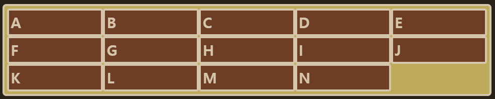
셀의 개수가 5개보다 모자라면, 아래와 같이 공간이 남게 된다.

- auto-fit
셀의 개수가 모자라면, 남는 공간을 채운다.

- row-gap / column-gap / gap
(간격 만들기)
그리드 셀 사이의 간격을 설정
.container{
	row-gap: 10px;
	column-gam: 20px;
}
/*-------shorthand---------*/
.container{
	gap: 10px 20px;
}
.container{
gap:20px;
/* row-gap:20px; column-gap:20px; */
}- 초기 버전: grid-gap ... (호환성때문에 둘 다 쓰기도 함)
- 현재 버전: gap...
*IE에서는 gap의 대체 속성이 없기 때문에, IE와 구조를 통일하고 싶으면 아예 처음 부터 gap을 사용하지 않고 구조를 설계하자!
- grid-auto-columns/rows
(그리드 형태를 자동으로 정의)
: grid-template-columns (또는 ...-rows)의 통제를 벗어난 위치에 있는 트랙의 크기를 지정하는 속성으로, 굳이 횟수를 지정해서 반복할 필요 없이 "알아서" 처리된다.
"통제를 벗어난" = grid-template-rows/columns 를 설정해 주지 않은
.container{
	grid-template-rows: repeat(3, minmax(100px, auto));
}
위에서 row의 개수를 미리 알 수 없는 경우에 사용하는 것
.container{
	grid-auto-rows: minmax(100px,1fr);
}
- align-items
(세로 방향 정렬)
아이템들을 가로(row축)방향으로 정렬, 컨테이너에 적용
- justify-items: stretch;
- justify-items: start;
- justify-items: center;
- justify-items: end;
▼ justify-items: start; 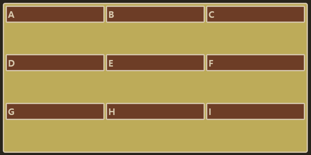
- justify-items
(가로 방향 정렬)
아이템들을 가로(row축)방향으로 정렬, 컨테이너에 적용
- justify-items: stretch;
- justify-items: start;
- justify-items: center;
- justify-items: end;
- place-items
align-items와 justify-items를 같이 쓸 수 있는 단축 속성
.container{
	place-items: center start;

/* place-items: center; 하면 center center;와 같다! */
}
- justify-content
Grid item들의 너비를 모두 합한 값이 Grid Container의 너비보다 작을 때 Grid item들을 통째로 정렬한다.
- justify-content: stretch;
- justify-content: start;
- justify-content: center;
- justify-content: end;
- justify-content: space-between;
- justify-content: space-around;
- justify-content: space-evenly;
- place-content
align-content와 justify-content를 같이 쓸 수 있는 단축 속성으로, 하나의 값만 쓰면 두 속성 모두에 적용된다.
.container{
	place-content: space-between center;
}
5) Grid Item 속성
- grid-column-start 외 5가지
: Grid Item에 적용하는 속성으로, Grid line 번호를 이용해서 각 셀의 영역을 지정한다.
- grid-column-start (시작 번호)
- grid-column-end (끝 번호)
- grid-column (축약형)
- grid-row-start (시작 번호)
- grid-row-end (끝 번호)
- grid-row (축약형)
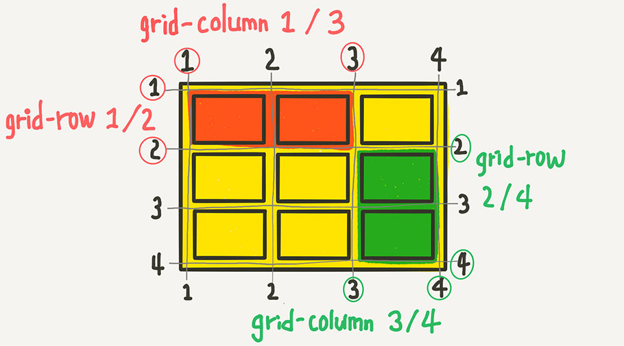
위의 빨간색 영역을 코드로 쓰면,
.item{
	grid-column-start:1;
	grid-column-end:3;
	grid-row-start:1;
	grid-row-end:2;
}
▫ Shorthand
1. 시작번호 / 끝번호 지정
.item:nth-child(1){
	grid-column: 1/3;
	grid-row: 1/2;
}
//💥 end를 생략하면 그냥 한칸임
2. 몇 개의 셀을 차지하게 할 것인지를 지정
.item:nth-child(1){
	grid-colum:1/span 2;
	// 1번 라인에서 2칸

	gird-row:1/span 3;
	// 1번 라인에서 3칸
}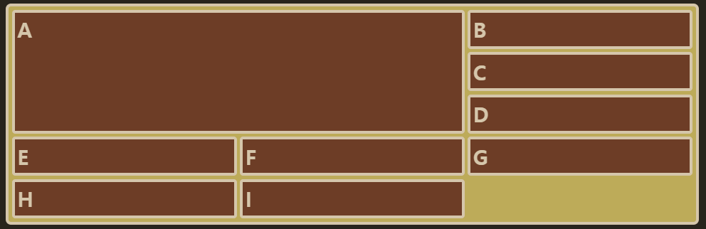
▫ 특징
- grid-column을 이용해서 "통제받지 않는" column들을 만들 수 있다.
.container{
grid-template-columns:50px;
grid-auto-columns: 1fr 2fr;
}
.item:nth-child(1){ grid-column: 2; }
.item:nth-child(2){ grid-column: 3; }
.item:nth-child(3){ grid-column: 4; }
.item:nth-child(4){ grid-column: 5; }
.item:nth-child(5){ grid-column: 6; }
.item:nth-child(6){ grid-column: 7; }
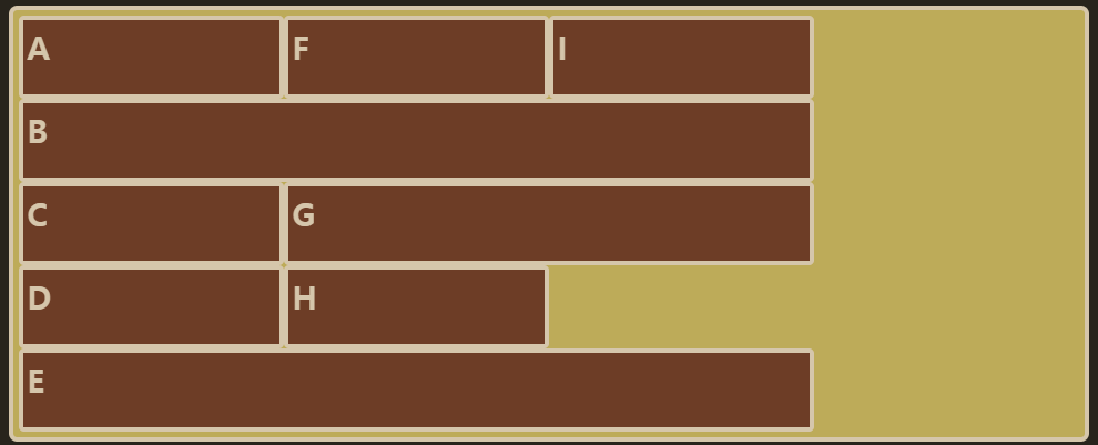
// end 생략하면 그냥 한 칸grid-template-columns의 통제를 받지 않는 column들만 배치해주는 grid-auto-columns를 이용해서 이를 확인해 볼 수 있다.
첫번째 column만 grid-template-columns의 통제를 받아 50px이 되고, 나머지는 grid-auto-columns의 규칙에 따라 1:2의 비율이 반복된다.
- grid-template-areas
(영역 이름으로 그리드 정의)
: 각 영역(Grid Area)에 이름을 붙이고, 그 이름을 이용해서 직관적으로 배치하는 방법
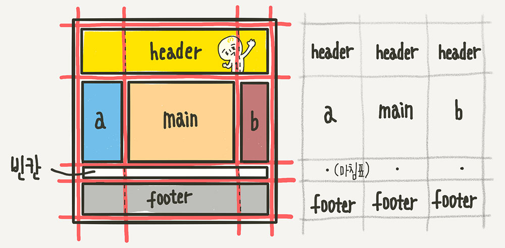
.container{
	grid-template-areas:
		"header header header"
		"   a    main    b   "
		"   .     .      .   "
		"footer footer footer";
}
위의 형태로 각자 차지하는 셀의 개수만큼 해당 위치에 이름을 써준다. 각 셀마다 공백을 하나씩 넣어서 구분하고, 빈칸은 마침표 또는 "none"을 사용한다.
각 영역의 이름을 매칭하려면, 해당 아이템 요소에 grid-area 속성으로 이름을 지정해주면 된다.
예를 들면,
.header{gird-area:header;}
.sidebar-a{grid-area:a;}
.main-content{grid-area:main;}
.sidebar-b{grid-area:b;}
.footer{grid-area:footer;}

//💥 이름 값에 따옴표가 없는 것에 주의!
- grid-auto-flow
(자동 배치)
: 아이템이 자동 배치되는 흐름을 결정하는 속성
-
grid-auto-flow: row;
Grid 배치의 기본 설정: 아이템이 row를 기준으로 순서대로 배치되다가 들어갈 자리가 없으면 그 칸을 비워두고 아래로 배치가 된다. -
grid-auto-flow: column;
-
grid-auto-flow: dense; = row dense;
dense: 기본적으로 빈 셀을 채우는 알고리즘
-
grid-auto-flow: column dense;
.container{
	display: grid;
	grid-template-columns: repeat(auto-fill, minmax(25%,auto));
	grid-template-rows: repeat(5, minmax(50px,auto));
	grid-auto-flow: dense;
}
item:nth-child(2){grid-column:auto/span 3;}
item:nth-child(5){grid-column:auto/span 3;}
item:nth-child(7){grid-column:auto/span 2;}- row
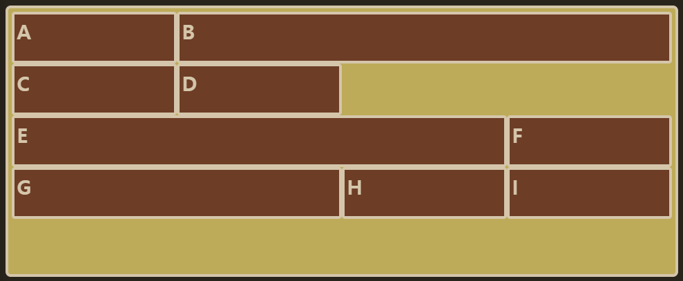
- column
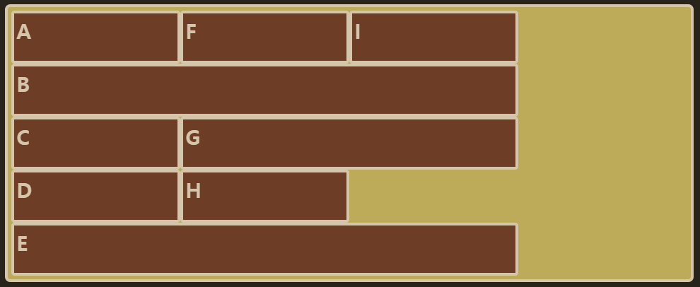
- dense
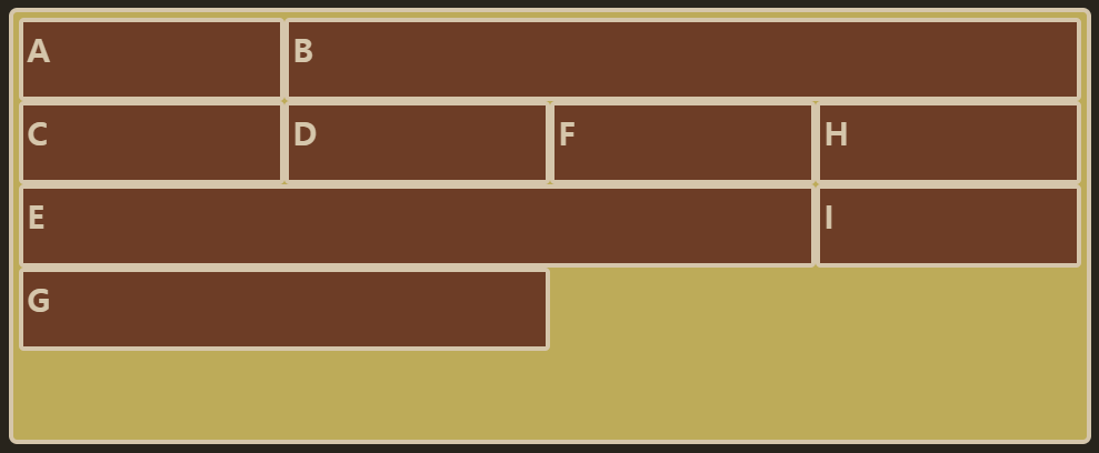
-column dense
- align-self
(개별 아이템 세로 정렬)
해당 아이템들을 세로 방향으로 정렬, 아이템에 적용
-
align-items vs. align-self
align-items: 컨테이너 속 모든 아이템에 적용
align-self: 지정된 아이템 하나만 적용 -
align-self: stretch;
-
align-self: start;
-
align-self: center;
-
align-self: end;
- justify-self
(개별 아이템 가로 정렬)
해당 아이템을 가로 방향으로 정렬, 아이템에 적용
- justify-self: stretch;
- justify-self: start;
- justify-self: center;
- justify-self: end;
- place-self
align-self와 justify-self를 같이 쓸 수 있는 단축 속성
.item {
	place-self: start center;
}
- order
(배치 순서)
각 아이템들의 시각적 나열 순서를 결정하는 속성
.item:nth-child(1) { order: 3; } /* A */
.item:nth-child(2) { order: 1; } /* B */
.item:nth-child(3) { order: 2; } /* C */

/*----결과-----*/
B-C-A
- z-index
z-index로 z축 정렬 가능
6) IE10, 11에서 사용할 수 있는 Grid 속성
| 표준😃 | 그지같은 IE😩 |
|---|---|
| display: grid; | display: -ms-grid; |
| grid-template-rows | -ms-grid-rows |
| grid-template-columns | -ms-grid-columns |
| grid-row-start | -ms-grid-row |
| grid-column-start | -ms-grid-column |
| grid-row: 1 / span 2;에서 span 2 대신 | -ms-grid-row-span: 2 |
| grid-column: 1 / span 2;에서 span 2 대신 | -ms-grid-column-span: 2 |
| align-self | -ms-grid-row-align |
| justify-self | -ms-grid-column-align |