Pandas 및 Matplotlib을 이용한 문제이다.
1. Netflix and Code
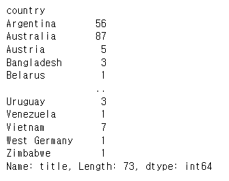
한국 작품은 총 얼마나 있는가?
- country column을 기준
- "South Korea"인 경우만 인정("US, South Korea"는 인정하지 않음
csv 파일을 먼저 읽은 후, "South Korea"인 경우만 계산한다.
import pandas as pd

nf = pd.read_csv("netflix_titles.csv")
len(nf[nf["country"] == "South Korea"])
199정확히 "South Korea"와 일치하는 경우만 세리기 때문에 다른 경우를 세리지 않는다.
가장 많은 작품이 올라간 국가는 어디이고, 얼마나 많은 작품이 있는가?
- country column을 기준으로 한다.
- 단일 국가인 경우를 기준으로 결과를 구해보자.
nf["country"].unique()을 통해 확인해보면 무수히 많은 조합(2개 국가 이상의 조합)이 있다.

nf_one_country = nf[(nf["country"].str.contains(',')) == False]

nf_two_more_country = (nf[(nf["country"].str.contains(',')) == True])

len(nf_one_country)

6656

len(nf_two_more_country)

1320
2개 이상의 나라일 경우, ","로 구분되어 있기 때문에 "," 포함 여부로 단일 국가인지를 식별했다.
그런데,
len(nf) == len(nf_one_country) + len(nf_two_more_country)

False
이 두 가지 케이스를 합하면 전체 케이스가 나와야하는데 그렇지 않았다. 결측치가 있는 것으로 보인다.
nf.info()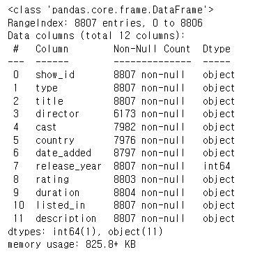
country 열이 다른 열보다 non-null이 적은 것으로 보아 결측치가 있다.
len(nf[nf["country"].isnull() == False]) == len(nf_one_country) + len(nf_two_more_country)

True
결측치를 빼고 계산하면 알맞게 나온다.
country_count = nf_one_country["title"].groupby(by=nf_one_country["country"])
country_count.count()
문제에서 요구하는 단일 국가에서 제작한 컨텐츠의 개수를 count를 이용해서 뽑아냈는데, 정렬이 되어있지 않아 가장 많이 제작한 나라가 어디인지 한눈에 들어오지 않는다.
country_count.count().max()

2818

country_count.count().idxmax()

'United States'
미국이라는 것은 알겠는데 정말 그럴까?
country_count.count().sort_values(ascending=False)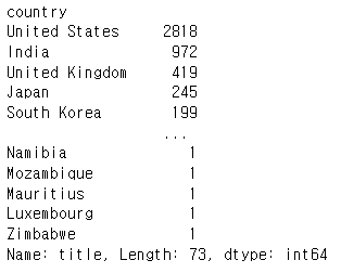
정렬해서 보니 max()와 idxmax()를 이용해서 얻은 값과 일치한다.
country_count.count().sum() == len(nf_one_country)

Truecount()함수가 의도대로 계산되었는지 한번 확인해보았는데 정상적으로 작동된 것 같다.
2. 가즈아!
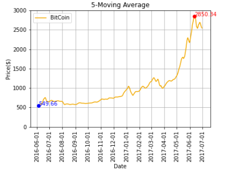
5-MA(Moving Average) 비트코인 가격 그래프 그리기
- 2016.6 ~ 2017.6 기간
- 선의 색깔은 노란색(#f2a900)
- x-axis label과 y-axis label에 적절한 텍스트 삽입
- 이동평균의 기준은 'Open' Column으로 계산
- 이외에도 그래프를 알아보기 쉽게 하기 위한 정보(Text, Facet 등)를 추가
비트코인과 이더리움 비교 그래프
- 2016.6 ~ 2017.6 기간
- 비트코인의 5-MA 그래프와 이더리움의 5-MA 그래프 동시에 그리기
- 비트코인 : 노란색(#f2a900), 이더리움 : 검은색(#3c3c3d)
from matplotlib import dates

# read csv
bit = pd.read_csv("BitCoin.csv")

# date range
pd.set_option('display.max_rows', bit.shape[0]+1)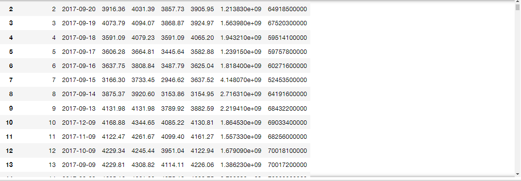
매달 1일~12일까지의 데이터가 월 <-> 일이 바뀌어 있다.
순서는 맞게 들어있으므로, 순서대로 정렬후, 다시 날짜를 기록한다.
그러나 사실은 이렇게하면 중간에 날짜가 비어있을 경우가 있는지 확인할 수 없다.
parsing등을 통한 검증이 필요할 수 있는데,
세세하게 따지자면 애초에 이 데이터를 믿을 수 없는 부분이기에(과연 1일~12일의 데이터만 월 <-> 일이 바뀌어 있고 나머지는 정상인 것이 맞는가?)
이 정도에서 데이터가 맞다는 가정하에 다음으로 넘어간다.
bit = bit.sort_values(by="Unnamed: 0", ascending=False)
bit["Date"] = pd.date_range("2013-04-28", "2017-09-22")
index를 기준으로 순서를 맞춘 후, 데이터의 날짜 시작값과 끝 값으로 date를 다시 매긴다.
# date range
bit = bit[(bit["Date"] >= "2016-06-01") & (bit["Date"] <= "2017-06-30")]
원하는 기간의 데이터만 추출한 후
plt.title("5-Moving Average")
plt.xlabel("Date")
plt.ylabel("Price($)")
각종 정보를 기록하고,
# Calculate MA5
ma5 = bit['Open'].rolling(window=5).mean()
moving average를 계산한 뒤에
plt.plot(bit["Date"], ma5, label="BitCoin", color = '#f2a900')

# x axis setting
plt.xticks(rotation=90)
ax=plt.gca()
dateFormat = mdates.DateFormatter('%Y-%m-%d')
ax.xaxis.set_major_formatter(dateFormat)
ax.xaxis.set_major_locator(dates.MonthLocator(interval=1))


# y axis setting
plt.ylim(0, 3000)
x, y축 세팅을 한다. x축의 경우 month 간격을 1달로 표기했다.
# min, max text
dicForMinMax = {y:x for x, y in zip(bit['Date'], ma5)}
plt.text(dicForMinMax[min(ma5[ma5.isnull() == False])], min(ma5[ma5.isnull() == False]),
         '%.2f' % min(ma5[ma5.isnull() == False]),
         color='b')

plt.text(dicForMinMax[max(ma5[ma5.isnull() == False])], max(ma5[ma5.isnull() == False]),
         '%.2f' % max(ma5[ma5.isnull() == False]),
         color='r')

# min, max point
plt.plot(dicForMinMax[min(ma5[ma5.isnull() == False])], min(ma5[ma5.isnull() == False]), 'bo')
plt.plot(dicForMinMax[max(ma5[ma5.isnull() == False])], max(ma5[ma5.isnull() == False]), 'ro')

plt.legend()
plt.grid()
plt.show()
최소값, 최대값에 대한 표기를 추가했다.
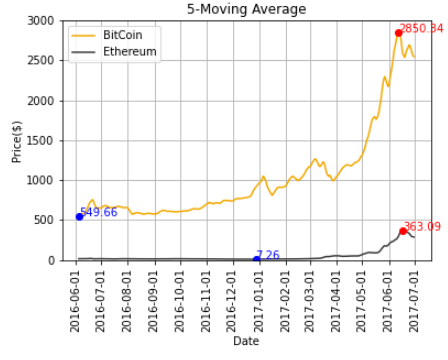
비트코인과 이더리움 비교 그래프
- 2016.6 ~ 2017.6 기간
- 비트코인의 5-MA 그래프와 이더리움의 5-MA 그래프 동시에 그리기
- 비트코인 : 노란색(#f2a900), 이더리움 : 검은색(#3c3c3d)
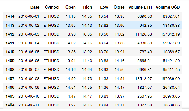
# read csv
eth = pd.read_csv("ETH_day.csv")
csv 파일을 읽어오고
# date range
eth = eth[(eth["Date"] >= "2016-06-01") & (eth["Date"] <= "2017-06-30")]

eth = eth.sort_index(ascending=False)
eth["Date"] = pd.date_range("2016-06-01", "2017-06-30")
eth
eth의 날짜순서대로 정렬한다.
import matplotlib.dates as mdates

plt.title("5-Moving Average")
plt.xlabel("Date")
plt.ylabel("Price($)")

# Calculate MA5
ma5_eth = eth['Open'].rolling(window=5).mean()

plt.plot(bit["Date"], ma5, label="BitCoin", color = '#f2a900')
plt.plot(eth["Date"], ma5_eth, label="Ethereum", color = '#3c3c3d')

# x axis setting
plt.xticks(rotation=90)
ax=plt.gca()
dateFormat = mdates.DateFormatter('%Y-%m-%d')
ax.xaxis.set_major_formatter(dateFormat)
ax.xaxis.set_major_locator(dates.MonthLocator(interval=1))

# y axis setting
plt.ylim(0, 3000)

# min, max text
dicForMinMax = {y:x for x, y in zip(bit['Date'], ma5)}
plt.text(dicForMinMax[min(ma5[ma5.isnull() == False])], min(ma5[ma5.isnull() == False]),
         '%.2f' % min(ma5[ma5.isnull() == False]),
         color='b')

plt.text(dicForMinMax[max(ma5[ma5.isnull() == False])], max(ma5[ma5.isnull() == False]),
         '%.2f' % max(ma5[ma5.isnull() == False]),
         color='r')

dicForMinMax_eth = {y:x for x, y in zip(eth['Date'], ma5_eth)}
plt.text(dicForMinMax_eth[min(ma5_eth[ma5_eth.isnull() == False])], min(ma5_eth[ma5_eth.isnull() == False]),
         '%.2f' % min(ma5_eth[ma5_eth.isnull() == False]),
         color='b')

plt.text(dicForMinMax_eth[max(ma5_eth[ma5_eth.isnull() == False])], max(ma5_eth[ma5_eth.isnull() == False]),
         '%.2f' % max(ma5_eth[ma5_eth.isnull() == False]),
         color='r')

# min, max point
plt.plot(dicForMinMax[min(ma5[ma5.isnull() == False])], min(ma5[ma5.isnull() == False]), 'bo')
plt.plot(dicForMinMax[max(ma5[ma5.isnull() == False])], max(ma5[ma5.isnull() == False]), 'ro')
plt.plot(dicForMinMax_eth[min(ma5_eth[ma5_eth.isnull() == False])], min(ma5_eth[ma5_eth.isnull() == False]), 'bo')
plt.plot(dicForMinMax_eth[max(ma5_eth[ma5_eth.isnull() == False])], max(ma5_eth[ma5_eth.isnull() == False]), 'ro')

plt.legend()
plt.grid()
plt.show()
앞서 그렸던 BitCoin 정보에 매핑하여 Ethereum 정보도 그린다.