EDA
데이터 그 자체만으로부터 인사이트를 얻어내는 접근법
## 라이브러리 불러오기

import numpy as np
import pandas as pd
import matplotlib.pyplot as plt
import seaborn as sns

%matplotlib inline

## 동일 경로에 "train.csv"가 있다면 데이터 불러오기

titanic_df = pd.read_csv("./train.csv")
절차
1. 분석의 목적과 변수 확인
목적이 무엇인가?
데이터 안의 변수는 어떤 것이 있는가?
- 데이터의 생김새 파악하기
 ## 상위 5개 데이터 확인하기

titanic_df.head(5)- 데이터 타입 확인하기
 ## 각 column의 데이터 타입 확인하기

titanic_df.dtypes
2. 데이터 전체적으로 살펴보기
## 데이터 전체 정보를 얻는 함수 : .describe()
titanic_df.describe() # 수치형 데이터에 대한 요약만을 제공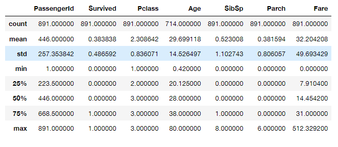
## 상관계수 확인

titanic_df.corr()

# 상관성 != 인과성
# 상관성 : A up, B up ...
# 인과성 : A -> B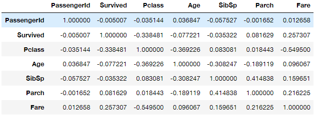
## 결측치 확인

titanic_df.isnull().sum()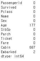
3. 데이터의 개별 속성 파악하기
## 생존자, 사망자 명수는?

titanic_df['Survived'].value_counts()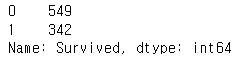
## 생존자 수와 사망자 수를 Barplot으로 그려보기 sns.countplot()

sns.countplot(x='Survived', data=titanic_df)
plt.show()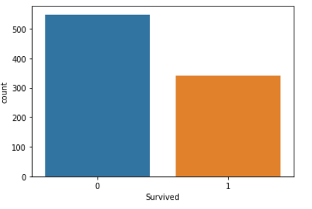
# Pclass에 따른 인원 파악

titanic_df[['Pclass', 'Survived']].groupby(['Pclass']).count()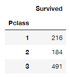
# 생존자 인원?

titanic_df[['Pclass', 'Survived']].groupby(['Pclass']).sum()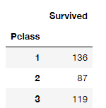
# 생존 비율?

titanic_df[['Pclass', 'Survived']].groupby(['Pclass']).mean()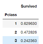
# 히트맵 활용

sns.heatmap(titanic_df[['Pclass', 'Survived']].groupby(['Pclass']).mean())
plt.plot()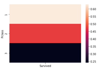
titanic_df.groupby(['Survived', 'Sex'])['Survived'].count()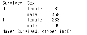
# sns.catplot

sns.catplot(x='Sex', col='Survived', kind='count', data=titanic_df)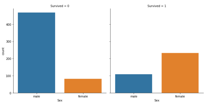
## Sruvived 1, 0과 Age의 경향성

# figure -> axis -> plot

fig, ax = plt.subplots(1, 1, figsize=(10, 5))
sns.kdeplot(x=titanic_df[titanic_df.Survived == 1]['Age'], ax=ax)
sns.kdeplot(x=titanic_df[titanic_df.Survived == 0]['Age'], ax=ax)


plt.legend(['Survived', 'Dead'])
plt.show()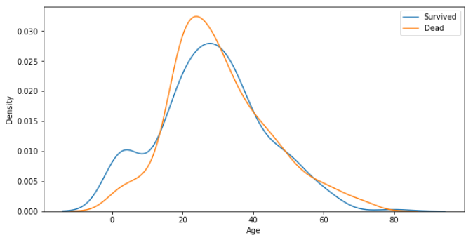
sns.catplot(x='Pclass', y='Survived', kind='point', data=titanic_df)
plt.show()
![]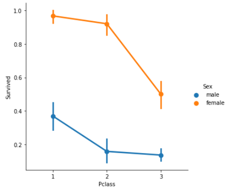
## Age graph with Pclass

titanic_df['Age'][titanic_df.Pclass == 1].plot(kind='kde')
titanic_df['Age'][titanic_df.Pclass == 2].plot(kind='kde')
titanic_df['Age'][titanic_df.Pclass == 3].plot(kind='kde')

plt.legend(['1st class', '2nd class', '3rd class'])
plt.show()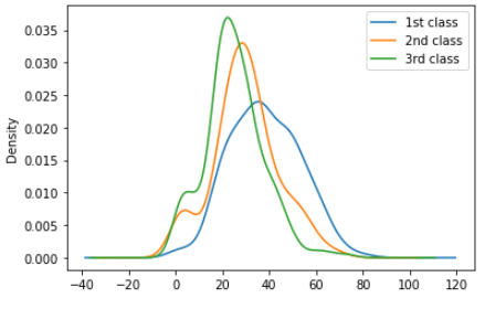
Mission
- 다른 유의미한 Feature 찾기
sns.catplot(x='SibSp', col='Survived', kind='count', data=titanic_df)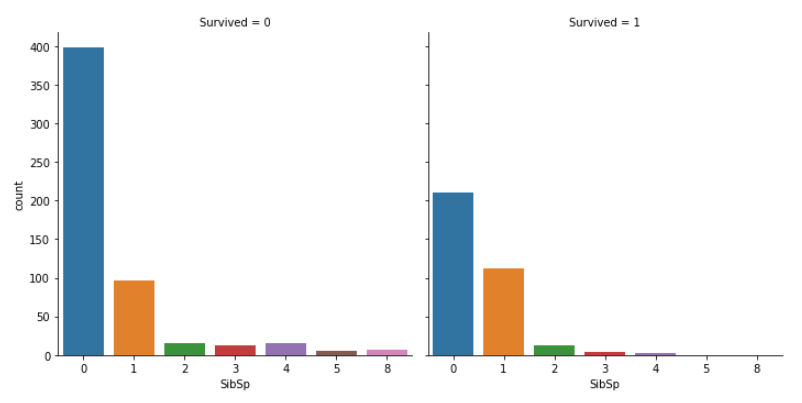
sns.heatmap(titanic_df[['SibSp', 'Survived']].groupby(['SibSp']).mean())
plt.plot()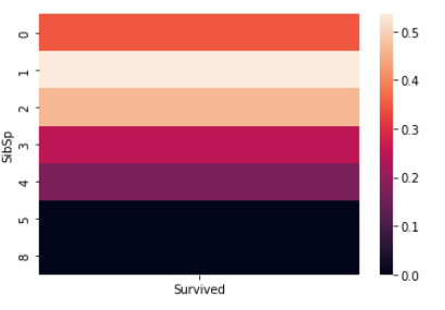
SibSp : 배우자 혹은 자녀의 수

특히 3 이상으로 많아질 수록 생존률이 떨어지는 모습- Kaggle dataset을 하나 선정해서, 유의미한 Feature 3개 이상 찾고 시각화 하기
fish_df = pd.read_csv("./Fish.csv")

fish_df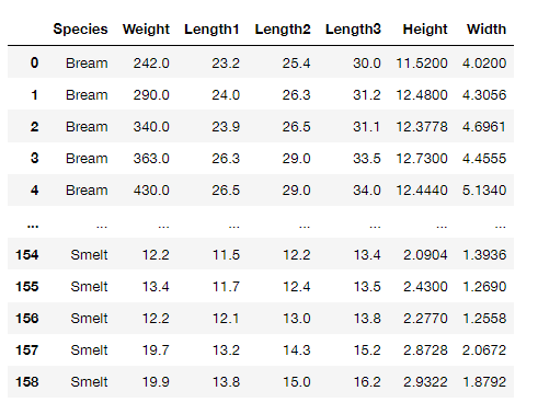
fish_df['Species'].unique()
fish_df.corr()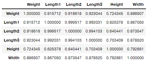
sns.heatmap(fish_df.corr())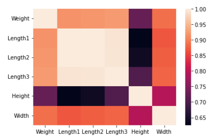
Length1 - Length2
Length1 - Length3
지느러미간 길이가 상관도가 가장 높다
Weight - 지느러미, 너비 등이 다음으로 상관도가 높게 따라온다.

오래 공부하는 사람