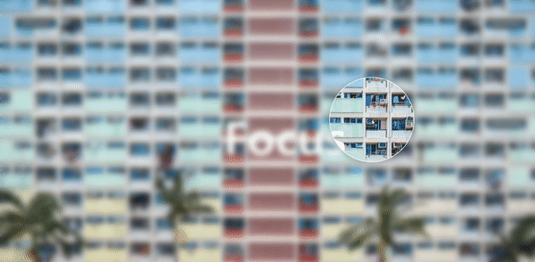
우연히 서핑하다가 토스 CONF사이트에서 재밌는 표현을 발견!
호다닥 유툽에서 비슷한 영상 찾아서 따라 만들어봤다.
1. 기본구조
<section>
  <div class="box">
    <h2>Focus</h2>
  </div>
  <div class="box">
    <h2>Focus</h2>
  </div>
  <div class="circle"></div>
</section>
배경 두개에 원하나
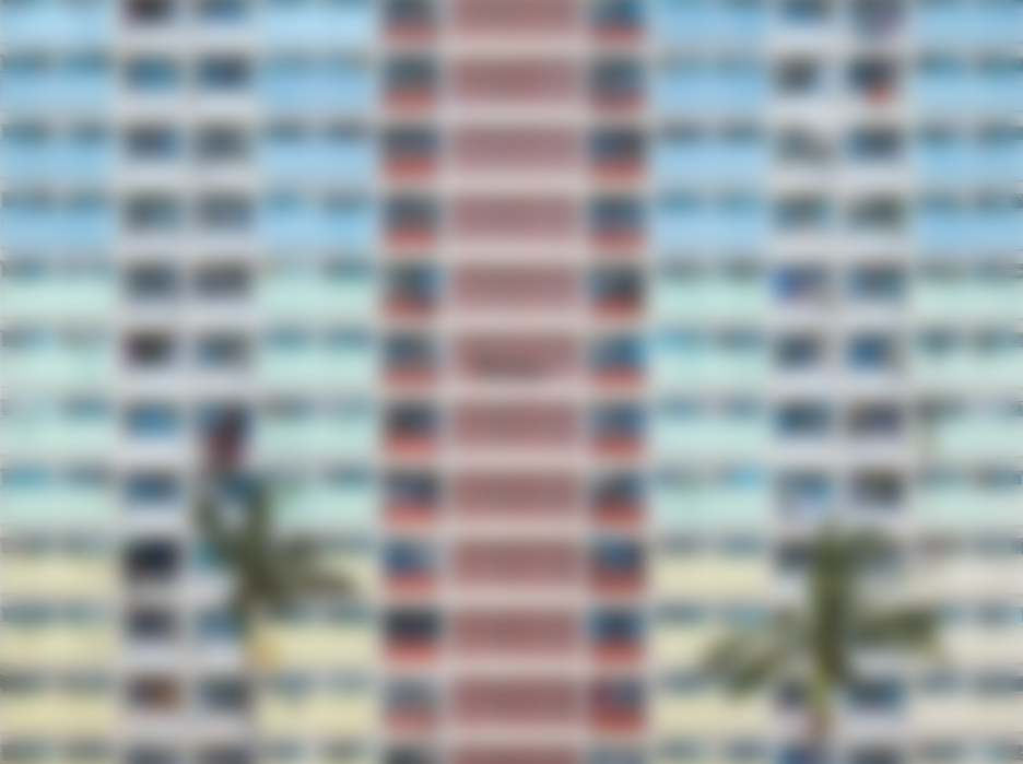
2. 아래 배경 블러처리
밑에 깔린 배경은 블러처리(아래있으므로 화면엔 현재 안보여야 정상)
section .box:nth-child(1) {
filter: blur(10px);
}
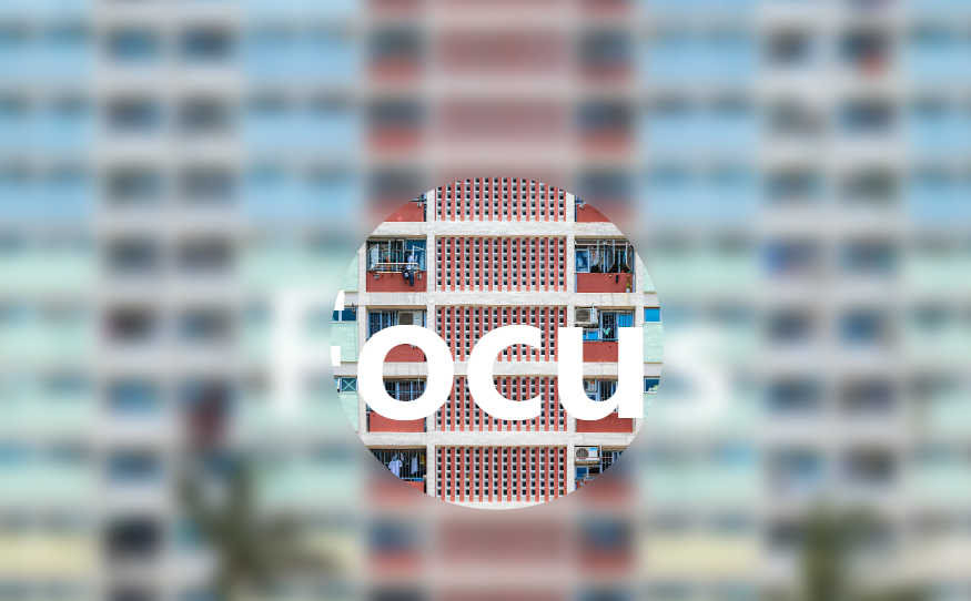
3. 위에 배경 하나를 원으로 잘라냄
section .box:nth-child(2) {
clip-path: circle(150px at var(--x) var(--y));
}
4. 움직이는 마우스 좌표알아내기!
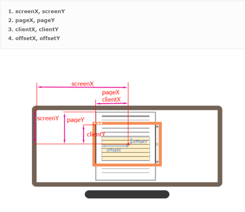
screen는 사용자의 모니터를 기준으로
page는 전체문서를 기준으로(스크롤이 다합쳐진)
client는 지금보이는 화면을 기준으로
offset은 좌표를 출력하도록 이벤트가 걸려있는 DOM node를 기준으로 좌표를 표시
  const pos = document.documentElement; // html을 반환
  pos.addEventListener("mousemove", (e) => {
    pos.style.setProperty("--x", e.clientX + "px");
    pos.style.setProperty("--y", e.clientY + "px");
  });
마우스가 움직일때마다 mousemove이벤트를 html에 걸어주고, 그 때마다의 x,y 좌표값을 --x,--y라는 변수로 지정
5. 좌표에 따라 css위치변경
section .box:nth-child(2) {
clip-path: circle(150px at var(--x) var(--y));
}.circle {
position: absolute;
top: -150px;
left: -150px;
width: 300px;
height: 300px;
border: 2px solid #fff;
border-radius: 50%;
box-shadow: 0 5px 25px rgba(0, 0, 0, 0.25);
transform: translate(var(--x), var(--y));
}
앞서 지정한 변수값에 따라 circle과 배경의 원의 위치를 변경
6. 약간의 디테일 추가
마우스움직임에 따라 글자가 조금 움직이는 인터랙션 추가
section .box h2 {
position: absolute;
color: #fff;
font-size: 10em;
transform: translate(0, 0);
transform: translate(calc(var(--x) / 25), calc(var(--y) / 25));
}