클론 코딩 진행시 어려움을 겪었던 부분에 대해 작성했다.
Bootstrap을 사용했다.
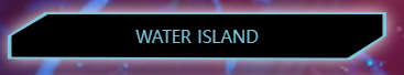
축제 페이지의 메인 화면이다.
뒷 배경은 움직이는 동영상이고, POOL:US 문구는 glitch 효과를 넣어줘서 약간 흔들린 모습이다.
배경 영상 재생
<div class="main d-flex justify-content-center align-items-center">
  <video autoplay loop muted playsinline>
    <source src="./viedo/background-video.mp4" type="video/mp4">
  </video>
<div>
.main video{
position:absolute;
top: 0;
left: 0;
height: 100%;
width: 100%;
object-fit: cover;
z-index: -1;
}배경 영상을 자동 반복 재생되도록 해주었다.
영상은 전체 영역을 차지하도록 해주었고, object-fit:cover는 부모 요소의 크기에 맞게 자르고, z-index:-1은 다른 요소들 보다 뒤에 위치하도록 해주었다.
z-index:-1을 입력하지 않았을 때
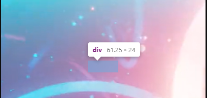
z-index:-1을 입력했을 때
흐릿하지만POOLUS라는 문구가 보이는 것을 볼 수 있다.
clip-path
clip-path generator라고 구글에 검색하고 내가 원하는 모양의 도형을 만든다.
결과

마우스를 올렸을 때 색이 바뀌는 동작을 볼 수 있다.
html
<a href="#" class="btn-main d-flex justify-content-center align-items-center mb-4">
  <div class="text-center py-2 isamanroo-font btn-main-waterisland-in">WATER ISLAND</div>
  <div class="text-center py-2 isamanroo-font btn-main-waterisland-out"></div>
</a>
href="#"으로 해둔 이유는 메인 화면만 구성했기 때문에 "#"으로 두었다.
class를 btn-main-waterisland-in과 btn-main-waterisland-out으로 나누었다.
줄여서 in과 out으로 구분했다.
css
 .btn-main{
    position: relative;
    z-index:1;
    text-decoration-line: none;
    filter: drop-shadow(0px 0px 8px #ffffff);
 }
 .btn-main-waterisland-in{
    color:#6bc6dd;
    background-color: #000000;
    width:98%;
    height: 100%;
    clip-path: polygon(10.1% 0%, 100% 0%, 100% 50%, 90.6% 100%, 0% 97.7%, 0% 50%);
 }
 .btn-main-waterisland-out{
    position: absolute;
    background-color: #6bc6dd;
    width: 100%;
    height: 110%;
    z-index: -1;
    clip-path: polygon(10.1% 0%, 100% 0%, 100% 50%, 90.6% 100%, 0% 97.7%, 0% 50%);
 }
 .btn-main-waterisland-in:hover{
    color:#ffffff;
    background-color:#55d6f6;
    width: 98%;
    height:100%;
    clip-path: polygon(10.1% 0%, 100% 0%, 100% 50%, 90.6% 100%, 0% 97.7%, 0% 50%);
    transition: 0.3s;
}
btn-main은 그림자를 추가해주었다.
in과 out class의 차이점을 보면 out이 in보다 width와 height가 더 큰 것을 볼 수 있다. 또한 background-color이 다르고 out에는 z-index:-1이 있는 것을 볼 수 있다.
이것은 in 박스의 테두리에 out의 색을 추가해준 것이다.
hover는 마우스 커서가 요소 위에 올라갔을 때 발생하는 상태이다. transition을 사용하여 일정 시간을 가지고 변화를 부드럽게 적용해주었다.
마치며
헷갈렸던 부분을 작성하며 조금 더 이해가 된 것 같고, position과 flex에 대해서는 더 공부해야 한다고 느꼈다.
